Wikivoyage:Destination of the month candidates/Banners/Archive/2013
| DotM banner archives: 2013 • 2014 • 2015 • 2016 • 2017 • 2018 • 2019 • 2020 • 2021 • 2022 • 2023 • 2024 |
Archived banners for destinations featured on the Main Page in 2013.
![]()
![]()

![]()

![]()

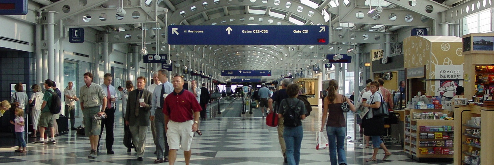
- I'm torn here. #3 would be the runaway winner if it weren't so similar to the pagebanner; also, the text is a bit hard to read (especially the closer you get to the left margin) because of he light-colored background. #4 and #1 are good photos, but a little too generic - they could be any airport. If pressed to make a decision now, I'd say #4, but certainly would like to hear other opinions.
- Also, what's the deal with right-justified text overhanging the margin? Is that my browser or an issue with the MediaWiki coding? Is it fixable?
- I'm having the same problem with the right-justified text in this group of banners. I think the first looks best, with the text, and it does look like O'Hare to me, though some other airports look similar. If the top priority is having a highly distinctive picture, then the third banner should be chosen, and damn the text - it might be OK to make it hard to read, as part of the psychedelic experience of the curvy lights. In the 2nd banner, the passengers look bored, and the line of planes with hazy exhaust doesn't interest me. Ikan Kekek (talk) 00:20, 16 October 2013 (UTC)
#1 is sourced from the same image as Musandam's pagebanner, which I did not realize until after I had uploaded it. I don't believe there's any policy against that, though.
![]()

![]()
![]()

- This is a tough one for me - they're all good. But I'm going to say #1 by a nose. -- AndreCarrotflower (talk) 08:25, 14 October 2013 (UTC)
- I also vote for the first one, with the 3rd also excellent, in a close 2nd place. I don't think the 2nd is as good as the others, because the middleground of the left side is fuzzy and the scene is not quite as picturesque. Really good efforts on these! Ikan Kekek (talk) 08:35, 14 October 2013 (UTC)
- I like #1 best and don't think it matters it coincides with the page banner. Danapit (talk) 07:47, 24 October 2013 (UTC)
![]()

![]()
![]()
![]()

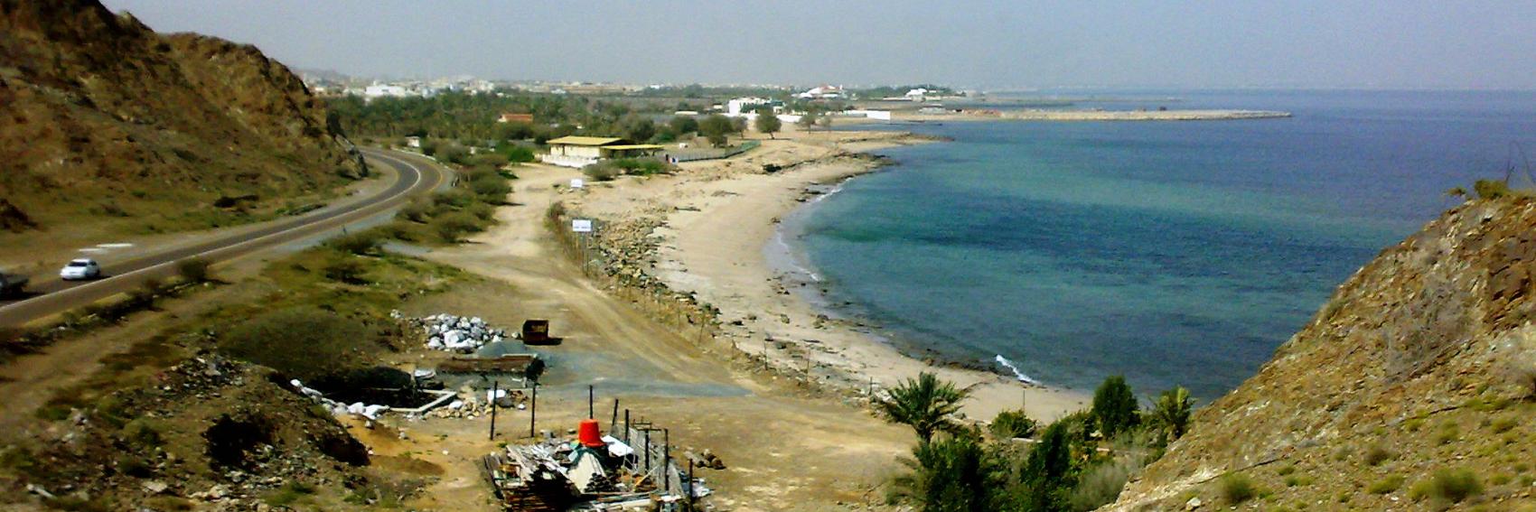
- #2. #4 is a close second. -- AndreCarrotflower (talk) 05:19, 14 October 2013 (UTC)
- I don't think there's anything close to the 2nd banner. Beach and boats, and a just plain good photo. Ikan Kekek (talk) 05:32, 14 October 2013 (UTC)
- Does #4 have copyright issues? LtPowers (talk) 18:47, 14 October 2013 (UTC)
- @LtPowers - in a word, no:
- Does #4 have copyright issues? LtPowers (talk) 18:47, 14 October 2013 (UTC)
- Copyright Act 1968, § 65: "The copyright in a work... that is situated, otherwise than temporarily, in a public place, or in premises open to the public, is not infringed by the making of a painting, drawing, engraving or photograph of the work or by the inclusion of the work in a cinematograph film or in a television broadcast."
- I like the fishies a lot, #4 gets my vote. #2 is fine, too. #1 and #3, on the other hand, feel somewhat non-descriptive. --Danapit (talk) 22:38, 29 October 2013 (UTC)
You know the drill. Vote on your favorite(s).
![]()
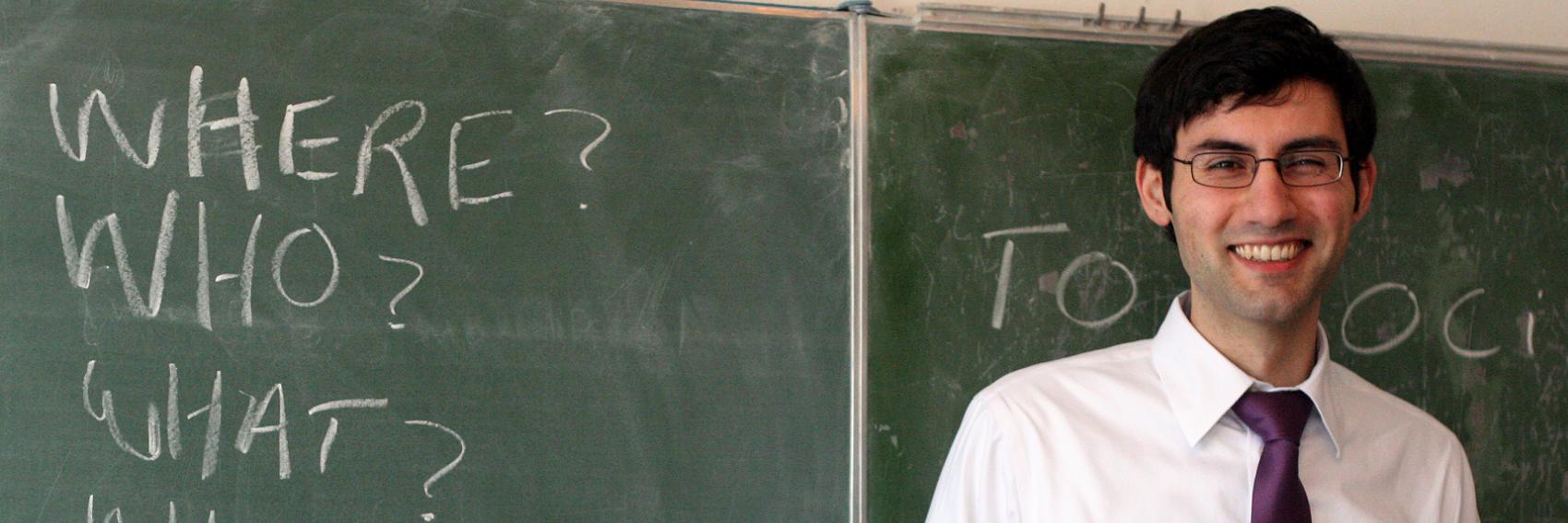
![]()

![]()
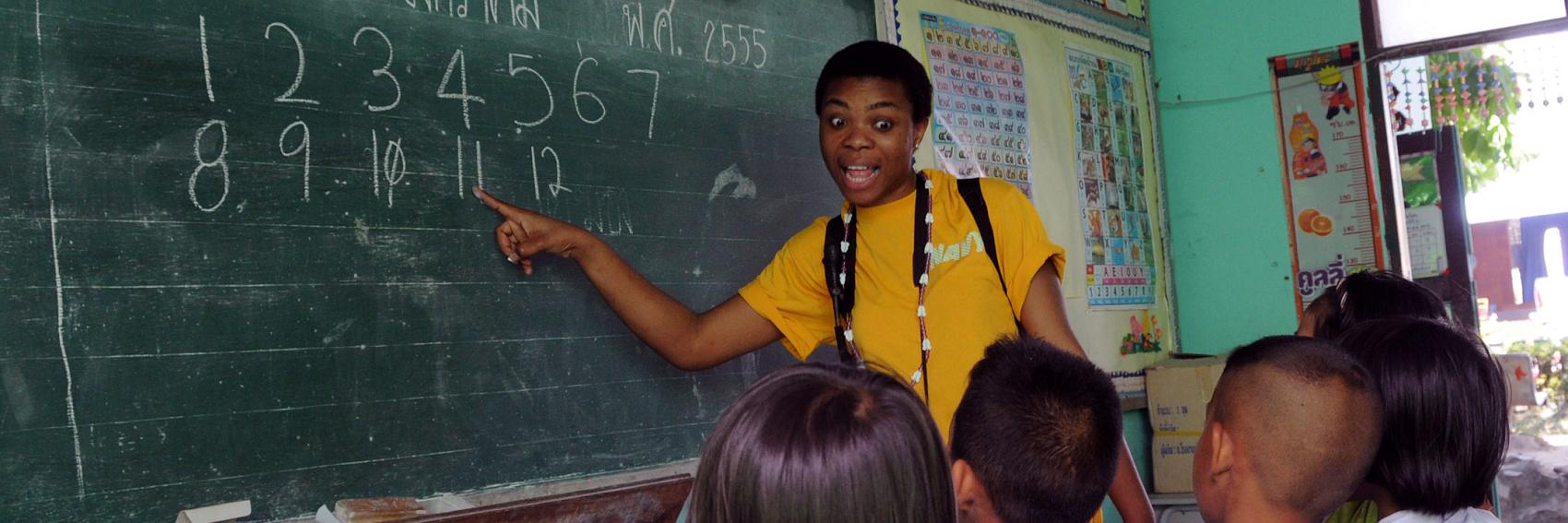
- #2, #3 and #1, in that order. #1 looks too "stock photo-ey" and doesn't show any interaction between teacher and students; #3 would be my favorite except the teacher has a weird look on her face. -- AndreCarrotflower (talk) 15:52, 13 October 2013 (UTC)
- I was going to say No. 3, but your point about her facial expression is well taken. I agree that the 2nd one is more appropriate than the first. Ikan Kekek (talk) 17:25, 13 October 2013 (UTC)
- To elaborate a bit: The 1st banner looks like a snapshot, whereas in the 2nd, the activity of teaching and studying is taking place. Ikan Kekek (talk) 00:22, 16 October 2013 (UTC)
- I do like #3 best, even the "e-le-ven" funny look is quite fine with me, after all overacting sometimes belongs to teaching, as well. At least my English teachers were often funny (it explains a lot about my English, doesn't it). #2 as a second choice. Danapit (talk) 07:30, 21 October 2013 (UTC)
- I see nothing wrong with #3, except perhaps for the prevalence of Thai lettering in a banner about Teaching English. =) LtPowers (talk) 14:34, 22 October 2013 (UTC)
- Ups, well observed, LtPowers ;) Still I wouldn't mind using #3. Danapit (talk) 07:09, 24 October 2013 (UTC)
- I see nothing wrong with #3, except perhaps for the prevalence of Thai lettering in a banner about Teaching English. =) LtPowers (talk) 14:34, 22 October 2013 (UTC)
- I do like #3 best, even the "e-le-ven" funny look is quite fine with me, after all overacting sometimes belongs to teaching, as well. At least my English teachers were often funny (it explains a lot about my English, doesn't it). #2 as a second choice. Danapit (talk) 07:30, 21 October 2013 (UTC)
![]()

![]()

![]()

![]()
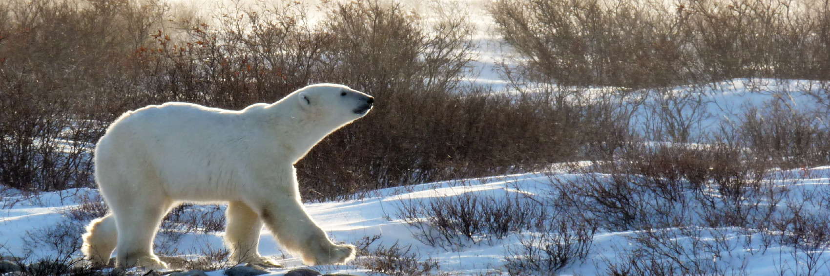
Maybe it's premature, but while I've got Churchill on the brain... I think #1 is the best eye candy, but there just has to be a polar bear in the pic. I'm torn between #2 and #3. #4 is doing a fabulous strut, but the blurb text gets in his eye. --Peter Talk 01:20, 4 April 2013 (UTC)
- As of now my vote goes with #3, but if you have the original #4 and can crop it so that the bear is further to the left and there's no conflict with the blurb text, that would be the obvious winner IMO. -- AndreCarrotflower (talk) 04:35, 4 April 2013 (UTC)
- On my screen, the text is just on the edge of the bear's nose in #4 and it looks great! Too bad all screens display differently. In that case, I'd go for #2. JamesA >talk 13:41, 4 April 2013 (UTC)
- It actually should look the same on all screens—I zoomed it in to try and get it out of his face. Maybe if I do it just a bit more... --Peter Talk 16:08, 4 April 2013 (UTC)
- OK, now it's out of his nose too. And it still looks good, since I had such a nice high res 5MB photo to work with (thank goodness my friends had decent cameras). I'm still torn, but I have a personal connection to all these photos ;) --Peter Talk 16:14, 4 April 2013 (UTC)
- I love the #4 bear's "corona"! Both #1 and 4 great pictures. In #1 there is some shade in bottom left part which bothers me a little, without that I would even prefer #1. --Danapit (talk) 07:15, 5 April 2013 (UTC).
- I would favour the fourth pic. The truck in the first pic singles it out for me. jan (talk) 09:18, 10 April 2013 (UTC)
- #4, but #1 is also great. Jjtk (talk) 08:52, 16 April 2013 (UTC)
- I also like #4 the best. My second choice would be #3, but I like #4 considerably more because it's a much more interesting scene, overall, and I like the fact that the text is not over the photo of the polar bear in that one. Ikan Kekek (talk) 09:05, 16 September 2013 (UTC)
- My vote goes to #3 and #4. #3 is too cute, but #4 is less obstructed. Rastapopulous (talk) 19:29, 7 October 2013 (UTC)
You'd think a city of Oakland's caliber would have a better selection of images at Commons. These images, while of perfectly good quality, don't capture the diversity of subject matter that I was hoping for. I'd have liked to find a nice picture of the Morcom Rose Gardens, but no dice. -- AndreCarrotflower (talk) 18:03, 13 September 2013 (UTC)
![]()

![]()

![]()

![]()

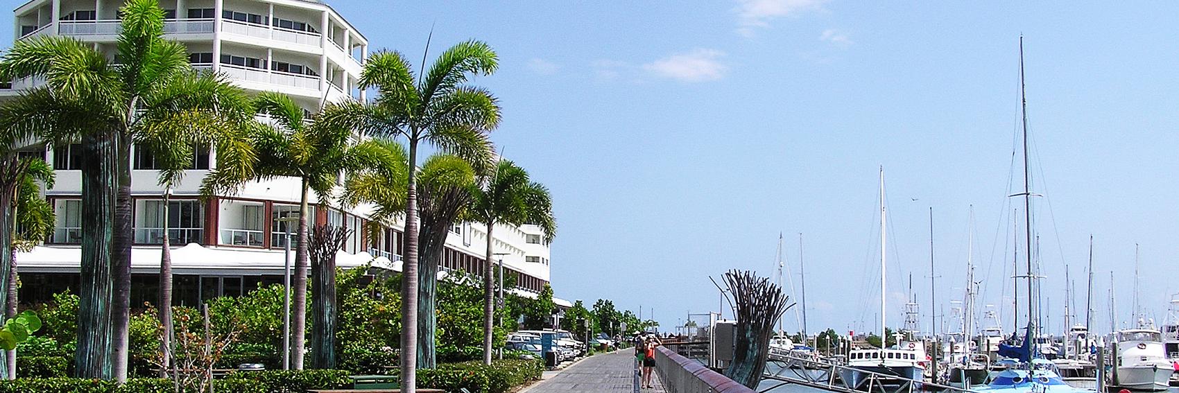
- #1 for me. #2 is good, but a bit generic; #3 is a touch too busy. -- AndreCarrotflower (talk) 18:09, 13 September 2013 (UTC)
- I really don't like any of these, but if I have to pick between them, the third one says "Oakland" to me more than the others. Perhaps one of us could ask User: Challenger l whether s/he would like to try her/his hand at taking some more photos and making a banner. Ikan Kekek (talk) 20:51, 13 September 2013 (UTC)
- Yes, not typcial pics for Oakland but if that is the selection #1 is my choice. jan (talk) 09:16, 16 September 2013 (UTC)
- I have found one that I would love to use - but it has the honor have having been uploaded and then deleted from Wikimedia Commons a few years ago, the debate about it long since archived, and the photo itself having since been released into the public domain. This is the original site, panorama at the top: http://thedude.com/2005/11/13/oakland-skyline-panorama/ Any suggestions? WC's interface seems in this regard, about as user-friendly as a concrete wall. L. Challenger (talk) 09:53, 16 September 2013 (UTC)
- I find the statement of the PD on the author's web is enough (correct me if I'm wrong). I plunged forward and uploaded the file locally and added it as a banner #4. It's a great pic! It collides with the blurb badly though. Still it gets my vote, the second option would be #2 (it's so clear!) an inch before #1. Danapit (talk) 12:15, 16 September 2013 (UTC)
- I like the first one; it has the best composition and it shows a unique view. LtPowers (talk) 18:50, 16 September 2013 (UTC)
- As I said, slim pickin's on Commons. I'd applaud any effort to find better copyleft-compatible images, but frankly, if the complaint about #2 is that it's bland and not representative of Oakland's identity, I don't see how #4 is any improvement: it's the exact same subject matter, but from a different angle such that the text gets in the way. #3 would have been a great banner if only it had been possible to crop it so the text weren't so intrusive. I like #1 for the same reason User:LtPowers does; in fact, I'm surprised the votes weren't unanimously in favor of #1. It ranks up there among the uniquest compositions of any banner since the new Main Page was designed, and I fondly remember my own visit to the Mormon Temple in Oakland in 2005 - the view is unparalleled and awe-inspiring. -- AndreCarrotflower (talk) 22:31, 16 September 2013 (UTC)
- I thought that the pic that turned into #4 would have space enough for the text so it wouldn't conflict nearly so much. As it is, #3 and #4 are pretty images, but too busy to throw text in there. #2 is too much of a long-distance shot for it to be characteristically Oakland. #1 looks the strongest, by a long shot. -- L. Challenger (talk) 22:48, 16 September 2013 (UTC)
- #1 is very hazy. #4 is my favorite, but I agree that the text collides with the image. Would it be any better if the text was moved to the left side of the picture? Ikan Kekek (talk) 22:58, 16 September 2013 (UTC)
- Sadly, no; there is even less empty space left of center than right. -- AndreCarrotflower (talk) 23:09, 16 September 2013 (UTC)
- Furthermore, I think #1's haziness works to the benefit of the composition - it thrusts the spire of the Temple firmly into the foreground and creates a really strong sense of three-dimensionality. -- AndreCarrotflower (talk) 23:20, 16 September 2013 (UTC)
- That's true. I can live with #1, but Oakland is not typically hazy, unlike SF across the bay. Ikan Kekek (talk) 23:23, 16 September 2013 (UTC)
- (edit conflict) I am also afraid it is not possible to accommodate all the text in #4. It just looks messy. I like #2 because it is clear and somehow pleasant to look at. #1 is a rather weird (I mean positively weird) and interesting picture, but as Ikan Kekek said, somewhat hazy. Which doesn't go well with the text "or just for a break from the fog and drizzle" ;) Danapit (talk) 23:25, 16 September 2013 (UTC)
- Excellent point, Dana. Ikan Kekek (talk) 23:35, 16 September 2013 (UTC)
- (edit conflict) I am also afraid it is not possible to accommodate all the text in #4. It just looks messy. I like #2 because it is clear and somehow pleasant to look at. #1 is a rather weird (I mean positively weird) and interesting picture, but as Ikan Kekek said, somewhat hazy. Which doesn't go well with the text "or just for a break from the fog and drizzle" ;) Danapit (talk) 23:25, 16 September 2013 (UTC)
- That's true. I can live with #1, but Oakland is not typically hazy, unlike SF across the bay. Ikan Kekek (talk) 23:23, 16 September 2013 (UTC)
- Furthermore, I think #1's haziness works to the benefit of the composition - it thrusts the spire of the Temple firmly into the foreground and creates a really strong sense of three-dimensionality. -- AndreCarrotflower (talk) 23:20, 16 September 2013 (UTC)
- Sadly, no; there is even less empty space left of center than right. -- AndreCarrotflower (talk) 23:09, 16 September 2013 (UTC)
I don't know Oakland at all, but I wondered whether either of these images, derived from here and here, had any merit as banners. --Nick talk 23:34, 16 September 2013 (UTC)
![]()

![]()

- They are both great, Nick. I think the upper one (#5) looks a bit better with the text on the left side, but still it is difficult to read. #6 might work - I think I like this one best (except it's slightly hazy, too). Danapit (talk) 23:45, 16 September 2013 (UTC)
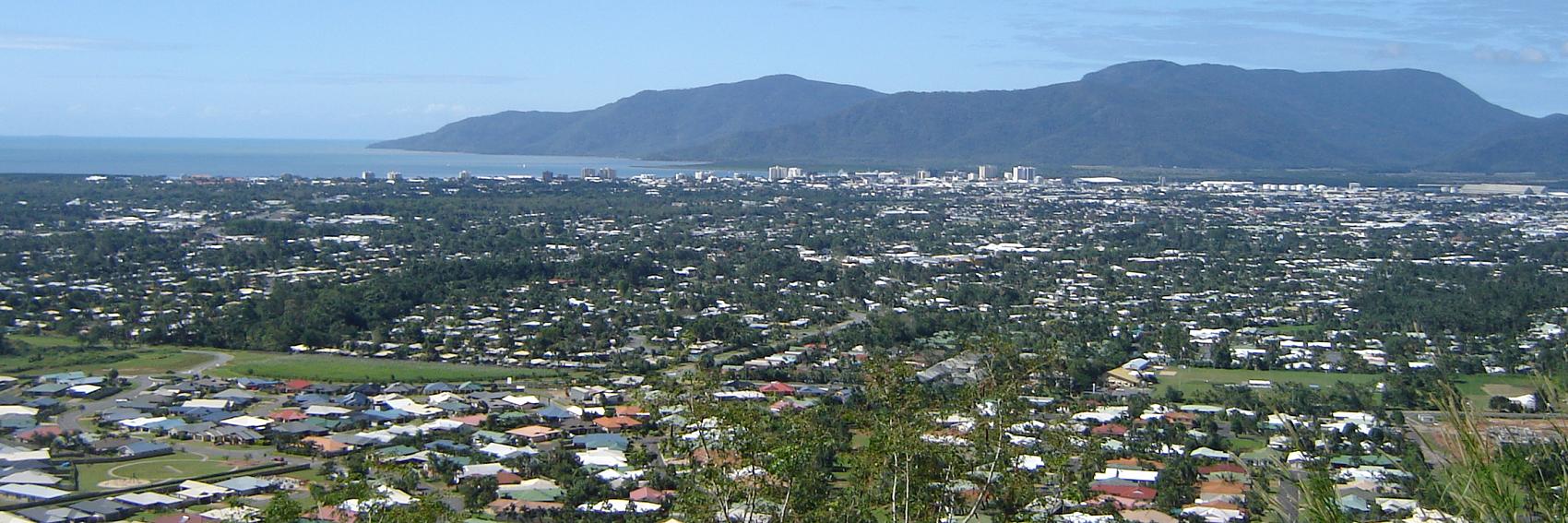
- I have to say I'm not a fan of #5. It's visually interesting, but that's about all that can be said in its favor. Nowhere in the picture do I see Oakland. I was skeptical of the banner we ended up choosing for Kunming for essentially the same reason, but at least it's identifiably Chinese, albeit in probably the most idiosyncratic way that any banner we've ever put on the Main Page represents its location.
- #6 is a better image, and I wouldn't be altogether upset to see it on the Main Page. But it just doesn't pack the punch that #1 does.
- -- AndreCarrotflower (talk) 00:28, 17 September 2013 (UTC)
- I agree with Andre's points. Plus, neither of these two banners really say "Oakland" to me, while the other 4 are recognizably Oakland. Ikan Kekek (talk) 01:58, 17 September 2013 (UTC)
- It's interesting to see the two new ones, #5 and #6. I recognize #5 at once - it was among the many pics I dug through on looking for a front-page pic for Oakland itself. It makes for an interesting image, though sadly, for the most part, one skyscraper at that distance is very like another. #6 is much more interesting, one of the few actually showing people front and center, and I know exactly where they are, near Lake Merritt. It's time like these that make me really miss my cameras. L. Challenger (talk) 23:17, 17 September 2013 (UTC)
- I, too, knew that that was Lake Merritt, but you can't see much city on the other side in this view. Ikan Kekek (talk) 23:48, 17 September 2013 (UTC)
- It's growing on me, though. I wouldn't mind if it (banner #6) were picked for the DotM banner. Ikan Kekek (talk) 00:34, 18 September 2013 (UTC)
- I'm liking banner #2 best now, because it's a clear picture and shot in clear (not hazy) weather. It's bugging me that #3 is so dark on the right. Ikan Kekek (talk) 00:38, 18 September 2013 (UTC)
- I agree, Ikan - clear weather and a big lump of Oakland's skyline. L. Challenger (talk) 16:05, 1 October 2013 (UTC)
- I'm liking banner #2 best now, because it's a clear picture and shot in clear (not hazy) weather. It's bugging me that #3 is so dark on the right. Ikan Kekek (talk) 00:38, 18 September 2013 (UTC)
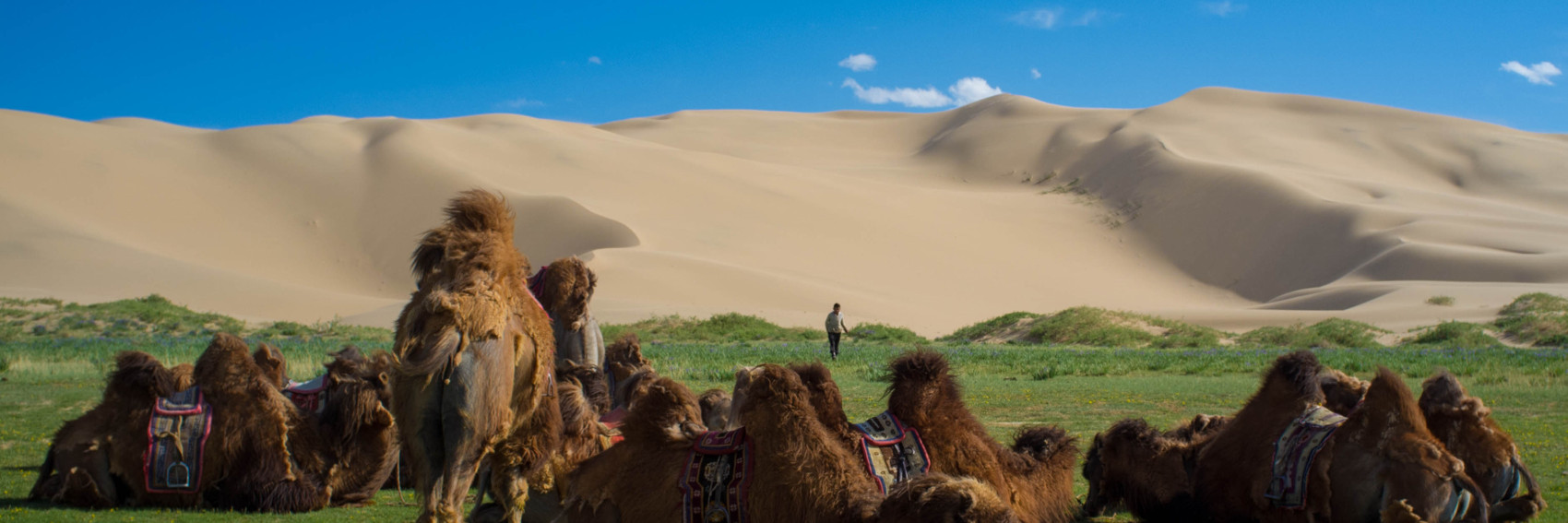
It was a bit of a challenge finding these images, but I think I came up with some good ones. Searching for "Silk Road" on Commons was no help, so Plan B was to search for some of the key places mentioned in the article as well as in Wikipedia. I tried to provide for not only a diversity of different typical scenes along the modern-day Silk Road, but also a geographic diversity: from Xinjiang (#s 1 and 3) to Uzbekistan (#2) to Afghanistan (#4).
Also, on another topic, don't despair about our next OtBP: I'll be making the trip out to Clarence as soon as I can get a day off work to search for banner shots. Stay tuned.
-- AndreCarrotflower (talk) 04:48, 13 September 2013 (UTC)
![]()

![]()

![]()

![]()
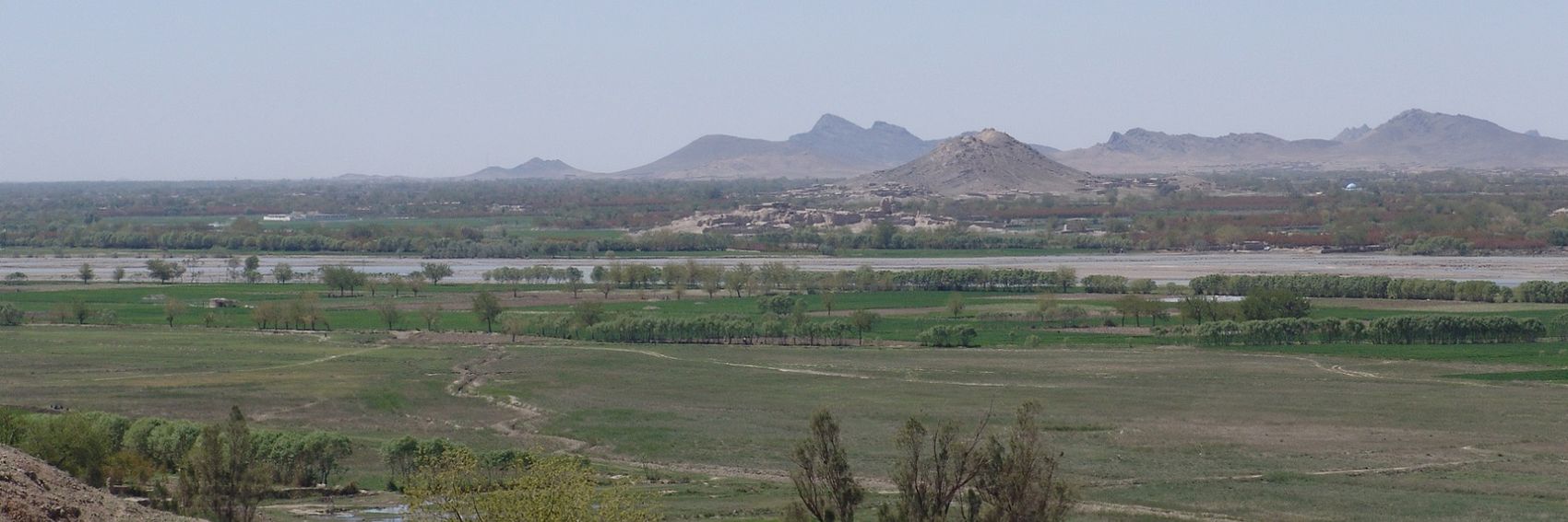
#1 gets my vote by a nose over #3. They're both beautifully proportioned, but #3 appears to have been taken through some sort of filter - it gives it an interesting effect, but something about it looks off to me. #2 is a distant third - I'm a huge fan of symmetry, which the photo itself has, but the text screws it all up. -- AndreCarrotflower (talk) 04:48, 13 September 2013 (UTC)
- I think I would like the third photo best if it had black text. Can we try it that way? Ikan Kekek (talk) 05:26, 13 September 2013 (UTC)
- You've mentioned black text several times; do we actually have that capability? I've never seen it before on our banners. -- AndreCarrotflower (talk) 05:52, 13 September 2013 (UTC)
- I'm not sure how colors are encoded in Wiki language, but it should be possible to change the text color. If it isn't, that's a pretty bad shortcoming of the code and should be brought up with whomever is in charge of developing it. Ikan Kekek (talk) 07:21, 13 September 2013 (UTC)
- I like #2 very much, but as Andre pointed out, the collision with the text is annoying. I like the camel #3 picture idea, but it is really a bad quality photo. #1 would do. Danapit (talk) 11:20, 13 September 2013 (UTC)
- I retouched #3 in Picasa to remove the worst of the scratches/dust and rebalance the color. What do you think? LtPowers (talk) 14:15, 13 September 2013 (UTC)
- That's a huge improvement. IMO we can use it like that. Danapit (talk) 14:48, 13 September 2013 (UTC)
- Thanks to LtPowers' improvements to it, I think I'm going to change my vote to #3. -- AndreCarrotflower (talk) 17:52, 13 September 2013 (UTC)
- I still want black text on that. Who do we contact to find out how to change the text color? Ikan Kekek (talk) 20:47, 13 September 2013 (UTC)
- #3 pic is my choice. jan (talk) 09:15, 16 September 2013 (UTC)
I like the subject matter of #3, but the image quality is just too low. The Silk Road covers an enormous geographic area, so we really have a lot of pics to choose from. So why not have a few more banners to choose from ;) Of the following, I think I like mysterious #6 the best, but it's hard not to go with Bactrian camels. --Peter Talk 20:48, 19 September 2013 (UTC)
- You shoulda seen it before! LtPowers (talk) 22:40, 19 September 2013 (UTC)
![]()

![]()

![]()

![]()
- Thanks for the new banners! I like #5 best. It's a good composition and has an air of antiquity and a faraway horizon that implies a long journey. The 7th is my 2nd choice. Ikan Kekek (talk) 22:46, 19 September 2013 (UTC)
- Very fine selection. Like Ikan Kekek I like #5 and #7 best, but in the reverse order: #7 is my favourite one. Danapit (talk) 05:50, 20 September 2013 (UTC)
- I'm in the minority here, but none of the new banners do it for me. The middle two have dull (#6) or awkward (#7) compositions that throw me off. #8's colors are so bright that it looks unrealistic. #5 is a good picture and easily my favorite of the newbies, but it still doesn't stack up to #3, which still has my vote.
- I've heard other Wikivoyagers complain about the "poor quality" of #3. I think that this is one of those rare occurrences where poor photo quality enhances, rather than detracts from, the quality of an image. #3 almost looks to me like a still from an old silent film that's been colorized (even more so after LtPowers' enhancements). It's perfect for the subject matter - as the blurb says, the Silk Road has probably the longest history of all travel itineraries.
- Come to think of it, #5 isn't a terribly high-quality photo itself. The low resolution is especially apparent on the ornamentation that's wrapped around the left-most tower, and on either side of the entrance thingy at the bottom left corner of the building. -- AndreCarrotflower (talk) 23:31, 20 September 2013 (UTC)
- Good point about #3: It does look like an old photo, as you say. Ikan Kekek (talk) 11:36, 21 September 2013 (UTC)
- Peter, did you crop #7 intentionally so that the top of the wall isn't horizontal? I find this is the only thing about the picture I find slightly disturbing. Can I try to upload a new version with the wall horizontal? Danapit (talk) 14:44, 21 September 2013 (UTC)
- Please, by all means! --Peter Talk 19:36, 26 September 2013 (UTC)
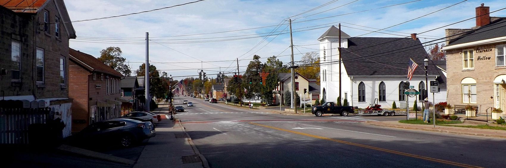
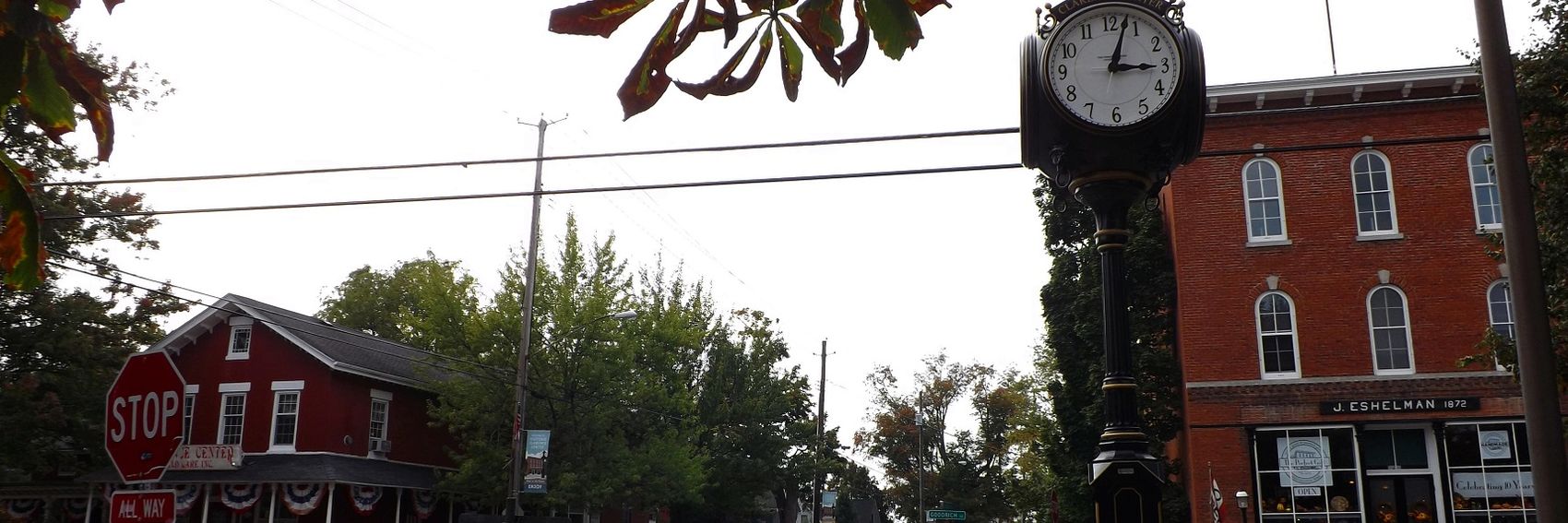
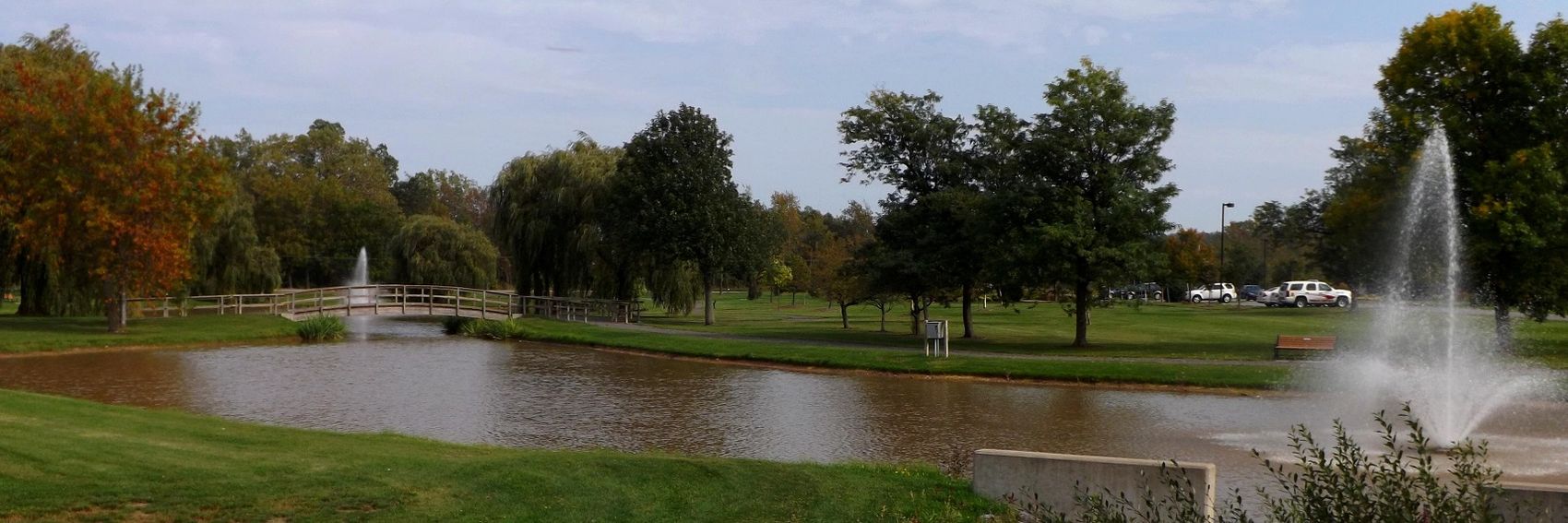
Over the past two or three weeks, one of two things has happened: either I've been stuck at work all day or it's been gray and rainy out. Today, I had a day off that was hazy but not exactly overcast, so I decided to not tempt fate by procrastinating further, and headed out to Clarence to take some banner pictures. -- AndreCarrotflower (talk) 23:08, 20 September 2013 (UTC)
![]()
![]()

![]()
![]()

![]()
![]()

- Off the top of my head, #1, #2 and #6. I'd be pleased as punch to have any of them on the Main Page, though. -- AndreCarrotflower (talk) 23:08, 20 September 2013 (UTC)
- Great job, Andre! To me, the prettiest ones are #5, #6, and #4, in that order. For banners featuring buildings, #3 gets across the feeling of Clarence being a quaint town, but the resolution of the caption is poor as white text on a white background. #2 is better in that respect, and the one I'd favor if a decision is made to include a brick building in the featured pagebanner. #1 is a nice general view of the town, but in that one (and only in that one), the overcast sky bugs me, because it gives a somewhat drab aspect to the town. Ikan Kekek (talk) 23:33, 20 September 2013 (UTC)
- Ikan, I wonder if your monitor settings might be behind the resolution issues you're noticing on Clarence #3 and Silk Road #3. On my laptop and desktop computer and my iPhone, the text in both of those banners is easily legible, but on my computer at work it's completely invisible on the Clarence banner and almost completely on the Silk Road banner. -- AndreCarrotflower (talk) 21:02, 22 September 2013 (UTC)
- That's possible, as the monitor in my office at school seems clearer. However, the text is far from invisible on my monitor at home; it's reasonably legible, but just not that clear. I think my monitor is fine - it's a very good analog monitor that Dell sold cheaply (bundled with the computer) when they were trying to clear inventory, having just converted to all digital monitors a few years ago; it's just not as good as today's state-of-the-art digital monitors, but not everyone is using those yet. Ikan Kekek (talk) 21:11, 22 September 2013 (UTC)
- OK, I'm in my office now, looking at these on an Acer G185HV monitor, and my opinions haven't changed. Can I see the white-against-white text? Sure. But it's a bit of a strain. Ikan Kekek (talk) 21:29, 23 September 2013 (UTC)
- Looking at it again, the issue with my computer at work is that for some reason it doesn't display the shadowing effect of the text, which seems more like a problem with my browser. At any rate, for the record, in saying "maybe it's a problem with your monitor" I was talking more about the brightness, contrast etc. settings than the particular model you have. -- AndreCarrotflower (talk) 23:35, 23 September 2013 (UTC)
- I see the shadowing effect on both monitors, and there's definitely nothing unusual about the brightness or contrast settings on either monitor. My remarks stand. Ikan Kekek (talk) 22:50, 26 September 2013 (UTC)
- Andre, great that you made the photoexpedition! Nice pictures, indeed. The first 3 fit better together with the text. However, I like #6 most (#5 looks a bit cliche to me, #4 a bit too much OtBP). I also like #3 a lot, specially the horse chestnut leaves, which improve the gray sky impression. The building in #2 is a bit lobsided, but isn't it something that could be fixed in photoshop? Otherwise I like the picture. --Danapit (talk) 14:59, 21 September 2013 (UTC)
- #2 is actually an accurate photograph of the building in question, being situated on the side of a hill (it's also visible at the right margin of photo #1). Look at the roofline, which is parallel with the top margin of the photo. -- AndreCarrotflower (talk) 15:36, 21 September 2013 (UTC)
- Yes, the roofline is, but the other horizontal lines in the photo are not. It appears you took the photo from somewhere to the right of the centerline of the building, which means the left side of the building is farther from the camera than the right side; that means that it will appear smaller on the photo. That's just the way it is. There are two options for fixing this: 1) rotate the image so that line that is horizontal is in the middle of the banner (vertically), allowing lines near the top and bottom to both angle inward on the left; 2) use a program such as 'hugin' to correct the perspective of the photo so that all vertical lines are vertical and horizontal lines are horizontal. LtPowers (talk) 16:25, 21 September 2013 (UTC)
- At any rate, the current consensus is trending away from #2 and toward #6, so that might not be necessary. Taking the votes thus far into account, the thing that comes to my mind so far is that all of these photos are imperfect, though good. #1 is probably the classic view of Clarence, but as Ikan said, it's marred by the hazy sky. #2, aside from being lopsided, strikes me as too similar to Soltau's banner from August. As for #3, I had hoped the relative emptiness of the left half of the picture would be balanced if I left-aligned the text, but it still seems misproportioned to me (maybe because of the light-text-over-light-sky issue that Ikan mentioned). #4 and #5 are nice, but nondescript (I agree with Danapit about #5; it's my least favorite of the six, flat and static in the same way as Kunming's #3 banner). #6 is probably my favorite of the bunch, but it makes Clarence look less like a town and more like a national park or something of that nature.
- Yes, the roofline is, but the other horizontal lines in the photo are not. It appears you took the photo from somewhere to the right of the centerline of the building, which means the left side of the building is farther from the camera than the right side; that means that it will appear smaller on the photo. That's just the way it is. There are two options for fixing this: 1) rotate the image so that line that is horizontal is in the middle of the banner (vertically), allowing lines near the top and bottom to both angle inward on the left; 2) use a program such as 'hugin' to correct the perspective of the photo so that all vertical lines are vertical and horizontal lines are horizontal. LtPowers (talk) 16:25, 21 September 2013 (UTC)
- #2 is actually an accurate photograph of the building in question, being situated on the side of a hill (it's also visible at the right margin of photo #1). Look at the roofline, which is parallel with the top margin of the photo. -- AndreCarrotflower (talk) 15:36, 21 September 2013 (UTC)
- I'll try to take a new version of #1 on a sunnier day, and see if that changes the scenario at all. After all, we still have almost three weeks before Clarence goes on the main page.
- In terms of subject matter, I'd say I like #2 the best, but understand the concerns raised. Andre, would you mind uploading the original to Commons, so I could play around with it a bit in Gimp? --Peter Talk 16:37, 28 September 2013 (UTC)
- Alas, I've since deleted the original. I still intend to retake photo #1 at some point; it would be easy enough to also retake #2. -- AndreCarrotflower (talk) 18:22, 28 September 2013 (UTC)
Per the concerns of several users, I have uploaded new versions of Banners #1 and 2. -- AndreCarrotflower (talk) 20:45, 3 October 2013 (UTC)
- Thanks, Andre. I'm liking #6 best now, but #2 is good, and if it gets the feeling of Clarence across more, we should go with it. Ikan Kekek (talk) 22:31, 3 October 2013 (UTC)
- Oh, you've had lovely weather during the latest shooting. Good work. I like #2, #6 and #1 now, in this order. Danapit (talk) 09:29, 4 October 2013 (UTC)
#4 is a little off the wall, but I couldn't resist. -- AndreCarrotflower (talk) 05:24, 12 September 2013 (UTC)
![]()

![]()

![]()

![]()

- My vote goes with #3; #2 as a second choice. -- AndreCarrotflower (talk) 05:24, 12 September 2013 (UTC)
- #2 has the best image, though I wish the top of the pagoda weren't cut off. #1 gets the idea of "eternal spring" across and is a well-composed photo, but does not show what's most beautiful and characteristic about the city, it seems to me, as someone who hasn't visited Kunming. #3 is just not as spectacular a scene as #2, looks kind of like it could be in any of a number of cities in China, to the uninitiated, and is not as good a composition as #1, in my opinion (it's really just a snapshot, with nothing in the foreground but water that just sits there). #4 is a cool image, but just too weird to stand for a whole city, I think. Short version: #2 gets my vote, but I'd love another image of a great temple that doesn't have its top cut off. #1 is a distant second choice. if we go with #2, I'd love to see what black text would look like with it. Ikan Kekek (talk) 06:08, 12 September 2013 (UTC)
- I wouldn't describe the composition of #3 as "bad" as much as it is "static". In my decidedly non-expert opinion, it seems like a good representation of the nature of its subject - Daguan Pavilion comes across as a pretty placid place if the description of it in the article is to be believed. As for #2, I agree with you about the top of the pagoda being cut off. There seemed to be a plethora of photos of Yuantong on Commons; I'll see if I can't find another one that works better. -- AndreCarrotflower (talk) 19:18, 12 September 2013 (UTC)
- I love #4! Also #1, it has a kind of insider (instead of tourist) feel to it. Danapit (talk) 09:05, 12 September 2013 (UTC)
- #4 is gold. Think outside the box; it might not work as a page banner, but on the front page it would entice click-throughs. LtPowers (talk) 23:11, 12 September 2013 (UTC)
- In #4 there is an object in the upper right corner that upsets the picture slightly. What about retouching it, something like this? Danapit (talk) 07:16, 13 September 2013 (UTC)
- I heartily approve. -- AndreCarrotflower (talk) 17:58, 13 September 2013 (UTC)
- I exchanged the banner #4 for the retouched pic then. Danapit (talk) 18:47, 13 September 2013 (UTC)
- I heartily approve. -- AndreCarrotflower (talk) 17:58, 13 September 2013 (UTC)
Here we go with the first bunch of candidates for Northern Lights banner. The blurb needs some work. We already have it! Danapit (talk) 11:16, 22 August 2013 (UTC)
![]()

![]()

- They're both pretty, but I love the second one! Ikan Kekek (talk) 05:38, 23 August 2013 (UTC)
We're extremely lucky that Peter took such lovely photos on his trip there, because other than what he uploaded, there is pretty much nothing of La Macarena on Commons! -- AndreCarrotflower (talk) 05:06, 22 July 2013 (UTC)
![]()

![]()

![]()

![]()

Tough choice here, but I say #3. -- AndreCarrotflower (talk) 05:05, 22 July 2013 (UTC)- I'd say #3, too. Danapit (talk) 12:37, 4 August 2013 (UTC)
- Eek, I'm late to the party. I think it's important that the red plants are in the banner, and will see what I can come up with from my photos (I have lots more than what I've uploaded). --Peter Talk 00:57, 13 August 2013 (UTC)
![]()

![]()
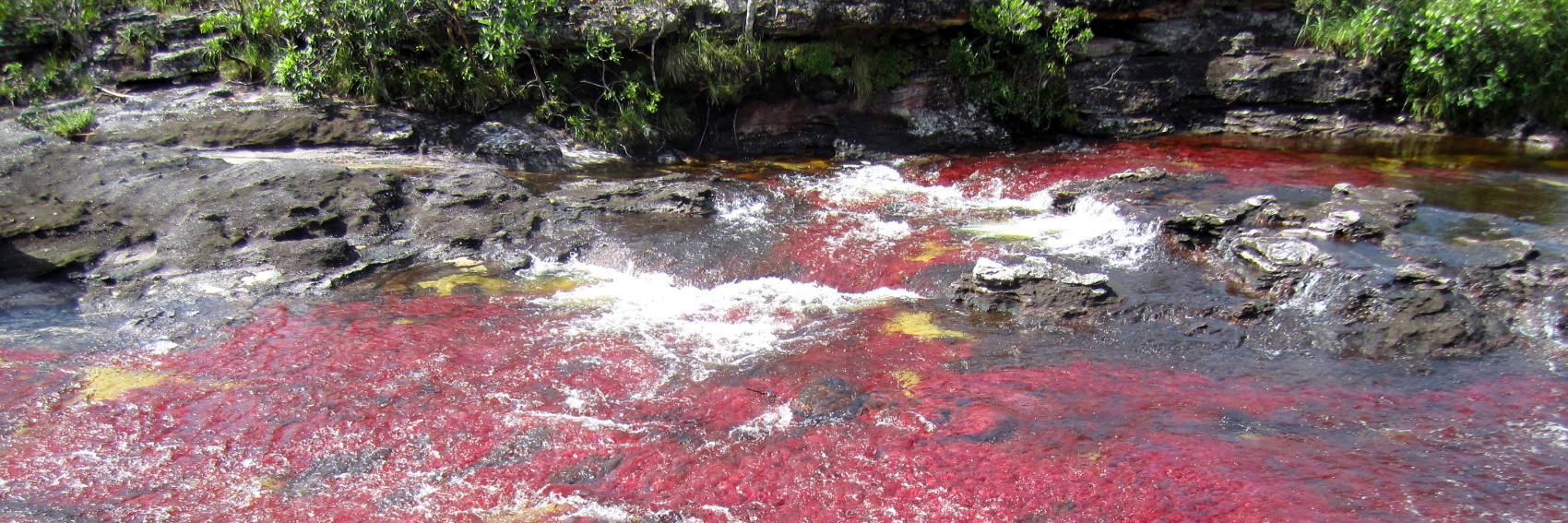
![]()

![]()

So I just mucked through my shotgun-style photography and pulled out some ideas that I think would work well as banners, and at the same time feature the plants that make this river so Dr Seussian. I think I'd go 7, but I rather like all of these. --Peter Talk 01:21, 16 August 2013 (UTC)
- Very tough choice. #5 and #8 to me have the best combination of being arresting images and having clear text, but #6 is also really good. Ikan Kekek (talk) 01:30, 16 August 2013 (UTC)
- In making up the original banners, I was searching for an image that showed the colorful water and plants, but I'd hoped for an end product that was more dynamic than #1 and #4 ended up being. Combining the colored water with the waterfall (I still think #3 is the best of the original four) is a great way to do that, and between #7 and #8, I feel #8 has the edge, with a wider color palette (the classic red plus the greenish patch just right of center). #8 gets my vote. -- AndreCarrotflower (talk) 01:35, 16 August 2013 (UTC)
- I like #5 or #8 most, although any of #5--#8 are pretty. Danapit (talk) 09:49, 22 August 2013 (UTC)
- In making up the original banners, I was searching for an image that showed the colorful water and plants, but I'd hoped for an end product that was more dynamic than #1 and #4 ended up being. Combining the colored water with the waterfall (I still think #3 is the best of the original four) is a great way to do that, and between #7 and #8, I feel #8 has the edge, with a wider color palette (the classic red plus the greenish patch just right of center). #8 gets my vote. -- AndreCarrotflower (talk) 01:35, 16 August 2013 (UTC)
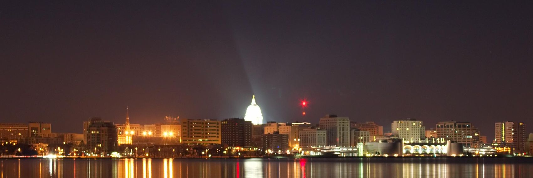
As usual, let's hear your thoughts. -- AndreCarrotflower (talk) 06:04, 10 April 2013 (UTC)
![]()
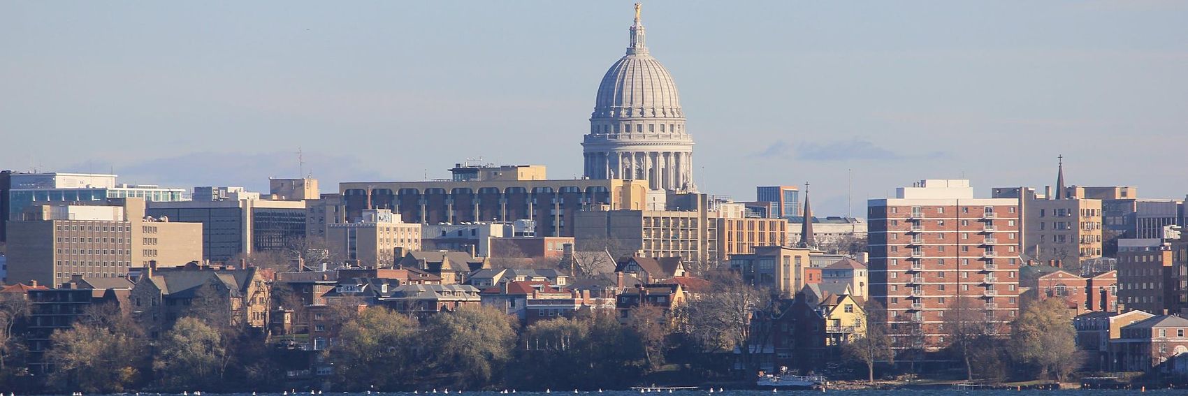
![]()
![]()
![]()

- I would favour the second or fourth banner pic. The fourth is a good mixture of Otbp style and city while the second gives an impression of a big city. jan (talk) 09:16, 10 April 2013 (UTC)
- A state capital is OtBP?? The fourth one is too busy to handle the text over it, IMO. I love three; two is also good. LtPowers (talk) 13:33, 10 April 2013 (UTC)
- I also prefer three by a pretty wide margin. (And not to pick a fight, but some U.S. state capitals are pretty far off any beaten path.) --Peter Talk 14:44, 10 April 2013 (UTC)
- I actually think they're all very nice, but 3 and 4 look particularly good to me. Could we find a way to remove the bracketed (Wisconsin)? It just looks a little odd to me! --Nick (talk) 16:19, 10 April 2013 (UTC)
- In my entire, relatively long, tenure at Wikitravel and Wikivoyage I don't think we've ever had a "parenthetical" featured destination. I'd prefer to omit the "(Wisconsin)" as well, but I'd like to first know that I'm not violating some precedent that was last applied before I got here. Does anyone care either way? -- AndreCarrotflower (talk) 19:32, 10 April 2013 (UTC)
- Rochester (New York). LtPowers (talk) 00:02, 11 April 2013 (UTC)
- Indeed, but that was before my time. -- AndreCarrotflower (talk) 15:41, 11 April 2013 (UTC)
- Rochester (New York). LtPowers (talk) 00:02, 11 April 2013 (UTC)
- In my entire, relatively long, tenure at Wikitravel and Wikivoyage I don't think we've ever had a "parenthetical" featured destination. I'd prefer to omit the "(Wisconsin)" as well, but I'd like to first know that I'm not violating some precedent that was last applied before I got here. Does anyone care either way? -- AndreCarrotflower (talk) 19:32, 10 April 2013 (UTC)
- There's no problem in shortening the name as it's displayed on the Main Page. For this particular case, though, the question is moot as we finally moved the article to de-disambiguated Madison. --Peter Talk 20:21, 10 April 2013 (UTC)
- All of these pictures are spectacular, but IMO, #1 and #3 have a slight edge, with #2 a close third. Looks like #3 is the most popular one thus far; when I update Wikivoyage:Destination of the month candidates in about five hours, that's the one I'll put in "Next Change". -- AndreCarrotflower (talk) 20:52, 10 April 2013 (UTC)
- Also, FYI, I'd love my fellow Wikivoyagers to weigh in on the issue of whether Madison ought to be DotM or OtBP, alluded to above by LtPowers and Peter. See this thread. -- AndreCarrotflower (talk) 20:55, 10 April 2013 (UTC)
- I prefer #3, because while there's the monumental element of the Capitol, you also get a sense of the street level, and none of the other banners has the same sense of human-level foreground and monumental background. I also like this because, though I haven't visited Wisconsin, I think one of the things we probably want to get across is that Madison is a friendly place. Ikan Kekek (talk) 03:01, 17 May 2013 (UTC)
- Comment about the caption: "Rural countryside" is redundant. I'd suggest eliminating the word "rural." Ikan Kekek (talk) 07:34, 31 August 2013 (UTC)
Jumping the gun a bit, but it's probably safe to assume that this will pass the nomination, given that it's a star topic. I rather like this one:
![]()
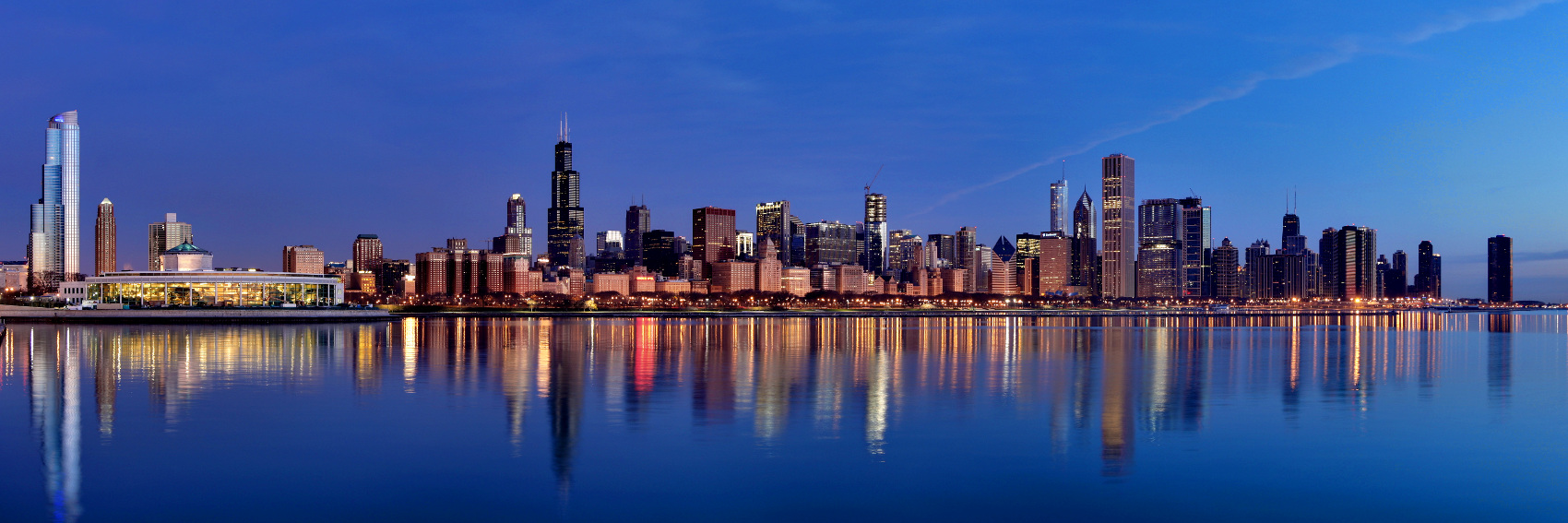
--Peter Talk 22:17, 10 May 2013 (UTC)
- Ooooh - I do like that! Might I suggest however that we label it simply as 'Chicago skyline'? --Nick (talk) 22:26, 10 May 2013 (UTC)
- Done. --Peter Talk 22:45, 10 May 2013 (UTC)
- That's a terrific banner. Ikan Kekek (talk) 02:52, 17 May 2013 (UTC)
- I realize I'm a little late to the party with this comment, but I am strongly opposed to truncating the title of articles on the pagebanner absent an extremely compelling reason for doing so, i.e. as a method for avoiding blocking out interesting parts of the banner image with text or removing parenthetical dab's such as we did with Rochester (New York), none of which apply to this banner. I am reverting the title back to the original as we do not have a consensus for lopping off the word "guide" from the article's title. -- AndreCarrotflower (talk) 16:24, 10 July 2013 (UTC)
- Andre, why are you so opposed to truncating names on Main Page banners? (You're the only person who has expressed this issue.) There are sensible reasons to shorten long strings of giant text that cover beautiful banners. What are the reasons against it? Omitting the word "guide" hardly causes any sort of confusion, and I say that as the author of the guide, nominator, creator of the banner, and the person who put in the alt-title. We could move the article to Chicago skyline today, and it wouldn't matter one whit. --Peter Talk 22:04, 11 July 2013 (UTC)
- Anytime you eliminate words, you eliminate information. This was discussed last month when we debated "Across Canada by train" vs. "Canada by train" (and by the way, regarding your statement about me being the only one to express concerns about this, LtPowers agreed with me on that issue). Obviously eliminating the word "guide" from this article will cause a lot less confusion than eliminating "across" from "Across Canada by train", but it's not inconceivable that a reader would see the banner with the shortened title on the main page and wonder exactly what approach the article would take in discussing Chicago's skyline.
- The above point may look like nitpicking, and it probably is. But let me ask this: if your contention is that it does no harm to omit "guide" from the banner, what harm does it do to keep it there? The small bit of extra text is not blocking out anything but a monotonous patch of blue sky. This is one of those cases where I could be talked out of my stance fairly easily if there were any benefit to shortening the title, but to me this looks like we're doing it just for the hell of it.
- Besides, there's something to be said for consistency. The article's pagebanner says "Chicago skyline guide", its URL is http://en.wikivoyage.org/wiki/Chicago_skyline_guide, and you can get to it from the search box by typing in "Chicago skyline guide". So you have to admit it's a little bit jarring to see simply "Chicago skyline" on the DotM banner.
- You can also get to it by typing in "Chicago skyline" in the search box, as Peter has just demonstrated, so your last point feels a little moot. Honestly, this seems like excessive nitpicking. I have no strong opinion one way or the other, but strictly speaking, adding "guide" to the title of any Wikitravel article feels redundant, since they're all guides. In fact, I can't think of a single other instance where we slapped "guide" at the end of the title (this is starting to feel more like an argument for redirecting it to Chicago skyline). PerryPlanet (talk) 22:22, 12 July 2013 (UTC)
- As I said, inconsistency is jarring for the reader, and the searchbox issue is not the only way that the DotM banner is inconsistent. In point of fact, Chicago skyline redirects to Chicago skyline guide. Meanwhile, the pagebanner and the URL both include the word "guide".
- Now - and I want to emphasize this - I'm fully aware that in the case of this article I'm nitpicking. But what I'm really trying to prevent (especially in light of the similar debate re: Across Canada by train) is establishing a precedent where we play fast and loose with titles on some future banner and it really does affect the reader's preconception of the article's contents. I think the answer here is to redirect the article to "Chicago skyline" because in the end, as you say, the word "guide" really doesn't add much.
- This argument seems at odds with some basic precepts of wiki linking. As with the link I just typed, the [[article name|name displayed]] does not match the article title. Throughout the Chicago guides I often link to Chicago skyline guide using different terms like Chicago skyline, or skyline view. I think the banner is more attractive using the text "Chicago skyline," simply because the blue sky is more attractive than giant white shadowed blocks of text. It's not a huge deal in this case, but if using the long form of an article name actually starts bleeding over the banner subject, then it seems backwards to nitpick about the text presentation—the visual is what matters on the main page. And I just cannot accept that someone would be confused to click "Chicago skyline" and get "Chicago skyline guide." If altering the text does actually create the potential for confusion, then we should not alter it, but we should be pragmatic in thinking about these things individually. --Peter Talk 04:59, 17 July 2013 (UTC)
It took me longer to whip these banners up than I thought. From an artistic standpoint I'm pleased with these banners, but being wholly unfamiliar with Soltau in any way other than the article itself, I'm not sure whether they're representative of the place's identity. Any further banner suggestions would be most welcome. -- AndreCarrotflower (talk) 18:19, 14 July 2013 (UTC)
- Banner #5 was suggested by Mey2008 at Soltau talk page. It is a photo of the toy museum. Danapit (talk) 07:38, 15 July 2013 (UTC)
![]()

![]()

![]()

![]()
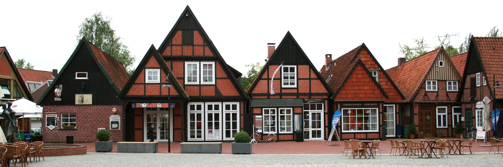
![]()

- I vote #2. -- AndreCarrotflower (talk) 18:19, 14 July 2013 (UTC)
- I like #5 most - it is a very friendly banner. The only problem is the blurb collides with the theme a lot, but still it is my favorite one. #3 and #2 are very nice, as well. Danapit (talk) 07:49, 15 July 2013 (UTC)
- Collision fixed. Mostly; there's still the bright white window behind the text. LtPowers (talk) 15:53, 15 July 2013 (UTC)
- I have to confess I'm not a huge fan of #5. It's brightly colored and cheery, but if you're aiming for a representative image of a particular place you need more than two windows and a door. -- AndreCarrotflower (talk) 16:33, 15 July 2013 (UTC)
- Yeah, you're right, Andre. I haven't been to Soltau, but I'd think #2 and #4 probably more nearly represent the town. However, the text is clearest in #3, which is also a nice, rustic photo. I'm not totally in love with any of these banners, but on balance, I think I would vote for #3 for the reasons I stated. Having a white sky with really poor contrast between the image and the text is a demerit for #4 and having a blue sky favors #2 and #3. One thing I wonder about is whether black text could be tried for some of these banners. It may work better for all of them except #3 and could help us pick between them. Ikan Kekek (talk) 16:47, 15 July 2013 (UTC)
- Off course this is a nearly philosophical question, what represents a town/city/region/country/continent and never a satisfactory agreement can be reached. I would not say we need to make a banner that would represent all about the place, but we can also have a look at what makes it special. I've been to Soltau briefly and it wasn't high on my scale of exciting places to visit, this is my personal opinion, matter of taste, fair enough for a destination OtBP - the main thing is the article is in a good shape to be presented by now. I don't think a picture of a small church in a nearby village (#3) would represent Soltau any better than a characteristic entrance to a museum (#5) - and due to the size of the place and the museum's central location, I would expect all visitors spending a day or two in Soltau must notice it. Plus, the picture is an eye-chatcher. Probably most people I know (and who know Soltau) would associate it with the Heide Park (#1 and #2) near A1 Autobahn and then most of them would not find visiting this theme park any desirable anyway. #4 could represent any town in the Lüneburger Heide area, as far as I am concerned. It wouldn't be bad, but the gray sky is not so pretty. It is currently used for the page banner, and I asked at the Soltau talk page for a possible replacement suggestions. Danapit (talk) 07:31, 16 July 2013 (UTC)
- Yeah, you're right, Andre. I haven't been to Soltau, but I'd think #2 and #4 probably more nearly represent the town. However, the text is clearest in #3, which is also a nice, rustic photo. I'm not totally in love with any of these banners, but on balance, I think I would vote for #3 for the reasons I stated. Having a white sky with really poor contrast between the image and the text is a demerit for #4 and having a blue sky favors #2 and #3. One thing I wonder about is whether black text could be tried for some of these banners. It may work better for all of them except #3 and could help us pick between them. Ikan Kekek (talk) 16:47, 15 July 2013 (UTC)
- I have to confess I'm not a huge fan of #5. It's brightly colored and cheery, but if you're aiming for a representative image of a particular place you need more than two windows and a door. -- AndreCarrotflower (talk) 16:33, 15 July 2013 (UTC)
- #5 is my favorite. jan (talk) 07:46, 16 July 2013 (UTC)
- I also like #5 the best. It is a fun, playful, bright image with great composition and has a quirky character that makes it intriguing. Based on the images alone (without reading the text), it's the one I'd most likely click through, because I'd be intrigued to read about this apparently quirky place. And the click through is really all we want from Main Page banners—they'll learn far more about the destination after reading the article, but we need to hook them first with something catchy. The ones of buildings just say to me "this is a place in Germany." The roller coaster is pretty neat geometrically, but the poor image quality drags it down. --Peter Talk 04:51, 17 July 2013 (UTC)
Trying to get into the habit of doing these ahead of time, and not having to write things like "Banner for [Destination X] goes here" on the DotM page. As usual, let's hear your votes. -- AndreCarrotflower (talk) 10:35, 22 June 2013 (UTC)
![]()

![]()

![]()

- My vote goes with #3. -- AndreCarrotflower (talk) 10:35, 22 June 2013 (UTC)
- I prefer #3, too. Alternatively, #1, I like the contrast of the old and new. It's just not very colorful. Danapit (talk) 12:38, 22 June 2013 (UTC)
- #3 is awesome. It's a no-brainer to me. LtPowers (talk) 23:34, 22 June 2013 (UTC)
- #3. I agree. It's a great view, and not only does the view perfectly express the mix of old and new; it also displays the caption most clearly. Ikan Kekek (talk) 15:56, 15 July 2013 (UTC)
It was a bit of a challenge to find suitable banner pics for this article. The single image on the article itself wasn't high-res enough to use, and Commons was of no help in finding images of campsites that were specifically "leave-no-trace". What I was compelled to do was to choose from images of campsites that seemed as "rustic" as possible, without modern trappings or garbage strewn about, so that it could easily pass as an image of leave-no-trace camping. I guess that should be kept in mind when we vote on which image we prefer. -- AndreCarrotflower (talk) 06:43, 22 June 2013 (UTC)
![]()

![]()

![]()

![]()
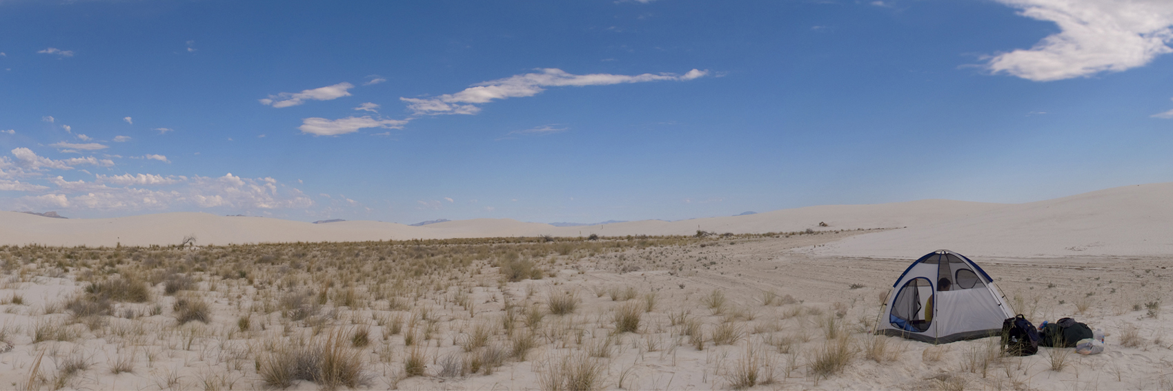
- My vote goes with #1. #2 and #3 have a definite edge as far as visual appeal, but let's face it—they are distinctly atypical camping experiences. -- AndreCarrotflower (talk) 06:43, 22 June 2013 (UTC)
- Adding #4. I found it at Flickr and retouched (removing some objects lying around the tent like a brief case and a water melon, which most people don't carry around for a backpack trip). Andre is right. I had lots of trouble previously trying to find a page banner for the topic, due to lack of suitable pictures in Commons. My vote goes: #4, #2, #1 and #3 (the person in the foreground bothers me when looking at the picture). Danapit (talk) 12:27, 22 June 2013 (UTC)
- I like #4, if only because it has no person in it. The fact that it's edited doesn't bother me, since we're not trying to represent any specific location. LtPowers (talk) 23:35, 22 June 2013 (UTC)
- Question: Is #4 Copyleft-compatible? I wasn't able to find any licensing information on the original. -- AndreCarrotflower (talk) 02:45, 23 June 2013 (UTC)
- I'm a big fan of #4. And Andre, by the original, you mean this , right? If so, it's kosher per the little CC-by icon next to "Some rights reserved," which links to the CC-by license. --Peter Talk 07:16, 23 June 2013 (UTC)
- I agree with LtPowers' reasoning - #4 is the sparest photo and has no person in it, so it expresses the idea best. Ikan Kekek (talk) 15:53, 15 July 2013 (UTC)
- I appreciate the vote of agreement, but I see now upon a closer look that there is a person inside the tent! LtPowers (talk) 18:12, 15 July 2013 (UTC)
- You're right! But still, the person leaves less of a "trace" for the viewer. :-) Ikan Kekek (talk) 22:41, 15 July 2013 (UTC)
- I appreciate the vote of agreement, but I see now upon a closer look that there is a person inside the tent! LtPowers (talk) 18:12, 15 July 2013 (UTC)
As other Wikivoyagers have insinuated in the past, there's not much raw material in Childs with which to make a banner photo. Nonetheless, here's two I took today that sum the place up pretty well, IMO. For the record, I added two new photos to the article itself as well. -- AndreCarrotflower (talk) 01:01, 22 May 2013 (UTC)
![]()

![]()

Comment: The first banner is more comprehensive and a better composition, though arguably somewhat spoiled by the Sunoco station (although of course that's really there). In the second banner, the text is clearer, due to contrast, but I vote for the first banner, as the overall effect of the more sweeping photo is better. Ikan Kekek (talk) 01:21, 22 May 2013 (UTC)
- Also, the additional photos and the text in the banner make a strong argument for Childs as a good OtBP destination. Ikan Kekek (talk) 01:23, 22 May 2013 (UTC)
- I think the second one is superior. Thanks for taking them, Andre. These may be valuable for the Wikipedia articles (w:Childs, New York, w:Cobblestone Historic District) as well! LtPowers (talk) 02:54, 22 May 2013 (UTC)
- I just want to mention in passing that if the words in the banner caption had been used to argue for Childs at an OtBP in the first place, there would have been less doubt about and opposition toward featuring it. And part of my argument is that it should be necessary to advocate for a place as worth featuring, not just to say "there's not much there but the article is a guide, so let's run it." Ikan Kekek (talk) 05:32, 22 May 2013 (UTC)
- FWIW, I adapted the text in the banner from the blurb that LtPowers wrote for Childs' nomination in Wikivoyage:Destination of the month candidates. -- AndreCarrotflower (talk) 05:55, 22 May 2013 (UTC)
- I guess my memory is selective, as what sticks in my mind is something like "not much there, but it's all good, so that's OK." In any case, it's great that you made another trip to take more photos. They improve the article considerably. Ikan Kekek (talk) 06:38, 22 May 2013 (UTC)
- FWIW, I adapted the text in the banner from the blurb that LtPowers wrote for Childs' nomination in Wikivoyage:Destination of the month candidates. -- AndreCarrotflower (talk) 05:55, 22 May 2013 (UTC)
- I just want to mention in passing that if the words in the banner caption had been used to argue for Childs at an OtBP in the first place, there would have been less doubt about and opposition toward featuring it. And part of my argument is that it should be necessary to advocate for a place as worth featuring, not just to say "there's not much there but the article is a guide, so let's run it." Ikan Kekek (talk) 05:32, 22 May 2013 (UTC)
- I think the second one is superior. Thanks for taking them, Andre. These may be valuable for the Wikipedia articles (w:Childs, New York, w:Cobblestone Historic District) as well! LtPowers (talk) 02:54, 22 May 2013 (UTC)
Again, being the creator of both of these images, I'm torn. However, I have to give an ever-so-slight edge to #2 solely because the text is more visible and less intrusive onto the integral parts of the image. -- AndreCarrotflower (talk) 17:40, 22 May 2013 (UTC)
- Compositionally and aesthetically, I like #2, but #1 gives a better overview of the hamlet. LtPowers (talk) 18:42, 10 July 2013 (UTC)
Here's a few banners I whipped up for next month's DotM. I still haven't gotten around to jazzing up the introductory paragraph to the article as I mentioned in its nomination, hence the lack of a text blurb on these banners. I'll get on that. In the meantime, let's hear your thoughts. -- AndreCarrotflower (talk) 21:48, 11 June 2013 (UTC)
![]()
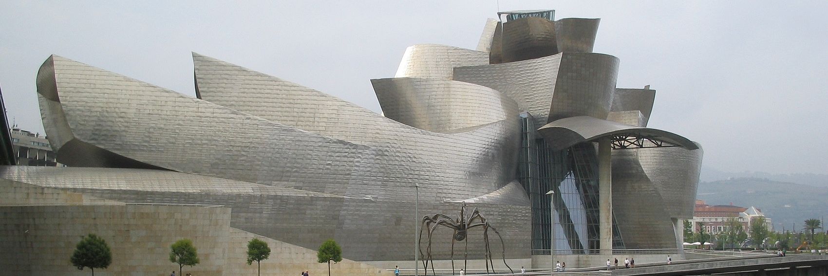
![]()
![]()

![]()
- My vote goes with #2. -- AndreCarrotflower (talk) 21:49, 11 June 2013 (UTC)
- Ooh, these are nice! I think I like #1 best—it's a little less busy, has great composition, and I'm a sucker for giant metal spiders. --Peter Talk 07:05, 12 June 2013 (UTC)
- I'd go for the spider, too! Danapit (talk) 07:49, 12 June 2013 (UTC)
![]()

Here's a fun shot from my Churchill trip. Does this look good? --Peter Talk 18:55, 7 May 2013 (UTC)
- Fabulous! Danapit (talk) 19:05, 7 May 2013 (UTC)
- Very nice - you've got my vote! --Nick (talk) 19:50, 7 May 2013 (UTC)
- Yeah! jan (talk) 19:54, 7 May 2013 (UTC)
- Very nice - you've got my vote! --Nick (talk) 19:50, 7 May 2013 (UTC)
- Outstanding shot, but I think I prefer the text on the left. LtPowers (talk) 22:44, 7 May 2013 (UTC)
- I hope you don't mind Peter, I've just had a little play with the formatting of the description. Is this any better LtPowers? --Nick (talk) 22:48, 7 May 2013 (UTC)
- Yes, but I still think the text works better over the plainer left side than the busier right. But it's a minor issue. LtPowers (talk) 02:16, 8 May 2013 (UTC)
- I like left too. --Peter Talk 03:31, 8 May 2013 (UTC)
- Yeah, left is a definite improvement. --Nick (talk) 09:27, 8 May 2013 (UTC)
- I like left too. --Peter Talk 03:31, 8 May 2013 (UTC)
- Yes, but I still think the text works better over the plainer left side than the busier right. But it's a minor issue. LtPowers (talk) 02:16, 8 May 2013 (UTC)
- I hope you don't mind Peter, I've just had a little play with the formatting of the description. Is this any better LtPowers? --Nick (talk) 22:48, 7 May 2013 (UTC)
- Fantastic shot! Though I do hope that train wasn't moving when you took that shot. ;) PerryPlanet (talk) 10:42, 22 May 2013 (UTC)
- Apologies for my quietness lately, I'm getting over a monster of an illness. I do like this image but would love to have some other banners to choose from if possible. -- AndreCarrotflower (talk) 04:12, 8 May 2013 (UTC)
- Hope you get better soon! :) --Nick (talk) 23:33, 9 May 2013 (UTC)
- Andre changed the title here back to "Across Canada by Train" with the edit summary "Alternate title is not appropriate. This article is an itinerary that crosses Canada from coast to coast; it's not merely a description of rail travel in Canada such as Rail travel in the United States." . I disagree with the rationale, as the article covers multiple routes (more or less all of them), and think this ruins the visual by having text run across the middle of the photo, covering up the train itself. And since we're talking about a graphic on the main page, the visual really is the most important thing. To see what it looks like as "Canada by Train," see this old revision . --Peter Talk 22:23, 17 June 2013 (UTC)
- I think we're really between a rock and a hard place on this one. Peter's points are well taken, but the shortened title of "Canada by train" strikes me as inaccurate vis-à-vis what the article is actually about, and as I intimated in the edit summary that Peter quoted, it may mislead people who click on the link on the front page expecting something like a Canadian version of Rail travel in the United States. In point of fact, Across Canada by train does contain information about the particularities of VIA Rail and its services, but unlike Rail travel in the United States, that's not the sole or even the main focus of the article. The meat and potatoes of Across Canada by train is an itinerary that, in my estimation, is what makes that sense of "across-ness" the main distinguishing characteristic of the article. The itinerary begins in the Maritimes at the east end of Canada's railroad network, and proceeds in a distinctly linear fashion to the far end of the line at Vancouver. Peter speaks of the "multiple routes" covered by the article, which I suppose is a reference to "The Ocean", "The Corridor" and "The Canadian", but the article treats these as merely three legs of one huge coast-to-coast voyage. Other side trips are also mentioned, but only as brief asides—it's almost as if the author is consciously attempting to be as brief as possible in discussing side routes so as not to distract from the main goal of forging westward to the Pacific along the main Ocean-Corridor-Canadian route. Again, "across" is really the operative word in the title of the article, almost more so than "by train".
- What I think this issue really speaks to, and I realize this probably isn't the proper forum to bring this up, is one of the inherent weaknesses of the banner format. Though we've gained a great deal visually with the switch to banners, we've also hamstrung ourselves with needing to obsessively take care that the text portion of the banner stays out of the way of the image. Well and good to provide the front page with a bit of extra visual pizzazz, but Wikivoyage isn't a photo blog—it's a collection of travel guides, which is an inherently textual format. In fact, in writing articles, we're counselled to keep photos and other graphics as small in size and few in number as possible. In my opinion, text should always be paramount in importance over images here, even on the front page. I, personally, am not at all comfortable with abbreviating the titles of articles on the front page in pretty much any case, aside from omitting parenthetical disambiguators as we did with Rochester (New York) when it was DotM. And in writing descriptive blurbs, I can't tell you how very difficult it is to say much of anything in 140 characters. And I don't think that's just because I personally tend to be verbose.
- I think a long-term solution to this problem is to tweak the design of the banners themselves so the text is smaller and easier to fit in among the substantive parts of the images. Perhaps that may cause problems for visually-impaired readers or those with small screens or whatever the case may be, but quite frankly I think we can scale down the gargantuan text of the titles and the blurbs without it being too much of an issue.
- With regards to just this instance (not to your general points about sizing of text in the banners and others), I think you are overthinking things. The difference between "Across Canada by train" and "Canada by train" just isn't that big/important, but the banner looks better without the subject blotted out. --Peter Talk 05:45, 18 June 2013 (UTC)
- Andre does have a point; "Canada by train" doesn't sound like an itinerary, but rather a travel topic. It's a little misleading. That said, I'd love to find a way to convey the same information without blotting out the train. LtPowers (talk) 14:49, 18 June 2013 (UTC)
- With regards to just this instance (not to your general points about sizing of text in the banners and others), I think you are overthinking things. The difference between "Across Canada by train" and "Canada by train" just isn't that big/important, but the banner looks better without the subject blotted out. --Peter Talk 05:45, 18 June 2013 (UTC)
- I haven't tried it yet, and won't have access to the Internet anywhere other than my phone for a few hours. But what if we right-aligned the text? -- AndreCarrotflower (talk) 17:13, 18 June 2013 (UTC)
- That looks really bad. LtPowers (talk) 17:26, 18 June 2013 (UTC)
- I haven't tried it yet, and won't have access to the Internet anywhere other than my phone for a few hours. But what if we right-aligned the text? -- AndreCarrotflower (talk) 17:13, 18 June 2013 (UTC)
(re-indent) Well, my own opinion is that while it's not ideal to have text blocking the image of the train, the alternative - shortening the title such that it no longer accurately describes what the article is about - is far worse. This is especially true, IMO, in light of the fact that only a small corner of the train is obscured by the text. Obviously Peter thinks differently. I guess this is going to end up being one of those "consensus" things. Hopefully more people than the three of us will weigh in before the 21st, because as of now it doesn't seem at all clear what to do. -- AndreCarrotflower (talk) 20:01, 18 June 2013 (UTC)
- I would think "Canada by train" is a fine name for an itinerary. Given that the article has multiple itineraries and an overview of Canadian train travel in general, it seems all the more fitting. But yes, it would be nice to hear more comments. --Peter Talk 21:02, 18 June 2013 (UTC)
- Yes, it's a good name if you know it's an itinerary. LtPowers (talk) 01:18, 19 June 2013 (UTC)
![]()

- Problem solved? -- AndreCarrotflower (talk) 16:15, 20 June 2013 (UTC)
- It does look even better! Danapit (talk) 16:59, 20 June 2013 (UTC)
- Works for me. Important parts of an image should be off-center anyway, by good photographic practice. LtPowers (talk) 18:16, 20 June 2013 (UTC)
- It does look even better! Danapit (talk) 16:59, 20 June 2013 (UTC)
So for the banner photo for Olgii, what would be good? The city itself is not very pretty, mostly Soviet apartments and dusty streets. I was thinking of using a photo of an eagle hunter, a popular reason to visit. Would showing a person in a banner be acceptable? Altaihunters (talk) 03:02, 17 May 2013 (UTC)
- Given the fact that finding photos of Ölgii on Commons or another free source might have been quite difficult, I was relieved to see that there was a decent selection of appropriately high-res images on the article itself that would be translatable into the banner format. Off the top of my head, I think that Olgii from Bugan Tou.JPG or Kokpar.JPG, cropped into the proper dimensions, would work quite well as banners. -- AndreCarrotflower (talk) 01:55, 18 May 2013 (UTC)
- Here is some photo that I added to wikicommons to be used for banners, [Commons/Category:Ölgii]. I will most more if I find something good. Altaihunters (talk) 08:49, 18 May 2013 (UTC)
![]()
How is this? --Peter Talk 14:25, 18 May 2013 (UTC)
- I like it! Ikan Kekek (talk) 22:14, 18 May 2013 (UTC)
- Looks good! Altaihunters (talk) 03:20, 19 May 2013 (UTC)
![]()

![]()

![]()

![]()

![]()

Time to get this party started, I guess. I've put up option #1 (fans with Terrible Towels) but it has it's problems and I'll need some time to find some additional options. Feel free to add your own. LtPowers (talk) 15:48, 1 May 2013 (UTC)
- That's pretty fabulous, actually. I'll still try to cook up something skyliney, since I love the Pittsburgh skyline (got to enjoy it last week!), but I think that's a great one. --Peter Talk 01:38, 2 May 2013 (UTC)
- The skyline is impressive, but it's a bit overdone IMO. And it's hard to capture in a banner format. But I look forward to seeing what you come up with! LtPowers (talk) 02:30, 2 May 2013 (UTC)
Skylines are overused... already on our main page, but Pittsburgh really does have one of my favorites. Anywho, Commons had some pretty phenomenal shots to work with. What do you think? --Peter Talk 03:02, 2 May 2013 (UTC)
- Pretty good. I moved the text in #4 to the right; I think it works better there. I think #4 is by far the best of the three; it avoids the fishbowl look of the other two (which are panoramas) and best showcases the bridges. The colors are a little weird; it's sunset, but I don't know if that's clear to the casual viewer. I also think if we go with a skyline, we'd definitely want to tweak the blurb to include something about said skyline. (In fact, we can and should look at additional blurbs anyway; I just hacked this one up quickly from the DotM nom.) LtPowers (talk) 11:20, 2 May 2013 (UTC)
- I'm having a hell of a time deciding whether I like #2 or #4 better. #4 is the classic shot, with Point State Park right out front—but I really like the city lights reflecting off the river in #2. Frankly, any of the four would be fine with me.
- I do think the blurb needs to be redone, though. Perhaps something like: "Pennsylvania's second-largest city transcends its grubby steel-town reputation with cultural institutions, fine dining, and exciting professional sports—all at surprisingly affordable prices"?
- -- AndreCarrotflower (talk) 18:09, 2 May 2013 (UTC)
Either #2 or #4 The other pictures just do it justice. Only a pic from the boss would be superior. I know that there a a lot of skylines but architecture is a point for a city. jan (talk) 19:53, 7 May 2013 (UTC)
- The boss? LtPowers (talk) 12:46, 16 May 2013 (UTC)
I've added #5, the nighttime shot over the Allegheny with the fireworks. I'm also trying out a new blurb, the current one ("Pennsylvania's second-largest city...") is too long according to our guidelines. LtPowers (talk) 12:46, 16 May 2013 (UTC)
- As pictures, I like 3 and 5 the best, but they're busy, and the text looks best with #4, so maybe that's the one we should go with. Ikan Kekek (talk) 02:55, 17 May 2013 (UTC)
- Oh man, there's so many good options... still, I'm leaning towards #4 for the same reasons as Ikan. Although, I definitely prefer the new blurb. PerryPlanet (talk) 10:49, 22 May 2013 (UTC)
Whoa, this snuck up on me. Did we ever come to a consensus on the text and image to use? I still feel like the blurb needs work. LtPowers (talk) 15:28, 31 May 2013 (UTC)
- From my read of the discussion, I think it's #4. By all means, edit the blurb, though—I think it's OK as is, but I'm sure your changes would make it better. --Peter Talk 06:03, 1 June 2013 (UTC)
- I don't know what else to change. I'm not happy with what I came up with, so I was hoping for some refinements from others. LtPowers (talk) 12:55, 1 June 2013 (UTC)
Slim pickin's on this one. Nonetheless, I tried to come up with photographs that represent a wide range of different Australian landscapes. Let's hear your thoughts (and, by all means, if you find some better pictures throw them in the mix!) -- AndreCarrotflower (talk) 04:00, 9 April 2013 (UTC)
![]()
![]()
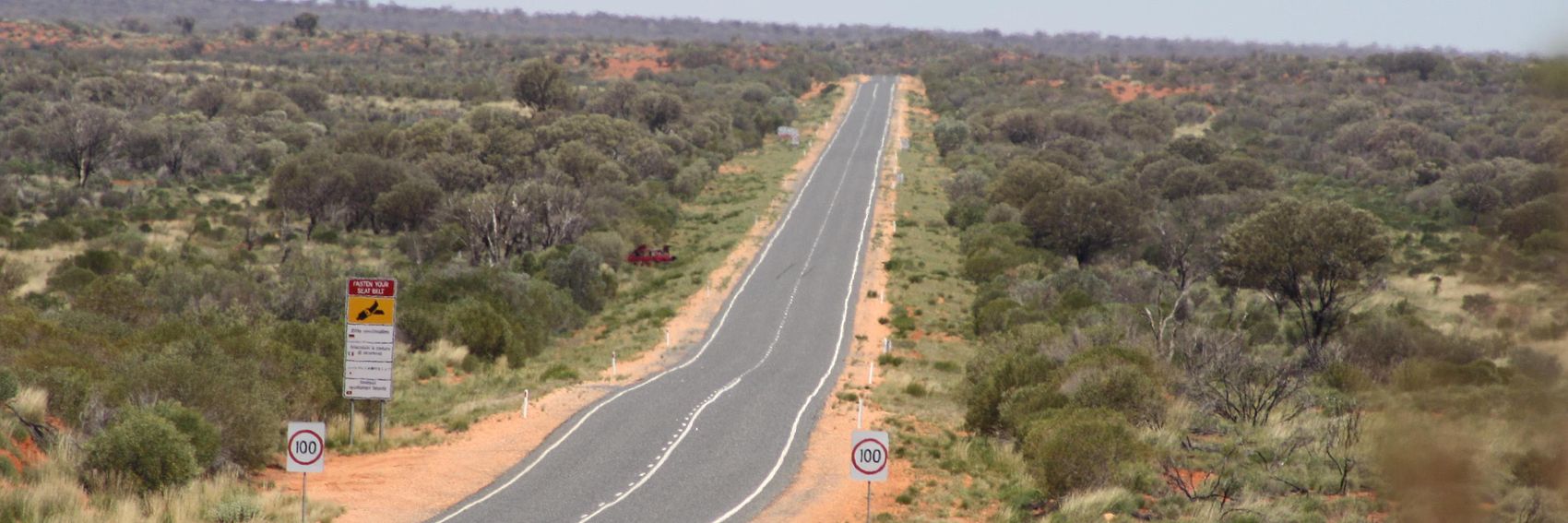
![]()

- Personally, my vote goes with #1, which is the most "road-centric" photo, and which best exemplifies the "wide-open spaces and magnificent natural scenery" mentioned in the blurb. -- AndreCarrotflower (talk) 05:45, 9 April 2013 (UTC)
- I also think #1 looks pretty good. I was hoping but haven't succeeded to find a good pic that would be basically the same as that one, but with a kangaroo crossing sign. --Peter Talk 03:05, 10 April 2013 (UTC)
- Number 1 is my favourite too, but it would be nice to have a kangaroo sign if we can find one. --Nick (talk) 17:30, 10 April 2013 (UTC)
- Believe me, I looked and looked and looked for one. I found a few, but the photos weren't of high enough resolution to work as banners. As I said, if anyone else can find one that's compatible with copyleft, throw it in the mix. -- AndreCarrotflower (talk) 19:17, 10 April 2013 (UTC)
- Sorry if my above comment sounded a bit unpleasant! I really do like the banners you found, particularly No1. :) The only kangaroo sign one I could find was the one below, but it's not very good and I still think the first banner above might be preferable. --Nick (talk) 19:29, 10 April 2013 (UTC)
- No need to apologize, I was indeed quite dismayed that I couldn't find one. If I played around with the gamma settings on PhotoShop I think the photo you found would be a lot better, but is that allowed per Creative Commons? -- AndreCarrotflower (talk) 19:34, 10 April 2013 (UTC)
- I think we can do... I would have done it myself, but I wanted to see what it would look like in situ first. :) --Nick (talk) 19:37, 10 April 2013 (UTC)
![]()
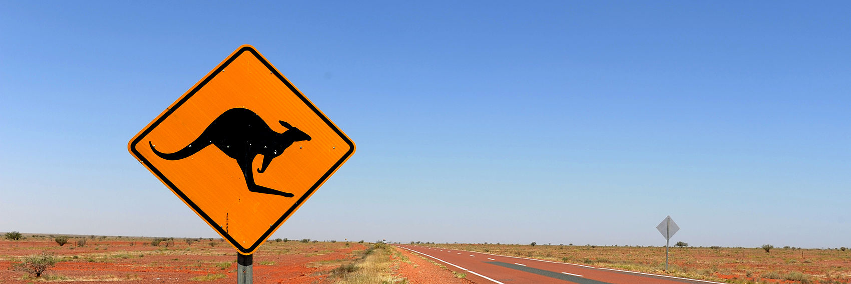
I spruced up the kangaroo banner a little (you may need to refresh the page to see the change), but I'm still a little inclined to prefer #1. --Peter Talk 20:34, 10 April 2013 (UTC)
- I love #4. The kangaroo sign is perfect. The top picture could be Arizona as easily as Australia. LtPowers (talk) 00:03, 11 April 2013 (UTC)
- My main problem with #4 is that it has too much sky and not enough road. What is the source image? If there's some way to re-crop it so the horizon is higher, that'd be ideal. -- AndreCarrotflower (talk) 00:40, 11 April 2013 (UTC)
- It's from File:Stuart Highway Solar Car.JPG, which unfortunately has the kangaroo sign so far into the foreground that we won't be able to re-crop to focus more on the road. --Peter Talk 01:01, 11 April 2013 (UTC)
- Also, does anyone know of a way to get the newest revision of File:Australia Banner Sign.jpg to actually display? I can get thumbnails to refresh by changing the size by one pixel or something silly like that, but our banners are not thumbnails. --Peter Talk 01:03, 11 April 2013 (UTC)
- I see the new version just fine, so it might be a problem with your cache. Personally, I don't think the abundance of sky is a problem; it makes a good background for the text. LtPowers (talk) 14:54, 11 April 2013 (UTC)
- I see it now too. Now that I can see the much improved version (excuse the arrogance) along with #1, I do prefer #4, since it both has more color (now) and more sense of place with the kangaroo sign. --Peter Talk 17:08, 11 April 2013 (UTC)
- Yeah, I still like 1, but I think 4 is the one to go for here. --Nick (talk) 18:52, 11 April 2013 (UTC)
- Would using File:DrivingInAustralia.JPG, or a crop thereof, address concerns about the lack of road-focus in #4? LtPowers (talk) 23:16, 11 April 2013 (UTC)
- Not high-res enough, sadly. But to be quite honest, now that I'm seeing the new version of #4, I think the more interesting and diverse range of colors on the ground—and, of course, the kangaroo sign—make up for the low horizon. For my choice, now, I think #1 and #4 are in a dead heat. I'd be perfectly happy to see either of them on the front page. -- AndreCarrotflower (talk) 23:34, 11 April 2013 (UTC)
- Would using File:DrivingInAustralia.JPG, or a crop thereof, address concerns about the lack of road-focus in #4? LtPowers (talk) 23:16, 11 April 2013 (UTC)
- Yeah, I still like 1, but I think 4 is the one to go for here. --Nick (talk) 18:52, 11 April 2013 (UTC)
- I see it now too. Now that I can see the much improved version (excuse the arrogance) along with #1, I do prefer #4, since it both has more color (now) and more sense of place with the kangaroo sign. --Peter Talk 17:08, 11 April 2013 (UTC)
- I see the new version just fine, so it might be a problem with your cache. Personally, I don't think the abundance of sky is a problem; it makes a good background for the text. LtPowers (talk) 14:54, 11 April 2013 (UTC)
- Also, does anyone know of a way to get the newest revision of File:Australia Banner Sign.jpg to actually display? I can get thumbnails to refresh by changing the size by one pixel or something silly like that, but our banners are not thumbnails. --Peter Talk 01:03, 11 April 2013 (UTC)
- It's from File:Stuart Highway Solar Car.JPG, which unfortunately has the kangaroo sign so far into the foreground that we won't be able to re-crop to focus more on the road. --Peter Talk 01:01, 11 April 2013 (UTC)
- My main problem with #4 is that it has too much sky and not enough road. What is the source image? If there's some way to re-crop it so the horizon is higher, that'd be ideal. -- AndreCarrotflower (talk) 00:40, 11 April 2013 (UTC)
- As an Australian myself, the yellow kangaroo signs are a big tourist photo opportunity and immediately say "Driving in Australia" (although they do actually have practical purpose, believe it or not). #4 is the way to go. JamesA >talk 08:07, 2 May 2013 (UTC)
- Having done the cross continent drive too many times to remember, number 2 is closest to the statistically realistic nature of driving in australia... I personally dislike 4 quite a lot as it reflects the sadly worn cliches of image that really are not part of most of the driving in Australia at all. However, as the notion of consensus and the editors above judgements will probably carry the use of number 4 - I think it is important to note that the cliche of the image is sadly not what driving in australia is about... It is significant that most travellers will see a kangaroo carcass on the side of the road, rather than have the experience of driving into one (my most memorable encounter being with a young kangaroo I could not swerve to avoid in eyre peninsula about 5 years ago.) there are better photos available somewhere - where kangaroos are only part of the encounters on long lonely stretches of road - kangaroos have to compete with goats and camels and emus in the more drier areas - surely there is a panorama shot of three if not four warning signs - camels, cattle, kangaroo, emus, and even wombats? As james says yellow kangaroo signs seem to have photo opportunity, (like the sydney opera house), but hardly something that actually connects with reality - there is a lot more to australia than the opera house or kangaroo signs, but hey if its four - mayebe someone needs to clarify that statistically the image on 2 covers at least 70% more of the experience of australian country driving than 4... sorry to sound negative - but we shouldnt get too carried away with 4 as being anything but a cliche, and far from the general experience of driving in australia sats (talk) 10:33, 2 May 2013 (UTC)
I also object to part of the text - natural scenery?
![]()

![]()
This is a tough one because the one blazingly obvious landmark is a (mostly) vertical tower. I'm considering cheating by rotating the image (pre-cropped) from the first banner to make the tower lean more, since the perspective doesn't really show it off too well. --Peter Talk 04:27, 16 April 2013 (UTC)
- #2, easy. Not only does the tower "lean" more, but the cathedral is in there too. -- AndreCarrotflower (talk) 23:42, 16 April 2013 (UTC)
- Of the 2, I definitely brefer the second- as Andre says it's very eye-catching and I like the clouds too - it all looks very 'fire & brimstone'! --Nick (talk) 23:43, 16 April 2013 (UTC)
- I just cheated and tilted the tower more in #1. Does that change anyone's opinion, or is it still #2? --Peter Talk 00:56, 17 April 2013 (UTC)
- My other problem with #1 is that it looks lopsided. Well and good to have a blank sky or something else that's monotonous to place the text onto, but #1 takes it too far to the extreme. So yes, my vote still goes with #2. -- AndreCarrotflower (talk) 01:11, 17 April 2013 (UTC)
- Yeah, between the two of these, the second is the clear winner, for the reasons stated. Ikan Kekek (talk) 02:57, 17 May 2013 (UTC)
Rotterdam
editA few to consider:
![]()
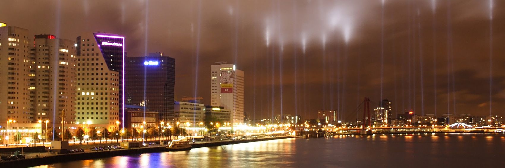
![]()

![]()
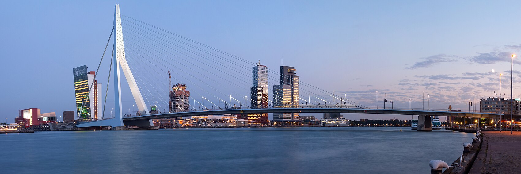
Nick (talk) 00:53, 2 April 2013 (UTC)
- Number 3 is the classic view, but I like #1 best. #2 is a little dark on the right. --Peter Talk 01:39, 2 April 2013 (UTC)
- This is a tough one. As Peter said, #3 is "the classic view". Banner photos should obviously be visually striking, but in my opinion, the question of whether the image is unique or unusual ought to take a backseat to the question of whether it's emblematic, or a good visual summary, of the destination in question. For that reason, #3 has a slight edge over #1 for me. Additionally, in #1, I find those columns of light that streak above all the lampposts and city lights distracting and off-putting.
- I'd be satisfied with either #1 or #3 as the banner, though I do strongly feel in either case that the text ought to be shifted to the right.
- #1 makes me want to visit. #2 and #3 don't. LtPowers (talk) 01:40, 3 April 2013 (UTC)
- I'm actually the opposite. #1 doesn't make make want to visit at all -- to me it looks like a generic night skyline -- and between the streetlights, building lights, the clouds and the white streaks (is that some kind of light show?), I think there's too much white/yellow light in the photo. The second and third images pique my interest in the location more. I think I prefer #2, but it would be nice if the colour was more eye-catching. -Shaundd (talk) 03:56, 3 April 2013 (UTC)
- I find #1 the most inviting one, but #3 would be also striking, if the text didn't collide with the motive. In #2 the lack of colors makes the banner less impressive. But what if the text was moved to the right to bring the attention to the more colorful part of the image? --Danapit (talk) 07:30, 3 April 2013 (UTC)
- #1, frankly, looks like it was taken with a camera whose lens was smeared (those columns of light). And the sky and the muted colors give me the overall impression of dampness, frigidness, and dreariness. You make a good point about #3, Danapit: if the text were oriented to the right, I daresay it would come very close to being an ideal selection for the banner. -- AndreCarrotflower (talk) 08:47, 3 April 2013 (UTC)
- Tada! Any better?--Nick (talk) 22:19, 3 April 2013 (UTC)
- Yeah! That's what I'm talking about. -- AndreCarrotflower (talk) 04:36, 4 April 2013 (UTC)
I would love to see the third picture. It's all in it what R-town represents for me. jan (talk) 09:19, 10 April 2013 (UTC)
- I like the third most as well. Jjtk (talk) 08:50, 16 April 2013 (UTC)
![]()

I think this image is the obvious choice, although there might be a better way to do it. --Peter Talk 21:27, 25 March 2013 (UTC)
![]()

Actually, this zoomed in version might be better—you can see more of the buildings. --Peter Talk 21:30, 25 March 2013 (UTC)
- Text would look better on the right. LtPowers (talk) 00:16, 26 March 2013 (UTC)
- Agree with LtPowers, and perhaps move it closer to the top margin as well. -- AndreCarrotflower (talk) 01:22, 26 March 2013 (UTC)
- Realistically, I think we'll only have the option between left or right alignment (courtesy of Template:Banner), not control over the text's absolute position. --Peter Talk 06:12, 26 March 2013 (UTC)
- Agree with LtPowers, and perhaps move it closer to the top margin as well. -- AndreCarrotflower (talk) 01:22, 26 March 2013 (UTC)
- There's always the option of *ahem* flipping the picture too as we previously did in the Beta. --Nick (talk) 22:40, 26 March 2013 (UTC)
![]()

![]()

![]()

Between these three, I'm not sure what the clear winner is. I would say #2, but we are featuring Northern Lights later in the year, which includes that very image! #1 seems to lose the text a bit at the bottom where it meets the snow, although that might change if we get rid of the excessive space between the two lines. --Peter Talk 21:09, 25 March 2013 (UTC)
- #3 is the obvious choice, IMO. It conveys the sense of isolation expressed in the blurb far better than the other two. #1 is a distant second. -- AndreCarrotflower (talk) 01:21, 26 March 2013 (UTC)

- 3 is probably the easiest to read for color-blind users, which makes sense, given that it doesn't have a lot of color to begin with. See thumb to right. --Peter Talk 16:59, 26 March 2013 (UTC)
- I think 3 is probably the one to go for here - 2 is a lovely image, but, as you say, we don't want any conflict between topics if possible. --Nick (talk) 22:49, 26 March 2013 (UTC)
![]()

![]()

![]()

Of these three, I really like the horse and buggy. --Peter Talk 20:31, 25 March 2013 (UTC)
- I'm frankly not a huge fan of any of these, but between the three of them, I agree that the horse and buggy is the best. -- AndreCarrotflower (talk) 01:23, 26 March 2013 (UTC)
- I like the second and third ones. The strong colours of the second image stand out for me and I like the horse and buggy aspect of the third image. -Shaundd (talk) 03:44, 3 April 2013 (UTC)
![]()

![]()

![]()

![]()
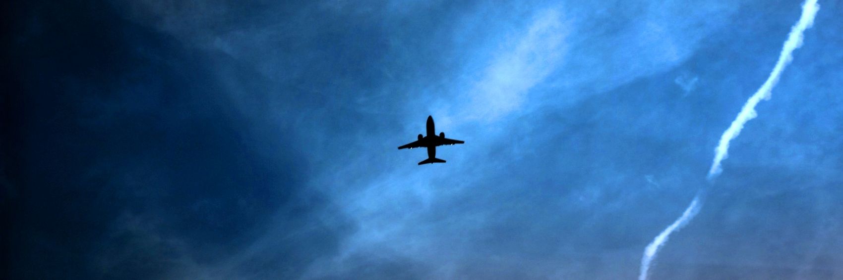
![]()

![]()

![]()
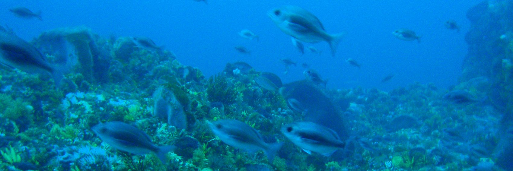
![]()

![]()
