Wikivoyage:Destination of the month candidates/Banners/Archive/2015
| DotM banner archives: 2013 • 2014 • 2015 • 2016 • 2017 • 2018 • 2019 • 2020 • 2021 • 2022 • 2023 • 2024 |
Archived banners for destinations featured on the Main Page in 2015.
More banners. Vote! -- AndreCarrotflower (talk) 17:02, 18 October 2015 (UTC)
![]()

![]()
![]()

![]()
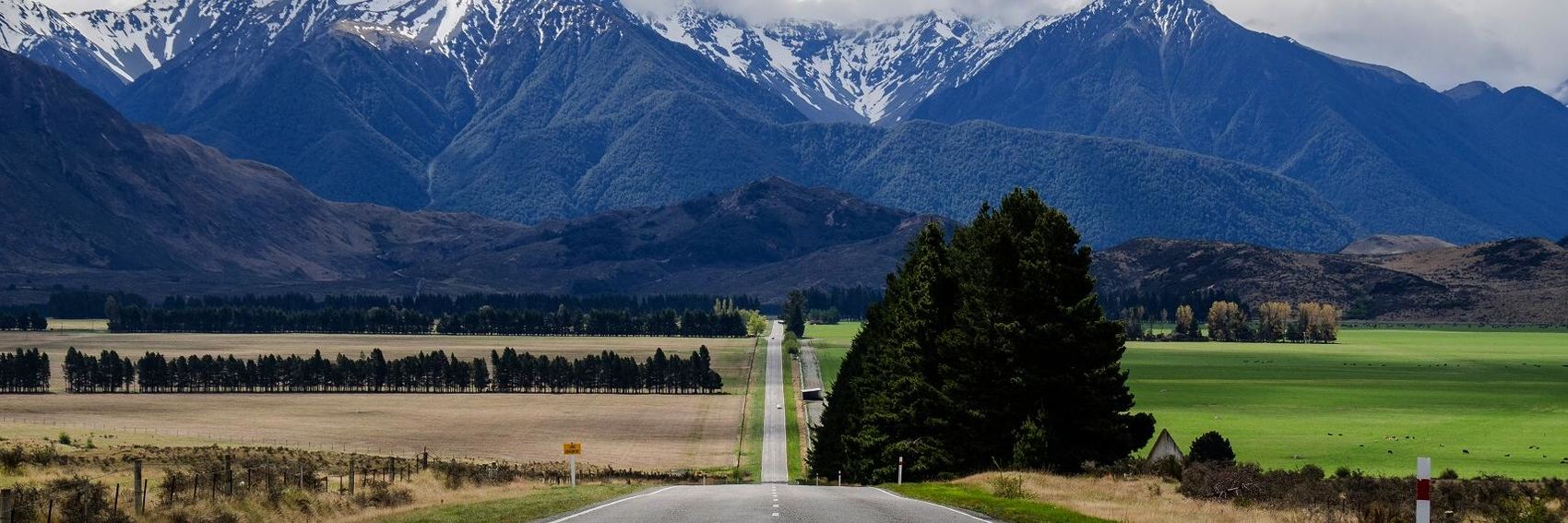
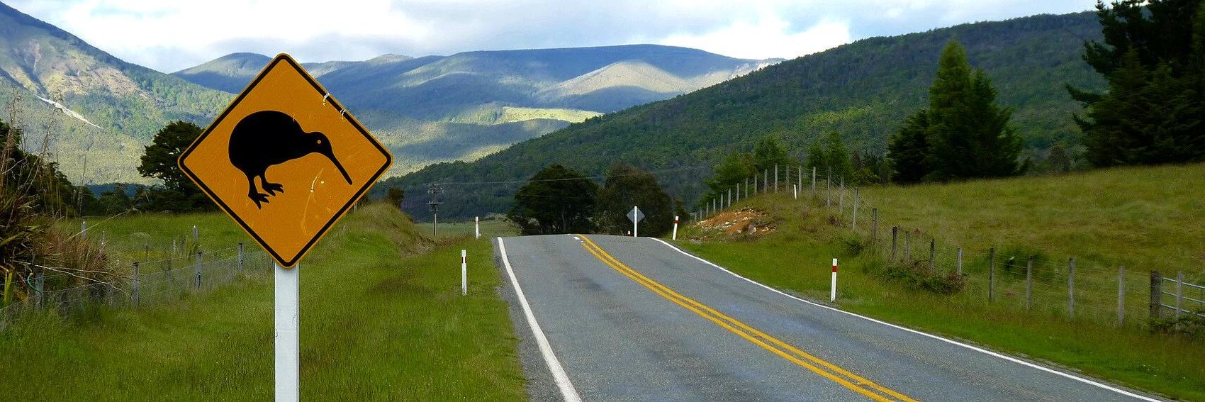
- #2 is my choice, with the caveat that (similar to the conundrum I described above with the Taxila banners), it's quite conceptually similar to the banner we had for Driving in Australia, a similar FTT we ran in 2013. However, that was three years ago, and besides #2 has the best composition of any of these banners by a long shot. In a close race for second place are #3 and #4, but I'm giving a very slight edge to the former because the textbox is less disruptive to the content of the image. In last place is #1, which depicts the concept of driving (as opposed to merely a road) much better than the other three, but in terms of visual appeal is a bit boring, and is the least identifiably Kiwi of any of the four banners. -- AndreCarrotflower (talk) 17:02, 18 October 2015 (UTC)
- Incidentally, in the case of Banner #1 I could not decide whether the textbox looked better on the left or the right. Feel free to opine about that too. -- AndreCarrotflower (talk) 17:02, 18 October 2015 (UTC)
- Great work as always and I actually agree exactly with your ranking. The kiwi sign is just superb! The pretty landscape in #3 comes second, the somewhat darker landscape in #4 comes third and the urban one #1 comes last for me (its only advantage being that it has some cars in it). ϒpsilon (talk) 17:40, 18 October 2015 (UTC)
- Congratulations to yet another great selection and yes, I completely agree with Andre's and Ypsilon's ranking. Danapit (talk) 17:52, 18 October 2015 (UTC)
- #2 for sure, although the others are good as well. Andrewssi2 (talk) 20:06, 18 October 2015 (UTC)
- I feel like I just can't pass up voting for the banner with the kiwi crossing sign, so for the purpose of this article, #2 is my favorite. #3 and #4 have gorgeous scenery and are my 2nd and 3rd choices. #1 is a very good banner to show driving and it's a nice composition, but I find it hard to favor it over the others because rural New Zealand is so beautiful in those pictures. As is my practice, I normally make my banner choices before viewing previous comments, but I see that I'm in agreement with pretty much everyone else. Incidentally, I think the text box on #1 is probably best kept where it is, so as not to cover part of the highway. Ikan Kekek (talk) 03:23, 19 October 2015 (UTC)
- I think that #2 is best. The view is good, the kiwi warning sign says the country, and it being on the left says that they drive on the left. My second choice would be #4. I am not so keen on #1 as it is not typical, there are not many miles of 3 lane highway, and it is too anonymous - I had to investigate to see that it was Auckland although I recently visited the city, but maybe the original image could be added to the article which doesn't have images of urban driving. AlasdairW (talk) 23:20, 2 November 2015 (UTC)
- Beautiful banners. It has to be #2 or #3; they both just really make me want to pack my bags and go. JuliasTravels (talk) 21:49, 5 November 2015 (UTC)
More banners submitted for your approval.
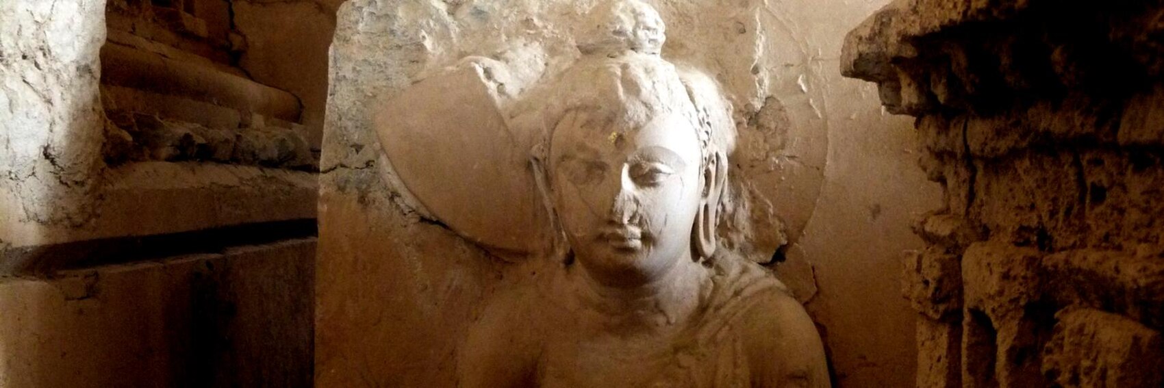
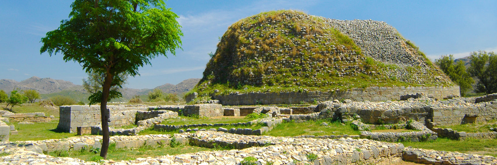
Most of you will remember that we ran another archaeological site in Pakistan, Mohenjo-daro, as OtBP a year or two ago. So, one of my main objectives in making banners for Taxila was to avoid source images that look similar to its banner - of which there were many. Despite the somewhat limited topical range of the resulting four candidates, I think I came up with a pretty good selection for you to choose among. Let's get to it!
-- AndreCarrotflower (talk) 00:15, 16 October 2015 (UTC)
![]()

![]()

![]()
![]()

- #4 comes out on top for me - it gets across the points illustrated in the blurb in a way that's more detailed and visually appealing than its competitors. #2 comes in second; the greenery at right is attractive (even if mostly covered by the textbox) and the stupa is eye-catching in a way that's more unusual than #4 or third-place finisher #1, but the stone foundations in front a) aren't terribly interesting looking and b) smack of the aforementioned Mohenjo-daro banner. As for #3, it's a different approach to the subject of archaeology that, if the image quality were a bit better, might not have landed in last place on my list. -- AndreCarrotflower (talk) 00:15, 16 October 2015 (UTC)
- They all look pretty good. I like #4 the best. Andrewssi2 (talk) 02:53, 16 October 2015 (UTC)
- The third one is the most different from Mohejno-daro's Main Page banner, in general a little more uncommon, and as always, I'm rather liberal when it comes to image quality; therefore #3 is my first choice. Then #4 (with interesting stairs and pillars), #1 and finally #2 (the tree is little disturbing) on the last place. ϒpsilon (talk) 04:25, 16 October 2015 (UTC)
- Very nice banners once more, and I'd be perfectly fine with running any of them. I find it a near-tossup between #4 and #1, but I give the pleasant composition of #4 a slight edge, even though #1 may be a more interesting image. I'm finding #3 and #2, highly different images, to also be near-tossups. Right now, I give #3 and edge, but tomorrow I might change my mind. To recap: #4, #1, #3, #2. Ikan Kekek (talk) 06:45, 16 October 2015 (UTC)
- Andre, you've cropped some nice banners. I've no preference here but I am here to suggest an alternate of banner #2. --Saqib (talk) 20:39, 16 October 2015 (UTC)
![]()
- I now like Saqib's banner best, because of its composition and my enjoyment at the depth of the view. I'll keep everything else in the same order (4, 1, 3, 2). Ikan Kekek (talk) 20:45, 16 October 2015 (UTC)
- I still prefer #4, but Saqib's banner is now in second place for me. -- AndreCarrotflower (talk) 21:21, 16 October 2015 (UTC)
- I'm quite torn between #5 and #4, but in the end I like #5 best of all (in other photos there is always a lagre portion of shadow). The next is #4, #2, #1 and #3, but I would be fine with any of them. Danapit (talk) 17:58, 18 October 2015 (UTC)
Slipping another set of banners in before it's back to the grind tomorrow morning. Vote! -- AndreCarrotflower (talk) 01:55, 13 October 2015 (UTC)
![]()

![]()
![]()
![]()
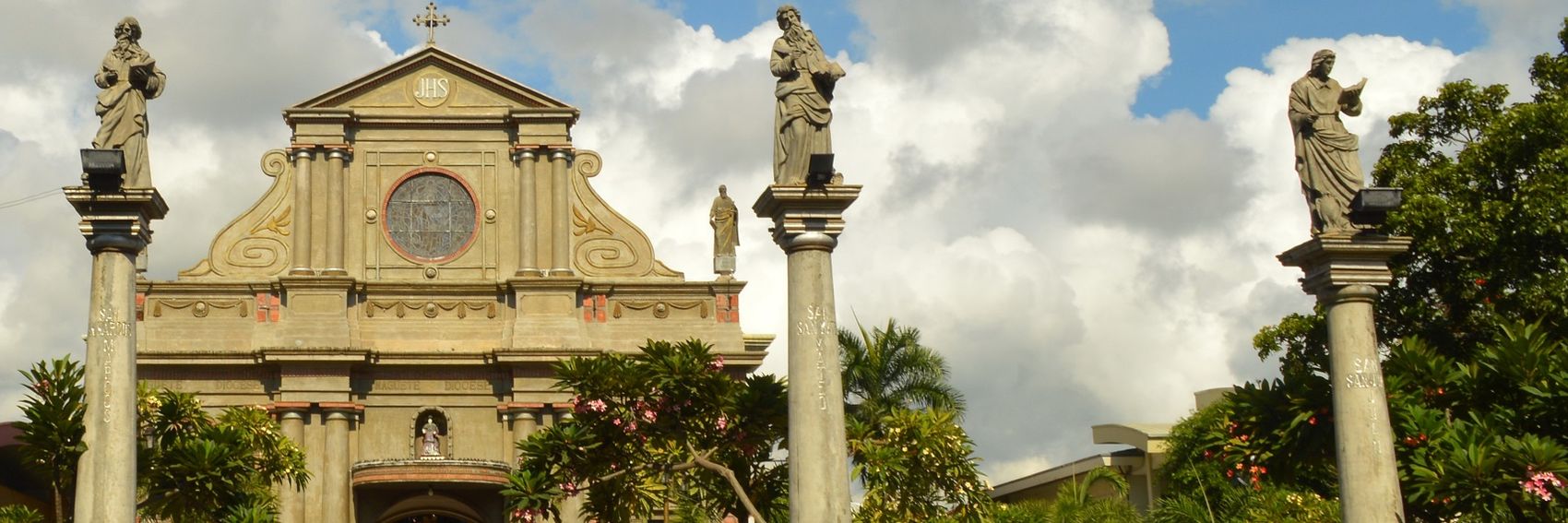
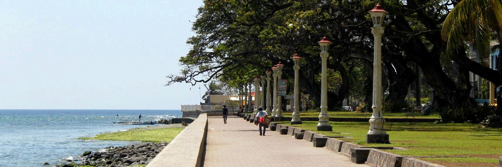
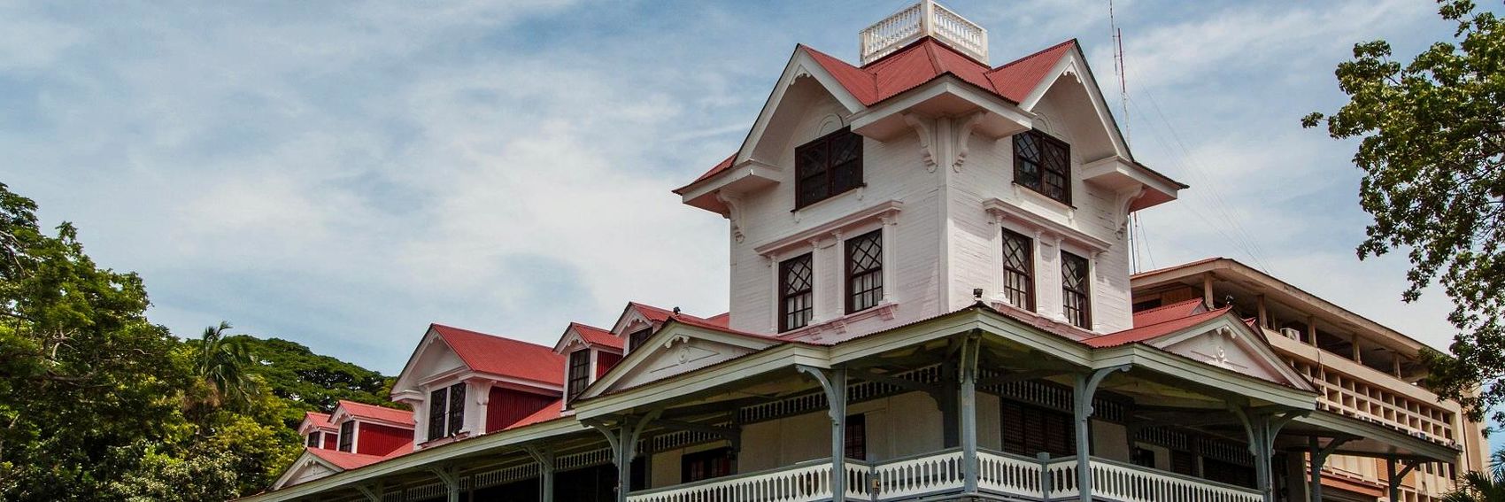
- Tough choice here. It's between #1 and #2 for me - the subject of the former is regarded to be the iconic landmark of the city, but #2's waterfront promenade is awfully inviting. I suppose that, if pressed, I prefer #1, but again it's a razor-thin margin. #4 is in third place - I find it the best overall image, but points are docked because the textbox clashes with the furthest-right column. Last-place #3 would be a great demonstration of Dumaguete's status as a university town if only it were made clear that the picture is of the university building. -- AndreCarrotflower (talk) 01:55, 13 October 2015 (UTC)
- Pinging Pashley, whose opinion on anything Dumaguete is undoubtedly the most qualified of all our editors. -- AndreCarrotflower (talk) 01:58, 13 October 2015 (UTC)
- #1 for sure. #2 looks inviting, but somewhat generic to me.... --Andrewssi2 (talk) 02:53, 13 October 2015 (UTC)
- I agree, either #1 or #2. I have a mild preference for #2.
- A problem with #4 is that there are columns for Matthew, Mark, Luke & john but photo has only three. Pashley (talk) 03:36, 13 October 2015 (UTC)
- The beach promenade, #2. Then #1, #4 and #3. ϒpsilon (talk) 04:17, 13 October 2015 (UTC)
- Very good job! I like all 4 of them. My favorite is #2, which is a beautiful composition with a long sight line. I find #4 my second-favorite, as it is harmonious and pretty. After that, it's a bit of a tossup between #3 and #1, as I find the old building in #1 more interesting to look at, but #3 is a bit more restful to look at, so it wins out. Tldr version in order of preference: #2, #4, #3, #1. Ikan Kekek (talk) 05:34, 13 October 2015 (UTC)
- I'll go with Pashley, as I'm fairly undecided. All of these make excellent banners. #4 comes in third for me, even if it's not a complete image (which for me is not a big problem, really), and then #3. Good work. JuliasTravels (talk) 22:04, 3 November 2015 (UTC)
Going into the process of making these banners, I hadn't taken begging to be a difficult subject to illustrate in this way - and indeed, by one measure it wasn't; there were plenty of usable images on Commons. But more and more when perusing the photos, the importance dawned on me of ensuring that any banner like this, which would be placed prominently on the Main Page, treats its subjects with respect and dignity. However, the image should also avoid whitewashing the reality of the issue at hand - after all, beggars are in almost all cases individuals who are in unfortunate circumstances in life. It was tough to walk that fine line in choosing images, but I think I found four that succeed in doing so. Let's see if you all agree. -- AndreCarrotflower (talk) 03:13, 12 October 2015 (UTC)
![]()

![]()

![]()

![]()

- Though it's not the best image composition-wise, I think the content of Banner #2 is most in keeping with the portrayal of beggars that I was aiming for. Something about the image - perhaps the concerned look on the donor's face and the quietly dignified posture of the beggar? - is frankly heartwarming. Close behind is #3 - one of the rare instances in which a lack of color works to a banner's advantage, in this case giving the image a gritty "documentary" feel. However, it lacks the personal touch of #2 and is already in use as the article's pagebanner. #4 is in third place, a beautifully composed image that falls a little too far on the "depressing" side of the spectrum for my tastes. Finally in last place is #1 - if there had been another image with these basic components (folded hands, sign, cup) it might have worked a lot better, but the unexplained presence of a dog that's half cut off from the top margin of the picture (I did the best cropping job I could) combined with the fact that the text is written in a language other than English place it beneath the other three in my estimation. -- AndreCarrotflower (talk) 03:13, 12 October 2015 (UTC)
- Number 2 is pretty good. Andrewssi2 (talk) 04:09, 12 October 2015 (UTC)
- The 4th one is the best depiction of the subject, IMO. Then #2, #1, #3 (I think we should not have the same as on the page itself). ϒpsilon (talk) 04:26, 12 October 2015 (UTC)
- I wasn't so sure about #4, since it could be someone just having a cup of water on a warm day.... --Andrewssi2 (talk) 04:31, 12 October 2015 (UTC)
- I was finding #3 the best, because it perfectly exemplifies the subject without violating anyone's privacy, but I see the point about #2 - it really humanizes the subject. I'm still thinking of it as being in 2nd place, but it's good. I put #1 third, as I find it fine. #4 is also fine, but the point about it being ambiguous is well taken. I think bills are in the cup, but it's so glary it's hard to really tell. By the way, I'm not sure why the banner already being used in the article is a problem. Ikan Kekek (talk) 05:48, 12 October 2015 (UTC)
- Re: Ikan "I'm not sure why the banner already being used in the article is a problem" - personal preference on my part, that's all. Others may agree or disagree. -- AndreCarrotflower (talk) 15:28, 12 October 2015 (UTC)
- I like #4 the best, it is striking and well illustrates the subject. But so does #3. However, I personally prefer having another banner for the title page where a reasonably appealing option is available, too. Danapit (talk) 18:01, 18 October 2015 (UTC)
- Same for me, I guess. I'd say #3, but as it's the article banner I'll go for #4 but still with #3 as second. While 2 is a very powerful and in a way beautiful image, I feel in this context it's extra important to stick to our "no recognizable people"-preference. I'm not comfortable with it on the main page. Number 1 is interesting as much as it is odd, with that dog :-) It's not my preference, but I'd be fine with it. JuliasTravels (talk) 21:58, 3 November 2015 (UTC)
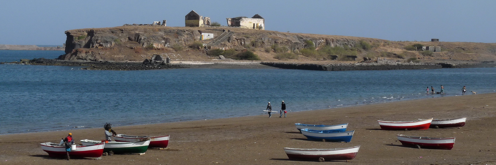
If you've seen the Dirty Sanchez Movie, you may perhaps know the scene where they first were promised some KFC, then; " So, I am from Kentucky...this is a [live] chicken and you're gonna fry it.". Somewhat along the same lines; here are four banners, they are all from Praia... (but you can tell that it's some damn beginner and not Andre who has made them, anyways on Sunday we need to have something to put on Hyden's place at Wikivoyage:Destination_of_the_month_candidates, and Andre is apparently busy IRL, so I decided to give Main Page banner making a try). ϒpsilon (talk) 18:51, 6 October 2015 (UTC)
![]()
![]()
![]()

![]()

![]()
![]()
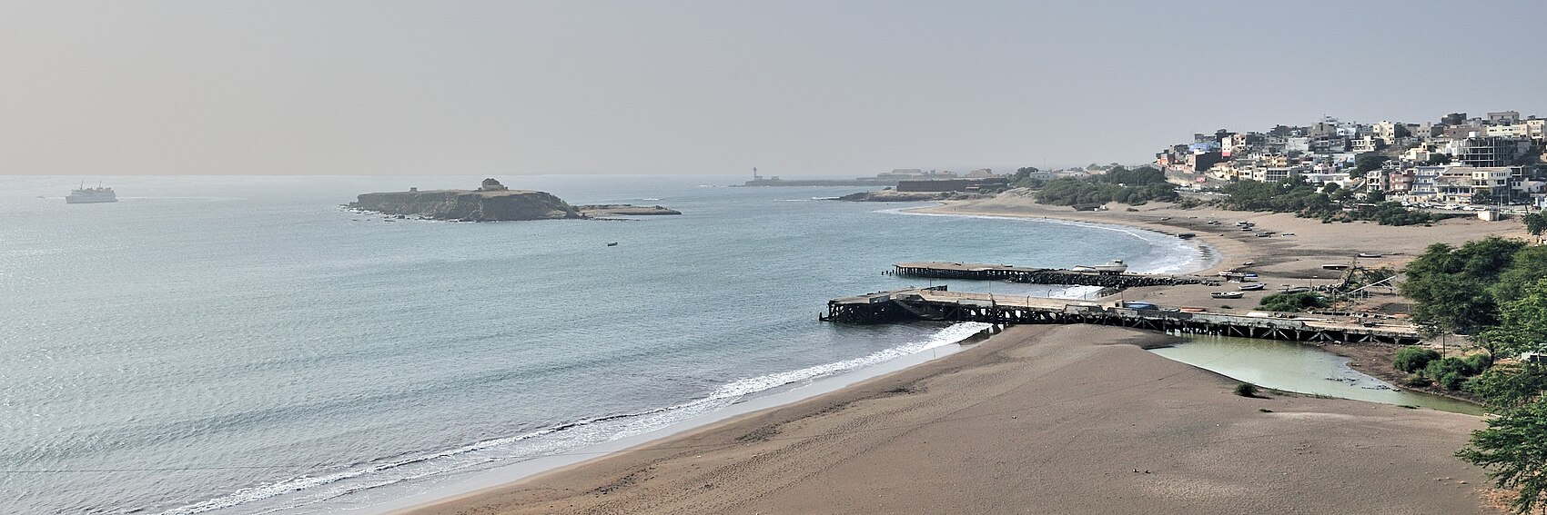
- Yeeah... for me it would be #4, #1, #2 and on the last place #3. ϒpsilon (talk) 18:51, 6 October 2015 (UTC)
- Thanks for doing this! I'd vote for #2, #1 and then #3. #4 is a very pretty view, but I'm tending to find it too glary to consider. Are there any pictures of the beachfront itself that are big enough to make banners from? Ikan Kekek (talk) 20:01, 6 October 2015 (UTC)
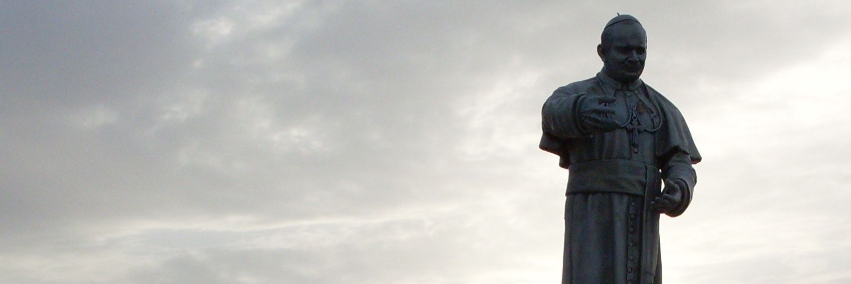
- Who's that guy in #2: a surfer or water skier :) Sorry to intervene, ϒpsilon, I just wanted to add some beach options to reflect better the blurb. Please note I have no knowledge of the destination, so I cannot judge, if they are representative for Praia or not. I'll leave this to others. From this point of view, I'd vote for #6, which probably has a better composition of both (could the blurb be moved down?), then #5. From the other non-beach photos #4 (a pleasing view) and #2 (if we play around with shadows of the statue). Again, is this statue in any way typical for the destination? I didn't find it in the guide. Danapit (talk) 12:15, 7 October 2015 (UTC)
- The statue is of the pope. The photo itself looked interesting with the sunset, the banner less so. I'm not an expert on the city either, but just translated the article from German and Portuguese versions a while ago.
- I noticed the beach viewed the way as in banner #6 occurs on many photos, likely from the Achada Grande district to southwest with the city to the right. My vote goes to the sixth banner. ϒpsilon (talk) 15:04, 7 October 2015 (UTC)
- I prefer the 5th banner now, I think, but I'm reconsidering and would have #1 second and #2 third. The others strike me as too glary, though maybe they look different on other screens. Ikan Kekek (talk) 15:14, 7 October 2015 (UTC)
- Apologies for letting this get away from me. Ypsi is correct; it's peak season at work and my presence on Wikivoyage will be somewhat reduced until at least the end of the year. (Nonetheless, I'll continue handling DotM and hope to continue making banners as well.)
- As to the banners: according to the article, the beaches and the Old Town are the two main tourist draws to Praia. I think I agree with Ikan about the Banner #5 being best, and for second place #6 and #1 are in a dead heat. The intriguing #2 takes fourth; #3 is fifth and #4 is last.
- I like #5 best, then 6, 2, 1, 3 and 4. JuliasTravels (talk) 17:07, 2 November 2015 (UTC)
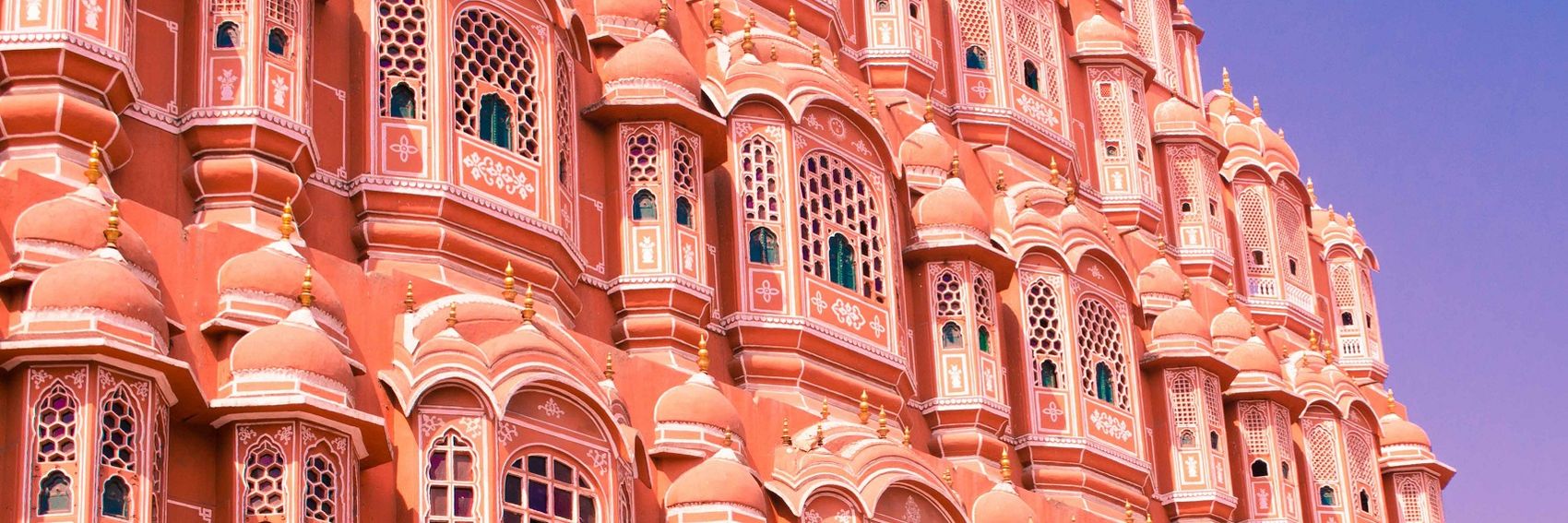
I'm more excited about this set of banners than any I can remember. My goodness, what a photogenic place. -- AndreCarrotflower (talk) 02:29, 20 August 2015 (UTC)
![]()
![]()

![]()

![]()
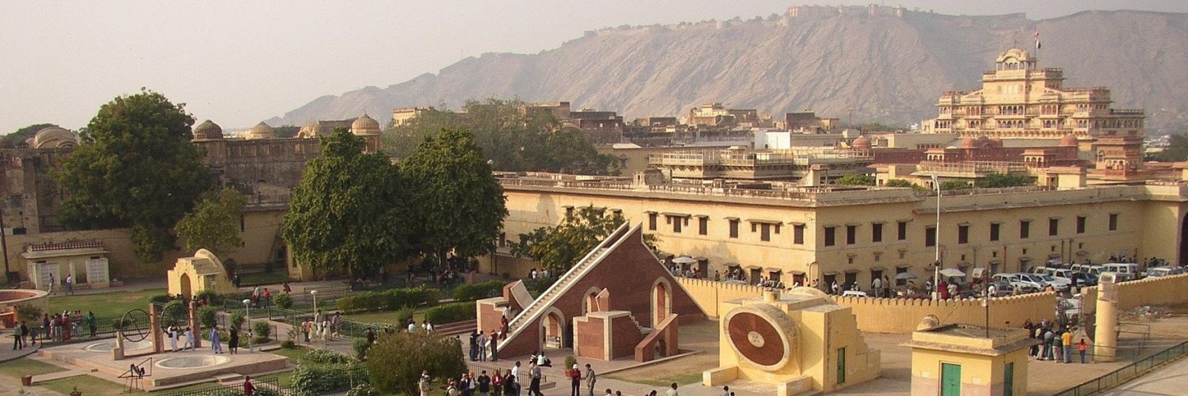
- My favorites are the first two, which really drive the point home that Jaipur is the "Pink City". #1 has an ever-so-slight edge over #2, only because it reminds me of the kind of pictures I like to take myself, but really the difference between them is trifling. #3 is a lovely image as well, but I docked points because it's not pink and, judging by how many different pictures of the Jal Mahal I found on Commons and Flickr, it seems cliché. The monumental sundial of the Jantar Mantar depicted in #4 is certainly a well-known attraction in Jaipur and boasts a look that's unique among the four banners, but though it's a nice image I don't feel it quite stacks up to the others, so it's in last place. -- AndreCarrotflower (talk) 02:29, 20 August 2015 (UTC)
- Thank you for the great banners, AndreCarrotflower! I'm a little torn because #1 is a banner of a really unique attraction, but I prefer the composition of #2, so I rank #2 first and #1 second. #3 is third, and not by much at all. I, too, rank #4 in last place, yet I'd be happy with it running. Ikan Kekek (talk) 02:56, 20 August 2015 (UTC)
- Amazing banners, can we have all of them on the Main Page? No? Then I'll pick #1. On the second place, the palace surrounded by water #3, then the pretty palace interior #2, and on the last place #4 which is a little less stunning. ϒpsilon (talk) 06:48, 20 August 2015 (UTC)
- #1 and #2 both depict the best of Jaipur to me, as I have always experienced the city. I'd be happy with #3 as well. While a fine banner, #4 is a distant last for me as it just misses the enchantment. Nice work. JuliasTravels (talk) 10:31, 1 September 2015 (UTC)
- Very pretty, great job! I would rank them #1 (very sweet and pink and picturesque), #2, #3 and #4. Danapit (talk) 20:37, 2 September 2015 (UTC)
I was a bit torn with how to approach these banners: the Natchez Trace Parkway is a road-trip itinerary, so at first it seemed that any good DotM banner for it should include the road itself as part of the image. However, I could find no trace, either on Commons or in the copyleft-compatible sections of Flickr, of the "exceptional scenery" originally vaunted by the blurb (since changed). In the end, I split the difference: half these images show the parkway as it passes through pleasant but not terribly exciting scenery, and half of them show notable attractions visible along the route, though not the road itself. I think in the end we ended up with a fairly broad and interesting gamut of banner selections, so let's hear your thoughts on them. -- AndreCarrotflower (talk) 00:11, 20 August 2015 (UTC)
![]()

![]()

![]()

![]()

- In the end, the "roadway" images just didn't speak to me as much as the others. For me the winner is #1: the image of the old roadside inn really emphasizes the long and rich history behind this route. #3 is second; though the image is merely pleasant looking as opposed to a demonstration of some core element of the Trace's identity, it appeals to me as a fan of road trips, and those who might enjoy the Trace as simply a leisurely country drive would probably feel the same way. Close behind in third place is #4, which, despite the fact that it depicts the old Amerindian burial mounds which are one of the Trace's main draws for history buffs, I fear it might not be obvious to casual viewers exactly what they're looking at. Also, though #4 does have a pleasant bucolic look to it, to my eyes it just doesn't have the same level of visual appeal as #1 and #3. Last place is #2, which if not for the abysmal image quality would function well as a pleasant autumn scene. -- AndreCarrotflower (talk) 00:11, 20 August 2015 (UTC)
- I like all these images. I find #3 pleasant and illustrative of this being a road, so I put it in 1st place. I don't find the image quality of #2 abysmal and put it 2nd. I like the inn also, and would put it 3rd. The field with the bales of hay and Native American burial mounds is interesting, too. I'm thinking of it as my #4 choice but would be perfectly happy with it running on the main page. Ikan Kekek (talk) 02:08, 20 August 2015 (UTC)
- I prefer #3 with #2 a close second. The defining characteristic of the destination is the parkway, so while there is plenty of interesting scenery along the route, including the road makes for a better main page illustration. -- Ryan • (talk) • 02:47, 20 August 2015 (UTC)
- Number 2 is pleasant to look at and suitable for late October when the article will get featured. After this maybe #2 (as Ryan said, the article is about the route), #1 and on the last place #4. ϒpsilon (talk) 06:41, 20 August 2015 (UTC)
- ϒpsilon, do you mean #2 is your favourite (before #3)? For me, it is. It's a beautiful, curvy, colorful picture, with a dreamy atmosphere and it makes me want to sit behind the wheel :) I don't find anything particularly wrong with #2's quality - maybe I just need to get new spectacles. Second, #4: the sky is a bit monotone. Third, #1: I don't know anything about the place, but looks sooo cosy. Last, #3. It has also a pleasant composition, but the colors are colder. Danapit (talk) 20:54, 2 September 2015 (UTC)
- The roadway in #2 is clear, but that's the only clear part of the picture. The leaves on the trees are a blurry mess, especially to the left of the roadway and in the background at center. -- AndreCarrotflower (talk) 21:13, 2 September 2015 (UTC)
- One person's blurry mess is another person's poetic imagery. Paintings can be great without indicating every leaf in detail. I don't think that we need a different standard for photographs. Ikan Kekek (talk) 21:20, 2 September 2015 (UTC)
- In this case, I agree. The colours of #2 are great, and the park way makes an excellent topic for the banner. #4 comes second for me, #3 third. #1 is a good image, but I find it least interesting (not knowing anything about this place, it's just a building to me), so it comes last for me. JuliasTravels (talk) 21:05, 5 September 2015 (UTC)
As Hyden is a tiny little village with just one major tourist attraction to its name, you're not going to see a lot of thematic diversity in these banners. Luckily, the selection of copyleft-compatible images of Wave Rock on Commons and Flickr was good enough to enable me to produce three banners that depict it from a variety of different angles, in a variety of different lighting conditions, etc. Banner #4 presents a bit of variety, a view of a different attraction listed in the See section.
As always, let's hear your votes.
-- AndreCarrotflower (talk) 01:43, 9 August 2015 (UTC)
![]()

![]()
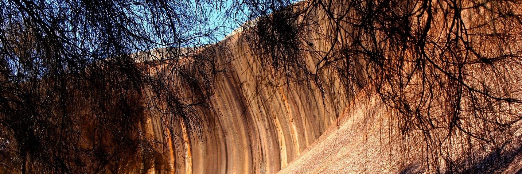
![]()
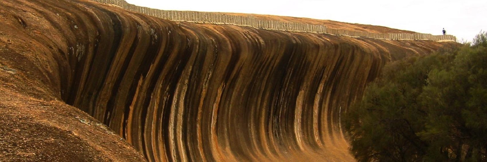
![]()
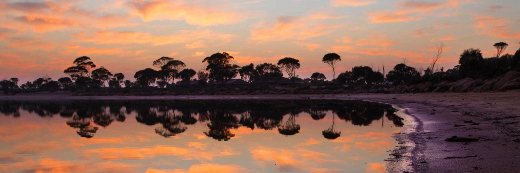
- #1 is a pretty clear winner for me: it's a nice crisp image with a great composition: the tree at left provides a nice balanced counterpoint to the rock, and there's a triangle of open sky under the textbox. #3 is in second place as basically the same idea, but with markedly poorer image quality. Odd-man-out #4 is probably the most attractive image to my eyes - it's got plenty of those umbrella-shaped trees I constantly saw while filing through pictures of Hyden on Flickr, and look at their reflection in the lake! - but the absence of Wave Rock drops it down to third place in my ranking. #2 is an interesting vantage point from which to view the rock, but that's about all it has going for it - the tree branches and slope in the foreground seem more like obstacles in the way of your view than diverse additional elements to include in the picture, and the image quality isn't great either. -- AndreCarrotflower (talk) 01:43, 9 August 2015 (UTC)
- It's interesting to read your take on the banners, as the one who created them. I actually find #2 the most pleasant combination of an image with the text box. I'd rate #4 second, but the fact that it's not of Wave Rock might disqualify it from real consideration. I'd rate #1 after that. I think my aesthetics on what makes a great composition are somewhat different from yours. #1 is an impressive picture, or a picture of an impressive image, but #2 has the quality of a good landscape painting that's pleasant to move the eye around. #3 might be even more impressive than #1, except for the notable falloff in photo quality that you mention. Ikan Kekek (talk) 04:07, 9 August 2015 (UTC)
- #1 for me too, as it's the best image. Even if it's not the most exciting one, it's still interesting and the composition is solid. I like the colours and elements of #2 too, but perhaps there is a bit too much of the black trees and I really do find lacking quality a problem for the main page. That's why #3 is definitely last for me, even when the composition is nice. So #1,#4, #2, #3 then. JuliasTravels (talk) 09:44, 9 August 2015 (UTC)
- I also think this Wave Rock, being the main attraction, should appear on the banner. But can't we smuggle the beautiful photo from #4 in the destination article? I really like the composition of #3, but the quality is suboptimal. I am torn between #1 and #2, and ... #2 gets my vote by a hair. Danapit (talk) 12:11, 9 August 2015 (UTC)
- Good idea to put #4 in the article. Is it of Lake Magic or another lake? Ikan Kekek (talk) 12:48, 9 August 2015 (UTC)
- It's an image of Lake Magic that I found on Flickr. I think it would work great in the article. -- AndreCarrotflower (talk) 14:02, 9 August 2015 (UTC)
- I notice there's no listing for the lake in the article, unless the "Sleep" listing for Wave Rock Lakeside Resort counts. The lake is on the map — but you have to click on the map and then zoom in once to see the name. Should there be a listing for the lake in the article? Ikan Kekek (talk) 20:24, 9 August 2015 (UTC)
- It's an image of Lake Magic that I found on Flickr. I think it would work great in the article. -- AndreCarrotflower (talk) 14:02, 9 August 2015 (UTC)
- Good idea to put #4 in the article. Is it of Lake Magic or another lake? Ikan Kekek (talk) 12:48, 9 August 2015 (UTC)
- The second one is my favorite, I actually think the branches add an interesting effect to the banner. After this #1, then #4 (otherwise pretty but I do think we should have the Wave Rock on the banner) and on the last place #3. ϒpsilon (talk) 16:44, 9 August 2015 (UTC)
- Number one is the most pleasing to my eye. Reminds me of the banner on Niagara Falls (Ontario). Powers (talk) 14:11, 20 August 2015 (UTC)
More banners. Vote! -- AndreCarrotflower (talk) 15:30, 8 August 2015 (UTC)
![]()

![]()
![]()
![]()

- It's a tight competition between the first and last banner for me. #1 is far more distinctive than its counterpart, which could be pretty much any beach destination (particularly in Brazil), but #4 just makes me want to pack up my sandals and umbrella and hop a flight right now. I suppose that, if pressed, I'd put #4 over #1 by a hair. Of the other two, I prefer #2 for third place - the building's architecture and facade definitely have that Latin American look to them, and the textbox clashes with the image much less than I feared it would - and, while #3 does depict an attraction listed in the "See" section and is taken from an unusual perspective (from the Parque do Cocó, looking at the skyline from the rear), it seems to speak the least to what Fortaleza is all about according to the article. -- AndreCarrotflower (talk) 15:30, 8 August 2015 (UTC)
- To me, #3 outclasses all the other photos and is just a striking and beautiful photo. I don't like #1 or #2 as much, perhaps in part because they are closeups, and #4 certainly shows Fortaleza as a beach resort, but with a line of rather ordinary-looking hotels. #3 is the only photo here that gives the eye something relaxing to look at, with a great depth of field, indicating both the size of the city and the fact that it has greenery as well as buildings, and in my opinion, it's by far the best composition of the bunch. I haven't visited Fortaleza, but that one is my pick. Ikan Kekek (talk) 18:31, 8 August 2015 (UTC)
- Ikan - so, to be clear, #4 is your second-place choice? -- AndreCarrotflower (talk) 01:45, 9 August 2015 (UTC)
- Yes, now that I think about it, it is, though a distant second. Ikan Kekek (talk) 04:00, 9 August 2015 (UTC)
- Ikan - so, to be clear, #4 is your second-place choice? -- AndreCarrotflower (talk) 01:45, 9 August 2015 (UTC)
- With respect to the keywords "beach" and "party", #4 is a clear winner. It has a very good composition. I think #1 can also do. But #3 and #2, though both pretty pictures, don't go well together with the blurb. Danapit (talk) 12:02, 9 August 2015 (UTC)
- Difficult choice. My favorite would be #4 where the beach is best visible, on the second place #3, then #1 and lastly #2. ϒpsilon (talk) 16:37, 9 August 2015 (UTC)
- Number 1 is the best composition and most striking, by far. Powers (talk) 14:11, 20 August 2015 (UTC)
Whew! I'm behind on banners. Time to put a dent in the backlog.
These banners were a conundrum for me. It's not that the article didn't have plenty of good pictures - it did. The problem is that I've never seen even one episode of Breaking Bad. The selections I chose were based on a mixture of aesthetic value and educated guesswork as to the relative importance to the show's plot of the sites listed on the tour, based on the text of the article. Hopefully someone who has a little more familiarity with the show than me can tell me how well I did at that (and maybe also tweak the blurb, which I also wrote?)
-- AndreCarrotflower (talk) 04:11, 7 August 2015 (UTC)
![]()

![]()

![]()

![]()
- As someone with no familiarity at all with Breaking Bad and thus no way to judge them based on the context of the show, I'm going to refrain from ranking these banners in order, as I usually do. However, I will give my general impressions of each:
- #1: generally speaking, I usually get okay results taking an image that's slightly less than 1700px in width, expanding it, and tweaking it with my photo editing software when necessary. However, the source image for this banner is only 1200px across, which is really pushing the envelope. Image quality took a significant hit despite all my best PhotoShop efforts, but the scene is absolutely breathtaking so I included it anyway. Whether it'd be recognizable to a Breaking Bad fan, I haven't the slightest idea.
- #2: a happy medium in all respects. Judging by the article text, I'd say this is an image a fan would likely recognize, and it's okay from an aesthetic perspective too.
- #3: I'm not a huge fan of DotM banners using the same source image as pagebanners, as many of you probably know. Another potential problem is that this restaurant is called "Los Pollos Hermanos" within the show's universe, yet in the image the sign reads "Twisters".
- #4: judging again by the article text, this would likely be the most pertinent image when it comes to the plot of the show, but it's pretty dull when it comes to aesthetics.
- Hmmm, tricky choice. I'd say #3 is my least favorite since, as you point out, it's not as readily recognizable as a location from the show and aesthetically it's not all that exciting. #1 is definitely the prettiest, but I'm not sure how readily it would jump out to fans of the show. I think #4 is probably my preferred choice, since it's so much more recognizable as a filming location to fans of the show than any of the others, with #2 as a distant runner-up. PerryPlanet (talk) 21:52, 7 August 2015 (UTC)
- Aesthetically, #1 works the best for me. There are many back-country scenes in the series. Except from the fact that the blurb mentiones "streets", which doesn't match well with this picture. From the street photos, #4 is my preferred one, but both #2 and #3 are fine, as well. I believe all 3 should be recognizable. Danapit (talk) 11:44, 9 August 2015 (UTC)
- Disclaimer: I'm not familiar with the tv series at all. But while the first photo looks amazingly pretty, I would still imagine that specific buildings where the series take place are better themes for a banner for this article. So #4, #2, #3, #1 for me. —The preceding comment was added by Ypsilon (talk • contribs)
Our own Altaihunters gifted the article with a wealth of pictures, but only one of them (#1) was both of sufficiently high resolution and had a composition that worked well with our banners' 3:1 horizontal aspect ratio. Luckily, Flickr user "martin_vmorris" was a lifesaver: his feed provided the rest of the images. Let's hear your thoughts! -- AndreCarrotflower (talk) 13:31, 18 June 2015 (UTC)
![]()

![]()
![]()

![]()

- #4 for me by a wide margin: it may be the least colorful of the images, but it's by far the most dramatic, plus the textbox fits perfectly between the mountains. After that, in descending order: #2, #3, and trailing somewhat further behind the rest #1. -- AndreCarrotflower (talk) 13:31, 18 June 2015 (UTC)
- My ranking is a bit different. My favorite is #3, then comes #2, #4 and #1. ϒpsilon (talk) 14:30, 18 June 2015 (UTC)
- I'm having trouble picking between these, because they're all splendid! Ikan Kekek (talk) 20:42, 18 June 2015 (UTC)
- I'll say this: I like the idea of the horse and camels in #3, because that gives somewhat of a sense of place (Central Asia, at least). But I think I'll go with #4, which seems to be to have the best composition. Ikan Kekek (talk) 21:13, 18 June 2015 (UTC)
- All are great, and I too really like #3, but I'll still pick #4 first because it's a kind of image we seldom have on the front page. So #4, #3, #2, #1 for me. Really nice images, make me want to pack my stuff and go.. JuliasTravels (talk) 21:45, 21 July 2015 (UTC)
Vote away! -- AndreCarrotflower (talk) 17:48, 17 June 2015 (UTC)
![]()
![]()
![]()

![]()

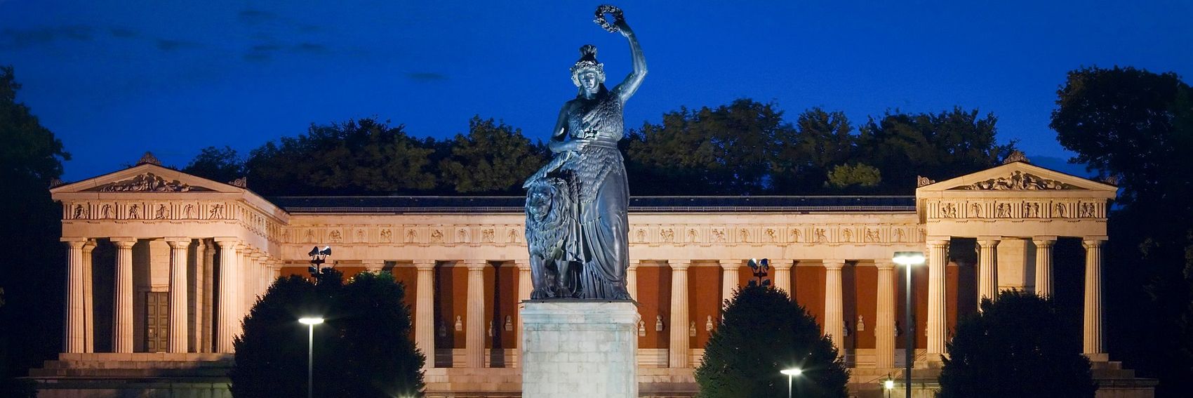
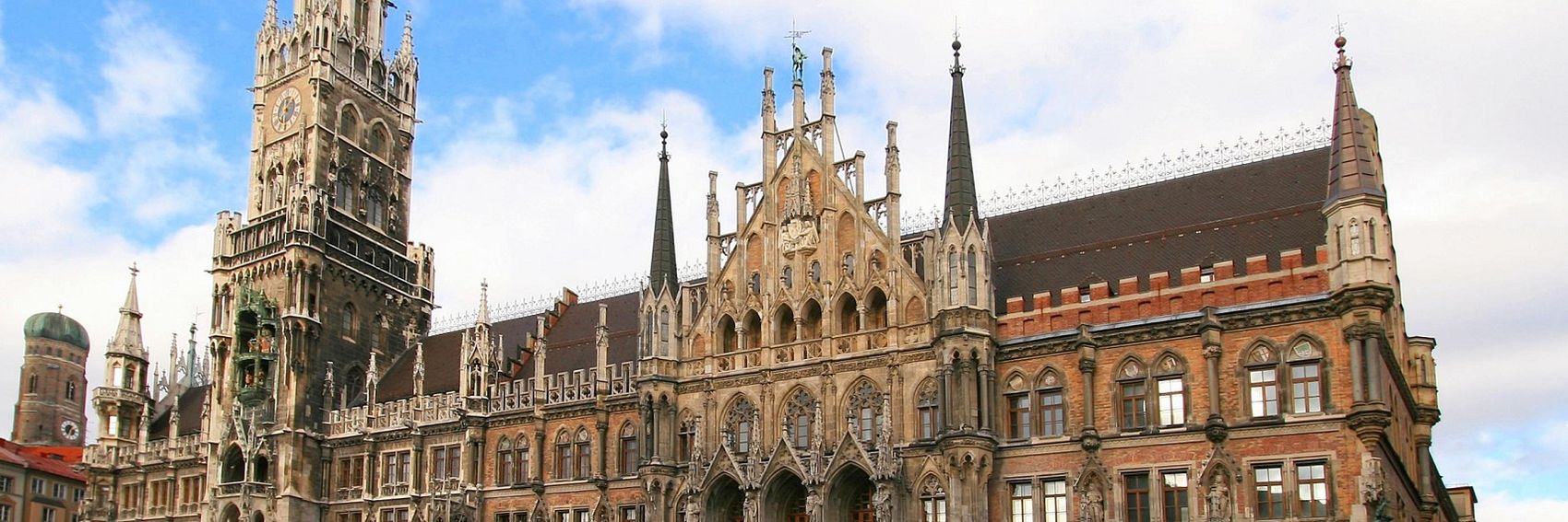
- Another tough choice for me. Let me preface my comments by saying that the split between first place and last place is extremely narrow, and I'd be pleased to have any of these banners on the Main Page come September. That being said, my favorite is #4, whose view of the cityscape around the Stachus is (if the article is to be believed) about as quintessentially Munich as it gets. Second is #1, a much simpler composition than any of the others, but with beautiful rich colors. #2 would have been my second-place choice but for the fact that I had to crop out the top of the Neues Rathaus' spire; as it is; it's in third. Last place is #3, which - even though it's the only one that depicts Oktoberfest (the reason why we've chosen this month to feature Munich) and even though the Chairoplane is an iconic feature of Oktoberfest, just isn't as visually arresting an image to me as the others. -- AndreCarrotflower (talk) 17:48, 17 June 2015 (UTC)
- The city hall, #2, for me. Then #1, #4, #3. ϒpsilon (talk) 18:16, 17 June 2015 (UTC)
- I like #4 best, #1 and #2 are tied in second . Ibaman (talk) 18:32, 17 June 2015 (UTC)
- Terrific job! All are excellent. I'll vote for #1 as my top choice, as I love both the monumentality of the building and the gesture of the sculpture, and it's a beautiful composition. I'll put #3 in 2nd place and was considering it for my top choice, because it's so much fun and really gets across the idea of a fun party, which is what we're emphasizing in the blurb. #4, the nice photo of the Stachus, et al., is my third choice. And #2, a photo of one of my favorite buildings of all, the Neues Rathaus, is only 4 of 4 for me, because the way the building is cut off bugs me a bit. And yet I'd still be fine with it if we end up running it as the banner! Ikan Kekek (talk) 20:50, 17 June 2015 (UTC)
- #3, #2, #4, #1 for me. The swing ride is so energetic and fun, and it's way more original a banner than the others. #4 may show one of the best known areas, but most readers will not recognize it and then it's just a large building on a square. JuliasTravels (talk) 21:50, 21 July 2015 (UTC)
LPfi and Erik den yngre, the principal authors of this article, are to be commended: they included so many great pictures that it was not necessary to search outside the article for one that was suitable for adaptation as a banner! (I did source one image from elsewhere, but only for the specific purpose of having an option for those who preferred a "new" photo - if not, it would have been easy to choose a fourth from the article itself.)
I'm so torn on which of these banners I prefer that I'm going to do something I don't usually do: wait for others to share their thoughts before casting my own vote. So, let's hear them!
-- AndreCarrotflower (talk) 20:07, 15 June 2015 (UTC)
![]()

![]()

![]()

![]()
- I agree with you: Those photos are all excellent! There's something to be said for having a hiker (or a sign) in the picture. I think that I prefer picture #3, overall, but boy is #2 a beautiful landscape! And speaking of landscapes, how about #1? For a pure "wow" factor in terms of the landscape, I'd vote for #1 and then #2. #4 is just fine but pales in comparison with the other three outstanding images, in my opinion. Ikan Kekek (talk) 06:53, 16 June 2015 (UTC)
- Great selection, again. In my opinion, #3 matches the best to the title. Also I have a very "Scandinavian feeling" about the picture. Similarly, #4: clearly Norwegian sign, hiking, countryside. Here, the blurb interferes with the banner more than in #3, therefore I find is somewhat inferior. Next, #2, great composition, but sligtly grainy picture (also a bit gray, not that it would be so uncommon in Scandinavia) and lastly, #1, great picture, but matches the least to the title. Danapit (talk) 10:15, 16 June 2015 (UTC)
- I completely agree with your analysis. Ikan Kekek (talk) 16:56, 16 June 2015 (UTC)
- This is a difficult one. My vote goes to #3 which could be almost anywhere in Scandinavia. Then #2, #4 and #1. ϒpsilon (talk) 17:35, 16 June 2015 (UTC)
- It's still a very close race for me (at least among the top three candidates), but after thinking it over for a while and reviewing others' thoughts, I think I'm ready to vote on these. For me, I prefer them in descending order:
- #4 - something about the sign with the arrow really drives home the concept of hiking as the topic of the article
- #3 - the landscape is pretty and the image includes a hiker, which the frontrunner does not, but in my view the shelters in the background sort of detract from the idea of the "vast, untamed wilderness" described in the blurb
- #2 - I love the feeling of solitude and the vastness of the surrounding landscape, but the image quality issues Danapit pointed out are indeed problematic
- #1 - while probably the best of the four in terms of aesthetics, this image really does not address the concept of hiking at all.
- Number 3 is most fair as it can be anywhere in Norway, Sweden or Finland. Number 2 is a good one, really suggest the kind of cool, open space typical to this area. Number 1 is good, but most representative for Norway, partly Sweden, and does not suggest hiking. I would vote for 3 or perhaps 2. --Erik den yngre (talk) 07:19, 17 June 2015 (UTC)
- I really like the composition and content of #4 so that's my choice. It may not show off the scenery, but this isn't a destination guide, so I think that's okay. Powers (talk) 15:10, 17 June 2015 (UTC)
- #3, then #2, #1 and #4 for me. All great images, but #3 ticks all the boxes. While the image itself is great on #4, I like it less with the blurb, as it has these two fairly similar but not well aligned rectangles. JuliasTravels (talk) 21:55, 21 July 2015 (UTC)
The selection of suitable images for Davenport at Commons and Flickr left something to be desired. I was able to come up with some pretty good banners, but on the other hand some of them are just okay.
Because the Mississippi River is vital to Davenport's identity, I wanted to make it as much of factor in these images as possible. Unfortunately, that necessarily limited the range of subject matter that's covered. Most of the best available source images included it, though, so I think the selection of banners here is pretty close to the best possible scenario given what I had to work with.
Let's hear your votes.
-- AndreCarrotflower (talk) 15:09, 15 June 2015 (UTC)
![]()

![]()

![]()
![]()
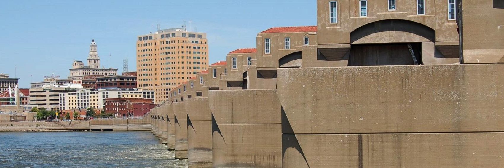
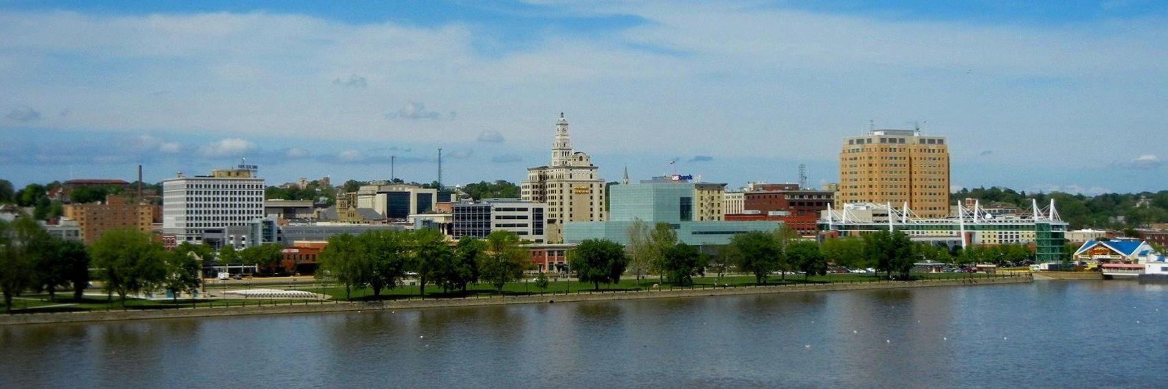
- #2 over #3 for me by a hair, only because in the latter case Davenport's pagebanner was adapted from the same source image. Third place is #4, which is a higher-quality image than #1 and really gets across the Mississippi's specific importance as an element of transportation infrastructure for the Davenport area (the image is of Mississippi River Lock and Dam No. 15). -- AndreCarrotflower (talk) 15:09, 15 June 2015 (UTC)
- I actually like the dam banner because it's a bit unusual. So #4, #2, #3, #1. ϒpsilon (talk) 15:32, 15 June 2015 (UTC)
- I think #2 is better than the rest because it's a beautiful image, but I do agree that #4 is quite interesting, so it's my 2nd choice. After that, I prefer the nice building in #1 to the more topical-to-the-blurb but less interesting (to me) cityscape in #3. Ikan Kekek (talk) 19:46, 15 June 2015 (UTC)
Between my rush to get Buffalo districted in time for its stint as DotM and my urge to attend to offwiki life in the aftermath, it's been tough to get motivated to create new banners. But it's one of my favorite tasks here at Wikivoyage, so here's a step in the direction of addressing the backlog. It took me a good while to find four images that really stood out to me, but here they are. Vote away! -- AndreCarrotflower (talk) 18:00, 10 June 2015 (UTC)
![]()

![]()
![]()
![]()

- Hmm. I'm having a tough time deciding between #s 2 and 3: the latter is the best when it comes to reflecting the textual content of the blurb, but I love the humor in the former. #1 is in a close third place as a representation of the Victorian architecture of the Manchester of old; #4 is also very good, but the symmetry is thrown off by the fact that the text blurb is necessarily off to one side. -- AndreCarrotflower (talk) 18:00, 10 June 2015 (UTC)
- My first vote goes to #1. Then #3, #2 and #4. ϒpsilon (talk) 18:03, 10 June 2015 (UTC)
- Second city of UK is only going to open up controversy, it is often used with reference to Birmingham and I am sure people from Edinburgh, Glasgow, Belfast and Cardiff will also object. --Traveler100 (talk) 18:22, 10 June 2015 (UTC)
- Oh, for Pete's sake... -- AndreCarrotflower (talk) 19:21, 10 June 2015 (UTC)
- Assume the original image is a composite panorama. Would be good to have the original photos that it was built from and see of can calculate a better perspective for the towers. Focal point for 4 could also be redone. --Traveler100 (talk) 18:28, 10 June 2015 (UTC)
- OK, I have never been to Manchester. Keeping that in mind: #4 is a harmonious composition and probably my top pick. If so, #3 is a strong 2nd, and definitely fits with the blurb about the industrial city having a renaissance. #1 is beautiful but seems to be floating a bit unnaturally in air, and #2 is not bad and makes a contrast of the seemingly older monumental style and a more modern piece of machinery. I actually think #2's composition works better than #1's. So my order is: 4, 3, 1, 2. Ikan Kekek (talk) 00:24, 11 June 2015 (UTC)
Just to complicate matters a little further, here's another couple - I do think Andrew's are very good though and the description's excellent! --Nick talk 23:21, 26 June 2015 (UTC)
![]()

![]()
- I find the last one overly blurry. The 2nd-to-last one is perfectly good, and I would be happy with it but I'm really not sure in what order to rate it. Ikan Kekek (talk) 08:20, 27 June 2015 (UTC)
If the fourth banner looks familiar, it's because it's a cropped version of the same one we used for Fundamentals of flying in February 2013. But before anyone objects, let me emphasize that at that time we were still using Main Page 1.0, the one we inherited from WT without any banners at all - the FoF banner was only ever visible on the mockup Main Page in Nick's userspace, which did not go live in mainspace until the following month. Thus, for the average reader it will be effectively a completely new image.
For good measure, though, and to accommodate those who are uneasy about recycling old banners, I've added three more. None of them are spot-on depictions of the subject matter - images of frequent flyer cards, etc. are almost completely absent from Commons and Flickr (due to prominently placed, copyright-protected corporate logos?) - so the images here have more to do with air travel in general, which has to suffice, I suppose.
Let's hear your thoughts!
-- AndreCarrotflower (talk) 19:19, 22 April 2015 (UTC)
![]()
![]()

![]()
![]()
- As none of these images do a particularly good job of advancing the concept of frequent flyer programs as opposed to other facets of air travel, my votes are based on aesthetics alone. On that basis, #4 is the clear winner for me despite its having been recycled. Following that, in descending order: #2, #3, #1. -- AndreCarrotflower (talk) 19:19, 22 April 2015 (UTC)
- None of the pictures is really great for frequent flyer programs, but IMO the airport, #1, is a little better than the other three even if it's not the checkin area. The last one is actually also used as pagebanner on flying and two similar ones on articles related to flying, nevertheless the I think it's really spectacular so that's my second choice. Then #3 and lastly #2. ϒpsilon (talk) 19:51, 22 April 2015 (UTC)
- We seem to be on the same wavelength on this one, too. I find #1 the best composition. Of the others, I like #4 best. Ikan Kekek (talk) 21:35, 22 April 2015 (UTC)
Another superlative set of banners. Vote away! -- AndreCarrotflower (talk) 17:40, 22 April 2015 (UTC)
![]()

![]()

![]()
![]()

- Jeez - not to toot my own horn or anything, but these are all really good. About all I can say for sure is #1 isn't quite as strong as the rest. #2 sort of reminds me of the glass elevator scene at the end of the original Willy Wonka and the Chocolate Factory - a manifestly Northern European image if there ever was one. Also, it has the Nidaros Cathedral which is mentioned in the article text, as does #4 which I like in much the same way as I liked Oakland's Banner #1 from way back. #3, on the other hand, is just a very beautifully composed, simple and bright-colored image: pure eye candy just as a banner should be. I'm really, really torn here, but if I were absolutely forced to rank then it would be #3 first, then #4, then #2 and finally #1. But the spread between those first three, again, is very small. -- AndreCarrotflower (talk) 17:40, 22 April 2015 (UTC)
- Fabulous banners! I like #4 most - it looks simply magical, then #3, #1, #2. ϒpsilon (talk) 18:20, 22 April 2015 (UTC)
- I agree. I like #4 best. Ikan Kekek (talk) 21:32, 22 April 2015 (UTC)
- They are great! I second Andre's ranking #3, #4, #2 and #1. Danapit (talk) 06:57, 9 June 2015 (UTC)
Some destinations are hard to find banners for on Commons and Flickr. Łódź, however, is emphatically not one of them. What a wealth of beautiful images to choose from! I bet I could have made fifteen or twenty of these banners without much of a problem, but here are four that I think are superlative (especially compared to the last few lackluster go-rounds).
On an unrelated topic: Banner #4 is adapted from the same source image as Łódź's pagebanner - but I noticed in the pagebanner that the image has been reversed as in a mirror. Is this acceptable? Also, it appears that the reversal was done so that the pagename/shadowbox are superimposed over the sky rather than part of the wall. Is there any way to right-align the page name on a pagebanner?
-- AndreCarrotflower (talk) 23:23, 15 April 2015 (UTC)
![]()

![]()

![]()

![]()

- It's normally not my style to produce (and even less so to vote for) DotM banners that are the same as the article's pagebanner, but I'm making an exception in this case. #4 is simply undeniable. Beautiful monochromatic brick walls, wrought-iron fence, lovely 19th-century architecture; an image bursting with color and character. #2 and #3 are hot on its heels, but I give the edge to #2 for its simple composition and, again, beight colors.
- With #1, I really tried - but the dimensions of the image couldn't be made to accommodate the textbox any better than it is now. Ideally it would have been a night shot like this one in the article, but that image wasn't of a high enough resolution.
- So, for me, the breakdown is #4 first, then #2, #3 a close third, and finally #1.
- These are really splendid! I'd be fine with running any of them, but I'd rank them 3, 4, 2, 1. 3 seems the most comprehensive, with its long view. 4 emphasizes the city's industrial heritage. 2 is a beautiful church. 1 is fine but doesn't grab me as much, maybe partly because the tops of 1 or 2 buildings are cut off and the text box interferes with my view of an important part of the composition. Ikan Kekek (talk) 07:05, 16 April 2015 (UTC)
- 4 (despite being the same as the banner), 2, 3, 1. Great that we'll soon FINALLY get Lodz off the nominations page. 3.5 years has to be a record. ϒpsilon (talk) 08:35, 16 April 2015 (UTC)
Back in the saddle of DotM bannermaking. Let's hear which of these four you all prefer. -- AndreCarrotflower (talk) 20:14, 9 April 2015 (UTC)
![]()
![]()
![]()
![]()

- Tough choice here. I think that in terms of the content of the image #1 is the clear winner, but in terms of the attractiveness of its composition it's decidedly in last place. #2 and #3 portray the same basic idea (the source images were quite distinct; if I had known the finished banners would turn out so similar I might have picked a different image), but between them I prefer #2 because it looks brighter. #4 is my favorite in terms of composition (I poached it from my own archive of photos, though, so I might be biased) that suffers just a bit from somewhat low quality.
- So, to recap, #2 is in first place for me, #4 is second, #3 third, and a distant fourth is #1.
- Uh-oh. #1 is not a pretty sight... I prefer #2, #3 (both simple and illustrative) and #4. There isn't anything particularly wrong with #4, I just find the previous two more suitable. For me, it's a bit alien to get voluntarily burnt at a beach, that's probably why :) Danapit (talk) 22:51, 9 April 2015 (UTC)
- #3 for me. I find it a better composition than #2, and it's effective in getting the point across without being, as you've said about #1, ugly. Ikan Kekek (talk) 22:57, 9 April 2015 (UTC)
- I actually like the idea of #1, it somehow gets the reader's attention like the Travel photography banner we had :). Then #3 (the sun looks more "aggressive"), #2, and #4 (the beach is by no means bad!). ϒpsilon (talk) 18:57, 14 April 2015 (UTC)
- I agree that the beach photo is not bad. I'd rank it third after #3 and #2. [Edit] Second thought: It's a better composition than #2, so I'm not sure which banner is in 2nd place for me. Ikan Kekek (talk) 08:27, 17 April 2015 (UTC)
I had some time so I tried to think about the banner images for Turku. I had hard time on coming up with the quote, so please feel free to edit and give feedback. :) Jontts (talk) 12:43, 5 February 2015 (UTC)
![]()
![]()

![]()

![]()

![]()

![]()

![]()

![]()

- One vote for Turku castle! ϒpsilon (talk) 13:06, 5 February 2015 (UTC)
- First off: thank you, Jontts, for your contribution here! It's nice to see others taking interest in the making of DotM banners. You mentioned you had a hard time coming up with a quote, but usually we use the one that's written by the nominator at Wikivoyage:Destination of the month candidates. There were certain things I liked better about what you wrote, though, so I came up with a new blurb that combines elements of both of them. If there's anything you'd like to add, feel free (but remember that we try to avoid the text stretching longer than three lines). Secondly, out of the two banners that you've posted above, I'm also inclined to support #2. But it might be nice to have other options to choose from as well. -- AndreCarrotflower (talk) 13:15, 5 February 2015 (UTC)
- Thanks for the information and edit with the quote. It looks good to me now. I added some more options to the banners. Jontts (talk) 18:50, 5 February 2015 (UTC)
- I echo AndreCarrotflower's remarks in full. Both banners are good; out of the two, I prefer the second; other options would be great. Ikan Kekek (talk) 13:19, 5 February 2015 (UTC)
- Actually, the more I look at Banner #2 the more I really, really like it. I'd still like to see some other options, but there's a high bar to clear. :) -- AndreCarrotflower (talk) 16:20, 5 February 2015 (UTC)
- Thanks for the additional banners! I think I still prefer #2, though. Ikan Kekek (talk) 07:16, 6 February 2015 (UTC)
- Actually, the more I look at Banner #2 the more I really, really like it. I'd still like to see some other options, but there's a high bar to clear. :) -- AndreCarrotflower (talk) 16:20, 5 February 2015 (UTC)
- Wow. Lots of new choices here, but I agree with Ikan - none of them come close to #2.
- The main problem with the new banners is that none of them, with the exception of #s 7 and 8, depict a scene that's identifiably Turku. #s 3, 5, and 6 in particular look like they could have been taken in any city. Meanwhile, #7 has what I think might be the city's coat of arms (correct me if I'm wrong) and thus is distinctly Turku, but outside of that the image has no aesthetic appeal at all. That leaves #8, which has a nice and interesting composition (even if the clock tower should maybe be over to the left a bit more), and #4, which is a visually arresting image even if it doesn't contain any of the iconic symbols of the city like the castle or the cathedral.
- In summation, my breakdown is #2 in first place by a wide margin, followed by #8, with #4 in third and #1 in fourth.
- To me, #2 or #4 are most appealing. JuliasTravels (talk) 08:52, 5 March 2015 (UTC)
- Great job, Jontts. I like #2 and #7 most, although #7 has the large overexposed corner in the upper left. #4 is also pretty, but it somehow doesn't remind me of Turku. Danapit (talk) 19:05, 10 March 2015 (UTC)
Okay, I realize I'm skipping way far ahead into the future, but hear me out: here in Buffalo we have, at best, two more months this year of the kind of climate that's conducive to taking banner photographs that would actually entice people to visit. And, if this winter is anything like the previous one, after the snow melts there won't be much of a window to take photographs again before May 1st, when I hope to have Buffalo on the Main Page. So, my logic went, if the photographs have to be taken now, why not upload them now and let the voting commence now?
About the banners themselves, a point Powers made in some earlier conversation was well taken: for as much as Buffalo makes of its architectural cornucopia, its downtown skyline isn't that aesthetically impressive. So you'll notice that none of these images are skyline shots, though the skyline does play a supporting role in a few of them. Anyway, I'd say that more than most cities, Buffalo's attractions tend to be in the outer neighborhoods rather than the business district, so perhaps it makes sense for downtown not to take center stage.
-- AndreCarrotflower (talk) 20:07, 19 August 2014 (UTC)
![]()
![]()
![]()

![]()
![]()
![]()
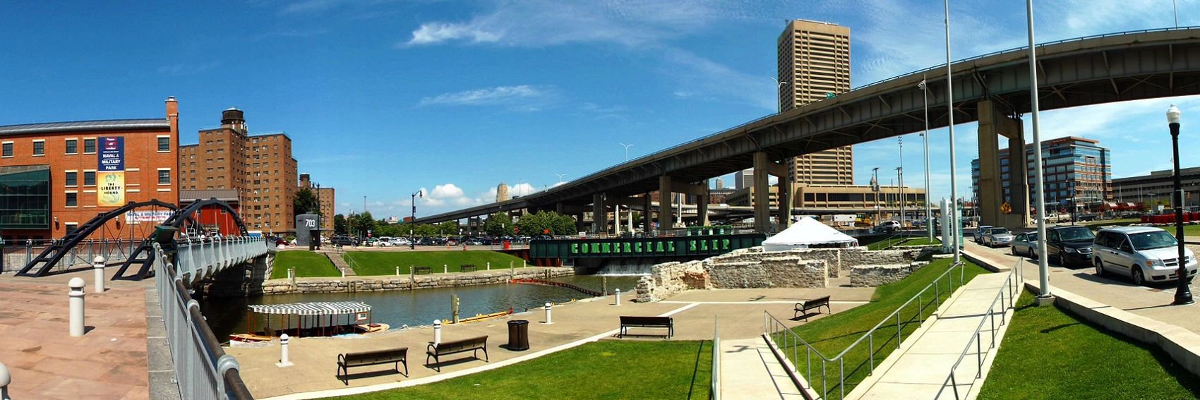
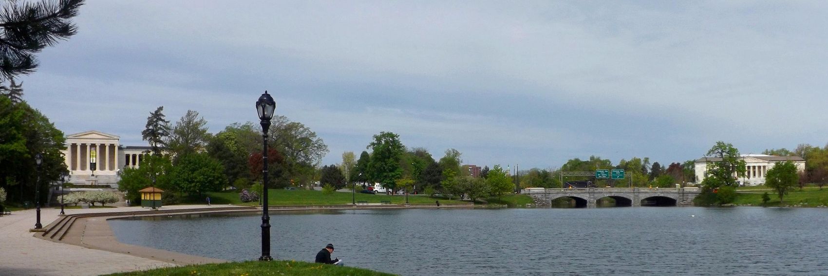
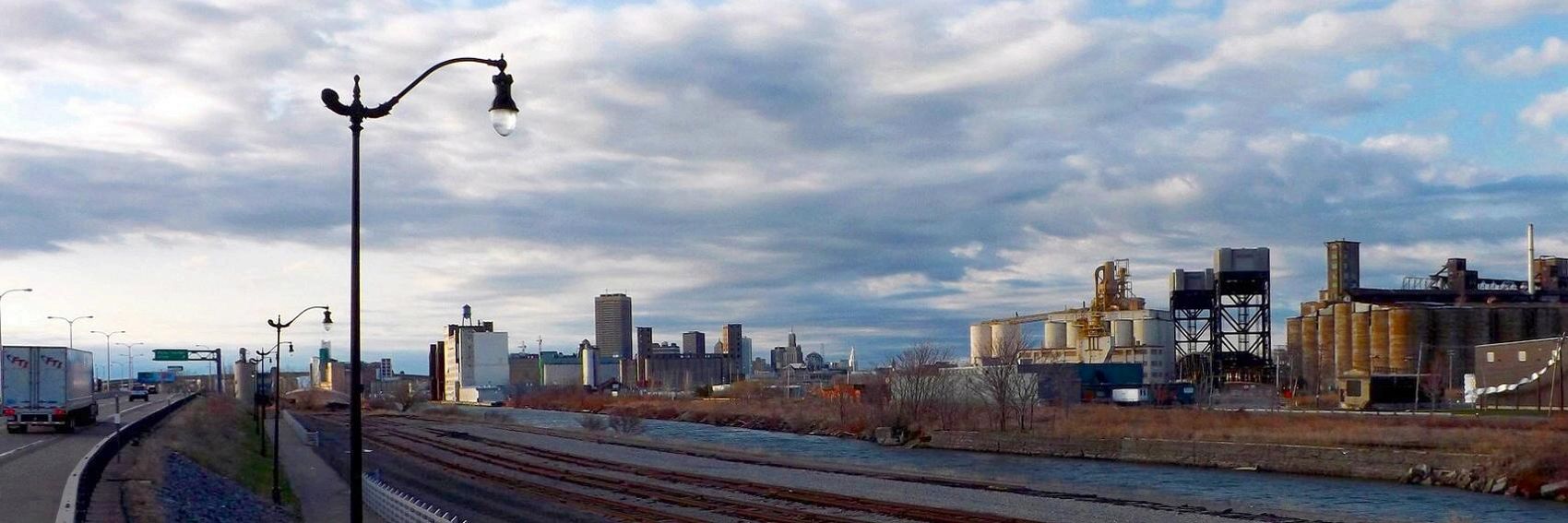
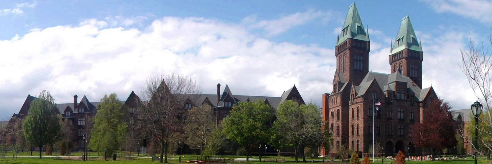
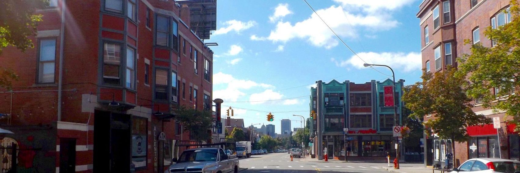
- This might be my Allentown bias talking (I live a three-minute walk from this corner), but my vote goes with #5. #2 is in second place: opinions were sharply divided about the use of that image as Buffalo's pagebanner, but I stand behind the arguments I made in the discussion thread I linked to, and it would be my first choice if not for the fact that it's already in use as the pagebanner. #6 is third as a marriage of the historic and modern, plus Canalside is certainly among the most touristed areas in Buffalo. #3 and #1 take fourth and fifth place, respectively: impressive as images, but a bit trite and clichéd (admittedly, I'm speaking as someone who knows the city well.) -- AndreCarrotflower (talk) 20:07, 19 August 2014 (UTC)
- Purely from a compositional point of view, #4 is the best, followed by #1. But there are other factors to consider, such as how well they represent the city. I want to like #2, I really do -- but I fear its message conflicts with that of the blurb, as there really isn't much in the way of surprises in the image. #6 is appealing as well, though a little busy; there's no natural focus for the eye to be drawn to. (I should also point out that some of your filenames for these locally-uploaded images conflict with filenames already on Commons; for example, compare File:BuffaloBanner4.jpg with commons:File:BuffaloBanner4.jpg.) Powers (talk) 20:15, 19 August 2014 (UTC)
- From someone who doesn't know much of anything about Buffalo: #6 (colorful & lively, shows many different things), #2, #3, #5, #1, #4. All banners look good, though.ϒpsilon (talk) 05:05, 20 August 2014 (UTC)
- I'd like to second Ypsilon's choice of #6: it has a pleasant atmosphere. Next, #2 and #4, purely based on aesthetics, I don't actually know Buffalo. --Danapit (talk) 08:22, 20 August 2014 (UTC)
- OK, I'm going to give you a reaction without reading others' remarks first, then have a look and see what I think afterwards. First, you did a great job, and there are several banners that I think would look good on the front page. Right now (this could change), I favor #3 slightly over #4 as my favorites. After that comes #6, but while it's a very good picture, I'm not sure what's surprising about it, nor does it include world-class architecture. #2 is a great picture but seems at variance with the caption; I no longer find the scene ugly, as I did initially, but I don't see the great architecture in it, except maybe as tiny shapes in the background. Following that would be #1, which is a pleasant scene and fine but probably not as compelling as a pagebanner for Buffalo. #5 is the least interesting picture, to my eyes. OK, now I'll read the rest of the thread and see what others thought. Ikan Kekek (talk) 07:40, 3 September 2014 (UTC)
- I found everyone's views interesting but haven't changed mine. To be fair, though, I have been to Buffalo only a few times (though I liked it), and the last time was probably over 10 years ago. Ikan Kekek (talk) 07:47, 3 September 2014 (UTC)
- JuliasTravels, you've been an active participant lately in the banner discussions. We've got nothing approaching a consensus on which Buffalo banner to use; would you care to opine? -- AndreCarrotflower (talk) 03:29, 10 January 2015 (UTC)
- I'm partial to either #5 or #6. I like #2 a lot as it seems the most like Buffalo as I remember it, but don't like the lamppost going through the text, and it doesn't look as good with the text moved to the right. That said, any of them but #1 should be fine - #1 doesn't look like Buffalo to me (my first thought when seeing it was DC). -- Ryan • (talk) • 03:38, 10 January 2015 (UTC)
- As a complete outsider, #6 does leave me with the most positive "feel", even when there's no world class architecture on it. The colours are bright, the composition is interesting, there are things going on. In terms of which image would more likely tempt me to read the article, it's #6. Content-wise I like #3 (although the light isn't as nice) and #4 (although that composition is a bit boring to my taste). #2 may represent the most accurate general view of this city, but it's probably not what makes it interesting or surprising to a traveller and doesn't support the positive blurb. It comes last for me. This is actually a though call, all would work.JuliasTravels (talk) 16:02, 10 January 2015 (UTC)
- I'm going to have to speak up against #6. I believe there is some significant fisheye distortion going on here that may not be apparent at first glance. Look, for instance, at the benches near the center of the image; they shouldn't appear curved like that. (Also, I believe the two bridges are, in real life, parallel!) While it's certainly bright and colorful and enticing, compositionally it lacks focus; it's just a jumble of colors and weird angles with nothing to draw the viewer's eye. Powers (talk) 19:03, 10 January 2015 (UTC)
- Okay, I take back what I said about the fisheye. The bridges are not parallel (I've only been to Canalside once!), and the distortion isn't as bad as I thought. The Skyway still veers off at a weird angle in the upper right, though; that stretch of the Skyway is supposed to be straight. And I stand by the composition concerns. Powers (talk) 19:06, 10 January 2015 (UTC)
- I have very ambiguous feelings about #6, because while on the one hand it's the best banner of the six in terms of content (Canalside is by far the densest concentration of tourist attractions in Buffalo), on the other hand Powers is right about its composition: it's extremely "busy" and full of weird lines that lead the eye all over the image and away from any central subject to focus on, and judged on those grounds it's the weakest of the six banners, I think.
- I'm going to make a last-ditch plea in favor of #5, which is my favorite of the six but is only in the middle of the pack according to the overall aggregate opinion. It's got a really attractive composition with a great sort of layered three-dimensionality, and it also depicts many of the things described in the blurb: the downtown skyline in the background testifying to a dynamic city and fine late-19th Century architecture in the foreground. And - while I admit that non-locals may not be able to identify the picture as being of Allentown, or Allentown's identity as being a hip, artsy enclave that's completely different from the outsider's perspective of Buffalo - I still think that some of the signs, street art, and other details of the image carry that connotation through a little bit.
- -- AndreCarrotflower (talk) 22:55, 10 January 2015 (UTC)
- I understand what you were going for with #5, but to me it just looks like a fairly generic light-urban intersection. Looking closer I can see a bit of street art and a small "Allentown" sign but I don't think most people will look that closely when it's on the main page. Powers (talk) 00:44, 13 January 2015 (UTC)
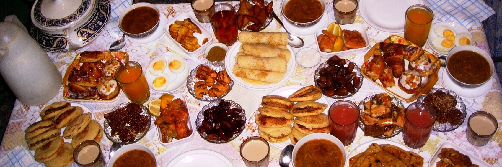
Travelling during Ramadan is one of the finest FTT candidates to come along in a while, chock full of well-presented, high-quality information - but I had quite a hard time finding images that reflect all that great content. Where on Earth, for example, could I find an image that depicts the concept of fasting? There are probably millions of images on Commons that include people but exclude food or drinks, but very few of them really drive home the point that those folks are not eating. What about the idea of Ramadan as a month of the Islamic lunar calendar? Should I find an image of a calendar? And how on Earth would I make such an image have the visual pizzazz that a good banner needs?
So, widening the scope of acceptable images to include pretty much anything smacking of Islamic spirituality, I came up with three banners that I think are pretty good. Let's hear your thoughts on them.
-- AndreCarrotflower (talk) 23:12, 11 March 2015 (UTC)
![]()

![]()

![]()
![]()

![]()

![]()

My vote goes with #1, and #2 is a very close second. #2 is better-proportioned vis-à-vis the text box, and its content dovetails nicely with that of the article - but holy moly, is #1 a visually arresting image. Meanwhile, the Eid al-Fitr feast depicted in #3 is a topic that's covered at length in the article, but it seems counterintuitive (perhaps even misleading) to use an image of food for an article on a month best known for sunrise-to-sunset fasting.-- AndreCarrotflower (talk) 23:12, 11 March 2015 (UTC)- Andrew: Why you think its misleading to use image of food? Well despite the fact, Ramadan is month of fasting - month of hunger strike - but the thing is without Iftar meals, there's no Ramadan. Iftar is one of the essence of Ramadan so its absolutely fine to showcase Ramadan through food photos. And While prayers are not relevant for a non-Muslim but Iftar and decorated and lighten-up mosques are. Anyways, I would go for either food image or mosque image and I've few banner recommendations as well. --Saqib (talk) 23:49, 11 March 2015 (UTC)
- I like the banners you made, Saqib, particularly #5 which is my new favorite. #1 is in second place; same idea as #5 but not executed as well. For third place it's a toss-up between #2 and #4: I'm coming around to the idea of a food banner, because non-Muslim tourists during Ramadan would likely be more impressed by the iftar feasts than a fast they're most likely not participating in. But, on the other hand, even if a non-Muslim would not participate in a prayer like the one shown in #2, he would at least see scenes like this one, right? Than after that, #6 and in last place #3. -- AndreCarrotflower (talk) 00:08, 12 March 2015 (UTC)
- Great selection! I'd go for #5 followed closely by #1. Both of them are eyecatchers. As for food banners, I believe they'd be relevant, too. Here I prefer #4, because there are probably less individual objects, but the remotes in the upper left disturb me a bit. Danapit (talk) 10:53, 12 March 2015 (UTC)
- Me go for #5, followed by #4. --Saqib (talk) 11:24, 12 March 2015 (UTC)
- Nice banners. Iftar absolutely is an important part of Ramadan in particular, as is the sunset. The mosques and the prayer take place all around the year (actually if our article on Islam would become FTT we already have banner candidates right here!). So, here is my ranking: #4, #5, #1, #2, #3, #6 ϒpsilon (talk) 13:17, 12 March 2015 (UTC)
- I favor #2, because it gets across the feeling of solemnity. After that, I'd rank the food pictures, #4 and #3, second and third. Somehow, of the (other) mosque pictures, #5 appeals to me most. Ikan Kekek (talk) 07:00, 16 April 2015 (UTC)
![]()

![]()
![]()

![]()
![]()
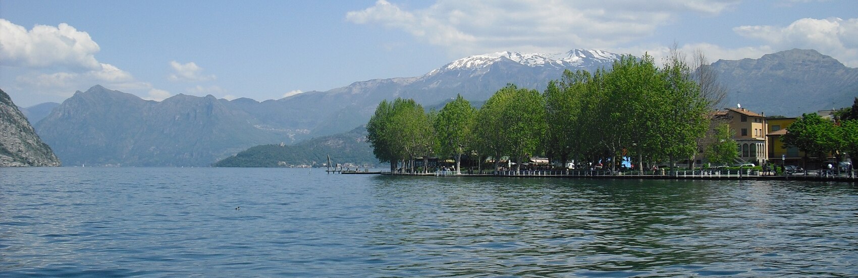
- The second banner is by far the best, in my opinion. It's a clear picture in good weather and a beautiful composition. The first banner is too cloudy, and the third one, which is a bit hazy and has cranes and two little people seemingly rising out of the water in the foreground, is not that beautiful and somewhat problematic to me. Ikan Kekek (talk) 01:55, 2 October 2014 (UTC)
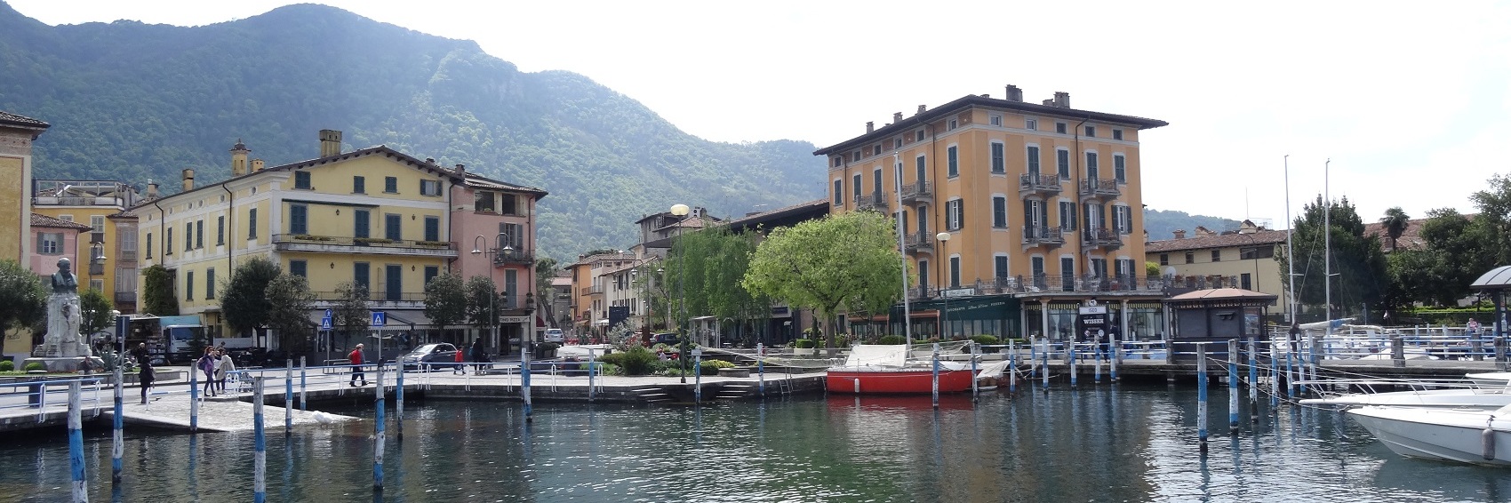
- I also think the caption needs editing. Most readers will have no idea where Franciacorta and Val Camonica are. How about: "This delightful Northern Italian town is in the midst of picturesque hilly countryside on the banks of Lake Iseo"? How's that? Ikan Kekek (talk) 02:03, 2 October 2014 (UTC)
- Agree with Ikan about Banner #2, but I'd like to see more options before I throw my full support behind it. All these banners are monotonously similar to each other. Obviously the lake shore and the mountains are the main drawing point, but surely there are other sides to Iseo that might be shown.
- Also, just for future reference, I think we really need to stay away from putting banners on this page for features that are extremely far in the future and/or aren't even on the schedule yet. It seems to me that if we try to put nominees on the Main Page as quickly as feasible to keep them from cluttering the dotm page, the same should be true for clutter on this page. (I admit that I've played a role in setting this precedent with the Buffalo banners above, but I think given the long, drawn-out history of Buffalo as a DotM nominee, that's a bit of a different circumstance.)
- -- AndreCarrotflower (talk) 02:30, 2 October 2014 (UTC)
- I'm sorry to have uploaded these banners too early ... In the following months I'll try to take some photos in Iseo to create other pagebanners or to cut some photos from commons. AndreCarrotflower you are right, in Iseo there aren't only the lake and the mountains, I'll try to create something with the castle and with Piazza Garibaldi. --Lkcl it (Talk) 15:26, 2 October 2014 (UTC)
- As others have said, the banners are quite similar to each other as they all show the same thing. Personally, I prefer the first one, the second one comes second, the last one last. ϒpsilon (talk) 18:46, 8 October 2014 (UTC)
- Agree with the second banner, I dont like the third, too much grey in it. Also the lack of country name is a problem in the caption. sats (talk) 00:48, 26 January 2015 (UTC)
- I have added two more banners. Please let me know if I have to transfer the first three banners to commons. Could someone also modify the caption: as I'm not a native speaker I'm not able to create a good one. Thanks --Lkcl it (Talk) 19:55, 11 March 2015 (UTC)
- Lkcl it - Saqib was mistaken. Main Page banners are hosted locally, so please don't transfer them to Commons. As to the blurb, I will be happy to modify it as soon as I get the chance. -- AndreCarrotflower (talk) 20:51, 11 March 2015 (UTC)
[unindent] Superb job on the blurb, just fabulous! Ikan Kekek (talk) 06:54, 16 April 2015 (UTC)
- Also, I still find that banner #2 is by far my favorite. Ikan Kekek (talk) 06:55, 16 April 2015 (UTC)
- Thanks AndreCarrotflower for the blurb, it is fantastic. Said that my favourites banners are (in order) #2 and #5. --Lkcl it (Talk) 16:48, 16 April 2015 (UTC)
Several of these banners fall under weird variations of the CC license: #2 is CC-BY-SA-3.0-AT, and #3 is CC-BY-SA-2.5. Can someone create templates for these categories of images, much as we did with 4.0 and 1.0 Public Domain? -- AndreCarrotflower (talk) 00:24, 5 February 2015 (UTC)
![]()

![]()

![]()
![]()

- #2 is the clear winner for me, with its beautiful composition and bright sunny sky. After that, #1 and #4 are in a tight race for second place, but I give the edge to #1 - not sure why, I just do. #3 is nice, but the text box is in an awkward position (moving it to the left worsens matters, and the dimensions of the source image make it exceedingly difficult to solve the problem with a re-crop). -- AndreCarrotflower (talk) 00:24, 5 February 2015 (UTC)
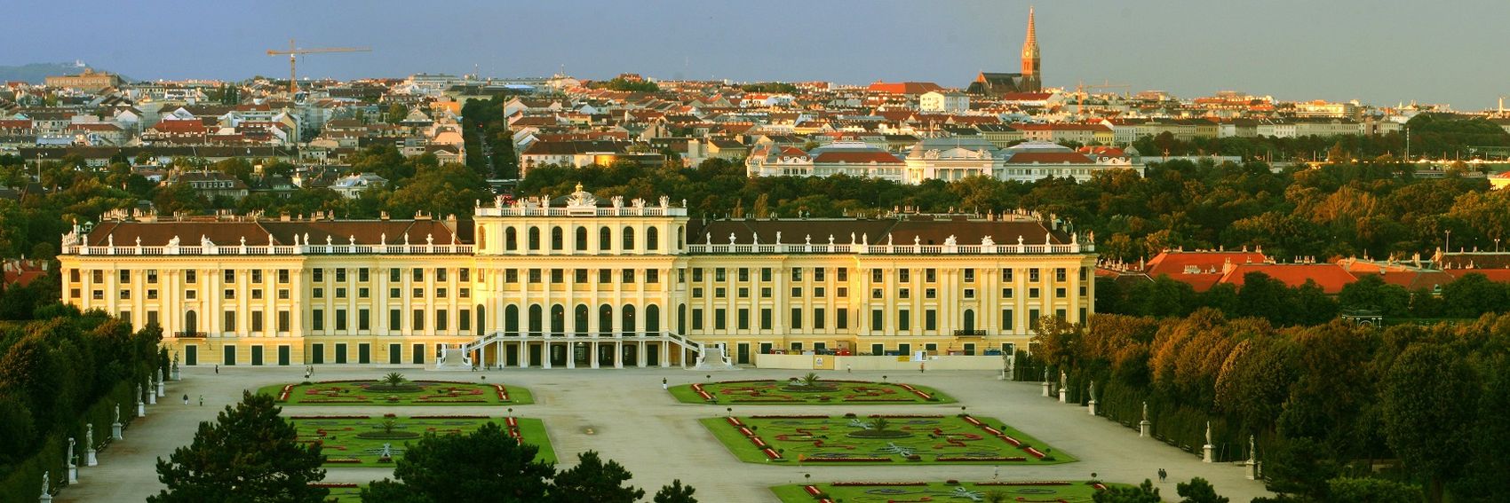
From a standpoint of pure beauty, I favor #2 as well. If the object is to show the Imperial alongside the modern, #3, which also has a dramatic sunset, is best (I rate it second, overall). #1 is a very solid and quite acceptable #3.Edit: Whoops, somehow, I didn't see #1. So my order is #3, #1, #4, #2.
- I have to quibble with the wording of the blurb, though. Vienna was the home town of neither Mozart, who ran there from Salzburg, nor Beethoven, who was from Bonn. "The home of Mozart, Beethoven and Freud" would be fine. Ikan Kekek (talk) 04:50, 5 February 2015 (UTC)
- Ikan - "The home of..." is such an overused phrase, but I do see your point. What do you think of the current wording? -- AndreCarrotflower (talk) 13:18, 5 February 2015 (UTC)
- I find it fine. Thanks, AndreCarrotflower. Ikan Kekek (talk) 13:20, 5 February 2015 (UTC)
- We have to have a palace for Vienna! So: 3,2,1,4 ϒpsilon (talk) 10:16, 5 February 2015 (UTC)
- N.B.: Creative Commons licenses after version 1.0 allow relicensing of derivative works under any later license. So you can go ahead and use 3.0 or 4.0 for them. Powers (talk) 02:36, 6 February 2015 (UTC)
- In terms of wording, we now have the "home" word twice in one blurb. Can we use "hosts" or an alternative for the Song Festival? As for the banner, it's #2, #3, #4, #1 for me. JuliasTravels (talk) 08:57, 5 March 2015 (UTC)
- JuliasTravels - Sorry for the belated reply. The reuse of the word "home" was intentional; an attempt to link the beginning and end of the blurb together. "It was once the home of Mozart, Beethoven, and Freud, now it's the home of the 2015 Eurovision". -- AndreCarrotflower (talk) 18:53, 10 March 2015 (UTC)
- Right, I missed that, AndreCarrotflower. In the wording of your explanation it works better than in the blurb, for me. Maybe it's just that calling a place the "home" of a travelling, 1-night competition seems unnatural to me. It's not very important though :-) JuliasTravels (talk) 22:26, 10 March 2015 (UTC)
- JuliasTravels - Sorry for the belated reply. The reuse of the word "home" was intentional; an attempt to link the beginning and end of the blurb together. "It was once the home of Mozart, Beethoven, and Freud, now it's the home of the 2015 Eurovision". -- AndreCarrotflower (talk) 18:53, 10 March 2015 (UTC)
- Lovely! #2 (simply clear) and #4 (I like the colours, but dislike the blurb collision) for me, please. #3 is so so (blurb difficult to read) and #1 is rather grey... Danapit (talk) 18:59, 10 March 2015 (UTC)
- #2 is no doubt Vienna. --Saqib (talk) 19:08, 10 March 2015 (UTC)
At its core, Ad's Path is a very simple and straightforward concept: a walking path through the Belgian forest with outdoor sculptures placed at varying intervals alongside it. In other words, not too many variables to choose from in crafting a thematically diverse selection of Wikivoyage banners. That worked to my advantage, though, because the freedom of panorama issues pointed out by Polyglot limited my source material basically to the few photos he'd uploaded locally through the Fair Use doctrine: there was only one suitable image on Commons (Banner #4 here), and nothing at all on Flickr. In the end, of the "forest", "sculpture" and "path" elements, all the banners included at least two - so I'm satisfied. Vote away! -- AndreCarrotflower (talk) 23:39, 29 January 2015 (UTC)
![]()

![]()

![]()

![]()

![]()

- #2 would be an easy choice for me if not for the fact that the contrast between trees and sky makes the text blurb very difficult to read. Instead, #2 is in third place behind front-runner #1 and second-place finisher #3: I like the fact that in both of those the sculptures look as though they're "reading" the text blurb, but #3's composition suffers a bit because the figure is centered in the middle of the picture (impossible to avoid due to the dimensions of the source image). I included last-place #4 so there was an image that included an actual path, but there are no sculptures to be seen in the image. -- AndreCarrotflower (talk) 23:39, 29 January 2015 (UTC)
- Well, #4 is my favorite composition, but unusually for me, I won't rate it as my favorite for this purpose, because the reader gets no sense of what the path is about from that image. So instead, I'll suggest #1, with #3 the runner-up. #1 is a very distinctive image. I would rate #4 third, but with the caveat that it just looks like any path, and #2 last because I find it too glary. Ikan Kekek (talk) 04:20, 30 January 2015 (UTC)
- Another concern I had: do you foresee any issues with using a DotM banner sourced from a non-free image? There was a pretty vigorous discussion a while back about what circumstances, if any, justify the use of "fair use" images as article pagebanners, which was never resolved. If anything, given that DotM banners go on the Main Page and are thus given a far more prominent place on our site than any pagebanner, the question is even more apropos here. -- AndreCarrotflower (talk) 04:36, 30 January 2015 (UTC)
- If there's any likelihood that Wikimedia could get sued in a Belgian court and lose money over this, I'd have to say it's not worth it. Otherwise, it is. That's my only concern. Ikan Kekek (talk) 05:14, 30 January 2015 (UTC)
- Probably not - art. 22 of the law: "Once a work has been lawfully published, its author may not prohibit [...] reproduction and communication to the public of a work shown in a place accessible to the public where the aim of reproduction or communication to the public is not the work itself [...]". --Traveler100 (talk) 05:56, 30 January 2015 (UTC)
- Would it be worth taking some other images of the walk? (Although lightly to be a little misty or snowy this time of year). --Traveler100 (talk) 05:56, 30 January 2015 (UTC)
- If there's any likelihood that Wikimedia could get sued in a Belgian court and lose money over this, I'd have to say it's not worth it. Otherwise, it is. That's my only concern. Ikan Kekek (talk) 05:14, 30 January 2015 (UTC)
- Another concern I had: do you foresee any issues with using a DotM banner sourced from a non-free image? There was a pretty vigorous discussion a while back about what circumstances, if any, justify the use of "fair use" images as article pagebanners, which was never resolved. If anything, given that DotM banners go on the Main Page and are thus given a far more prominent place on our site than any pagebanner, the question is even more apropos here. -- AndreCarrotflower (talk) 04:36, 30 January 2015 (UTC)
- Hi Andre. I didn't realise you were looking for a suitable picture to create a banner from.
- Unfortunately #4 is in Doode Bemde, about 10km to the West, so people won't even encounter that on the described path. The stone on the left is one of the works of Ad, that's why you found it on Commons. It's not the main feature in the picture, that's probably why it didn't get removed. On the German WP page about Ad Wouters you can find more pictures. And of course, if you find a picture on Mapillary you like, I can upload it to this site from my collection. On Monday I can also go out and make some more pictures, if the weather allows.
- My favourite is #1. Funny how he seems victorious in that picture. In one of the original pictures the water body is behind him and then it's more obvious he's 'drowning'.
- Don't worry about the FOP issues too much. Ad Wouters won't sue anybody over the use of pictures of his work, the reason why I didn't get his explicit permission to upload these pictures to Commons, is that he is very approachable "irl", but not so much by email. And I'm not the insisting kind. When I met him, I did mention it a few times, but I never succeeded to convince him about the importance of his explicit permission. Usually we were also discussing other topics.
- One of the reasons, I didn 't upload all that many pictures here, is that I think I read somewhere that only pictures actually used in articles can be uploaded on this site. --Polyglot (talk) 06:36, 30 January 2015 (UTC)
- I uploaded pictures of 2 other statues wich include forest and road, instead of close-ups. They're on the talk page of the article. The second one seems like a good candidate to replace candidate #4. Although I don't know if people would notice the bat inside the tree trunk. It was hard to take good pictures of it. But I only realise such things when I'm back home already. Much of a photographer, I am not.
- I think I'd still vote for #1 though... I could go out today and make a picture of that work, so it includes the water body, the road and the forest. It snowed (a little) today, so not sure how representative that would be. The plastic will also not be as "shiny", anymore, it probably weathered a bit in the mean time.--Polyglot (talk) 08:16, 30 January 2015 (UTC)
- Thanks for uploading those pictures, but I'd be able to judge those pictures as banners only if someone turned them into banners. :-) Ikan Kekek (talk) 00:17, 31 January 2015 (UTC)
- I'm out of town for the weekend; will get to this when I get back. -- AndreCarrotflower (talk) 01:41, 1 February 2015 (UTC)
- Thanks for uploading those pictures, but I'd be able to judge those pictures as banners only if someone turned them into banners. :-) Ikan Kekek (talk) 00:17, 31 January 2015 (UTC)
- I'd prefer to have a banner with a statue in it, because that's what makes this walking route special. So #3, #1, #2 and lastly #4. But if there's a real risk that we would get in legal trouble for using pictures of the artwork, I'm happy with #4 too. ϒpsilon (talk) 06:13, 30 January 2015 (UTC)
- I just reread the thread you linked, AndreCarrotflower, and in that thread, there was a strong consensus that it's OK to have non-free images in pagebanners for articles like the one about Disneyland Paris, because what makes Disney theme parks distinctive is precisely the copyrighted Disney content. Similarly, Ad's Path is special not because it's any old path but because of Ad's sculptures, so I think we are likely to have a strong consensus that the pagebanner for the article - or in this case, the FTT banner - should consist of a combination of the greenery of the path's natural surroundings and at least part of a picture of a copyrighted sculpture. And in terms of the Belgian law that Traveler100 refers to, the aim of reproduction or communication wouldn't be a particular work by Ad but its representation as part of the experience of travelling on a path, which is the entire reason why Ad's Path is a travel itinerary article in the first place! Ikan Kekek (talk) 06:38, 30 January 2015 (UTC)
- If the main subject of the photo is the path with sculptures that just happened to be in the background then should be no issue. Any way, a "what travel information the Belgium's do not want you to see" legal case would be great advertising for Wikivoyage (just look at the Dyson case) :-) . --Traveler100 (talk) 07:22, 30 January 2015 (UTC)
- That's a good point. What was the Dyson case, though? Ikan Kekek (talk) 07:35, 30 January 2015 (UTC)
- Dyson made a comparative advert against other vacuum cleaners. This is against the law in Belgium. They paid the fine then came out with with an advert that basically said "the government would not allow them to say how good their product is". Created more visibility though news reports than an expensive marketing campaign. --Traveler100 (talk) 07:53, 30 January 2015 (UTC)
- I think the whole FOP issue is to protect the artists somehow (and apparently the Atomium, and financial interests involving it, in ways that elude me...), not so much about what people are not allowed to see of Belgium :-)--Polyglot (talk) 08:16, 30 January 2015 (UTC)
- There is no question that we are in the clear to use these images, for the same reason that a newspaper or travel magazine could use them. Powers (talk) 14:28, 30 January 2015 (UTC)
- I think the whole FOP issue is to protect the artists somehow (and apparently the Atomium, and financial interests involving it, in ways that elude me...), not so much about what people are not allowed to see of Belgium :-)--Polyglot (talk) 08:16, 30 January 2015 (UTC)
- Dyson made a comparative advert against other vacuum cleaners. This is against the law in Belgium. They paid the fine then came out with with an advert that basically said "the government would not allow them to say how good their product is". Created more visibility though news reports than an expensive marketing campaign. --Traveler100 (talk) 07:53, 30 January 2015 (UTC)
- That's a good point. What was the Dyson case, though? Ikan Kekek (talk) 07:35, 30 January 2015 (UTC)
- If the main subject of the photo is the path with sculptures that just happened to be in the background then should be no issue. Any way, a "what travel information the Belgium's do not want you to see" legal case would be great advertising for Wikivoyage (just look at the Dyson case) :-) . --Traveler100 (talk) 07:22, 30 January 2015 (UTC)
- I just reread the thread you linked, AndreCarrotflower, and in that thread, there was a strong consensus that it's OK to have non-free images in pagebanners for articles like the one about Disneyland Paris, because what makes Disney theme parks distinctive is precisely the copyrighted Disney content. Similarly, Ad's Path is special not because it's any old path but because of Ad's sculptures, so I think we are likely to have a strong consensus that the pagebanner for the article - or in this case, the FTT banner - should consist of a combination of the greenery of the path's natural surroundings and at least part of a picture of a copyrighted sculpture. And in terms of the Belgian law that Traveler100 refers to, the aim of reproduction or communication wouldn't be a particular work by Ad but its representation as part of the experience of travelling on a path, which is the entire reason why Ad's Path is a travel itinerary article in the first place! Ikan Kekek (talk) 06:38, 30 January 2015 (UTC)
[unindent] I think I like the newly-added #5 best now. Ikan Kekek (talk) 20:36, 2 February 2015 (UTC)
- The new banner doesn't include any information on licensing or the identity of the source image. Traveler100, per the terms of the Creative Commons license you have to include that information when uploading images. I like Banner #5 okay, but it would be nice if I could figure out what its source image is, because I'd like to re-crop it so the figure is slightly right of center, looking toward the text blurb. -- AndreCarrotflower (talk) 22:09, 4 February 2015 (UTC)

- I have uploaded the original, so you can see if there is a better place to crop. Issue is the tree to the left gets in the way. This version has not been light adjusted. Also it was created by stitching four photographs together, do you want those? --Traveler100 (talk) 08:17, 5 February 2015 (UTC)
- I like the 5th one with both path, statue and nature, best. ϒpsilon (talk) 10:03, 5 February 2015 (UTC)
- You're right about the tree, Traveler100 - it's quite an impediment if we want to recrop the image in that direction. I'd just as soon leave it be. As for where it ranks among my preferred banners: I still think #s 1, 2 and 3 have better compositions than #5, but the issue of the content of the image trumps all of that: #5 depicts a statue, the path, and the forest, and thus I can't justify not giving it my vote as best banner. -- AndreCarrotflower (talk) 13:35, 6 February 2015 (UTC)
- I'm sorry to say there is something unnatural about the 5th composition. It seems like the statue was pasted on top of it. It stands out somehow. Lack of shadow? Did you notice the 2 images I added to the talk page of Ad's Path? I went out to make some more pictures of The Bat last Monday, but it's very hard to make good pictures of it. Bat on Mapillary I also made some more of the recycled plastic one, but by the time I got there, it was getting dark. --Polyglot (talk) 07:54, 8 February 2015 (UTC)
- It would be possible to re-crop the original image to include the base and shadow. Can still avoid the tree to the left and would add the path to the right. Should a different cut of the image be added as new alternate or override the current? --Traveler100 (talk) 08:07, 8 February 2015 (UTC)
- I'm sorry to say there is something unnatural about the 5th composition. It seems like the statue was pasted on top of it. It stands out somehow. Lack of shadow? Did you notice the 2 images I added to the talk page of Ad's Path? I went out to make some more pictures of The Bat last Monday, but it's very hard to make good pictures of it. Bat on Mapillary I also made some more of the recycled plastic one, but by the time I got there, it was getting dark. --Polyglot (talk) 07:54, 8 February 2015 (UTC)
- You're right about the tree, Traveler100 - it's quite an impediment if we want to recrop the image in that direction. I'd just as soon leave it be. As for where it ranks among my preferred banners: I still think #s 1, 2 and 3 have better compositions than #5, but the issue of the content of the image trumps all of that: #5 depicts a statue, the path, and the forest, and thus I can't justify not giving it my vote as best banner. -- AndreCarrotflower (talk) 13:35, 6 February 2015 (UTC)
- I like the 5th one with both path, statue and nature, best. ϒpsilon (talk) 10:03, 5 February 2015 (UTC)
- I have uploaded the original, so you can see if there is a better place to crop. Issue is the tree to the left gets in the way. This version has not been light adjusted. Also it was created by stitching four photographs together, do you want those? --Traveler100 (talk) 08:17, 5 February 2015 (UTC)
I had a bit of a time trying to find suitable images for the article. I think the resulting banners are attractive enough, but a little too samey for my tastes. Vote away! -- AndreCarrotflower (talk) 00:27, 29 January 2015 (UTC)
![]()
![]()
![]()
![]()
- #2 is my vote because of its excellent composition; #1 is a very close second - it's a more interesting image, but the text box clashes with it slightly. #4 is in third place as a scene that is attractive if not terribly representative of the surrounding landscape (awfully green for a desert!), while #3 might not have come in last place if so much hadn't had to be cut off from the bottom of the image. -- AndreCarrotflower (talk) 00:27, 29 January 2015 (UTC)
- I agree with your assessments. I'm curious what each banner (especially 2 and 4) depicts, however, and how well they represent the town. Powers (talk) 02:01, 29 January 2015 (UTC)
- One more vote for the beautiful #2. #3 with the military plane looks interesting and is my second choice, on the third place #1 and lastly #4. ϒpsilon (talk) 06:07, 29 January 2015 (UTC)
- Congratulations! I like every one of these banners! I think I'd rank them 2, 1, 3, 4. I agree that #2 is a great scene and composition; #1 is a very intriguing rockscape; the military plane over the pretty, characteristic landscape speaks to the area's military history. #4 is a beautiful, lush scene, so as you said, AndreCarrotflower. Ikan Kekek (talk) 06:20, 29 January 2015 (UTC)
- Powers: #1 is a picture of the Council Rocks in Coronado National Forest. Upon closer inspection, I don't know if it qualifies for consideration: it's located nearby to Sierra Vista but also close to Tombstone, and neither of those articles have clearly demarcated "boundaries" to determine in a geographical sense exactly what is and is not covered. It's not a listed POI in either article, but it is a view that's typical of the area. #2 was taken at Brown Canyon Ranch with the Huachuca Mountains in the background. #3 is an A-10 taking off from Fort Huachuca. #4 was taken at the Ramsey Canyon Preserve.
- Ikan and Ypsi (and Powers too): One of the things that bothered me about #3 was its composition. I just now recropped the original image, placing the airplane in a much less awkward position further from the top margin at the expense of showing less of the mountains in the foreground. Which do you prefer? Does this change anyone's votes?
- That does improve things. I still would rate #2 as my favorite, but I'd rate this one second, especially given what you posted above about #1 being a little questionable geographically in relation to Sierra Vista. Ikan Kekek (talk) 15:39, 29 January 2015 (UTC)
- Pinging StellarD: as the principal author of most of our coverage of Southern Arizona, in your opinion would the Council Rocks qualify as being in Sierra Vista for the purposes of our banner selection? -- AndreCarrotflower (talk) 15:43, 29 January 2015 (UTC)
- It's an improvement, but I'll still stay with #2. It's like from a western movie! :) ϒpsilon (talk) 17:53, 29 January 2015 (UTC)
Overall I'm not quite as happy with these images as the ones for Ninoy Aquino International Airport, but they're still pretty good, I think. In terms of subject matter for potential banner images, I found the Classical Gardens disproportionately inspiring, but as a UNESCO heritage site and Suzhou's premier destination for visitors, I don't suppose that's a huge problem. Vote away! -- AndreCarrotflower (talk) 05:53, 22 January 2015 (UTC)
![]()

![]()
![]()

![]()

- First off, #s 2 and 4 leave a bad taste in my mouth because of what had to be cropped out of the source images, so others may see things differently from me. The peaceful greenery of #1 makes it my first choice; #4 is a very close second, and would be first if only there had been some way to keep the lovely pond in the foreground within the margins of the banner without cropping off the top of the pagoda. #2 is in third place, with less greenery but crisper, brighter colors than the others. -- AndreCarrotflower (talk) 05:53, 22 January 2015 (UTC)
- I like #3 most, then #1, #2 and lastly #4 which looks a bit hazy and dark. --ϒpsilon (talk) 06:16, 22 January 2015 (UTC)
- I think these are all excellent, and I'd be happy with any one of them. And since I really don't feel I can pick between the different photos, I'll pick #3 as my favorite because the text box is least obtrusive and almost feels like part of the photo. Although on looking at the photos more, I think I find the composition of that picture most harmonious, too. Ikan Kekek (talk) 06:38, 22 January 2015 (UTC)
- It's #3 for me too, just the most appealing image and colours. #4 is last for me, in part because hazy urban scenes in China leave me with involuntary thoughts of smog, and I'm sure I'm not alone in that. JuliasTravels (talk) 21:40, 24 January 2015 (UTC)
- Concur with others over 3 - it has the telltale red objects, such a typical indoor chinese colour, outside. agree 4 is too close to the truth of china - haze, and not appealing. even 2 has detectable haze. Does the text really have to have the american spelling for centre? sats (talk) 01:11, 26 January 2015 (UTC)
- Sats - per Wikivoyage:Spelling#National varieties of English, "If the destination has no history of using English and no clear preference for the variety to use, we prefer US English spelling." -- AndreCarrotflower (talk) 22:43, 27 January 2015 (UTC)
- But unless things have changed since 2004, the last time I was in China, they do have a clear preference for British spelling of buildings such as "Cultural Centre." Ikan Kekek (talk) 09:58, 28 January 2015 (UTC)
- I have no preference between British and U.S. spelling, I was just going by the absence of China on the list of example countries at Wikivoyage:Spelling#National varieties of English where one or the other variety is preferred. If consensus says we should change the blurb, I don't object. -- AndreCarrotflower (talk) 14:47, 29 January 2015 (UTC)
- But unless things have changed since 2004, the last time I was in China, they do have a clear preference for British spelling of buildings such as "Cultural Centre." Ikan Kekek (talk) 09:58, 28 January 2015 (UTC)
- Sats - per Wikivoyage:Spelling#National varieties of English, "If the destination has no history of using English and no clear preference for the variety to use, we prefer US English spelling." -- AndreCarrotflower (talk) 22:43, 27 January 2015 (UTC)
![]()
![]()

![]()

![]()

- The conundrum I had with these banners is that, by the article's own admission, there's nothing particularly distinctive about MNL that would aid in determining what does and does not make a good banner image. Image #1 takes a different approach than the rest of the quartet: it's not identifiable as an airport, but it is identifiably Manila, being a statue of the late Ninoy Aquino himself who was assassinated not far from here. Also, it's the only banner that depicts one of the few points of interest within the airport that are described by the article. That leaves #s 2, 3 and 4, which were chosen for aesthetic consideration only. Of these, my favorite is #3, composed perfectly such that the text does not block out anything but sky. Close on its heels are #2, which shows some moderately interesting modern architecture, and #4, which has nice symmetry and a voluminous effect that I like. So, the final breakdown is #1 in first, then #3, #2, and finally #4. -- AndreCarrotflower (talk) 20:27, 21 January 2015 (UTC)
- 1, 2, 3, 4 ϒpsilon (talk) 20:47, 21 January 2015 (UTC)
- For me, 2, 4, 1, 3. The first two shots might not be that distinctive, but they're good. 3 shows a building, but it's not an interesting image to view, in my opinion. 1, for the reasons you state. Ikan Kekek (talk) 21:20, 21 January 2015 (UTC)
- The text Manila's unpopular airport ? intriguing, 1 seems the most appropriate as it has history related to it and context, 2 has a sense of something, but really 4 and 3 follow after sats (talk) 01:06, 26 January 2015 (UTC)
- 1, 2, 3, 4, with #1 as a clear winner to me as it is a surprising and thus interesting image for an airport article. JuliasTravels (talk) 09:01, 5 March 2015 (UTC)
Let's hear your votes. -- AndreCarrotflower (talk) 19:40, 8 January 2015 (UTC)
![]()

![]()

![]()

![]()
- Gosh, I'm really torn here. Any of these would be great to have on the Main Page. I suppose #3 is my favorite because it's got a little bit of everything: the towering mountains, the cityscape, the harbor, and the Antractic cruise-ship traffic that (let's face it) is still Ushuaia's top tourist draw. #4 has all the elements of #3 except the cruise ships, which is why it's very slightly behind #3 for second place on my list. (On the other hand, I like the perspective of looking down from the mountains a little bit better...) #1 is a scene from Tierra del Fuego National Park, which is covered in the article at length, and it's a more remote-looking view that's fitting for the southern tip of the world, and it also depicts the world's southernmost post office - but Ushuaia itself is nowhere to be found in the picture. If we were featuring Tierra del Fuego National Park this banner would be more of a contender, but in this case it's third place. #2 is a majestic mountain view that would probably place higher than fourth in a field of four, but for the stiff competition. -- AndreCarrotflower (talk) 19:40, 8 January 2015 (UTC)
- Would it be better to put the textbox for #1 on the left side? The image looks more balanced as it is now, but it also blocks out the mountains in the upper right corner. -- AndreCarrotflower (talk) 19:41, 8 January 2015 (UTC)
- #4 shows the town and the surrounding landscape well, but could it be cropped a little higher so there is less of the shed roof in the foreground and a little more sky. Would also help with text clarity. --Traveler100 (talk) 20:01, 8 January 2015 (UTC)
- A pretty and scenic town makes for fantastic banners, so it's not easy to choose. I'd like to give my vote to #1, because despite not depicting Ushuaia itself it has a certain "end of the world" feeling, then #3, after that #4 and lastly #2. Also, I agree the textbox in the first one could be put on the left side to make the mountains further away more visible. ϒpsilon (talk) 20:07, 8 January 2015 (UTC)
- My favorite photo is #2, but if it's not a picture of Ushuaia, shouldn't it be excluded from consideration? Let's make a decision about this before we go further. Ikan Kekek (talk) 20:23, 8 January 2015 (UTC)
- Banner #2 shows Ushuaia. #1 does unlike the other banners not depict downtown Ushuaia but the world's southernmost post office on an island a few kilometers away (POI 4 in Ushuaia's See section). ϒpsilon (talk) 20:34, 8 January 2015 (UTC)
- Traveler100: While not the most photogenic part of the banner, IMO the shed roof and other foreground elements are important in establishing a sense of perspective: this isn't a bird's-eye view from a tall building or whatever; you're actually looking down the slope of a mountain into town. Also, it would be exceedingly difficult if not impossible to crop the picture so the text box doesn't clash with the mountains without pushing most of the townscape off the bottom margin. -- AndreCarrotflower (talk) 00:26, 9 January 2015 (UTC)
- Banner #2 shows Ushuaia. #1 does unlike the other banners not depict downtown Ushuaia but the world's southernmost post office on an island a few kilometers away (POI 4 in Ushuaia's See section). ϒpsilon (talk) 20:34, 8 January 2015 (UTC)
- My favorite photo is #2, but if it's not a picture of Ushuaia, shouldn't it be excluded from consideration? Let's make a decision about this before we go further. Ikan Kekek (talk) 20:23, 8 January 2015 (UTC)
- A pretty and scenic town makes for fantastic banners, so it's not easy to choose. I'd like to give my vote to #1, because despite not depicting Ushuaia itself it has a certain "end of the world" feeling, then #3, after that #4 and lastly #2. Also, I agree the textbox in the first one could be put on the left side to make the mountains further away more visible. ϒpsilon (talk) 20:07, 8 January 2015 (UTC)
- #4 shows the town and the surrounding landscape well, but could it be cropped a little higher so there is less of the shed roof in the foreground and a little more sky. Would also help with text clarity. --Traveler100 (talk) 20:01, 8 January 2015 (UTC)
- Would it be better to put the textbox for #1 on the left side? The image looks more balanced as it is now, but it also blocks out the mountains in the upper right corner. -- AndreCarrotflower (talk) 19:41, 8 January 2015 (UTC)
- Either #3 or #4. Most travelers visiting Ushuaia are there to depart for Antarctica, so including the port seems important, but the town's charms are in the surrounding mountains and the Beagle Channel - both #3 and #4 capture those things. #1 is nice, but it's an image of the neighboring national park and not the city, and #2 looks too generic to me and isn't something that seems to represent Ushuaia well. -- Ryan • (talk) • 03:57, 10 January 2015 (UTC)
- Agree with 3 and 4 - I have problemss with the clash of the clutter of textbox and image - but if it was down to the wire 3. I really like 2 as an image that resonates with books that I have read about the area, but again for the area - it is too generic - it could be anywhere. sats (talk) 01:03, 26 January 2015 (UTC)
I'm really pleased with how these banners came out. Hope you all are too. -- AndreCarrotflower (talk) 23:27, 7 January 2015 (UTC)
![]()
![]()
![]()

![]()
- #1 is probably closest to the classic image of the Khao San Road area if the blurb and the article are to be believed, but the image strikes me as too busy - especially behind the textbox, making it a bit hard to read the blurb. #2 is a great image that depicts one of the main attractions of the district (the Democracy Monument) in a fairly unusual way. I especially like the motion shot of the cars on the street. #3 is basically the same idea as #1; I included it in case there were any misgivings about the warningbox on #1's source image. Finally, despite the fact that the content of the image is somewhat at odds with what the blurb says, its composition makes #4 my favorite of the quartet.
- So, to recap: #4 is my vote, followed by #2, with #1 in third place.
- I'm very torn on these, because I really like #1, #2 and #4, and it's hard to pick between them. I'll say this, though: The street scene really gets across the feeling of walking there, but #2 and #4 are more arresting images, and I find #4 the more arresting, so I suppose I'll give my vote of support to it, too. I don't find #3 as nice a photo as #1, and in such a crowded place, I don't think we have to worry about a few recognizable but presumably non-famous people being visible in what's somewhat of a crowd shot. Ikan Kekek (talk) 00:14, 8 January 2015 (UTC)
- A banner for a district where backpackers can eat, drink and be merry? That'd be either #1 or #3 but as the latter has warmer colors, I'll swim against the current and vote for #3. After that #1. Then #4 ("little doubt we're in Thailand"), and while it's interesting, there's only the last place left for banner #2. ϒpsilon (talk) 20:21, 8 January 2015 (UTC)
- Shifting the textbox on #1 to the left eliminates the readability issue. Powers (talk) 20:48, 8 January 2015 (UTC)
- For me, Khao San Road needs an image that breaths the bustling backpacker atmosphere of the area. While I like the image of #4, and it's clearly Thailand, it doesn't remind me of Khao San Road at all. I must admit I've not spent a lot of time there, but still. It's too generic for my liking. I prefer #1 or #3. JuliasTravels (talk) 22:43, 9 January 2015 (UTC)
- I don't recall if I visited Khao San Road when I was in Bangkok or not, but of these four, #1 is the one that most reminds me of what it felt like to roam around that city. -- Ryan • (talk) • 03:52, 10 January 2015 (UTC)
Let's hear your votes! -- AndreCarrotflower (talk) 18:32, 2 January 2015 (UTC)
![]()

![]()

![]()

![]()

- Touch choice here. When selecting the source photos, I expected to - and still want to - support #4 head and shoulders above the rest. Instead, it's an exceedingly close race, to the point of being almost a complete toss-up, between all four of these options. If pressed, I'd say #4 still takes the top prize because of its simple yet elegant composition and also because none of the sign is obscured by the text blurb. Second place goes to #1 due to practical utility - a visitor to Finland is more likely to find himself shopping in a supermarket than walking across a frozen lake, I would imagine - and while the text blurb does encroach onto the edges of the salient parts of the image, it's not as noticeable as on #s 2 and 3. Third place goes to #2, because of the attractive wintry landscape in the background. -- AndreCarrotflower (talk) 18:32, 2 January 2015 (UTC)
- Andre, great job! #4 for me please, because it is so clean and clear :) #1 comes next, here I like the (Swedish ;)) colors. I also like photo in #2, but the blurb is too obstructed here. Danapit (talk) 19:44, 2 January 2015 (UTC)
- I actually like #4 best, and I don't think it's close, but then I care more about composition than some people do. Ikan Kekek (talk) 20:04, 2 January 2015 (UTC)
- My worry with #4 was that its simplicity and minimalism were so extreme as to actually work against it in terms of visual appeal; one might say the image doesn't depict much of anything. I'm glad to see that folks seem not to think that's the case. -- AndreCarrotflower (talk) 20:15, 2 January 2015 (UTC)
- Oikein hienoja bannereita, kuten aina (really fine banners, like always)! Both #1 and #4 are my favorites. #4 is really elegant, even as lakes aren't frozen over but for a couple of months every year (here in the south occasionally not even that). #1 is indeed a very typical view, S Market is probably the most common grocery store chain. #2 isn't bad either and could perhaps also work if Saariselkä would become OtBP some winter month. Finally... sorry to say but the parking fine warning of #3 has text in both Finnish and the "second domestic language" so it ends up last.
- Ps. #4 reminded me of
the Finnish version of The Shininga psychedelic 1980's TV informercial for children whose purpose was toscare the s*** out of usteach kids not to walk on thin ice. :P ϒpsilon (talk) 20:50, 2 January 2015 (UTC)- For the benefit of the rest of us, what's the translation of the sign in #4? I don't know that it's usually important but in this case I think it is. Powers (talk) 22:01, 2 January 2015 (UTC)
- Literally: "Watch out. Weak ice." ϒpsilon (talk) 22:07, 2 January 2015 (UTC)
- For the benefit of the rest of us, what's the translation of the sign in #4? I don't know that it's usually important but in this case I think it is. Powers (talk) 22:01, 2 January 2015 (UTC)
- The best one is #4 hands down, for me. I really like the clean composition. A weak ice warning seems pretty essential to understand, so even content-wise it makes good sense :-) JuliasTravels (talk) 20:35, 5 January 2015 (UTC)
- I like #4 the by far the best as well - it's a nice picture, and given the subject an amusing banner choice. -- Ryan • (talk) • 03:46, 10 January 2015 (UTC)
- A sense of humour - 4 - is the only one sats (talk) 00:58, 26 January 2015 (UTC)
We have Saqib and his efforts with Wiki Loves Monuments Pakistan to thank for my favorite Kirthar banner. Thank you once again for your tireless contributions! -- AndreCarrotflower (talk) 17:25, 9 December 2014 (UTC)
![]()

![]()

![]()

![]()

- #3 for me - what a great photo. #s 1 and 2 are in a tight competition for second place, but despite its poorer photo quality, I'm giving the edge to #2 because it depicts one of the attractions mentioned in the blurb (wildlife) and it's also not used in the body of the article. #4 is interesting aesthetically but it's not a great depiction of its subject matter. -- AndreCarrotflower (talk) 17:25, 9 December 2014 (UTC)
- Thanks Andrew. So nice to see time has come to select the banner image. If you want to go with number 3 then please crop a good quality image from Ranikot003.jpg, File:Ranikot004.jpg, File:Ranikot011.jpg. --Saqib (talk) 17:41, 9 December 2014 (UTC)
- These are beautiful! I love #1 and would favor it purely on the basis of composition, but since it looks to an untrained eye like it could be in Arizona (probably not true if I were more expert on flora), I think I have to put it in 2nd place behind #3, which is not only a striking composition but also gives a real sense of place. I'd put #2 in 3rd place, and I agree with AndreCarrotflower's evaluation of #4. Ikan Kekek (talk) 17:50, 9 December 2014 (UTC)
- #2 because I prefer banners with people, animals or activity, then #3, #1 and #4 . ϒpsilon (talk) 21:49, 13 December 2014 (UTC)
- Great images. I could live with them all, but #3 is a particularly good image. For second place, I'd say #2. JuliasTravels (talk) 20:21, 6 January 2015 (UTC)
- Okay sorry for getting late to this. I've preference for banner # 3, but here I present a better quality image. --Saqib (talk) 22:30, 6 January 2015 (UTC)
- I like number 4 - it is something much more unique. 3 and 5 have the unfortunate resonance with similar images and angles for china, as a consequence, what little I know about the country, 2 and 4 suggest something that is unique to this location, 1 could be anywhere. sats (talk) 00:57, 26 January 2015 (UTC)
![]()

- Magnificent, Saqib. That one is my choice. -- AndreCarrotflower (talk) 22:57, 6 January 2015 (UTC)
- Yes, this is terrific. I vote for this one, too. Ikan Kekek (talk) 01:08, 7 January 2015 (UTC)
Let's hear your votes! -- AndreCarrotflower (talk) 16:38, 9 December 2014 (UTC)
![]()

![]()
![]()
![]()
- When I found the original image on Commons, I was expecting #4 to easily take my first-place vote: the framing effect of the window of Fort Jesus complements the image of the beach interestingly, and it depicts two of Mombasa's biggest tourist draws in one go. But aesthetically, it just doesn't pop out at me like #s 2 and 3 do. It's almost a toss-up which of those two I like better, but #2 is more colorful so it gets my vote. So here's the breakdown: #2 first, then #3, #4 in third place, and the pleasant but somewhat boring #1 in last. -- AndreCarrotflower (talk) 16:38, 9 December 2014 (UTC)
- Good job as usual! I actually do prefer #4. I like the framing of the new through the old. My 2nd choice is #1, which gets the point across that this is a place with history, and it's a good composition. After that, I prefer #3 slightly to #2 and only slightly less than #1, because though I prefer the image in #2, #3 has a better composition, in that I enjoy moving my eye around it more. Ikan Kekek (talk) 16:57, 9 December 2014 (UTC)
- Ikan has a good point, #4 indeed shows both the Fort and the beach line so that one gets my vote. Then the lively #3, the bright colored #2 and on the last place #1. ϒpsilon (talk) 21:57, 13 December 2014 (UTC)
- I'm with Andrew; #2 for me. #4 gives an overview, sure, but #2 makes me want to go there most. The colours are great. JuliasTravels (talk) 20:18, 6 January 2015 (UTC)
- I concur with the colour and composition of #2 - much more attractive than #4 - I am not really, with a tourist eye so happy with 1 and 3 - there is something offputting sats (talk) 00:51, 26 January 2015 (UTC)
An interesting conundrum here, to create a beautiful banner depicting a mostly ugly topic. -- AndreCarrotflower (talk) 15:28, 4 November 2014 (UTC)
![]()

![]()
![]()

![]()

![]()

- I doubt this is going to be a popular sentiment, but I prefer #2.
- #3 would easily take my prize if aesthetics were the only factor to consider, as it is obviously the most beautiful image, but therein lies the rub. Winter driving is, and is depicted in the article as being, an inherently dangerous, difficult and unpleasant task, and #3 does not advance that part of the narrative at all. #2, on the other hand, shows a far more realistic side of winter driving, with the water droplets on the windshield at left lending the image a bit of vérité realism - and, personally, I think its simple composition and lonely, bleak feel give it a beauty of its own. #1 might be described as a middle ground between #2 and #3, but it's also a fairly boring image. Meanwhile, while there's nothing particularly unique or surprising about #4, it's a solid choice as well, fairly nice-looking (the red snowplow gives it a splash of color that the other images lack) and a realistic depiction of the subject matter.
- The breakdown for me, then, is as follows: #2 first, then #4, #3, and #1 in last place.
- -- AndreCarrotflower (talk) 15:28, 4 November 2014 (UTC)
- I would agree with you on #2 if not for the dang bird, and the water on the camera lens. Those factors push me to prefer #1, but it's close. Powers (talk) 18:15, 4 November 2014 (UTC)
- Oh, and it's a shame this image isn't higher resolution. =) Powers (talk) 18:17, 4 November 2014 (UTC)
- The banner for Winter driving definitely should have some slush, sleet and whirling snow. So: #2, #4, #1, #3. ϒpsilon (talk) 20:24, 4 November 2014 (UTC)
- Powers, the Blizzard of '77 in Buffalo would make a better banner for Winter non-driving, or perhaps Winter side-of-the-road car abandonment - unless you owned a snowmobile, you probably weren't on the roads at all that week. :)
- The banner for Winter driving definitely should have some slush, sleet and whirling snow. So: #2, #4, #1, #3. ϒpsilon (talk) 20:24, 4 November 2014 (UTC)
- Oh, and it's a shame this image isn't higher resolution. =) Powers (talk) 18:17, 4 November 2014 (UTC)
- I would agree with you on #2 if not for the dang bird, and the water on the camera lens. Those factors push me to prefer #1, but it's close. Powers (talk) 18:15, 4 November 2014 (UTC)
- Anyway, if you look closely at #2, especially at the half-melted snowflakes above and to the right of the car, you'll see that it was taken from inside of a car, and the water droplets at left are therefore on the windshield, not the camera lens. That's why I say it lends the image an extra bit of realism: it's taken from the point of view of a winter driver.
- Your arguments about #2 are meritorious, but I prefer #3 on aesthetic grounds. #2 is my clear 2nd choice, though. After that, I'd pick #1 and #4 in no particular order, but I like #3 and #2 a lot better. Ikan Kekek (talk) 08:26, 6 November 2014 (UTC)
- Added another option actually showing driving in the snow for consideration. I think either #2 or #5 fits the article subject best.--Traveler100 (talk) 19:51, 6 January 2015 (UTC)
- I think #4 is the most interesting composition given the subject, and would rank these as #4, #3, #2, #1, #5. -- Ryan • (talk) • 03:43, 10 January 2015 (UTC)
Sadly, the best images of Saba on both Commons and Flickr were either too small or not copyleft-compatible. Still, I think I did a respectable job finding attractive images depicting a range of subject matter (not that the range of subject matter on all of Saba is terribly ample). Please vote! -- AndreCarrotflower (talk) 14:52, 29 October 2014 (UTC)
![]()
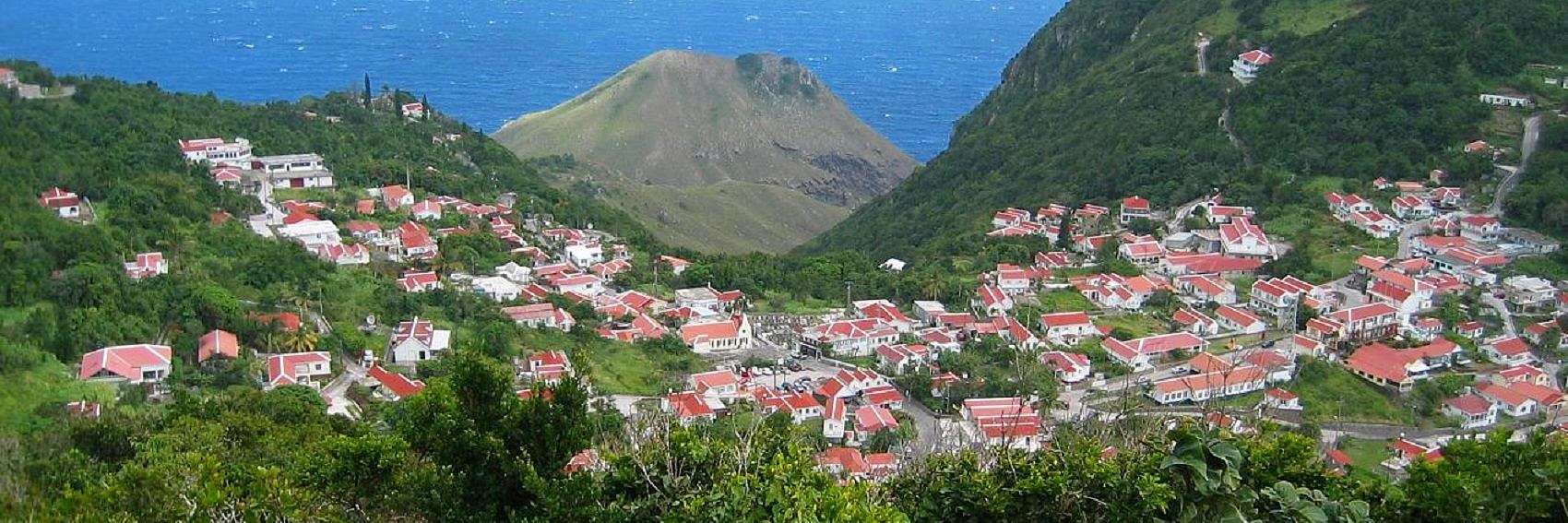
![]()

![]()

![]()

- Tough choice, but I have to go with #1 here as it's most similar to the type of banner image I'd have liked if all those too-small and copyleft-incompatible files had been in play. For second place, #3 over #2 by a nose. -- AndreCarrotflower (talk) 14:52, 29 October 2014 (UTC)
- I think all of these are great! Which one gives the greatest sense of the place? If we can establish that, that's the one we should go with. Ikan Kekek (talk) 06:16, 30 October 2014 (UTC)
- Nice banners. I like #3 most as it shows a variety of things - probably the famous The Road along the mountain side?, a village further away and the ocean behind it. On second place #1 (typical Saban panorama if we look at the photos Commons offers), third place #4 (the highest mountain in the Netherlands, I guess) and on the last place #2 (pretty flowers but a bit boring). ϒpsilon (talk) 20:17, 30 October 2014 (UTC)
- I won't argue with your ranking, which sounds logical, but I certainly don't find the landscape in #2 the least bit boring. Ikan Kekek (talk) 09:12, 31 October 2014 (UTC)
- IMHO something is "missing" from #2, it could use a boat, a building, some people or something else. --ϒpsilon (talk) 20:33, 4 November 2014 (UTC)
- Well, the article on Saba emphasizes its lack of excitement and things to do other than lay around in the sun, so perhaps #2 is apropos in that regard. -- AndreCarrotflower (talk) 20:37, 4 November 2014 (UTC)
- I think either #1 or #2 are the best - the colors on #3 seem washed out, and I don't find the composition on #4 to be as interesting as the others. -- Ryan • (talk) • 03:40, 10 January 2015 (UTC)
![]()

![]()
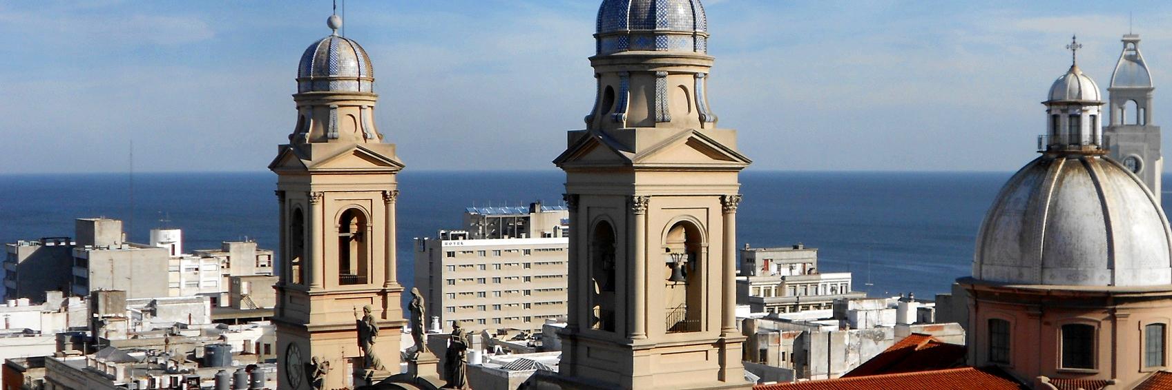
![]()
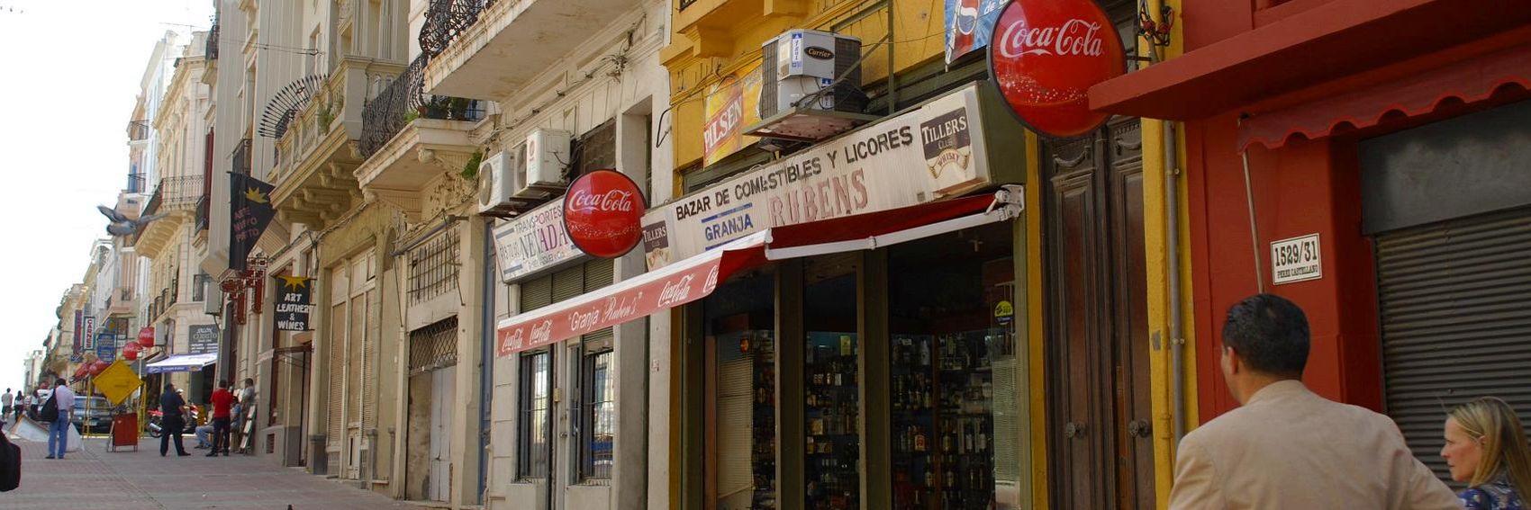
![]()

- For me they go in descending order, with #3 a very close third behind #2. -- AndreCarrotflower (talk) 16:45, 16 October 2014 (UTC)
- #1 - the heart of Montevideo is also my number one, despite the weather being cloudy in the photo, then #3, #4 and #2. ϒpsilon (talk) 17:53, 16 October 2014 (UTC)
- I really like the image in #1, but is there any way to straighten out that image? I really don't like that weird slanting on both ends. Ikan Kekek (talk) 08:43, 19 October 2014 (UTC)
- I rather like the slanting; it emphasizes the buildings' height. -- AndreCarrotflower (talk) 14:54, 29 October 2014 (UTC)
- The buildings aren't so tall, are they? Ikan Kekek (talk) 09:13, 31 October 2014 (UTC)
- The one immediately to the left of the statue appears to be at least 12 if not 13 stories, and that's one of the less tall ones in the image. -- AndreCarrotflower (talk) 17:55, 1 November 2014 (UTC)
- For the record: the tall art deco building to the left, Palacio Salvo, is 95 meters high. The others buildings are about a third to a half of it. In Ikan's home city I believe they'd be pretty invisible. ;) ϒpsilon (talk) 18:29, 1 November 2014 (UTC)
- Right. Or in Tokyo, Shanghai, or many other cities. So, going back to my question, is there any way to straighten out that image? It would be good to at least have a look at a straightened image by comparison with this slanted one. Ikan Kekek (talk) 19:53, 1 November 2014 (UTC)
- To be clear, the image is not unstraight in any way. It's only that your eyes are used to seeing vertical surfaces appearing vertical, so buildings look slanted when you take a camera and look up at them. Perspective can be corrected with image editing tools; one good example is hugin. Here is a tutorial on how to do it in that program. Powers (talk) 15:59, 2 November 2014 (UTC)
- Right. Or in Tokyo, Shanghai, or many other cities. So, going back to my question, is there any way to straighten out that image? It would be good to at least have a look at a straightened image by comparison with this slanted one. Ikan Kekek (talk) 19:53, 1 November 2014 (UTC)
- For the record: the tall art deco building to the left, Palacio Salvo, is 95 meters high. The others buildings are about a third to a half of it. In Ikan's home city I believe they'd be pretty invisible. ;) ϒpsilon (talk) 18:29, 1 November 2014 (UTC)
- The one immediately to the left of the statue appears to be at least 12 if not 13 stories, and that's one of the less tall ones in the image. -- AndreCarrotflower (talk) 17:55, 1 November 2014 (UTC)
- The buildings aren't so tall, are they? Ikan Kekek (talk) 09:13, 31 October 2014 (UTC)
- I rather like the slanting; it emphasizes the buildings' height. -- AndreCarrotflower (talk) 14:54, 29 October 2014 (UTC)