Wikivoyage:Destination of the month candidates/Banners/Archive/2021
| DotM banner archives: 2013 • 2014 • 2015 • 2016 • 2017 • 2018 • 2019 • 2020 • 2021 • 2022 • 2023 • 2024 |
Archived banners for destinations featured on the Main Page in 2021.
European classical music
editWe might have to run this article early, as Diving the Cape Peninsula and False Bay/Percy's Hole and Public transit in Israel could be put on hold for travel restrictions.
- Both good banners, but I prefer the first, which also has the virtue of being a view an audience is likely to see. Ikan Kekek (talk) 08:20, 29 November 2021 (UTC)
- Being a former musician, I was going to say the second one because that's the view I'm always used to seeing. However, from a travelers point of view, the first is better, and it's been long since I was a musician. So just like Ikan, I prefer the first. SHB2000 (talk | contribs | meta.wikimedia) 12:24, 29 November 2021 (UTC)
- Slightly prefer the first per others. --Comment by Selfie City (talk) (contributions) 03:10, 1 December 2021 (UTC)
With less than two months to go, here's some banners for Montserrat. SHB2000 (talk | contribs | meta.wikimedia) 08:42, 28 October 2021 (UTC)
- In my opinion, definitely banner 2 for me. SHB2000 (talk | contribs | meta.wikimedia) 09:13, 28 October 2021 (UTC)
- I like them both, but 2 is more dramatic. Ikan Kekek (talk) 07:21, 30 October 2021 (UTC)
- It'd be nice to have a photo of the deserted Plymouth, but it seems that Commons doesn't have any. SHB2000 (talk | contribs | meta.wikimedia) 07:28, 30 October 2021 (UTC)
- Banner 2: it fits nicely with the blurb. –LPfi (talk) 18:37, 22 November 2021 (UTC)
Time for the banners for Sydney. It was quite hard getting them to 1700x567 given that a lot of the photos out there on Commons are over 3000px in height. So if anyone has a better banner, it'll be well appreciated :-) Oh and the spelling on livability or liveability? According to the Macquarie Dictionary, Australia uses the US version (this is if anyone asks re the spelling). SHB2000 (talk | contribs | meta.wikimedia) 13:18, 7 October 2021 (UTC)
- The 1st banner is the obvious winner between these two. Ikan Kekek (talk) 13:37, 7 October 2021 (UTC)
- Banner #1 for me too. Also, I think larger banners are allowed, provided the height to width ratio 1:3 stays the same. --Ypsilon (talk) 18:03, 7 October 2021 (UTC)
- 1, 2, as #1 is Sydney’s iconic location. --Comment by Selfie City (talk | contributions) 20:16, 7 October 2021 (UTC)
- They are both good pictures, but #1 is a clear winner. As the photo in #1 is 12 years old, I assume that nothing significant has changed. I have created banners which are much bigger than 1700x567, but are 3:1 which is the main thing. (The instructions need updating.) AlasdairW (talk) 21:34, 7 October 2021 (UTC)
- Added a third one. SHB2000 (talk | contribs | meta.wikimedia) 21:43, 7 October 2021 (UTC)
- I think #3 is better than #2 but not quite as good as #1, which is still my favorite. --Comment by Selfie City (talk | contributions) 01:03, 9 October 2021 (UTC)
- Yeah. 1 and 3, with 2 a no for me. Ikan Kekek (talk) 03:16, 9 October 2021 (UTC)
- I think #3 is better than #2 but not quite as good as #1, which is still my favorite. --Comment by Selfie City (talk | contributions) 01:03, 9 October 2021 (UTC)
- Added a third one. SHB2000 (talk | contribs | meta.wikimedia) 21:43, 7 October 2021 (UTC)
- Definitely number 1 Tai123.123 (talk) 21:37, 10 October 2021 (UTC)
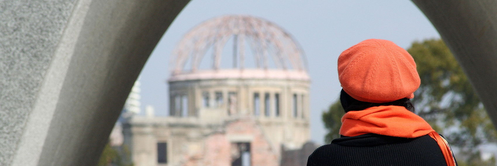
Recycling a banner candidate for April 2016's FTT, Nuclear tourism, depicting a woman below the Hiroshima Cenotaph looking at the Atomic Bomb Dome, both part of the Hiroshima Peace Memorial Park. Needless to say, other suggestions are welcome but I though why not bring this up again. --Ypsilon (talk) 16:40, 2 October 2021 (UTC)
- Added a photo of Pearl Harbor from a Japanese plane. /Yvwv (talk) 17:41, 2 October 2021 (UTC)
- Difficult call. I think I slightly prefer #1 as a tourist’s viewpoint. --Comment by Selfie City (talk | contributions) 17:43, 2 October 2021 (UTC)
- I'd also prefer #1 for the same reason as SelfieCity. SHB2000 (talk | contribs | meta.wikimedia) 23:16, 2 October 2021 (UTC)
- I vote for #2, which gets the historical aspect of the war across more, IMO. Ikan Kekek (talk) 05:09, 3 October 2021 (UTC)
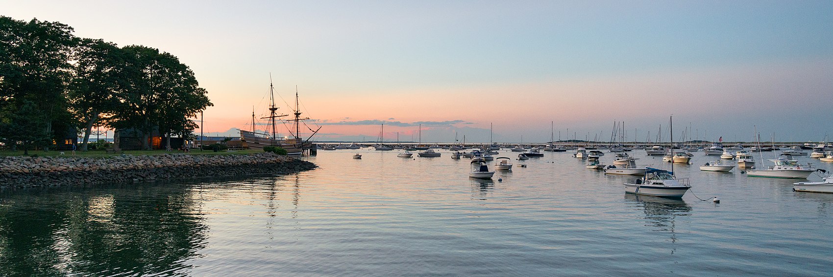
Contends Gävle for the November spot, if we want to honor the 400th anniversary of Thanksgiving. /Yvwv (talk) 12:51, 7 October 2021 (UTC)
- Banner 1 because of the image resolution. SHB2000 (talk | contribs | meta.wikimedia) 13:18, 7 October 2021 (UTC)
- 1, 2, 3. --Ypsilon (talk) 18:04, 7 October 2021 (UTC)
- 1 is the clear winner to me. Ikan Kekek (talk) 03:16, 9 October 2021 (UTC)
- I noticed Yvwv has added a third banner, after I voted, so I'm going 1, and then 3. 2 is a no for me. SHB2000 (talk | contribs | meta.wikimedia) 03:40, 9 October 2021 (UTC)
- 4, 1, 2, 3. #4 is by far the best, with an important scene well designed to fit the blurb. I have objections to all of the other three. In #1 the picture is mostly good (apart from some rather unusual color effects I did my best to counter in the editor), but unfortunately the blurb covers either the bridge or El Montazah. #2 has no glaring issues, other than that is appears bland. Unfortunately I couldn't figure out how to crop the image to show the whole building without the antenna or flag showing, which in my opinion weren't good for the aesthetic of the images. #3 isn't grainy, but something's not correct when you view closely, which I didn't when I picked the image, not to mention that it could be anywhere. --Comment by Selfie City (talk | contributions) 20:12, 14 September 2021 (UTC)
- All really picturesque. I may come back and vote later. Ikan Kekek (talk) 20:41, 14 September 2021 (UTC)
- #4, #1, #3. Thanks, all these are good images. AlasdairW (talk) 21:29, 14 September 2021 (UTC)
- 1, 3 and then 4 for me. SHB2000 (talk | contribs | meta.wikimedia) 00:30, 21 September 2021 (UTC)
- Beautiful banners, but #4 is just amazing. Then comes 1, 2, 3. Ypsilon (talk) 16:18, 1 October 2021 (UTC)
- What would #1 look like with the box on the other side? Or, a radical idea, what about with the box in the lower left corner on the water? Ikan Kekek (talk) 05:11, 3 October 2021 (UTC)
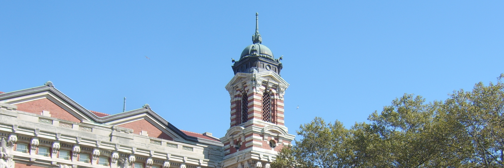
Banner #1 represents Ellis Island, banner #2 the public transport system at Sao Paolo, and the last tourist crowds at Montmartre in Paris. Is facial recognition an issue in the last photo? --Comment by Selfie City (talk | contributions) 15:24, 11 September 2021 (UTC)
- Two seemed the most popular so I added it. Tai123.123 (talk) 00:33, 21 September 2021 (UTC)
- Thanks; this conclusion was accurate. --Comment by Selfie City (talk | contributions) 01:17, 21 September 2021 (UTC)
- This is a hard one to come up with banners for. My favorite is the subway train #2, then #3 and #1. --Ypsilon (talk) 16:19, 11 September 2021 (UTC)
- 3, 2 and then 1. 3 gets across the feeling of crowds and possible chaos across, plus a view of a big city. 2 is clearly about arriving (or leaving or watching a train carrying people coming or going). 1 is part of a train station, but that's not obvious to everyone who doesn't recognize the building. Ikan Kekek (talk) 19:41, 11 September 2021 (UTC)
- #2 is a great banner, and conveys to me both the thrill and disorientation of being somewhere new. #3 also works, though for me is less effective.--ThunderingTyphoons! (talk) 22:24, 11 September 2021 (UTC)
- I am neutral between 2 and 3. Ellis Island is not recognizable like some of NY’s other sites such as the Statue of Liberty, and perhaps that’s why that banner didn’t work so well. I didn’t want to pick really famous landmarks that weren’t obviously topical (such as the statue) because the focus is on the overall topic and not any one destination. --Comment by Selfie City (talk | contributions) 16:37, 14 September 2021 (UTC)
- Indeed it isn't! I mistook this for a photo of a Dutch train station because the banner is missing most of the building! Ikan Kekek (talk) 20:40, 14 September 2021 (UTC)
- #2, #3. I think an underground station conveys the disorientation of an unfamiliar city well. AlasdairW (talk) 21:27, 14 September 2021 (UTC)
- 2 and then 3 for me. SHB2000 (talk | contribs | meta.wikimedia) 21:39, 14 September 2021 (UTC)
- Support --Ypsilon (talk) 16:55, 29 August 2021 (UTC)
- Looks good. Ikan Kekek (talk) 23:18, 29 August 2021 (UTC)
- Support. --Comment by Selfie City (talk | contributions) 23:19, 29 August 2021 (UTC)
- Support LGTM. SHB2000 (talk | contribs | meta.wikimedia) 00:03, 30 August 2021 (UTC)
- FTT banner time again! I don't really know anything about Game of Thrones, but if I understand correctly this fort in Dubrovnik beautifully sitting on a cliff, is apparently an important filming site. Ypsilon (talk) 16:54, 9 August 2021 (UTC)
- Support. Very nice banner. --Comment by Selfie City (talk | contributions) 17:01, 9 August 2021 (UTC)
- I don't know anything much about that show, either, but I like the banner, too! Ikan Kekek (talk) 20:58, 9 August 2021 (UTC)
- Support I like this, but if @Pashley: who is a huge fan of GoT finds a better banner, I'd go with it. SHB2000 (talk | contribs | meta.wikimedia) 22:51, 12 August 2021 (UTC)
- Support Pashley (talk) 23:37, 12 August 2021 (UTC)
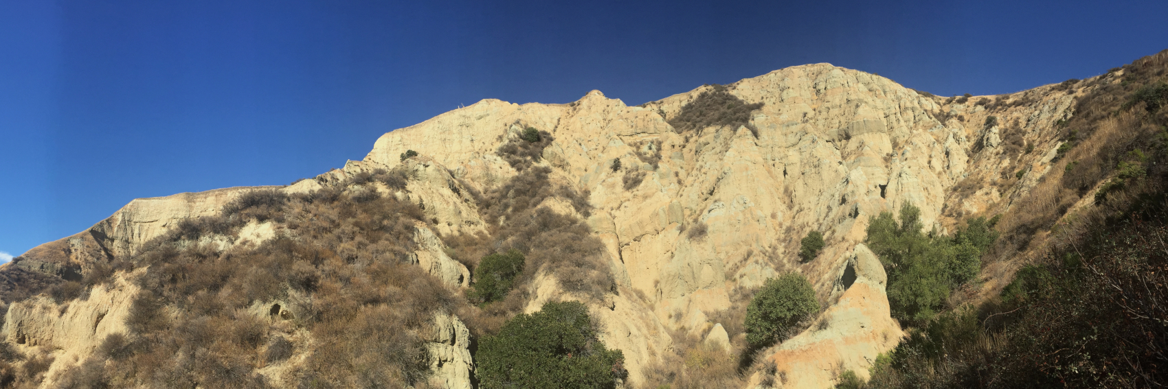
As a local I guess it's time to make some banners. I have created five, mostly from the northern part of the range. I was intending to use some from Henry Coe, Pacheco Pass, or San Benito Mountain, but unfortunately not many images were available for those places so I focused on the EBRPD. I'll look around for destinations in the Oakland Hills, as there are some interesting places there, but for now this is a decent selection.
Commentary to follow. --Comment by Selfie City (talk | contributions) 00:30, 1 August 2021 (UTC)
- The number of banners makes voting on this one complex. I'll start with #1, which (disclaimer) is my own picture, though not my favorite of this selection. The place itself is one of the mountain range's best points of interest, in my opinion, but the panoramic view causes some "fisheye" distortion, the lighting is far from perfect — notice the sky — and reaching the destination is, well, awkward. The trail to this place isn't marked on the park map, and particularly from the northern side it's easy to slip and hurt yourself. The "trail" up the cliff is even worse. So while it's not the worst, it's not the best either.
- #2 is a gem. The early autumn view (October, most likely) isn't typical in this one, as normally the grass is gray, not green, at this time of year. However, this only highlights the contrast of the autumn leaves against the background and the lighting is excellent. This must have been done by a professional photographer and while the scenery isn't as rugged as in the other shots, that's not an issue to me, given the blurb.
- #3 is another gem. Where else is there scenery like there is in Pinnacles? Again, excellent lighting, and maybe the banner should go to the right? I have made this change now. Most of the mountain range doesn't look like this, but since many tourists go to the Pinnacles, it's what many people will see of the Diablo Range. The competition is between this one and #2 for my favorite.
- #4 is, by comparison, dull. It looks like it's the northern side of Mission Peak, the side from which most ascents are done, but few go that far north of the peak itself. However, it must be said that the peak is an incredibly popular tourist destination (arguably the most of the entire Diablo Range) despite its relatively low elevation of approximately 1000 metres. Not sure whether to prioritize the face of Mission Peak or Mount Diablo on the background/right. The Sunol Quarries somewhat spoil the background view. The lighting is just okay in my opinion.
- I will replace #5, as it's already used as the pagebanner of the article.
- I have added 5b and plan for there to be a "5c" as the view from Mt. Hamilton (but not right now). 5b is of Mt. Hamilton and is a nice view of the snow, which occurs on average once every year or two. Unfortunately, it suffers from blurb placement, and I'm not sure anything can be done about that.
- Currently, my vote is 3, 6, 2, 5b, 1, 4. --Comment by Selfie City (talk | contributions) 00:42, 1 August 2021 (UTC)
3 is clearly the best quality image, followed by 1.The rest are interesting views, but a bit grainy.--ThunderingTyphoons! (talk) 10:17, 1 August 2021 (UTC)
- 3, 6, 1.--ThunderingTyphoons! (talk) 19:44, 3 August 2021 (UTC)
- I've added #6 to address the issues TT mentioned in the previous comment — to add another quality image for consideration. This is my second favorite now, after the Pinnacles image, as it represents the region well and possesses high quality. --Comment by Selfie City (talk | contributions) 13:00, 1 August 2021 (UTC)
- Banner 3 or 1. SHB2000 (talk | contribs | meta.wikimedia) 13:02, 1 August 2021 (UTC)
- Pretty cool sceneries. I like 6 most, then 2, 3, 5, 1, 4. Ypsilon (talk) 18:21, 3 August 2021 (UTC)
- Four to choose from for Ljubljana. There is a good selection of images on commons and alternatives would be welcome. I have restricted the choice to two views which I remember from visiting Ljubljana over 20 years ago.
- #1 is Ljubljana Castle.
- #2 is also Ljubljana Castle with the Turjak Fountain, and is by the same photographer as #1.
- #3 is the Triple Bridge, a daytime shot in early October
- #4 is the Triple Bridge at night
Which do you prefer? AlasdairW (talk) 22:13, 15 July 2021 (UTC)
- A good selection. My choices: 4, 3, 2, 1. Ground Zero (talk) 22:21, 15 July 2021 (UTC)
- 3, 4, 1, 2, but they're all beautiful in different ways. For me, it helps that #1 was taken at the right time of year.--ThunderingTyphoons! (talk) 14:47, 16 July 2021 (UTC)
- 3, 4, 2, 1. I like the surreal effect of the fountain in #2, but the composition of the overall photo isn't quite right. #3 seems like an excellent view to me, and #4 is almost as good. --Comment by Selfie City (talk | contributions) 14:50, 16 July 2021 (UTC)
- I like all of these and especially 2-4. 4 is kind of magical to me. My order is the same as Ground Zero's: 4, 3, 2, 1. Ikan Kekek (talk) 17:24, 16 July 2021 (UTC)
- 2, 4, 1, 3 and thanks for making these! :) --Ypsilon (talk) 20:06, 16 July 2021 (UTC)
- 4, 2, 3, 1. SHB2000 (talk | contribs | meta.wikimedia) 13:01, 1 August 2021 (UTC)
- Cropped from a photo of the Helsinki Velodrome taken by me this morning. :) --Ypsilon (talk) 16:06, 5 July 2021 (UTC)
- Very good. Ikan Kekek (talk) 23:35, 5 July 2021 (UTC)
- Trés bien. SHB2000 (talk | contribs | en.wikipedia) 06:58, 6 July 2021 (UTC)
- Support. --Comment by Selfie City (talk | contributions) 18:52, 6 July 2021 (UTC)
- I dunno, looks kind of functionalist to me. Oh that's the point? Well, in that case, support.--ThunderingTyphoons! (talk) 20:02, 9 July 2021 (UTC)
- Support. Functional photo! AlasdairW (talk) 22:13, 15 July 2021 (UTC)
- No matter how you look at it, the Bergen-Belsen camp site and the Holocaust is what Bergen is "famous" for, so I think a photo of the memorial stone is a good banner choice. --Ypsilon (talk) 16:06, 5 July 2021 (UTC)
- Fine banner. Ikan Kekek (talk) 23:35, 5 July 2021 (UTC)
- lgtm. SHB2000 (talk | contribs | en.wikipedia) 06:58, 6 July 2021 (UTC)
- Support. --Comment by Selfie City (talk | contributions) 18:52, 6 July 2021 (UTC)
One time long ago, I stated that it was "my personal goal to have at least three months' worth of featured-destination banners in queue at any given time". Today I'm proud to announce that I've reached that goal for the first time since the Antigua Guatemala DotM banners went live in November 2015.
In fact, to be more precise, that goal has been not only reached but exceeded - as you can see below, I have banners for Apia's August 2020 OtBP feature ready for your votes, and of course the Buffalo-Pittsburgh Highway banners went up a bit further in advance than usual as well.
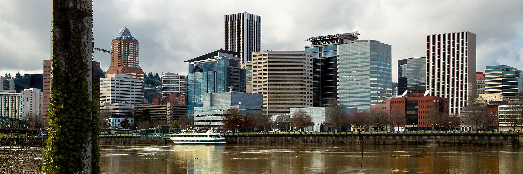
Anyway. Let's hear your votes on the three banner options for Portland's DotM feature.
-- AndreCarrotflower (talk) 01:32, 9 May 2020 (UTC)
- One of the greatest travel tragedies to ever befall me was when the hard drive of my laptop went kaput and I lost all the photos I'd taken on what's still the only trip I've ever taken the the U.S. west coast, in 2005 - the images I captured of the International Rose Test Gardens in Portland would have been perfect when it came time to make these banners. However, despite starting out biased in favor of #2, ultimately I have to give first place to #3, a scene from the 2019 "Witches' Paddle" on the Willammette River - what better encapsulation of the "keep Portland weird" motto? Last-place #1 seems to be a very popular photo spot, at least judging by all the similar images I found on Commons and Flickr, but of course, it's a generic skyline image of the type that tend toward the anonymous and that don't really tell the viewers much about a place. Not to mention that it dates to 2007, and therefore, in the case of a fast-growing city like Portland, said skyline might look very different today. -- AndreCarrotflower (talk) 01:32, 9 May 2020 (UTC)
- I like the idea of a banner that hints at the "Keep Portland Weird" motto, but unfortunately in #3 it's hard to tell what is going on if you haven't heard the phrase "Witches' Paddle", so the image doesn't end up conveying much of anything besides a bridge. At least that was my thought when I saw the photo. #1 is beautiful but, as you say, a somewhat generic skyline image. I'll say 2, 1, 3. —Granger (talk · contribs) 01:56, 9 May 2020 (UTC)
- I don't know what "Witches' paddle" is, but #3 is strange, interesting and unique, totally unlike any other banner we've ever run, and it draws me in most as a viewer, so it's my favorite. After that is the pretty view of #1 and the rose garden, #2. All are good. If anyone wants to try making another banner, see if you can find any pictures of public art of sufficient size. There are a bunch of nice statues Downtown. Ikan Kekek (talk) 02:51, 9 May 2020 (UTC)
- Andre, sorry about the hard drive, and your point about change in the skyline is well taken, but I don't know what to do about it. If we run #3, we have to worry less about that, though. Ikan Kekek (talk) 02:53, 9 May 2020 (UTC)
- It's ancient history at this point, and now that I think of the camera I owned at that time, the photos likely wouldn't have been high-res enough for banner use anyway. As for the statues downtown, keep in mind that public art does not fall under the auspices of freedom of panorama in U.S. copyright law, so we'd have to either stick to pre-1925 works or come up with a fair use rationale that would justify us uploading it locally (which may or may not be a viable option; I'm not well-versed enough in copyright law to say). -- AndreCarrotflower (talk) 02:59, 9 May 2020 (UTC)
- I didn't think of that. Some of the works are pre-1925, though, like the pioneer statue. But we don't really need more banners. I just liked a lot of the public art in Portland when I was there. -- Ikan Kekek (talk) 03:37, 9 May 2020 (UTC)
Question - as this article has not a single support vote to its name over on Wikivoyage:Destination_of_the_month_candidates#Portland_(Oregon), why are we voting on banners for it? --ThunderingTyphoons! (talk) 13:00, 9 May 2020 (UTC)
- 1, 3, 2, if this ever goes on the main page. --Comment by Selfie City (talk | contributions) 15:06, 9 May 2020 (UTC)
- I think I'll go for the skyline #1 which for some reason seems to have the highest resolution. #2 and #3 are about equally good, but the roses are already in the article's own banner, so I have a slight preference for the one with the paddlers. So 1, 3, 2. --Ypsilon (talk) 15:27, 9 May 2020 (UTC)
- 2, 3, 1. Prioritising subject matter over crispness. Gizza (roam) 12:43, 11 December 2020 (UTC)
I did five, having forgotten that these had already been done. Feel free to include them in your votes as we still have some time before this goes on the Main page:
Maybe none of them are as good, but that's OK as these were a mistake on my part anyway. --Comment by Selfie City (talk | contributions) 22:42, 18 June 2021 (UTC)
- I think they're good, though the one with the train is too gritty for me. I still think the weird third banner is best. It's very hard for me to pick between the others. Is there a way we could easily see all of these as they would look on the page and click back and forth between them? Ikan Kekek (talk) 06:22, 6 July 2021 (UTC)
- @Ikan Kekek: I must have missed your comment earlier, but I've done one quickly: User:SelfieCity/Tutorial. I don't understand what happens on the first slide but this is a basic concept I created quickly. --Comment by Selfie City (talk | contributions) 21:08, 16 July 2021 (UTC)
- Alright, here's my best effort: #3, #4, #1, #2, #6, #7, #8. Ikan Kekek (talk) 00:07, 17 July 2021 (UTC)
- A long & lonely road... --Ypsilon (talk) 17:04, 8 June 2021 (UTC)
- Looks kinda grainy. Interesting composition, though.--ThunderingTyphoons! (talk) 11:57, 9 June 2021 (UTC)
- Here's a link to pictures of the highway. Feel free to make any suggestions and I can crop them and add to the above picture. --Comment by Selfie City (talk | contributions) 12:28, 9 June 2021 (UTC)
- I like this banner and would be fine with running it, though if anyone contributes any others, I'd be happy to look at those. Ikan Kekek (talk) 13:37, 9 June 2021 (UTC)
- LGTM. SHB2000 (talk | contribs | en.wikipedia) 06:59, 6 July 2021 (UTC)
- =Looks good to me, in case anyone else wasn't sure. -- Ikan Kekek (talk) 18:50, 6 July 2021 (UTC)
- Comment in case anyone's wondering why I didn't follow up and add more suggestions, I came to the conclusion that while there are many images available, they don't offer perspectives different enough to be worth offering as alternatives. So I'm voting for this picture. --Comment by Selfie City (talk | contributions) 21:01, 16 July 2021 (UTC)
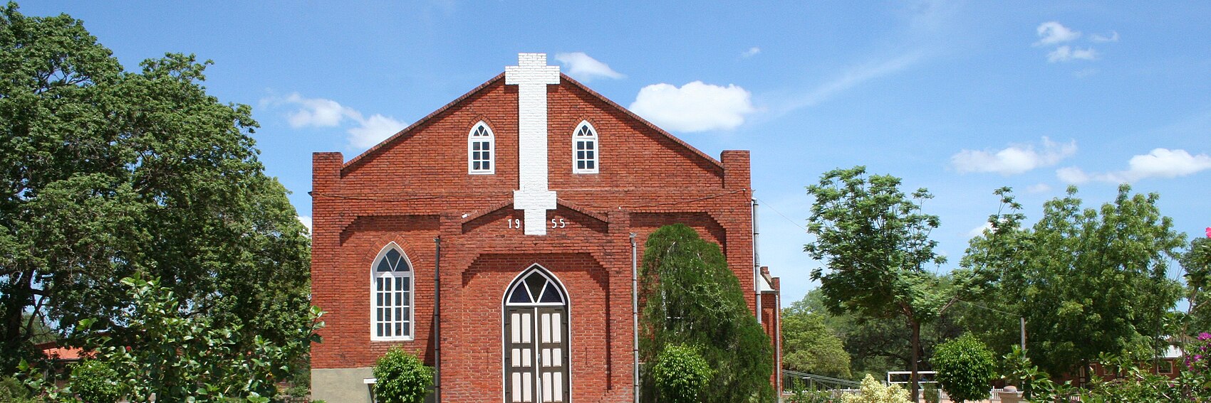
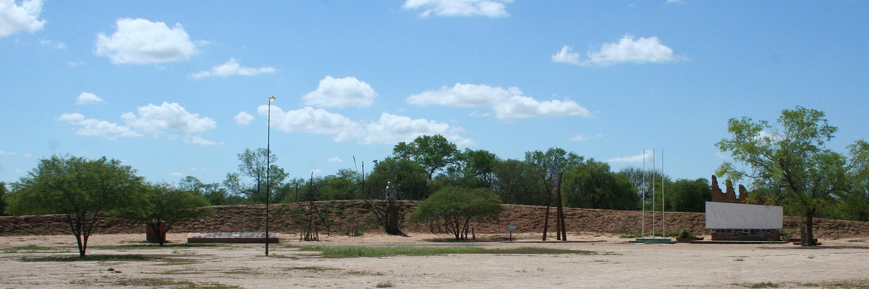
Not much choice on commons. The first is Iglesia Mennonita de Neuland (city church), which is a nice picture, but is also used for the article's page banner. The second is Avenida 1° de Febrero at the Hospital Concordia - an ordinary street scene. The third is Fortín Boquerón, which is 28 km southeast of Neuland, but is the sight with the biggest listing in the article. All three are by gomezminck on Panoramio, without whom there would be nothing that met the required dimensions. Other contributions would be very welcome. AlasdairW (talk) 22:11, 1 June 2021 (UTC)
- I was looking at the same picture as #3 for creating a Neuland banner myself. And I'd prefer to have a Main Page banner different from the article banner; therefore 3,2,1. --Ypsilon (talk) 04:05, 2 June 2021 (UTC)
- 1, 2, 3. #1 seems by far the best, even it it's used as the page banner. I would however recommend slight rotation of the banner image, which I can try myself. (Obviously, if consensus is not for that banner, there's no point.) --Comment by Selfie City (talk | contributions) 12:39, 2 June 2021 (UTC)
- Yes, definitely #1, and the slight rotation would improve it. Ikan Kekek (talk) 19:07, 2 June 2021 (UTC)
- I've added the rotated banner to the pictures included above. It might now be too far rotated the other way — I'm not sure — but I think it is an improvement on the original banner #1. --Comment by Selfie City (talk | contributions) 19:31, 2 June 2021 (UTC)
- At a glance the rotated image looks better, but zooming in to look at the bricks in the church wall, it has lost some of the sharpness of the original. I am not sure which is better overall. AlasdairW (talk) 21:59, 2 June 2021 (UTC)
- It looks better to me. AlasdairW, did you zoom just enough to see how it would look as a banner on the page? Ikan Kekek (talk) 07:00, 3 June 2021 (UTC)
- At a glance the rotated image looks better, but zooming in to look at the bricks in the church wall, it has lost some of the sharpness of the original. I am not sure which is better overall. AlasdairW (talk) 21:59, 2 June 2021 (UTC)
- I've added the rotated banner to the pictures included above. It might now be too far rotated the other way — I'm not sure — but I think it is an improvement on the original banner #1. --Comment by Selfie City (talk | contributions) 19:31, 2 June 2021 (UTC)
- #1 is indeed sharper than #4. The other two are essentially pictures of nothing. For those of us who didn't know where Chaco is, it would be nice to mention the country in the lede, e.g. "One of Paraguay's Mennonite colonies..." --ThunderingTyphoons! (talk) 08:53, 3 June 2021 (UTC)
- Banner #1 - looks more sharper than the others. SHB2000 (talk | contribs | en.wikipedia) 08:58, 3 June 2021 (UTC)
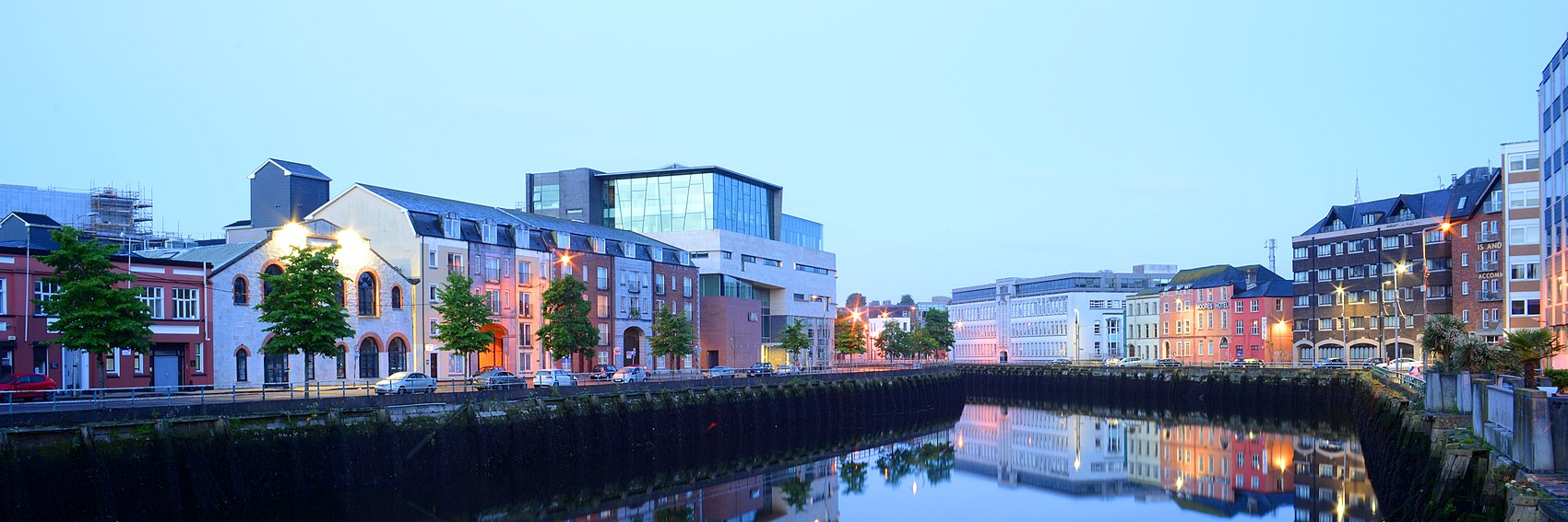
Two banners to choose from for Cork. Others would be very welcome. AlasdairW (talk) 23:03, 23 April 2021 (UTC)
- The second is more what I'd expect of Cork, but the first's colours are much more appealing, which I think is important for the main page. Ground Zero (talk)
- I agree, my choice is #1. Unfortunately I didn't see any photos of the second view on a cloudless day which would have given better colours. AlasdairW (talk) 20:59, 24 April 2021 (UTC)
- #1, 2.--ThunderingTyphoons! (talk) 21:27, 24 April 2021 (UTC)
- The more cheerful one, #1 for me. Ypsilon (talk) 15:24, 28 May 2021 (UTC)
- 1, 2. I agree with AlasdairW that if there was a blue sky in the second photo, it would have been a better picture to use. --Comment by Selfie City (talk | contributions) 12:41, 2 June 2021 (UTC)
...and for American cuisine some nice pancakes...
- Good one. I'd be happy to see anything else someone wants to nominate, but this is a pretty high bar to exceed. Ikan Kekek (talk) 19:52, 31 January 2021 (UTC)
- Definitely a great picture. I'm okay with not seeing alternatives to this. It's good. Ground Zero (talk) 16:38, 28 May 2021 (UTC)
- Looks like a really good choice to me. --Comment by Selfie City (talk | contributions) 12:42, 2 June 2021 (UTC)
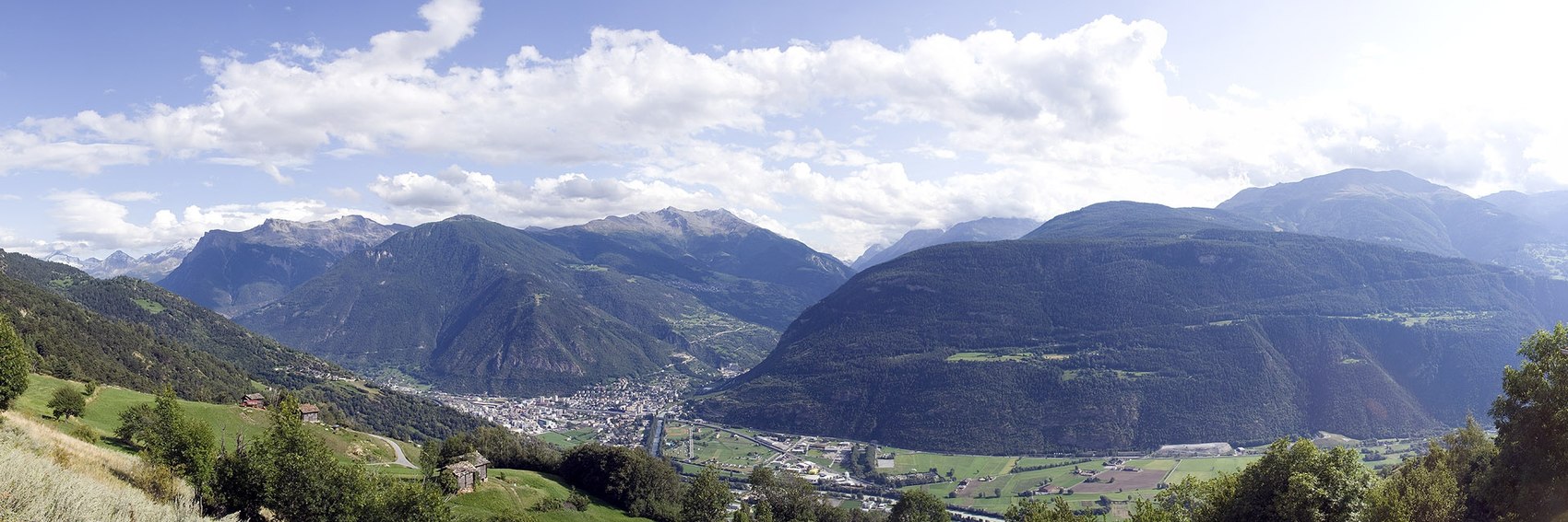
A bigger choice this time. The first is a view looking down on the town. the second is a side street (St Martinistrasse), the third is the new ice hockey stadium, and the fourth is inside the stadium. AlasdairW (talk) 20:59, 24 April 2021 (UTC)
- Number 1 is the nicest, then #4 and #2. #3 seems to have problematic quality though the content is perfectly OK. Thanks for the banners! -- Ikan Kekek (talk) 21:19, 24 April 2021 (UTC)
- Number 2 has the Swiss small town feel to it, so it's my favorite, but #1 comes close behind. After that the hockey banners, #3 and #4. Thanks for taking the time to make them. Ypsilon (talk) 15:27, 28 May 2021 (UTC)
- 2, 1, 4, 3. 1 is kind of generic, pretty mountain scenery, so I really prefer 2. 3 and 4 don't seem to say much about the place. It's nice to have all of this choice, though. Thanks. Ground Zero (talk) 16:36, 28 May 2021 (UTC)
- 1, 2, 4, 3. A good selection.--ThunderingTyphoons! (talk) 08:56, 4 June 2021 (UTC)
- 1, 2, 4, 3. I like #4 but it doesn’t seem as suited to a travel article as the first two. --Comment by Selfie City (talk | contributions) 15:04, 4 June 2021 (UTC)
- Here are two Winnipeg banners to choose from, but please add some more. I don't know the city, so these are just chosen from 2 places listed in the article: the Canadian Museum for Human Rights, and St Boniface Cathedral. I used the crop tool to create these, and so they are on Commons - can an Admin please make a local copy before featuring one of these. AlasdairW (talk) 22:31, 12 April 2021 (UTC)
- I don't know the city, but #1 looks more interesting and distinctive. Ikan Kekek (talk) 22:37, 12 April 2021 (UTC)
- Banner 1 – Looks more modern. SHB2000 (talk) 00:10, 13 April 2021 (UTC)
- Banner 1 — I'm planning a trip through Winnipeg this autumn, depending on the pandemic situation, and the Human Rights Museum is at the top of my list. I've heard really good things about it. I think it is an important reason to visit the city now. Ground Zero (talk) 01:03, 13 April 2021 (UTC)
- Funnily enough, I thought in a month time until I realised that this is the northern hemisphere lol :) SHB2000 (talk) 01:11, 13 April 2021 (UTC)
- I don't really count Winterpeg as a place I've been because I spent five days there at a convention one January, and it was just too cold to go outside. I saw nothing of the city. Ground Zero (talk) 01:17, 13 April 2021 (UTC)
- Yeah, the closest I've ever been to the Arctic circle was in Trømso, which was still too cold for me (in June). SHB2000 (talk) 01:22, 13 April 2021 (UTC)
- I'll bank that for next time an Aussie takes the piss out of a 25°C heatwave in London :P
- Banner 1 looks cool, per other comments.--ThunderingTyphoons! (talk) 08:50, 13 April 2021 (UTC)
- Yeah, the closest I've ever been to the Arctic circle was in Trømso, which was still too cold for me (in June). SHB2000 (talk) 01:22, 13 April 2021 (UTC)
- I don't really count Winterpeg as a place I've been because I spent five days there at a convention one January, and it was just too cold to go outside. I saw nothing of the city. Ground Zero (talk) 01:17, 13 April 2021 (UTC)
- Funnily enough, I thought in a month time until I realised that this is the northern hemisphere lol :) SHB2000 (talk) 01:11, 13 April 2021 (UTC)
- Both banners look nice, though I think I too will pick #1. --Ypsilon (talk) 18:10, 20 April 2021 (UTC)
Here's one for Stockholm history tour, looking down Riksbron (which you just walked across if you follow the itinerary) towards the Parliament. --Ypsilon (talk) 18:04, 20 April 2021 (UTC)
- I'll put this one on the schedule for now, but of course if anyone wants to design alternatives they can.--ThunderingTyphoons! (talk) 19:09, 22 April 2021 (UTC)
- Ooh, I did it with my mind. Redrum! Redrum!--ThunderingTyphoons! (talk) 19:11, 22 April 2021 (UTC)
- I like this one. AlasdairW (talk) 23:03, 23 April 2021 (UTC)
- Me too. Ground Zero (talk) 23:22, 23 April 2021 (UTC)
- Very representative, with Riddarholmskyrkan being one of Stockholm's oldest buildings. /Yvwv (talk) 00:32, 24 April 2021 (UTC)
...for Crawford we got some log cabins, part of the Fort Robinson...
- Archetypally American frontier. Very good. -- Ikan Kekek (talk) 19:53, 31 January 2021 (UTC)
...then something completely different, a pretty impressive school building in Nicosia...
- Seems a little dark, though. Ikan Kekek (talk) 23:41, 20 March 2021 (UTC)
And for The Wire Tour, from its Commons category, a view of West Fayette Street. --Ypsilon (talk) 18:04, 20 April 2021 (UTC)
...for Simpelveld a closeup of the Damiaan House with bricks around the windows painted in gold and all...
- Perfectly OK, but if someone has a good picture of the sarcophagus or steam railway they want to make into a banner, I'd enjoy seeing that. Ikan Kekek (talk) 23:43, 20 March 2021 (UTC)
...then an imposing shot of one of the Candis of Prambanan...
- Nice one. I approve, and thanks for taking on this challenge! Ikan Kekek (talk) 19:49, 31 January 2021 (UTC)
...and a Brno street view with several ads for our Czech phrasebook...
- Weird slanting on the left but serves the purpose. Ikan Kekek (talk) 23:41, 20 March 2021 (UTC)
...then something else that towers over our following destination - Penha da Águia or Eagle Rock...
OK, as we should have a banner for Oaxaca in a couple of hours and we don't have any; so here's now banners for three months, until the end of May. Perhaps it's worth discussing whether we should go back to a more traditional Main Page layout (more like our sister Wikipedia and less like that other travel site) with the featured destinations presented in a box (instead of a custom made banner), with the blurb and just a photo. It would save some time too, as we nowadays don't have as many active contributors working with the DotM process as there was when the project moved over eight years ago (and the new main page including banners was introduced).
Anyways, to the banners. As a major city of a Latin American city, Oaxaca would have some colonial religious architecture: the towers of the Church of Santo Domingo...
- Nice, but is there any possibility of cropping out the bits of vegetation? Ikan Kekek (talk) 19:51, 31 January 2021 (UTC)
 Done --Ypsilon (talk) 20:19, 31 January 2021 (UTC)
- You got rid of the entire building to the right, which was more than I asked for. It's fine, though, as I suppose it's a fair enough resemblance to reality. Ikan Kekek (talk) 21:09, 31 January 2021 (UTC)
...and finally for the Travel photography/Full systems FTT a closeup of a Soviet-made lens, intentionally picked so as not to favor any particular modern one. Anyways, feel free to make and post more banners if you like for whichever of these you like and let's hope Andre finds time to get back to banner making by the end of February. Ypsilon (talk) 19:11, 16 December 2020 (UTC)
- Good bunch of banners - you're a natural. I've made a handful of tweaks to the blurbs.--ThunderingTyphoons! (talk) 23:06, 16 December 2020 (UTC)
- Ypsilon, I really can't thank you enough for all you've done lately to chip in with our featured articles - both in terms of suggesting new nominees, making fixes to upcoming features and now drawing up banners (and I'll second what ThunderingTyphoons! said above, you've got a real knack for it!) I'll admit that with all the COVID-related travel restrictions we're under - not to mention all the business closures, which in the case of Buffalo are both happening too quickly to keep up with and is an issue that's basically pointless to try to tackle now, as it's not certain that any given business now shuttered "temporarily" will ever reopen - it's been hard for me to get excited about travel writing at this point in time. Luckily, with the rollout of the vaccines we are beginning to see a light at the end of the tunnel, and yada yada yada. Which is basically a longwinded way of saying please don't expect my current low level of activity to be permanent; I'll have my work cut out for me once COVID is finished. As for the banners, I'm perfectly happy with all the current selections and would just as soon have each of those on the Main Page, though I'll be happy to share my opinion in case others add additional options. -- AndreCarrotflower (talk) 04:03, 21 December 2020 (UTC)
- I like the picture of the lens. Although it is a little dated, it clearly shows the "full control" nature of these cameras. AlasdairW (talk) 22:45, 4 January 2021 (UTC)
- Good points by all. I'm perfectly satisfied with this banner. Ikan Kekek (talk) 22:58, 4 January 2021 (UTC)
...and then we got the railway which is one of Belgrave's top attractions... Ypsilon (talk) 19:11, 16 December 2020 (UTC)
- I've added one alternative here. I don't have a strong preference for either one. --Comment by Selfie City (talk | contributions) 21:34, 4 January 2021 (UTC)
- I prefer #2 with the train, as the bare railway line in #1 isn't too appealing although it shows the forest better. AlasdairW (talk) 22:42, 4 January 2021 (UTC)
- Maybe the old train make the 2nd photo slightly more interesting, but I'd be perfectly happy with either. Ikan Kekek (talk) 22:57, 4 January 2021 (UTC)
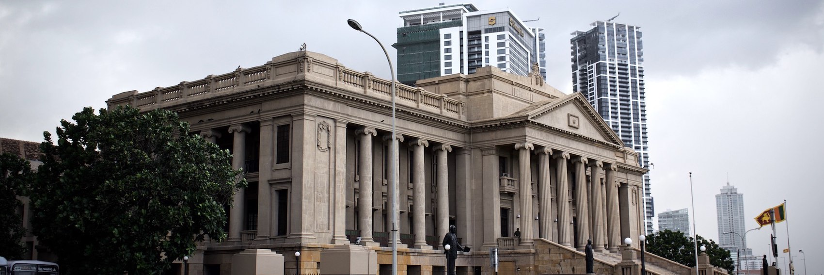
...back to Asia for February's DotM, there's a view of new (skyscrapers) and a little older (Old Parliament) Colombo with the Sri Lankan flag revealing where in the world we are... Ypsilon (talk) 19:11, 16 December 2020 (UTC)
...and a summer view of a Norwegian country road (could've picked a winter pic too but I think this is pretty nice)... Ypsilon (talk) 19:11, 16 December 2020 (UTC)
- Support. --Comment by Selfie City (talk | contributions) 21:35, 4 January 2021 (UTC)
- Comment: I'd welcome more choices if anyone else has another banner to propose, but this one is fine. Ikan Kekek (talk) 22:54, 4 January 2021 (UTC)
...for Torres del Paine, a view of Lake Dickson, presumably with the refugio (camp site) with the same name... Ypsilon (talk) 19:11, 16 December 2020 (UTC)
- I don't see a reason to go with any other picture; this one is excellent. --Comment by Selfie City (talk | contributions) 14:19, 1 January 2021 (UTC)
- This is a good image. AlasdairW (talk) 22:43, 4 January 2021 (UTC)
- Agreed, this is quite beautiful. Ikan Kekek (talk) 22:53, 4 January 2021 (UTC)
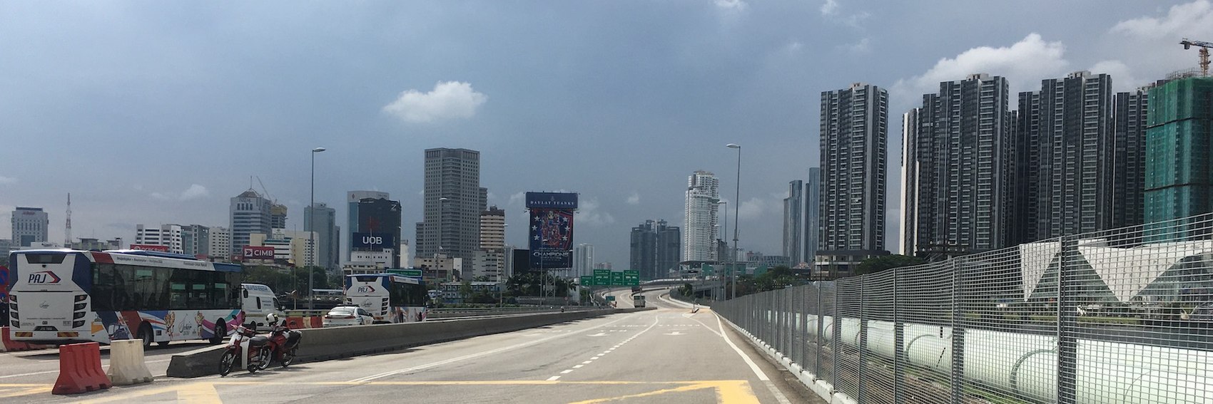
OK, here we go again, we're running out of banners for the featured articles so I decided to make a stash of them. There's just one for each article, for the six first articles for 2021. From Johor Bahru there's the skyline as seen when entering from Singapore... Ypsilon (talk) 19:11, 16 December 2020 (UTC)


