Wikivoyage:Destination of the month candidates/Banners/Archive/2014
| DotM banner archives: 2013 • 2014 • 2015 • 2016 • 2017 • 2018 • 2019 • 2020 • 2021 • 2022 • 2023 • 2024 |
Archived banners for destinations featured on the Main Page in 2014.
I went kind of conservative on these images, but it was for a good reason: banners should be a sort of visual summary of the topic as a whole, which, in my mind, necessarily precluded images like this one, which is really eye-catching but does not depict a traditional-style ship or destination that most people associate with cruises, and also interior images, few if any of which are immediately recognizable as being taken on a cruise ship. So, despite my attempts to include a wide diversity of different images within the fairly circumscribed parameters I set for myself, I apologize if these look samey. I think they're quite visually appealing, though. -- AndreCarrotflower (talk) 15:37, 16 October 2014 (UTC)
![]()

![]()

![]()

![]()
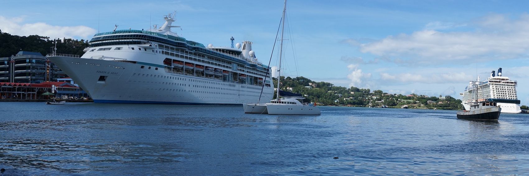
- My vote goes with #1, with #3 a very close second. #4 takes third place. #2 had a lot of potential and I still think it's pretty good, but the photo quality leaves something to be desired. -- AndreCarrotflower (talk) 15:37, 16 October 2014 (UTC)
- 2, 1, 3 for me. #2 looks fine on my monitor, and I like the image best as one that's a pretty setting with cruise ships. #1 is a clear ship in a good background, but I find that red-and-white thing on the left distracts me from the ship and makes me think "What the hell is that?!" The third one is perhaps the most arresting image, but the ship seems really small in that context, just happening to be in that stark land-and-seascape with icebergs. #4 is perfectly OK, but the image and composition don't interest me the way the others do. Ikan Kekek (talk) 16:40, 16 October 2014 (UTC)
- Difficult choice. My vote goes to which #4 has two cruise ships moored in a "typical cruise destination", #1 on second place, then #2 (if the island would look a little cheerier, this would be a winner) and #3 on the last place. ϒpsilon (talk) 17:45, 16 October 2014 (UTC)
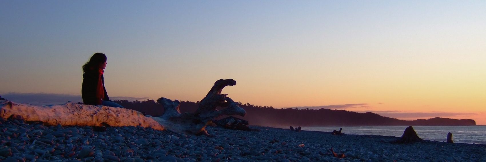
Pre-emptively: while we frown on photos that include people as Main Page banners, I figured #3 was acceptable because the person in the photo is not identifiable, and also the composition of the photo gives a sense of solitude and remoteness that, I think, is apropos for a place like Fox Glacier. -- AndreCarrotflower (talk) 15:17, 10 October 2014 (UTC)
![]()

![]()

![]()
![]()
- #4 is the clear winner for me, with #1 and #3 in a tight race for second place (#1 has the edge, though, I think.) #2 would be a much better image if I could figure out how to fix the colors - if someone would like to jump in on that, I might be inclined to change my votes. -- AndreCarrotflower (talk) 15:17, 10 October 2014 (UTC)
- Amazing banners, like always. My favorite is #4, after that come #3 and #2 and lastly #1. ϒpsilon (talk) 16:26, 10 October 2014 (UTC)
- Splendid! I think my favorites are 2, 3 and 4 in that order, but it's really a pick 'em, and 1 would be fine, too. Congratulations! Ikan Kekek (talk) 19:15, 10 October 2014 (UTC)
![]()

![]()

![]()
![]()

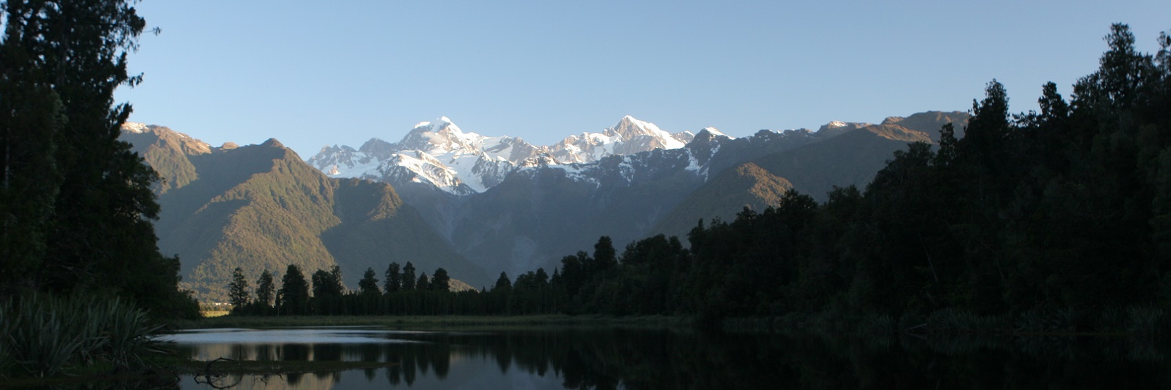
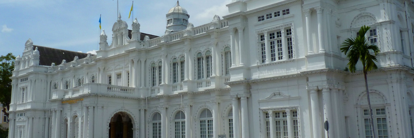
- #2 over #1 by a nose, for me, with #3 in third place. Any of these would be great, though. -- AndreCarrotflower (talk) 21:54, 15 February 2014 (UTC)
- # 1. --Saqib (talk) 21:58, 15 February 2014 (UTC)
- Great job! My preferences are 4, 1, 3. 2 is not as pretty a view, in my opinion, though it does get the feel of the city across admirably. #4 is just beautiful; #1 is a very unusual and interesting image that would be great to use. #3 is also very pretty, if we want a white colonial building with a palm tree. I feel like it doesn't have as much variation of scenery as the other photos, though, as it's mostly the one building, with a bit of sky and much less vegetation as a percentage of the image area than #4 and #1. Ikan Kekek (talk) 22:07, 15 February 2014 (UTC)
- The colorful number 1 is my favorite, number 4 is a close second. Matter of fact all four "candidates" look nice. :) ϒpsilon (talk) 22:15, 15 February 2014 (UTC)
- Number 1, please! Danapit (talk) 18:55, 27 February 2014 (UTC)
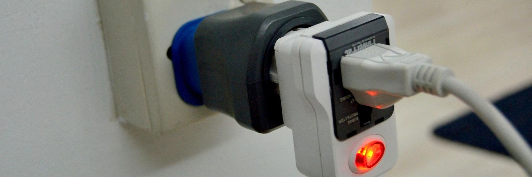
As with Travel photography, the reason why it took me so long to get around to this is because I hadn't the slightest idea what a banner for Electrical systems might look like. For ideas, I started with the pagebanner - the adaptation of which remains my favorite of the banners I made here - and looked for other images of the same ilk. It makes for a relatively samey slate of options, but then again there was never going to be any edge-of-your-seat excitement in these images even in the best-case scenario. -- AndreCarrotflower (talk) 14:00, 8 October 2014 (UTC)
![]()
![]()
![]()

![]()
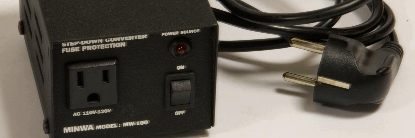
- As I said above, I like #3 best - it's by far the most colorful of the bunch, has a nice sense of three-dimensionality, and in general is about the most interesting banner you could ask for given the topic. #1 is my second choice, but if #4 is fixable (it looks like the camera's lens was smeared when the photo was taken, viz. the text on the converter box at bottom left) it will be my second choice. #2 is in last place. -- AndreCarrotflower (talk) 14:00, 8 October 2014 (UTC)
- I like the plug adapters, #1, most. Then #3 and #2, and #4 lands on the last place because it's a bit blurry. Like always, I don't think any of the banners is particularly bad. ϒpsilon (talk) 18:37, 8 October 2014 (UTC)
- Like Ypsi, I prefer the first banner, which I think is much better than any of the others. Ikan Kekek (talk) 19:08, 8 October 2014 (UTC)
Same issue with this article as with Muscat. The lede is literally nothing more than the standard skeleton template: "(x) is a city in region (y) of country (z)." Something that absolutely needs to be fixed before we run this article. -- AndreCarrotflower (talk) 19:43, 19 August 2014 (UTC)
![]()

![]()
![]()

![]()

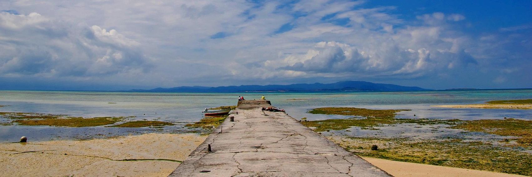
- If we were judging solely on aesthetics, my vote would go with #2. But, while #2 does a good job at communicating the sense of peacefulness and relaxation the article claims Taketomi to have, of the four images it contains the least amount of content vis-à-vis actual places listed in the article. To be perfectly honest, I'm not even sure what it's a picture of.
So, #1 is my favorite because it conveys the same island-paradise feel while depicting a listed attraction (Kondoi Beach). #2 is in second place, followed by #3 and in last place, #4.Like Muscat's photos, though, any of these would be fine to put on the Main Page. -- AndreCarrotflower (talk) 19:43, 19 August 2014 (UTC)
- I like the water buffalo #4 (and it was also one of the main attractions on the island). Then #1, #2 and #3 last (which IMHO could be any warm part of the world). ϒpsilon (talk) 19:54, 19 August 2014 (UTC)
- They're all beautiful, and I was going to suggest #3 until I read ϒpsilon's argument above. I don't favor #4 because it's a picture of a water buffalo cart, but because it's one with Japanese characters, thereby showing a sense of place. But in terms of beauty: #3, #2, #4 by a hair and then #1 - all are good. Ikan Kekek (talk) 21:27, 19 August 2014 (UTC)
- #2 is striking, but needs to have the horizon straightened. #4 next, as it is a local specialty. I don't find #3 and #1 very appealing. --Danapit (talk) 08:17, 20 August 2014 (UTC)
- Horizon has been straightened on #2. -- AndreCarrotflower (talk) 23:34, 2 November 2014 (UTC)
- I've been thinking about this for some time. Ypsi and Ikan's arguments in favor of #4 are convincing. I'm bumping it up to second place on my personal list of favorites. #1, #4, #2, and finally #3 for me now. -- AndreCarrotflower (talk) 03:47, 6 November 2014 (UTC)
This article's lede didn't give me anything to work with in sprucing up the blurb from the bare-bones original text. As I said at dotm, before I am anywhere near comfortable putting this article on the Main Page we need a proper intro written. -- AndreCarrotflower (talk) 21:09, 18 August 2014 (UTC)
![]()

![]()
![]()

![]()

- Tough choice here, but I'm going to pick #3 by a nose. #4 follows in second place, #1 is in third and #2 brings up the rear. All of these would be great, though. -- AndreCarrotflower (talk) 21:09, 18 August 2014 (UTC)
- I prefer #3 too. After that #2 actually, then #4 and #1. ϒpsilon (talk) 19:49, 19 August 2014 (UTC)
- Number 2 is awesome. That's my pick. Powers (talk) 20:07, 19 August 2014 (UTC)
- All really good. I agree with Powers, though: #2 is amazingly striking, and I have a strong preference for it. Ikan Kekek (talk) 21:21, 19 August 2014 (UTC)
- #3 for me, please, followed by #2 and #4. Good job. --Danapit (talk) 08:11, 20 August 2014 (UTC)
Confession: A big part of the reason why I'd gotten so far behind on the banners was that this topic was coming up, and I was dreading it. I had no idea what a banner for Travel photography would look like, what to put in the search bar at Commons or Flickr, what I would find when I did. That being the case, I'm happy with the variety of options I can present to the community. Regarding Banner #4 - sorry, but I couldn't resist. It's an unorthodox image, which is a double-edged sword: of all four banners, it's easily the most creative presentation of the subject matter, but I don't know what the community will think about how it would work on the Main Page. -- AndreCarrotflower (talk) 16:27, 12 August 2014 (UTC)
![]()

![]()
![]()
![]()
- My votes go in descending order: #1, #2, #3, then #4. The colors on #1 give it a sort of mystical quality - and as an avid traveler, photographer, and travel photographer, I feel the image cuts to the heart of the topic at its best. #2 is almost as good, but a little more sedate in appearance. #3 is probably closest to what travel photography really is for day-to-day tourists who would read Wikivoyage, but the contrast is really harsh and there's something sort of off about the colors - I tried to fix it in PhotoShop, with results that are far better than the source image but that still put it behind the first two on my ranking. #4 is interesting, I'll give it that. -- AndreCarrotflower (talk) 16:27, 12 August 2014 (UTC)
- Also, I'm well aware that regardless of the CC-compatibility of the source images, on the Main Page we try to keep away from photos of identifiable people. However, given the nature of the topic I think it's understandable for some of these images to skirt that rule. -- AndreCarrotflower (talk) 16:31, 12 August 2014 (UTC)
- Out of the banners, it's just the second one that has an identifiable person. I think the paparazzi banner #4 is cool (In America you photograph banner, in Soviet Russia banner photographs you!) and therefore my vote goes to #4. Then #1, #3 and #2. ϒpsilon (talk) 17:58, 12 August 2014 (UTC)
- All of these are interesting, but in my opinion, #2 is the best composition, and especially given the topic, I'd go with that one, but #4 would be my 2nd choice, again given the nature of the subject. It's not the best composition in the painterly sense of satisfyingly moving your eye around the picture frame, but it is absolutely the most topical and striking. Ikan Kekek (talk) 05:15, 13 August 2014 (UTC)
- #4 without a doubt. I wish we could move the lens to the left or make the text box smaller, though. Powers (talk) 23:49, 13 August 2014 (UTC)
- I think #4 represents the topic very well and agree that moving the lens to the right would be better, if the source picture allows. I would be equally happy with #1, which has lovely soft colors, a relaxed atmosphere and the title is well incorporated in the composition. Danapit (talk) 06:55, 14 August 2014 (UTC)
- Unfortunately, the full width of the original is in use, so we'd have to crop off the left side, and that means cropping the height tighter as well, which would not likely be as appealing. Powers (talk) 00:13, 15 August 2014 (UTC)
- I think #4 represents the topic very well and agree that moving the lens to the right would be better, if the source picture allows. I would be equally happy with #1, which has lovely soft colors, a relaxed atmosphere and the title is well incorporated in the composition. Danapit (talk) 06:55, 14 August 2014 (UTC)
- #4 without a doubt. I wish we could move the lens to the left or make the text box smaller, though. Powers (talk) 23:49, 13 August 2014 (UTC)
- All of these are interesting, but in my opinion, #2 is the best composition, and especially given the topic, I'd go with that one, but #4 would be my 2nd choice, again given the nature of the subject. It's not the best composition in the painterly sense of satisfyingly moving your eye around the picture frame, but it is absolutely the most topical and striking. Ikan Kekek (talk) 05:15, 13 August 2014 (UTC)
- Out of the banners, it's just the second one that has an identifiable person. I think the paparazzi banner #4 is cool (In America you photograph banner, in Soviet Russia banner photographs you!) and therefore my vote goes to #4. Then #1, #3 and #2. ϒpsilon (talk) 17:58, 12 August 2014 (UTC)
- Also, I'm well aware that regardless of the CC-compatibility of the source images, on the Main Page we try to keep away from photos of identifiable people. However, given the nature of the topic I think it's understandable for some of these images to skirt that rule. -- AndreCarrotflower (talk) 16:31, 12 August 2014 (UTC)
I'm happy to report that it was much easier to find images for Mitzpe Ramon than it was for Karachi. Though I'm happy with the final product, I'm aware that the source photos I chose might strike some as a bit samey - that's a function, I think, of Mitzpe Ramon being a small town with a single huge attraction that dominates its offerings to visitors. -- AndreCarrotflower (talk) 13:20, 12 August 2014 (UTC)
![]()
![]()
![]()
![]()
- #2 for me, though if someone wants to shorten up the blurb, I may well change my selection to #1 (the bottom of the shadowbox grazes the top of the mountains at right). #4 is my third choice. -- AndreCarrotflower (talk) 13:20, 12 August 2014 (UTC)
- Moved the shadowbox to the left on #1. It's an improvement, but I still prefer #2. -- AndreCarrotflower (talk) 13:25, 12 August 2014 (UTC)
- Perhaps it's just me but #2 makes me immediately think of Australia's Red Centre and after that Sedona, Grand Canyon and the Southwestern US in general, and not the Middle East at all. I prefer #1, after that #4 and #3. ϒpsilon (talk) 13:40, 12 August 2014 (UTC)
- I think I prefer 1, 4 and 3 in that order. 1 is a great overview, 4 is really strange and interesting, and to a slightly lesser extent, so is 3. The foreground in 2 looks a little out of focus, at least on my girlfriend's laptop (perhaps not on newer laptops?). Ikan Kekek (talk) 05:09, 13 August 2014 (UTC)
- The foreground in #2 is out of focus because the focus is on the outcropping in the far background. I like the effect; it gives the image some three-dimensionality. -- AndreCarrotflower (talk) 13:04, 14 August 2014 (UTC)
- I understand but still prefer the others. Ikan Kekek (talk) 04:34, 16 August 2014 (UTC)
- The foreground in #2 is out of focus because the focus is on the outcropping in the far background. I like the effect; it gives the image some three-dimensionality. -- AndreCarrotflower (talk) 13:04, 14 August 2014 (UTC)
- I think I prefer 1, 4 and 3 in that order. 1 is a great overview, 4 is really strange and interesting, and to a slightly lesser extent, so is 3. The foreground in 2 looks a little out of focus, at least on my girlfriend's laptop (perhaps not on newer laptops?). Ikan Kekek (talk) 05:09, 13 August 2014 (UTC)
- Perhaps it's just me but #2 makes me immediately think of Australia's Red Centre and after that Sedona, Grand Canyon and the Southwestern US in general, and not the Middle East at all. I prefer #1, after that #4 and #3. ϒpsilon (talk) 13:40, 12 August 2014 (UTC)
- Moved the shadowbox to the left on #1. It's an improvement, but I still prefer #2. -- AndreCarrotflower (talk) 13:25, 12 August 2014 (UTC)
In making DotM banners, whenever possible I try to avoid having less than four banner images to choose from. However, I had quite a bit of trouble finding suitable CC-compatible photos for Karachi's banner (read about it here). Saqib has informed us that due to a photography competition he's organizing, there is soon to be a glut of new images of Pakistan on Commons. In three weeks, I expect that there will be new banner selections to choose from; until then, I'm going to put Banner #1 here as a placeholder. -- AndreCarrotflower (talk) 20:45, 11 August 2014 (UTC)
![]()
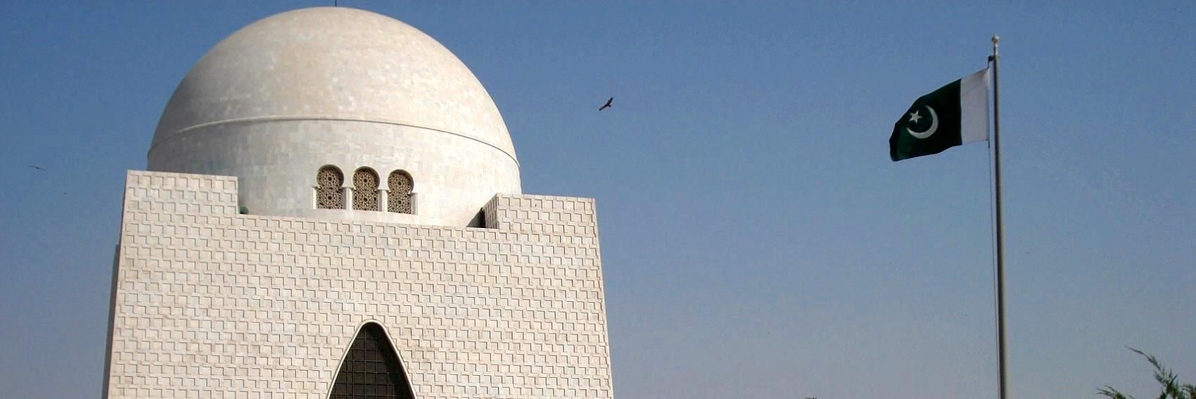
- For the record, I'd be perfectly fine with having this as the banner. It's excellent! Ikan Kekek (talk) 20:49, 11 August 2014 (UTC)
- This is perfect in my honest opinion. The photo is representing both Karachi and Pakistan. Well done Andrew. --Saqib (talk) 21:01, 11 August 2014 (UTC)
- As I said in the pub, it's a very good banner and I have nothing against having this as Karachi's feature banner on the main page. ϒpsilon (talk) 08:30, 12 August 2014 (UTC)
![]()
- I don't like the way the text covers the building; I'd like to see some other options once they become available. I did take the liberty of shortening the blurb, though. Powers (talk) 23:46, 13 August 2014 (UTC)
I was so "in the zone" with my work on the South Buffalo district article that I really let the banner thing get away from me. Sorry about that. Lots more forthcoming in the near future. -- AndreCarrotflower (talk) 19:48, 10 August 2014 (UTC)
![]()
![]()
![]()

![]()

- It's between the first two, that's for sure. I like #1 a little better because unlike #2, it's not adapted from the same image as the article's pagebanner. Tough choice for third place, but I'm going with #4. -- AndreCarrotflower (talk) 19:48, 10 August 2014 (UTC)
- I would favor #2, except for what you mention about it, but I think I favor it anyway, because it strikes me as the best composition and includes a statue of, I believe, Father Serra. I also like #1 and #4, probably in that order, and part of the reason I prefer #1 to #4 is that the caption is in the sky on #1. #3 is fine but grayer. Ikan Kekek (talk) 07:56, 11 August 2014 (UTC)
- Despite being the same as the pagebanner, I like #2 most. Then #3, #1 and #4. ϒpsilon (talk) 16:57, 11 August 2014 (UTC)
After creating these banners, I really want to go to Vava'u. -- AndreCarrotflower (talk) 00:01, 24 June 2014 (UTC)
![]()

![]()
![]()

![]()
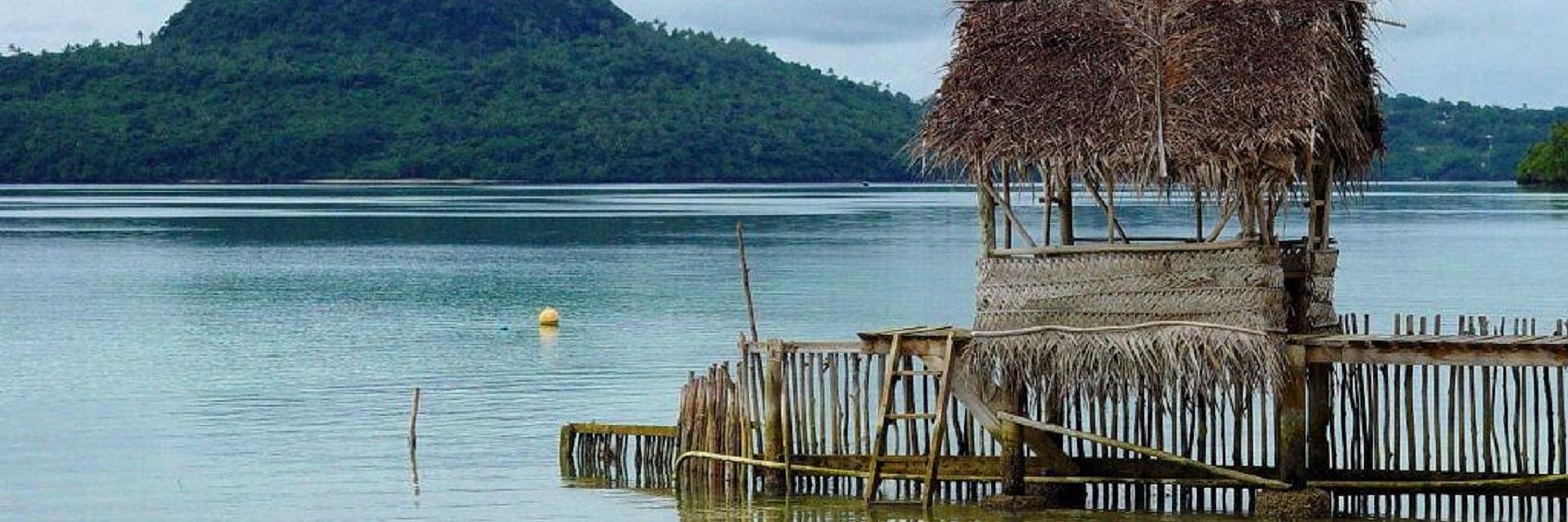
- #1 for me, please. #3 is second; #4 is third. -- AndreCarrotflower (talk) 00:01, 24 June 2014 (UTC)
- These are all great! 1, 3, and 4 are almost equally good. I slightly prefer 3 and 4 but can't really choose between them. I like photos with a foreground and a background, which all of these have. Ikan Kekek (talk) 00:08, 24 June 2014 (UTC)
- Here we have some wonderful tropical banners! I prefer #3 because of the sun behind the palm. Then #1, #2 and #4. ϒpsilon (talk) 17:31, 24 June 2014 (UTC)
![]()
![]()

![]()

![]()
- All these images are great, but #1 is so far beyond the others there's no question that it gets my vote. #2, #4 and #3, consecutively, are my next choices, but they're far behind #1. -- AndreCarrotflower (talk) 23:47, 23 June 2014 (UTC)
- The first photo is my favorite one, but I hate that the text box is over the mountains. Is it possible to move the text box below the mountains? The text box bothers me less with banner #4, which I really enjoy because of the convex shape of the Saddledome in the foreground, so I'm not convinced I wouldn't favor it if the text box can't be moved below the mountains in banner #1. Banner #3 is also a nice image, but shows a relaxing scene with less emphasis on Calgary as a boom town. (By the way, "boomtown" as a single word is getting a curvy red "spelling error" line below it in my browser. I think it's two words.) Ikan Kekek (talk) 00:06, 24 June 2014 (UTC)
- There's an interesting contrast in the second one between the log fence and house with skyscrapers in the background. But #1 looks so amazing that it gets my vote. Then #3 and last #4 (because it's so dark). ϒpsilon (talk) 16:48, 24 June 2014 (UTC)
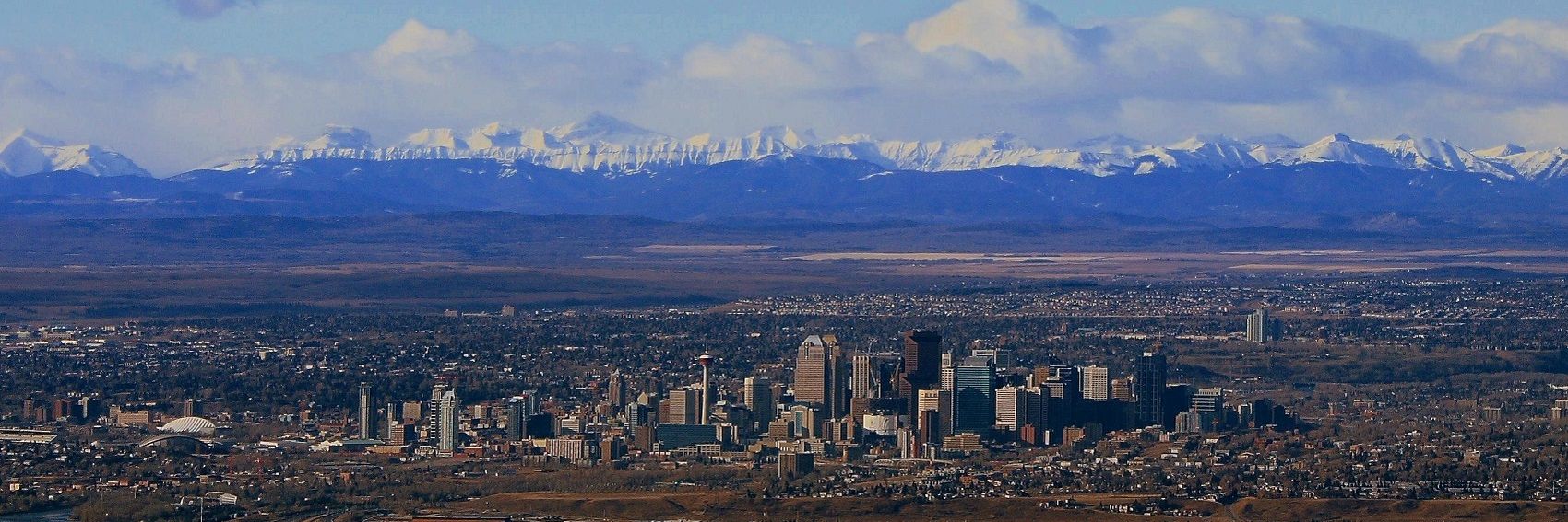
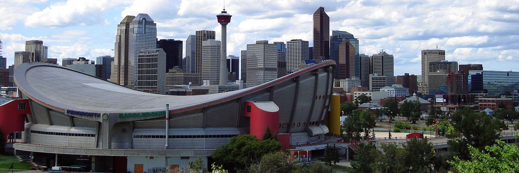
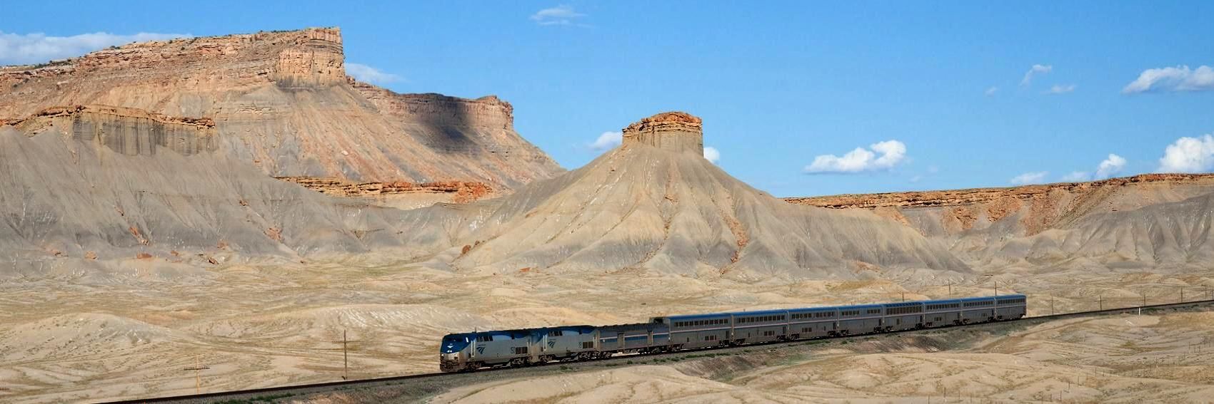
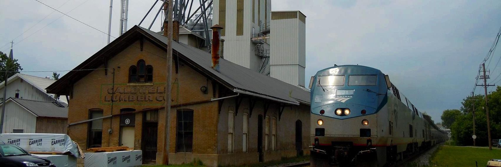
Finally getting up to speed on the banners. With these banners, I did the best I could with a limited stock of available images. I think I got a nice range of different subject matter, but it would have been better if I were able to come up with material like the ones for Rail travel in the United States. -- AndreCarrotflower (talk) 23:36, 23 June 2014 (UTC)
![]()

![]()

![]()

- Tough choice here. #2 is an absolutely spectacular photo, but of a decidedly lower quality image than the others. #1 is architecturally interesting, but a photo of a building (even if it's a train station) doesn't exactly scream "epic railroad journey across two continents" to me. #3 definitely does scream "epic railroad journey", but as an image it's kind of meh. #4 is reflective of what a passenger on the railroad would actually be seeing the majority of the time, and it's visually pleasant and a unique way to depict the subject matter. My choices, in descending order: #2, #3, #1, #4. -- AndreCarrotflower (talk) 23:36, 23 June 2014 (UTC)
- I prefer #3. #2 is a wonderful view and my second choice, but it's awfully dark on the right. #3 also has a dark region on the right, but it's not scenery and works well. #4 is interesting, too, and would be fine to use. #1 is fine but less compelling and has a clear sense of place mostly just because of the Cyrillic letters. Ikan Kekek (talk) 00:13, 24 June 2014 (UTC)
- One more vote for #3! It's really landscapes like that I imagine that one can see on the TSR. #1 and #2 tie for the second place, "Barabinsk" station looks very Russian indeed and the second is an amazing landscape probably towards the eastern end of the line. The decorated restaurant car #4 is pretty but can't compete with the others. ϒpsilon (talk) 16:43, 24 June 2014 (UTC)
- For the record, #2 is on the Trans-Mongolian branch line, somewhere between Ulaanbaatar and Beijing. -- AndreCarrotflower (talk) 16:56, 24 June 2014 (UTC)
- Interesting! Likely not far from the Great Wall! :) ϒpsilon (talk) 17:13, 24 June 2014 (UTC)
- For the record, #2 is on the Trans-Mongolian branch line, somewhere between Ulaanbaatar and Beijing. -- AndreCarrotflower (talk) 16:56, 24 June 2014 (UTC)
Okay: once again we have long page titles shagging over the margin of the text box, but now it's not just right-justified text anymore; with the shadowboxes we've introduced since the last time we faced this problem, even when the text is left-justified it still shags over the right margin of the box. There's simply no way to shorten the title any more than it already is, and the availability of CC-compatible images of the Far Northwest Side is extremely limited (hence the weakness of the selection here). We've dragged our feet long enough on this issue, and now our backs are against the wall. Again, I have no utility when it comes to writing MediaWiki code - believe me, if I did this problem would have been solved long ago - so it unfortunately has to fall on someone else to fix this. Either let's make the text smaller or make the shadowboxes extendable in width, but kicking the can down the road is no longer a viable answer. -- AndreCarrotflower (talk) 04:14, 31 May 2014 (UTC)
![]()
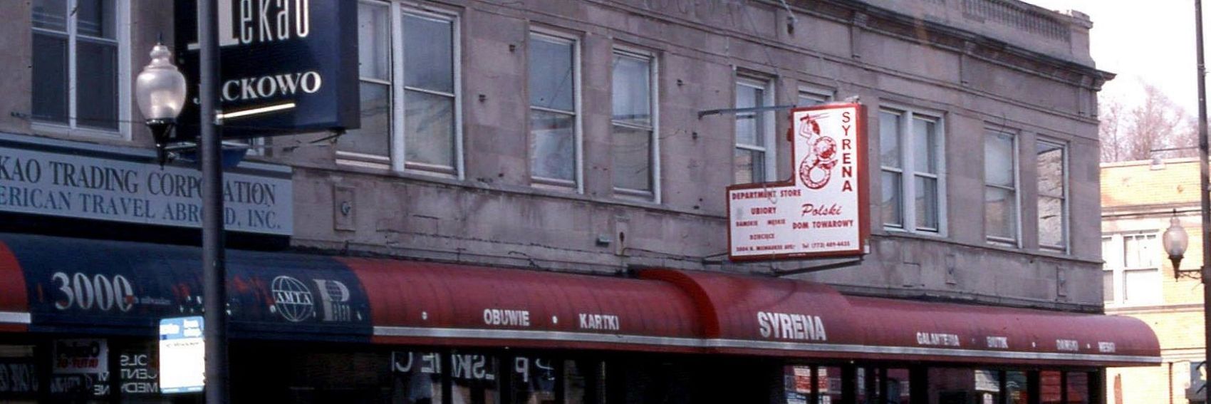
![]()

![]()

![]()

- #3, then #4, then #1. -- AndreCarrotflower (talk) 04:14, 31 May 2014 (UTC)
- I prefer #1 actually. Kielbasa, #3, comes second. ϒpsilon (talk) 07:00, 31 May 2014 (UTC)
- I've gotta vote for the kielbasa. My 2nd-favorite photo is actually #2, except that I don't know what it is, so neither will anyone else looking at it who doesn't know that area of Chicago. Which leaves the church, which would be fine, and the street with shops, which does get the point across, but not nearly as vividly, in my opinion. The light seemed to have been slightly hazy the day that photo was taken, and the street scene is only moderately interesting. Besides, the blurb mentions kielbasa. Ikan Kekek (talk) 09:28, 20 June 2014 (UTC)
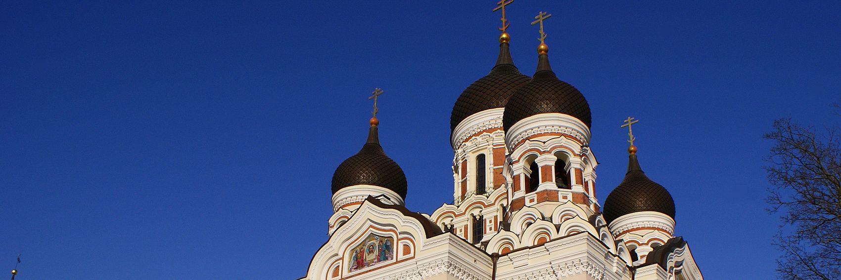
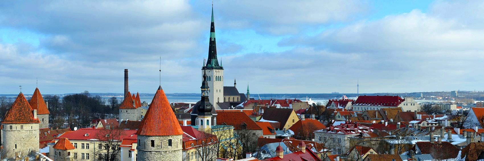
As promised, I fell behind. Banners for Chicago/Far Northwest Side and Trans-Siberian Railway are forthcoming in the near future. In the meantime, let's hear your opinions on the ones for Tallinn.
![]()
![]()
![]()

![]()
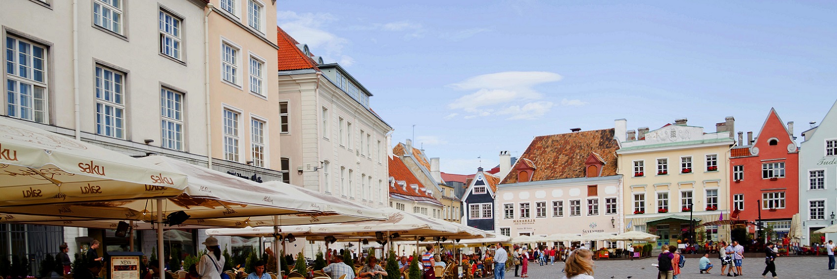
- For me, it's a toss-up between #s 2 and 4, with the interesting minimalist #1 close behind them. If pressed, my choice would be for #2; though there's nothing original about a skyline, the turrets, church steeple, and red tile roofs give it a very "Willy Wonka and the Chocolate Factory" feel which I really like. -- AndreCarrotflower (talk) 02:46, 31 May 2014 (UTC)
- #2 is perfect, the old town from the city hall tower is the iconic picture of Tallinn (comparable to #2 for Manhattan) found on brochure and map covers. The other banners are by no means bad, however they are all far behind number two. ϒpsilon (talk) 06:54, 31 May 2014 (UTC)
- Agree with Ypsi,#2 is perfect. Great banner and good fit. jan (talk) 10:10, 31 May 2014 (UTC)
- Another one for #2. Apart from the buildings, I also like the clouds in this picture, the sky looks really interesting. Danapit (talk) 11:19, 31 May 2014 (UTC)
- Another vote for #2. I just find it much more beautiful than any other, it's by far the best composition, really relaxing and pleasant to look at, and it's colorful and has a variety of shapes and gives an overview of a city I haven't been to, such that I get a much better introduction to it than by seeing a single building or even a single square, I think. Ikan Kekek (talk) 09:22, 20 June 2014 (UTC)
Okay, I know I sound like a broken record at this point, but we really need to fix the CSS in the banner formatting so the text of long titles doesn't shag over the margin when it's right-justified. We went through this with O'Hare International Airport and again with Uluru-Kata Tjuta National Park. This article's name was easy enough to abbreviate, but sooner or later we're going to come to one that isn't - and we shouldn't be forced to abbreviate for purely technical reasons, anyway. -- AndreCarrotflower (talk) 05:04, 28 February 2014 (UTC)
![]()
![]()

![]()
![]()
- It's really hard for me to argue in favor of any banner other than #3. Look at that majestic backdrop - wow! #1 is in second place and #2 is third. -- AndreCarrotflower (talk) 05:04, 28 February 2014 (UTC)
- Number three! ϒpsilon (talk) 05:07, 28 February 2014 (UTC)
- Yeah, this is really no contest. I like banners 1 and 2, but #3 has it by a mile. I think we can stop the competition right now. :-) Ikan Kekek (talk) 07:34, 28 February 2014 (UTC)
- No question, #3. Excellent banner.Danapit (talk) 07:58, 28 February 2014 (UTC)
- This may be my east-coast bias speaking, but I think #1 is no less majestic than #3, and it comes without that distracting cloud-shadow. Powers (talk) 18:25, 28 February 2014 (UTC)
- #1 is nice, but #3 is so much more eye-catching to me, the way the landscape just dwarfs the train. I think it goes a lot further in conveying what makes rail travel in the U.S. a unique experience. Although I do want to state some love for #2, since it comes the closest to capturing a typical experience on Amtrak. Still, overall, my vote is definitely for #3. PerryPlanet (talk) 20:15, 13 March 2014 (UTC)
- See, I find the landscape in #1 far more interesting, and I think it does a better job of dwarfing the train (look at the trains' relative sizes in each picture). Powers (talk) 12:42, 15 March 2014 (UTC)
- It's not the literal size of the train in each picture I was referring to. The landscape in #3 just seems more distinct and impressive to me, whereas the train sorta blends into the landscape in #1 for me. It's hard to put into words, but it's like the train in #1 is part of the landscape, while the one in #3 is venturing across it, which feels closer to the feel of "explore by train" for me. Perhaps it's simply because the train in #3 is closer to the bottom of the image, or perhaps it's because you can see the whole train in #3 whereas the train in #1 gives the sense of continuing off-camera. Either way, it makes the train look puny, like it's a barely-tolerated intruder in a land of sand and rock giants. Nothing about #1 gives me that same feeling. PerryPlanet (talk) 14:03, 15 March 2014 (UTC)
- See, I find the landscape in #1 far more interesting, and I think it does a better job of dwarfing the train (look at the trains' relative sizes in each picture). Powers (talk) 12:42, 15 March 2014 (UTC)
- Okay, here's my last-ditch effort. #3 is impressive, true, but #1 shows a more typical environment for Amtrak travel. #3 also has a weird shadow of a cloud that I find distracting. I think #1 is the superior choice. Powers (talk) 22:55, 12 July 2014 (UTC)
I know I jumped the gun by a few days on this one with my three-months rule, but as long as I've got banner-making on the brain (and as long as there's a very real possibility that I'll eventually fall behind again), why not?
I grant that these shots are a little bit samey, but they're all visually stunning and, IMO, they do a good job at representing what's written in the blurb.
-- AndreCarrotflower (talk) 01:59, 9 April 2014 (UTC)
![]()

![]()
![]()

![]()

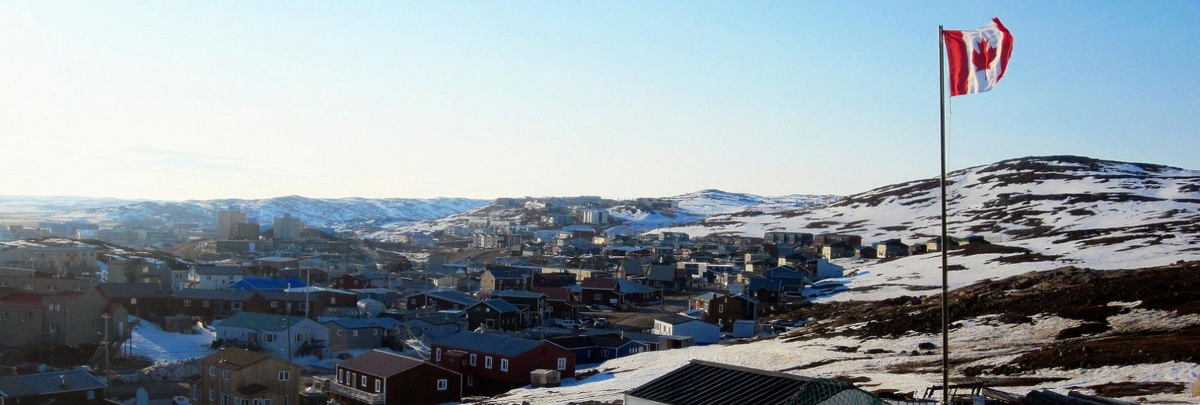
- #4 is my favorite, followed closely by #2 (I like the presence of the Maple Leaf flag in that one). Though #1 is a striking image (the original even more so), in the end I was right to be skeptical that it would work as a banner. #3, though it's sourced from the same image as the pagebanner, is a bit deceptive - though it's visually impressive, it makes Iqaluit look like a smaller town than it actually is. -- AndreCarrotflower (talk) 01:59, 9 April 2014 (UTC)
- I would be pleased for any of these four banners to grace the front page. My preference is for the second. I like the flag and the view. The third, with its wonderful texture and fine composition, is a close second, and the fourth is beautifully clear and, unlike the others, has a radiant blue sky. The first banner has a magical quality that causes me to accept the blurriness, naturally caused by the lights shining through the fog. Strictly as compositions, I think I like the third and first best. Ikan Kekek (talk) 02:17, 9 April 2014 (UTC)
- #1 is really cool, it looks like straight out of a video game! Again, all the banners look very good. ϒpsilon (talk) 04:37, 9 April 2014 (UTC)
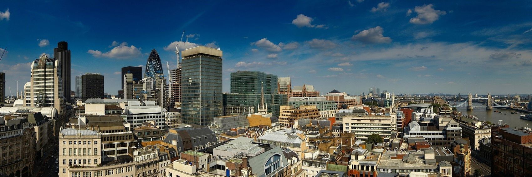
By way of heading off any comments that call Banner #2 into question: the Tower Bridge is not technically part of the City of London, but is covered in the article as if it were. It's also a spectacular image, IMO. -- AndreCarrotflower (talk) 07:33, 8 April 2014 (UTC)
![]()
![]()

![]()

![]()
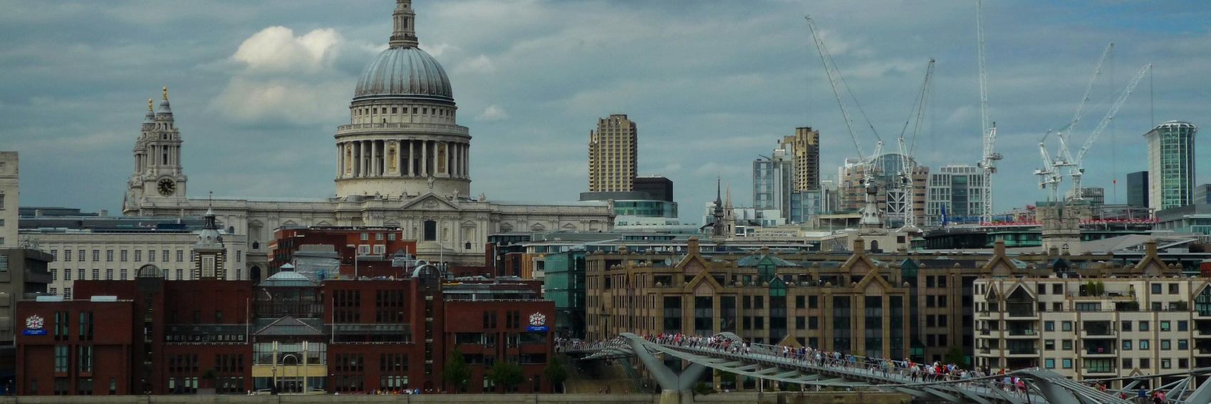
- #1 may be the best at depicting that "mix of iconic historic landmarks and modern high-rises", but there's just no denying #2. It gets my vote. -- AndreCarrotflower (talk) 07:33, 8 April 2014 (UTC)
- Yep. #2 is by far the most striking of the images. Ikan Kekek (talk) 08:04, 8 April 2014 (UTC)
- 2 for me. #4 with St.Pauls and the bridge to Tate Modern would otherwise be my choice if it wouldn't be so dark. ϒpsilon (talk) 09:06, 8 April 2014 (UTC)
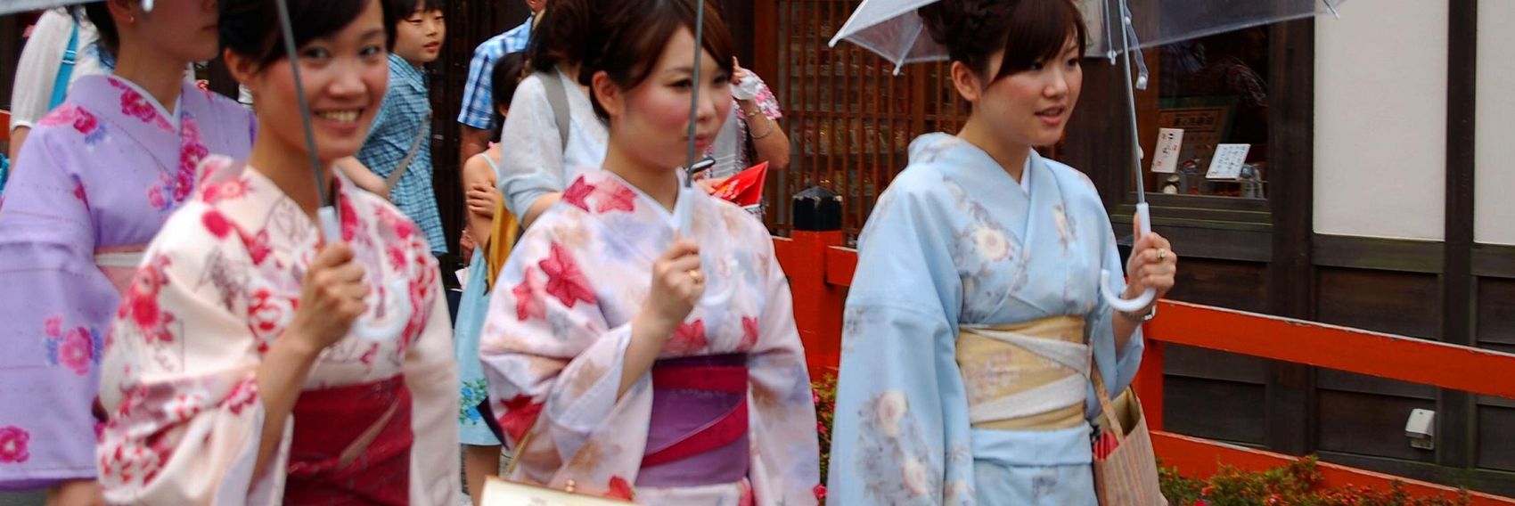
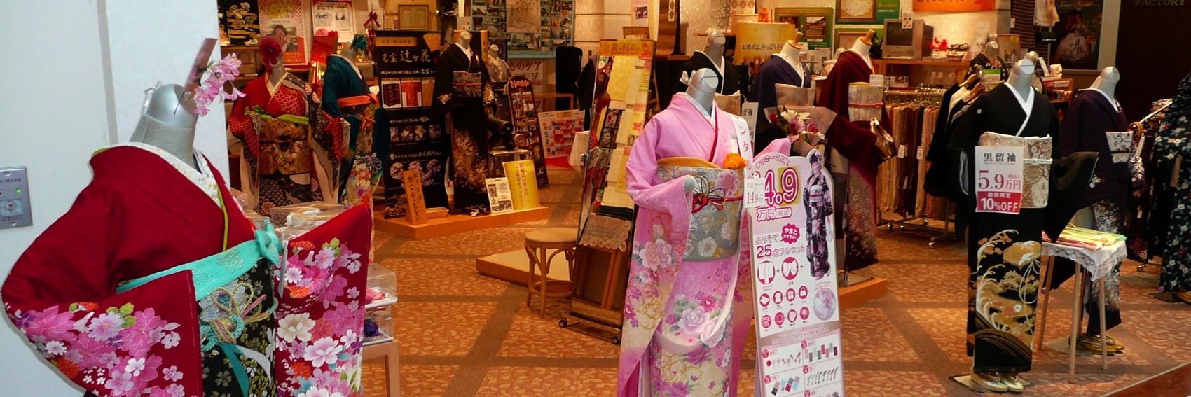
I figured if the rules about people in photographs could be loosened for any article, it ought to be one about a piece of clothing. Hence Banner #2. -- AndreCarrotflower (talk) 03:52, 8 April 2014 (UTC)
![]()

![]()
![]()
![]()
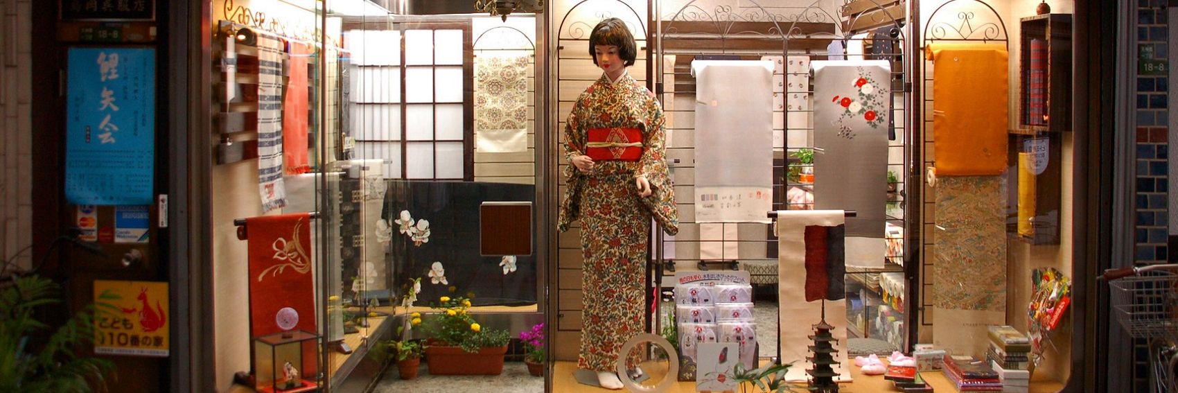
- In my opinion, #2 has by far the most interesting composition. #4 is a distant second. -- AndreCarrotflower (talk) 03:52, 8 April 2014 (UTC)
- #3 is my favorite. Some customers in the store trying out kimonos would make it even better. ϒpsilon (talk) 04:54, 8 April 2014 (UTC)
- I agree with you, Andre. The photo with the women wearing the kimonos is the nicest one, because it lives, and the 4th is second best. All of the images would be fine, though. Ikan Kekek (talk) 04:58, 8 April 2014 (UTC)
- On rereading that, it seemed strange to say "it lives." Of course, "it" is the photo; the women would be "they live." :-) Ikan Kekek (talk) 05:21, 8 April 2014 (UTC)
- I agree with you, Andre. The photo with the women wearing the kimonos is the nicest one, because it lives, and the 4th is second best. All of the images would be fine, though. Ikan Kekek (talk) 04:58, 8 April 2014 (UTC)
- 2 is poorly focused and the blurb will cover at least one woman's face. Not a good composition for a banner. Powers (talk) 14:09, 8 April 2014 (UTC)
- Which one do you prefer? Ikan Kekek (talk) 20:23, 8 April 2014 (UTC)
- I think #3 is probably the best, as it shows more than just kimonos but kimonos for sale (#1 does the same, but much less attractively presented). Powers (talk) 23:46, 9 April 2014 (UTC)
- On the other hand, #1 is a picture of a secondhand "recycling" shop of the type the article spends most of its time focusing on. #3 is a gift shop at Narita Airport, if I remember correctly from the source image - the type of place the article explicitly recommends avoiding. Also, #4 is a window display, so assumably the kimono on the mannequin is for sale as well. -- AndreCarrotflower (talk) 02:23, 10 April 2014 (UTC)
- Point taken; I obviously failed to read either the blurb or the article. Powers (talk) 23:14, 10 April 2014 (UTC)
- On the other hand, #1 is a picture of a secondhand "recycling" shop of the type the article spends most of its time focusing on. #3 is a gift shop at Narita Airport, if I remember correctly from the source image - the type of place the article explicitly recommends avoiding. Also, #4 is a window display, so assumably the kimono on the mannequin is for sale as well. -- AndreCarrotflower (talk) 02:23, 10 April 2014 (UTC)
- I think #3 is probably the best, as it shows more than just kimonos but kimonos for sale (#1 does the same, but much less attractively presented). Powers (talk) 23:46, 9 April 2014 (UTC)
- Which one do you prefer? Ikan Kekek (talk) 20:23, 8 April 2014 (UTC)
Banners for Kimono buying guide and City of London are forthcoming shortly. Sorry for falling so far behind on these; my work on Buffalo/West Side consumed me for quite a while. -- AndreCarrotflower (talk) 12:06, 7 April 2014 (UTC)
![]()

![]()
![]()

![]()

- #4 is my choice because it's a lovely picture that includes all three of the elements described in the blurb. #2 is in second place because of its interesting composition and peaceful look. -- AndreCarrotflower (talk) 12:08, 7 April 2014 (UTC)
- I like #3 and #4 best. ϒpsilon (talk) 17:50, 7 April 2014 (UTC)
- #4. Crane in the woods spoils #2 for me. Jjtkk (talk) 18:22, 7 April 2014 (UTC)
- I agree with Andre again, at least on a first choice: The 4th image is the prettiest, and I disregarded the blurb while looking at the banners. I think #1 is the second-nicest, and the other two are a pretty big comedown. I like seeing some older buildings and some boats. #3 shows a lot of water with not nearly as compelling a view on land, while #2 is a pretty peaceful scene, but I agree with Jjtkk that the crane on the hill is strange to look at. Ikan Kekek (talk) 05:03, 8 April 2014 (UTC)
- #4 or #2 would be nice. The crane in #2 is the difference for me as well. Does anyone talk with the German WV? Would be great to have the same header pic. German WV doesn't use banners but some pic would show cooperation. jan (talk) 08:27, 8 April 2014 (UTC)
- It is a true pleasure and joy to see you again, jan. :)
- I'm sorry to report that I could have done a much better job at reconnoitering with de: regarding the crosswiki feature, being utterly consumed with the ongoing process of writing Buffalo's district articles and a bit intimidated by the fact that I don't speak any German. I had hoped that some other member of the community who's perhaps more involved in cross-linguistic matters would take it up, but apparently that has not happened. Nevertheless, I personally, and I'm sure I speak for the rest of the community, am still very much interested in cooperating with them for this feature.
- André, i started the mess with the cross-WV so i'm willing to help out on this. I left a message in the German pub https://de.wikivoyage.org/wiki/Wikivoyage:Lounge#Bannerbild_Travem.C3.BCnde to get the picture discussion started. It would be very good for the community to have a successful presentation. jan (talk) 08:57, 9 April 2014 (UTC)
- #4. I'll follow this discussion here and will change the main picture at de:Travemünde once the voting here is over - assuming no decline will come up in the german community. --Tine (talk) 17:21, 9 April 2014 (UTC)
As you can imagine, there was no shortage of images on Commons to choose from. Following the blurb's lead, when making my selections I focused on "concrete canyons" and "the inimitable skyline". -- AndreCarrotflower (talk) 14:18, 3 March 2014 (UTC)
![]()
![]()
![]()

![]()
![]()

- I'm torn between #2 and #3: the latter shows off the skyline in far greater detail, but it lacks the Statue of Liberty, which IMO is far more iconic than the Chrysler Building or any of the other recognizable buildings promninently visible in #3. -- AndreCarrotflower (talk) 14:18, 3 March 2014 (UTC)
- I actually prefer #1, shouldn't we have some action in a Manhattan banner? The instantly recognizable #2 is my second choice. The last one would be perfect if Manhattan would be featured in the fall. ϒpsilon (talk) 15:44, 3 March 2014 (UTC)
- Regarding #1, I was a bit concerned (especially in light of the brouhaha about Midtown Baltimore's pagebanner) because of the possible issues with WMF policy on nonfree images due to the corporate logos, etc. on the advertisements depicted in the banner. In fact, I was initially reluctant to use the source image for that reason, but ultimately decided to do so because:
- I was able to crop out the most prominent ads,
- none of the remaining ads are large enough for it to be arguable that any one of them makes up an integral part of the image,
- the original image hosted at Commons is licensed under CC-BY-SA 3.0, seemingly without controversy, and
- the same source image was used for Manhattan's pagebanner, again seemingly without controversy.
- Still, I'd be interested to hear with others (Rschen?) have to say about it. In my estimation, it's equally likely that the lack of controversy on the last two points could just be an oversight on the part of admins at Commons and here.
- Manhattanite speaking here, so please take things in that spirit: #1 is vertiginous, but Times Square doesn't really look or even feel (to me, anyway) like that. Plus, there's so much more to Manhattan than Tourist Central, where "real" New Yorkers seldom tread anymore. #2 would be a great banner for a Statue of Liberty article or, very arguably (despite the fact that the statue is actually in New Jersey) a New York City banner, but the statue is not in Manhattan, and it absolutely dominates the picture, with the Manhattan skyline in the distance as a supporting player only. So that leaves #3 and #4. #3 is certainly a fair representation of the Manhattan skyline, if a bit overwhelming (though Manhattan can be like that) and shadowy; I've seen better views from the Brooklyn Bridge and Roosevelt Island, though, so I wonder if we could find an alternate skyline pic. But it is an exciting view, and is my clear second choice. Finally, there is #4. The image doesn't completely harmonize with the currently-phrased blurb, but for my money, it's really the best - or at least my favorite. Well-composed, appealing, and an image much beloved by New Yorkers as well as visitors. And while it's specifically a fall photo, that view is beautiful in every season. Ikan Kekek (talk) 08:59, 4 March 2014 (UTC)
- I get the feeling that if copyright was an issue with Times Square advertisements, commons:Times Square would be a lot smaller... --Rschen7754 09:48, 4 March 2014 (UTC)
- Manhattanite speaking here, so please take things in that spirit: #1 is vertiginous, but Times Square doesn't really look or even feel (to me, anyway) like that. Plus, there's so much more to Manhattan than Tourist Central, where "real" New Yorkers seldom tread anymore. #2 would be a great banner for a Statue of Liberty article or, very arguably (despite the fact that the statue is actually in New Jersey) a New York City banner, but the statue is not in Manhattan, and it absolutely dominates the picture, with the Manhattan skyline in the distance as a supporting player only. So that leaves #3 and #4. #3 is certainly a fair representation of the Manhattan skyline, if a bit overwhelming (though Manhattan can be like that) and shadowy; I've seen better views from the Brooklyn Bridge and Roosevelt Island, though, so I wonder if we could find an alternate skyline pic. But it is an exciting view, and is my clear second choice. Finally, there is #4. The image doesn't completely harmonize with the currently-phrased blurb, but for my money, it's really the best - or at least my favorite. Well-composed, appealing, and an image much beloved by New Yorkers as well as visitors. And while it's specifically a fall photo, that view is beautiful in every season. Ikan Kekek (talk) 08:59, 4 March 2014 (UTC)
- I add another support to #4. It is a very pleasing view with a nice composition and colors. But I could also live with any of #3 (which has too much shadows in the foreground), #2 (a bit hazy + I would second Ikan's complaint here) and #1 (personally, this picture is much too busy for me, but after all, isn't it what others like about cities?) Danapit (talk) 10:10, 4 March 2014 (UTC)
- To Ikan Kekek: I'm going to play devil's advocate and challenge you on #2. Regardless of the hair-splitting intricacies of the Liberty Island territorial dispute, in the public mind the Statue of Liberty is considered as much a symbol of New York, and Manhattan in particular, as the Empire State Building and Times Square. Moreover, Liberty Island was not de jure part of New Jersey until 1997, and many people (maybe a majority) still don't know about the jurisdictional transfer.
- Furthermore, your own argument in favor of Golan Trail Banner #1 seems noteworthy: the image is a view into Syria that just happens to have been taken from over the Israeli border. I agreed with your reasoning there, but it's a weaker argument IMO than the one I'm making in favor of Manhattan #2, which is essentially the polar opposite situation: it may have been taken from New Jersey, but the bulk of what is actually seen by someone who looks at the image is Manhattan.
- -- AndreCarrotflower (talk) 11:51, 4 March 2014 (UTC)
- If people like #4, just rewrite the blurb. =) Powers (talk) 14:30, 4 March 2014 (UTC)
- -- AndreCarrotflower (talk) 11:51, 4 March 2014 (UTC)
- My argument was that it's OK to have an image that shows a view including Syria from the Golan Heights, not a distant view of part of the Golan Heights from Syria. I agree that the Statue of Liberty is a symbol of New York, but I really don't agree that it's a symbol of Manhattan in particular. I understand the argument, though, and it's a respectable one, just one I don't agree with. Ikan Kekek (talk) 16:16, 4 March 2014 (UTC)
- Incidentally, the main hesitation I have about #4 is that Manhattan is not a particularly green place; Central Park, depicted, is the only significant exception to that rule. In our banners we try to represent the destination as accurately as possible, right? -- AndreCarrotflower (talk) 01:52, 8 March 2014 (UTC)
- Do we? Or do we present a featured destination in the best possible light in a banner that's featured on the front page? Manhattan is full of big buildings but does have some significant parks, and Central Park is a very big one and a huge attraction for tourists and New Yorkers alike. I don't think the photo is inaccurate, but if you'd rather have a skyline banner, I think that's totally fine; I'd just like a prettier one than banner #3. Ikan Kekek (talk) 05:48, 8 March 2014 (UTC)
- Much to my surprise, I'm honestly struggling to find a skyline image superior to #3 on Commons. There are plenty to choose from, but all of the ones I've seen are either so undistinctive that they could be pretty much any big city, great but too small for use as a banner, or total amateur-hour crap. The CC-compatible photos on Flickr weren't any better. Ikan, if you have better luck than me at finding something usable, please let me know. -- AndreCarrotflower (talk) 10:18, 9 March 2014 (UTC)
- That really is surprising. I'll try to look for some large skyline photos I like, but I haven't taught myself how to make a pagebanner and won't learn right now. Maybe someone would like to scour compatible sites outside of Commons? Ikan Kekek (talk) 10:33, 9 March 2014 (UTC)
- I may come back to this later (I really don't have the time now), but I happen to prefer the Midtown skyline to the Downtown skyline. Here are two possible photos to make banners from. The first "is a featured picture on Wikimedia Commons (Featured pictures) and is considered one of the finest images," but I prefer the second; you might not agree. I also don't know for sure whether either is big enough to make a pagebanner from. Ikan Kekek (talk) 10:55, 9 March 2014 (UTC)
.jpg)
- Further down is a third panorama, also considered one of the finest images on Commons, taken from the Top of the Rock at twilight. Ikan Kekek (talk) 11:23, 9 March 2014 (UTC)
- I'll add that there are 1,194 results for a Commons search of "new york skyline," in case anyone wants to look through all 1,194... Ikan Kekek (talk) 11:26, 9 March 2014 (UTC)
(unindent) To Ikan Kekek: Of the three that you posted:
- The first one is way too dark to effectively show off the skyline;
- unlike the current Manhattan Banner #3, in which the Chrysler and Empire State Buildings are both prominently visible, your #2 only shows the latter (plus it's just not as striking an image), which leaves
- #3, my clear favorite of the bunch. I'd still prefer a daytime image, but this is an undeniably stunning view which includes both the Empire State Building and the Chrysler Building, and as a bonus, a much better angle of the MetLife/Pan Am Building than the current Manhattan #3.
-- AndreCarrotflower (talk) 02:26, 10 March 2014 (UTC)
- Added a fifth banner. Unfortunately, now we have a problem with text clashing with the image. Does this change the game for you, Ikan (and everyone else)? -- AndreCarrotflower (talk) 18:20, 13 March 2014 (UTC)
- Yep. It's a beautiful banner, and it's the best now. Ikan Kekek (talk) 20:28, 13 March 2014 (UTC)
- The 5th banner reminds me of the first night of my first trip to the U.S. Sitting in a taxi from JFK and seeing Manhattan's skyline familiar from movies, tv series and video games appear for the first time for real...yay! So my vote goes to #5. ϒpsilon (talk) 21:34, 13 March 2014 (UTC)
- Yep, #5 looks very good to me, as well. Danapit (talk) 06:46, 14 March 2014 (UTC)
- I still prefer #2, though the reason why (the Statue of Liberty) is hard to defend: it's a New York icon, but only symbolically; de jure it's not even located in the city. Meanwhile, the beauty of #5 (and, on second thought, its superiority to #3) is undeniable, even if the text gets in the way. Let's say at this point I'd be equally happy with either of those two. -- AndreCarrotflower (talk) 06:55, 14 March 2014 (UTC)
- Also, you can see both the Midtown and the Downtown skylines in #2; the former in the far distance just to the right of the base of the statue. That works in its favor, IMO. -- AndreCarrotflower (talk) 06:57, 14 March 2014 (UTC)
- As a Manhattan skyline pic, I would submit that banner #2 is far inferior to banner #5, and the fact that it shows the Downtown as well as the Midtown skyline doesn't come close to evening things up in that respect, in my opinion. As a photo, it is certainly an excellent one, and if what we want is a picture that stars the Statue of Liberty with the Manhattan skyline as a supporting player, it would be fine. But you know my view on that: If we ever feature New York City as a whole, we can reconsider that pagebanner, and perhaps look at other banners that show more than one borough (perhaps a view from a bridge or from Brooklyn Heights). Ikan Kekek (talk) 09:25, 14 March 2014 (UTC)
- Hmmm...Looking at the banners again, I'm not so sure. #2 is actually a very good skyline pic. But the issue of it being a supporting player carries the day for me. Ikan Kekek (talk) 09:30, 14 March 2014 (UTC)
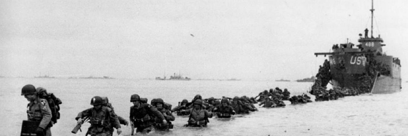
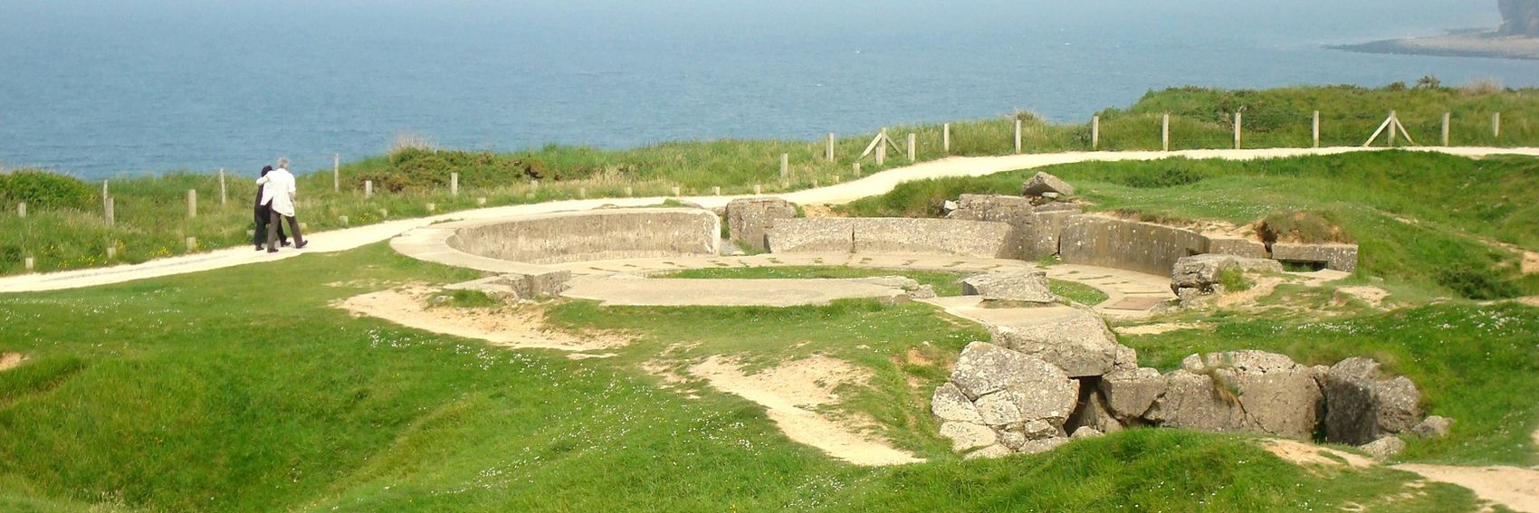
This is a rush job (one of these photos is due to go on the Main Page in a few hours!), but I think it's at least passable. This is obviously a unique feature, and I thought it would be good to split the difference between actual images from D-Day and scenes from the modern-day Normandy beaches. -- AndreCarrotflower (talk) 16:27, 20 May 2014 (UTC)
![]()
![]()

![]()
![]()

- #1 if it's decided that we prefer a historical image; #4 if not. If I were constrained to choose between the two, #1 would get my vote. -- AndreCarrotflower (talk) 16:27, 20 May 2014 (UTC)
- #4 is my clear favorite. jan (talk) 16:29, 20 May 2014 (UTC)
- I'm not in favour of historical ones. I prefer #3, its refreshing. --Saqib (talk) 16:31, 20 May 2014 (UTC)
- Banner voting opening just hours before article should to be featured? Lazy you! :) Anyways, while the two first pictures are full of action, the site visitors are going to visit do look like the "modern" banners. I would prefer #3 - with the trench and the anti aircraft gun place (?) it's a little bit more exciting than the calm beach in the fourth. ϒpsilon (talk) 16:55, 20 May 2014 (UTC)
- I prefer #3, too. It's touching, and I think the photo of the terrain as it now looks with a couple comforting each other with the man - presumably a veteran - putting his arm around his wife really expresses the feeling of the place. Ikan Kekek (talk) 21:16, 20 May 2014 (UTC)
![]()

![]()
![]()
![]()
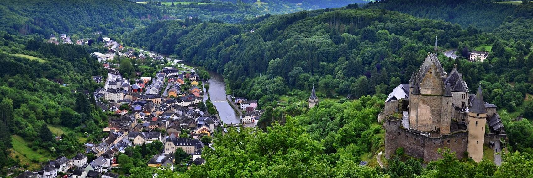
- Hmm... tough one. I like all of them except #1, which I included only so we'd have a token castle-free option. I think #4 is my favorite because it is the most effective demonstration of the text in the blurb, but I love the composition of #3 and the colors on #2. -- AndreCarrotflower (talk) 17:57, 27 February 2014 (UTC)
- Number 3 for me, please - it is so nice and plain. # 2& #4 share my second place, pity the blurb collides with the main motive in #2. Danapit (talk) 19:02, 27 February 2014 (UTC)
- Views from high up down into a valley with small houses are always cool. So: number 4 ϒpsilon (talk) 19:16, 27 February 2014 (UTC)
- All of these are great! I love the view in #4, so that's my favorite. I actually more or less prefer them in reverse order: 4, 3, 2, 1, but I really like #4 best because it shows both the castle and the town. Ikan Kekek (talk) 21:16, 27 February 2014 (UTC)
![]()
![]()

![]()
![]()

- #2 for me, please. It's representative of the uniqueness of the place and not your typical humdrum shot of a skyline or a historical building. #4 is my second choice because I like the colors, but I fear it may be a bit too offbeat - and the scenery is not very distinctive, almost to the point of seeming like an afterthought. #3 is third for me. -- AndreCarrotflower (talk) 14:01, 3 March 2014 (UTC)
- One more vote for #2 with its interesting statues! Then #1, #3, and on the last place #4. I must say the closeup of the colorful dragon heads with a rather gloomy sky and murky river as background and then a colorful boat in the middle of it all makes up a too contradictory picture IMO. ϒpsilon (talk) 15:38, 3 March 2014 (UTC)
- All are good! I agree that #2 is the best, by a considerable margin. After that my preferences are for #3, then the offbeat colors of #4, and then #1. Ikan Kekek (talk) 08:48, 4 March 2014 (UTC)
- Number 1 is my clear winner here: it has a relaxing and dreamy feel to it and a lovely color balance with the shades of gray plus the fresh green forest and the gate! Well found, Andre! #2 is very nice, too, but both in this and in #3 the blurb collides with text. (Just a technical remark: would there possibly be a way to make the position of blurbs better customized? We have this problem very frequently.) #4: at first I thought YES, but then at second look I agree with Ypsilon. Danapit (talk) 10:18, 4 March 2014 (UTC)
![]()
![]()
![]()
![]()

- #2; #3 a close second. -- AndreCarrotflower (talk) 05:51, 23 January 2014 (UTC)
- I also like nummer två best. 3 and 4 are also quite good, but the first one is a bit dark. ϒpsilon (talk) 10:04, 15 February 2014 (UTC)
- # 3. --Saqib (talk) 21:58, 15 February 2014 (UTC)
As I type this, it's 11°F (-12°C) in Buffalo. As you can imagine, I had a good time making these banners. :) -- AndreCarrotflower (talk) 06:34, 21 January 2014 (UTC)
![]()
![]()
![]()

![]()

- #3 for me, please.
- I plan to upload a re-cropped version of #4 as soon as I have access to a computer with photo editing software beyond MS Paint, so that the text collides with the water rather than a substantive part of the image. When I do that, I may change my vote because I can tell that photo has potential.
- Okay, I re-cropped #4 and, though I still prefer #3, #4 is now in a solid second place. #2 is third. -- AndreCarrotflower (talk) 15:39, 22 January 2014 (UTC)
- This is a tough one, they are all great! And one of those that won't make it as the OtBP banner should be used for making the page banner. I love the sky in #2, but otherwise the picture could have been taken just anywhere, there is nothing much specific about it. #3 has a very pleasant composition and the only thing I have a problem with is the graininess. In #4 the blurb just doesn't fit in nicely. And #1 doesn't speak to me much, although I can't put my finger on what exactly it is. So weighing all the above said, my preferences are in the following order: #3, #4, #2 and #1. Danapit (talk) 08:24, 23 January 2014 (UTC)
- "And one of those that won't make it as the OtBP banner should be used for making the page banner."
 Done -- AndreCarrotflower (talk) 17:44, 13 February 2014 (UTC)
- "And one of those that won't make it as the OtBP banner should be used for making the page banner."
- Very good job! My favorite compositions are #2 and #3. I understand Dana's point, but I still think that #2 is a pretty spectacular image, so I think I have a slight preference for it, but I'd be perfectly happy with #3, too. Very nice lighthouse. Ikan Kekek (talk) 22:28, 13 February 2014 (UTC)
- Number 2. The sunset/sunrise is pleasant to look at. ϒpsilon (talk) 10:08, 15 February 2014 (UTC)
Not to toot my own horn, but these banners came out spectacularly.
![]()
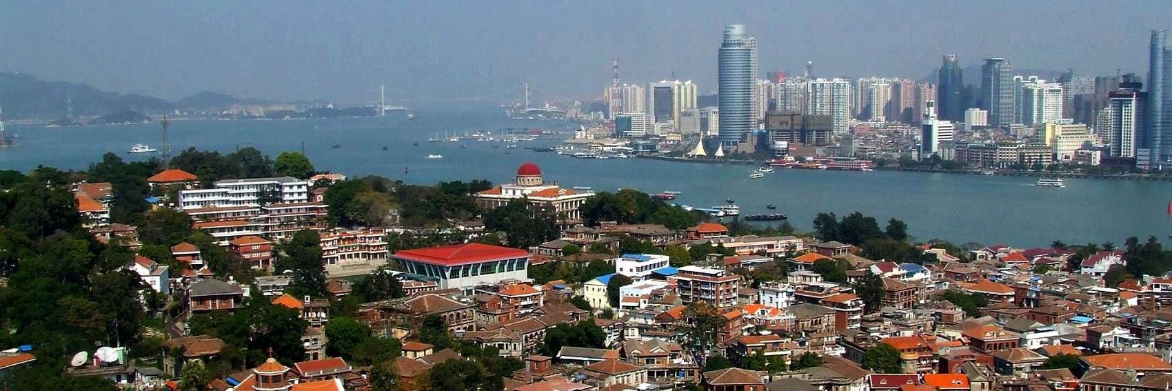
![]()
![]()

![]()

- As with the Golan Trail banners, I love the sweeping views of #1 and #4. But I'm giving #1 a slight edge because its foreground includes Xiamen's main tourist draw, Gulangyu, while #4 is little more than a garden-variety (though beautiful) skyline. #2 is in third place because the symmetry really appeals to me, though it's a very static-looking image. -- AndreCarrotflower (talk) 21:44, 1 January 2014 (UTC)
- Andre, #1 while having pretty composition, has quite bad picture quality, which is prominent in the sky part (what I mean are those "maps" composed of squares of the same color, not sure what this effect is called). I see you were trying to improve the colors, but the result for the sky is not so good. Similar effect is also present in #2, although not so prominent. I would prefer #4, although the caption slightly collides with the high building. Danapit (talk) 11:53, 17 January 2014 (UTC)
- While I respect what Dana says, I prefer banner #1. My second choice is banner #3, because the placement of the dragon among the trees makes it a unique image. #4 and #2 are perfectly good but not as special to me. Ikan Kekek (talk) 02:56, 18 January 2014 (UTC)
- Perhaps #1 could be touched up with PhotoShop? I like its composition so much better than the others (including #4, on second glance) that I'm not really willing to throw in the towel! -- AndreCarrotflower (talk) 02:57, 18 January 2014 (UTC)
- I went looking for the source image for #1 but the link seems to be incorrect. Can you double-check it, Andre? Powers (talk) 17:49, 20 January 2014 (UTC)
- To LtPowers: Fixed. Apparently the file extension was .jpg, not .JPG. -- AndreCarrotflower (talk) 06:15, 21 January 2014 (UTC)
- Ah, yes, I see you increased the contrast from the original. That's what's producing the JPEG compression artifacts that Danapit refers to. I'll have a go at it and see if I can improve the contrast without introducing visible artifacts. Powers (talk) 18:41, 21 January 2014 (UTC)
- To LtPowers: Fixed. Apparently the file extension was .jpg, not .JPG. -- AndreCarrotflower (talk) 06:15, 21 January 2014 (UTC)
![]()

- Is this better? Powers (talk) 19:24, 21 January 2014 (UTC)
- Much better. -- AndreCarrotflower (talk) 15:29, 22 January 2014 (UTC)
- Great. Thanks. Danapit (talk) 08:26, 23 January 2014 (UTC)
- Much better. -- AndreCarrotflower (talk) 15:29, 22 January 2014 (UTC)
- #3, I think the dragon looks cool. ϒpsilon (talk) 22:18, 15 February 2014 (UTC)
Let's hear your votes. -- AndreCarrotflower (talk) 07:38, 1 January 2014 (UTC)
![]()

![]()

![]()

![]()
- I love these sweeping views. #3 gets my vote, with #1 a close second and #4 a distant third. -- AndreCarrotflower (talk) 07:38, 1 January 2014 (UTC)
- Andre, great job. I completely agree. Danapit (talk) 20:14, 1 January 2014 (UTC)
- I like all of these banners. For whatever it's worth, my preferences are in reverse order (4, 3, 2, 1), though I'm not sure I could say why. Ikan Kekek (talk) 02:52, 18 January 2014 (UTC)
- Thanks a lot, Andre. I like #3 the best. The views in #1 & #4 are too pale. I like #2 as well as it's very vivid, but I think a wide-view is more suitable. Tamuz (talk) 13:04, 21 January 2014 (UTC)
- Also, I've now noticed that #1 is a view into Syria. Although the picture was taken from a point in the Trail (Mount Bental), the depicted view is not accessible from there. Tamuz (talk) 14:32, 12 February 2014 (UTC)
- Why isn't the view accessible anymore? Ikan Kekek (talk) 22:24, 13 February 2014 (UTC)
- I assume Tamuz means Syria is not accessible from the Golan Trail. Powers (talk) 18:22, 14 February 2014 (UTC)
- If that's what he meant, I don't see that as an important reason not to show a view that can be seen from there. Ikan Kekek (talk) 19:35, 14 February 2014 (UTC)
- Yes, that's what I meant, and I agree that's not a definitive argument. Regardless, my favorite is #3. Considering all votes, I think #3 is currently the choice? Tamuz (talk) 09:41, 15 February 2014 (UTC)
- If that's what he meant, I don't see that as an important reason not to show a view that can be seen from there. Ikan Kekek (talk) 19:35, 14 February 2014 (UTC)
- I assume Tamuz means Syria is not accessible from the Golan Trail. Powers (talk) 18:22, 14 February 2014 (UTC)
- Why isn't the view accessible anymore? Ikan Kekek (talk) 22:24, 13 February 2014 (UTC)
It's my hope that posting these banner selections will reignite the stalled "DotM vs. OtBP" debate regarding Paramaribo. I have it slotted in the OtBP column for next February, but I dislike doing such things unilaterally.
Personally, if the breadth and quality of photos available on Commons and in other CC-compatible venues are any indication, I'm even more convinced than before that Par'bo is OtBP.
-- AndreCarrotflower (talk) 01:05, 20 November 2013 (UTC)
![]()
![]()

![]()
![]()
- #3 over #4 by a nose for me, with #2 a distant third. I like #3's combination of simplicity and elegance; #4 would have been my choice if it had been possible to keep the text from colliding with the buildings without cropping the water out of the bottom of the photo completely. -- AndreCarrotflower (talk) 01:05, 20 November 2013 (UTC)
- I prefer #4 because it seems to me to get across the feel of the city more than the other banners. Ikan Kekek (talk) 02:07, 20 November 2013 (UTC)
- Clearly #3 for me, it has a pleasant composition. #4 isn't bad, but I have a feeling it is mildly out of focus. Or do I need glasses? Danapit (talk) 10:01, 20 November 2013 (UTC)
- I don't wear glasses and also see #4 as mildly out of focus. I still like it best, though. Ikan Kekek (talk) 22:01, 20 November 2013 (UTC)
As you can see, we have a real problem here with the text shagging off the side of the banner. We need to fix this by March, because we can't put these images on the Main Page looking like this.
![]()

![]()

![]()

![]()
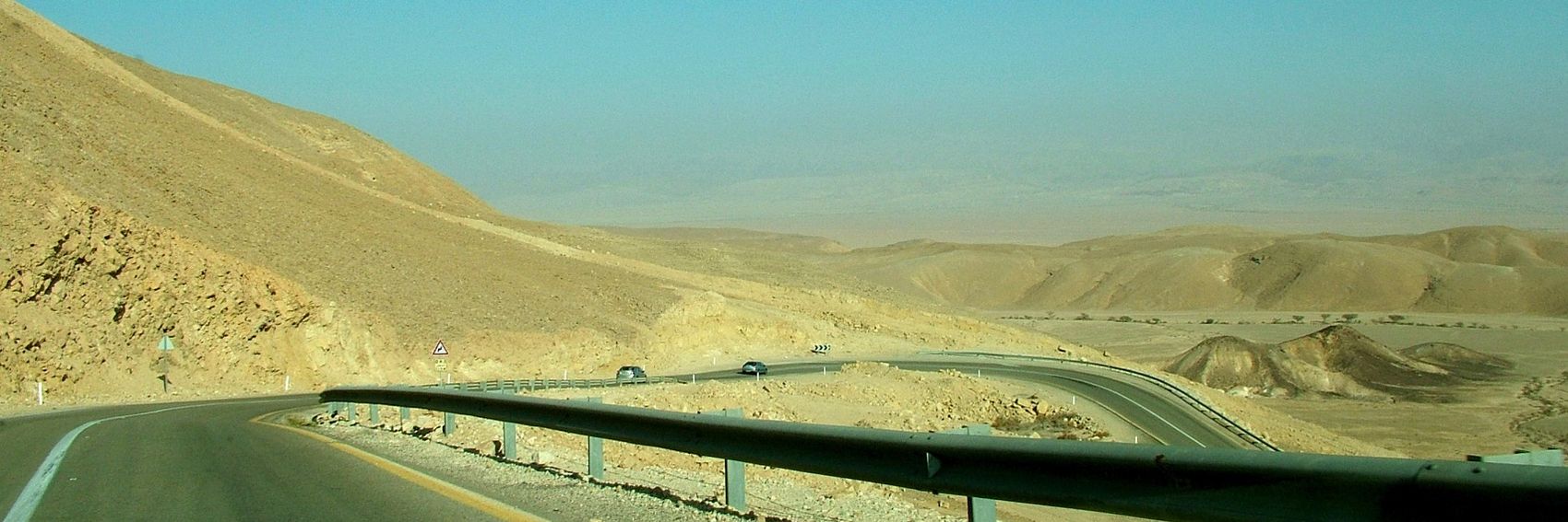
- I'm torn between #1 and #3. I was really hoping to find a suitable image that included both Uluru and Kata Tjuta, and #1 comes closest, but the crevice in Uluru depicted at the left and right sides of the banner could be any rock—and, if you'll pardon my fairly ignorant non-Australian perspective, Uluru is far better known and more recognizable than Kata Tjuta. On the other hand, #3 is the classic image of Uluru, which is precisely my concern: where's the uniqueness in that? And where's the other half of the park's namesake? -- AndreCarrotflower (talk) 10:00, 17 December 2013 (UTC)
- I've lived in Australia my entire life and I have no idea what Kata Tjuta is. You can't really tell either of them from #1. I say #3. James A ▪ talk 10:25, 17 December 2013 (UTC)
- The third one looks best. I knew that a place like Kata Tjuta exists, but I'm sorry to say that #1 could equally well depict some place in e.g. southern Spain... ϒpsilon (talk) 10:34, 17 December 2013 (UTC)
- The third and the fourth are best, and I think I prefer the third because it has wonderful light and the weather is overcast in #4. I don't find #1 a very successful image. Ikan Kekek (talk) 11:51, 17 December 2013 (UTC)
- What about the text issue? Is it easily fixable? (With apologies for what must sound like profound ignorance; I'm a prose writer, not a code writer.) -- AndreCarrotflower (talk) 15:35, 17 December 2013 (UTC)
- Hmm... I left-aligned the text on #s 2 and 4 and inadvertently created a possible solution. But I still don't see this as satisfactory for the long term; we ought to be able to right-justify the title even if the destination's name is long. Come to think of it, we had the same problem with O'Hare's nomination for FTT. Let's fix this. -- AndreCarrotflower (talk) 15:39, 17 December 2013 (UTC)
- It's the CSS that will need tweaking, but I'm not sure where it's kept. LtPowers (talk) 19:52, 17 December 2013 (UTC)
- Hmm... I left-aligned the text on #s 2 and 4 and inadvertently created a possible solution. But I still don't see this as satisfactory for the long term; we ought to be able to right-justify the title even if the destination's name is long. Come to think of it, we had the same problem with O'Hare's nomination for FTT. Let's fix this. -- AndreCarrotflower (talk) 15:39, 17 December 2013 (UTC)
- What about the text issue? Is it easily fixable? (With apologies for what must sound like profound ignorance; I'm a prose writer, not a code writer.) -- AndreCarrotflower (talk) 15:35, 17 December 2013 (UTC)
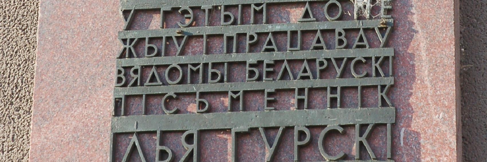
Hmm. Never done one of these for a phrasebook before... -- AndreCarrotflower (talk) 01:07, 5 December 2013 (UTC)
![]()
![]()
![]()
![]()

- I'm torn here. #4 is probably the most similar to what a traveller to Belarus would see (and need to read), but in terms of visual appeal #3 is clearly the best of the bunch. But look at the lettering on #2! -- AndreCarrotflower (talk) 01:07, 5 December 2013 (UTC)
- I like #4 the best. It best captures a situation where travelers that don't know Belarussian or Cyrillic would be completely lost. Altaihunters (talk) 01:36, 5 December 2013 (UTC)
- Maybe instead of a wikipedia description of Belarusian for the tag line, we can say something like "How do you say 'Where is the restroom?' when in Belarus?" Altaihunters (talk) 01:41, 5 December 2013 (UTC)
- Frankly, I wrote that blurb myself and wasn't impressed with it, so I'd welcome anyone who can come up with something more zippy. -- AndreCarrotflower (talk) 01:46, 5 December 2013 (UTC)
- I agree with Altaihunters' reasoning on #4, and I also find the 4th banner the best-looking. Ikan Kekek (talk) 02:04, 5 December 2013 (UTC)
- I'd say either #2 or #4. ϒpsilon (talk) 10:35, 17 December 2013 (UTC)
- I agree with Altaihunters' reasoning on #4, and I also find the 4th banner the best-looking. Ikan Kekek (talk) 02:04, 5 December 2013 (UTC)
- Frankly, I wrote that blurb myself and wasn't impressed with it, so I'd welcome anyone who can come up with something more zippy. -- AndreCarrotflower (talk) 01:46, 5 December 2013 (UTC)
- Maybe instead of a wikipedia description of Belarusian for the tag line, we can say something like "How do you say 'Where is the restroom?' when in Belarus?" Altaihunters (talk) 01:41, 5 December 2013 (UTC)
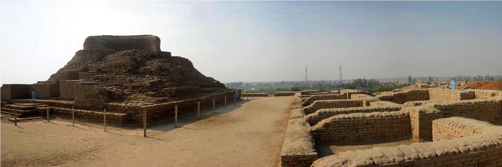
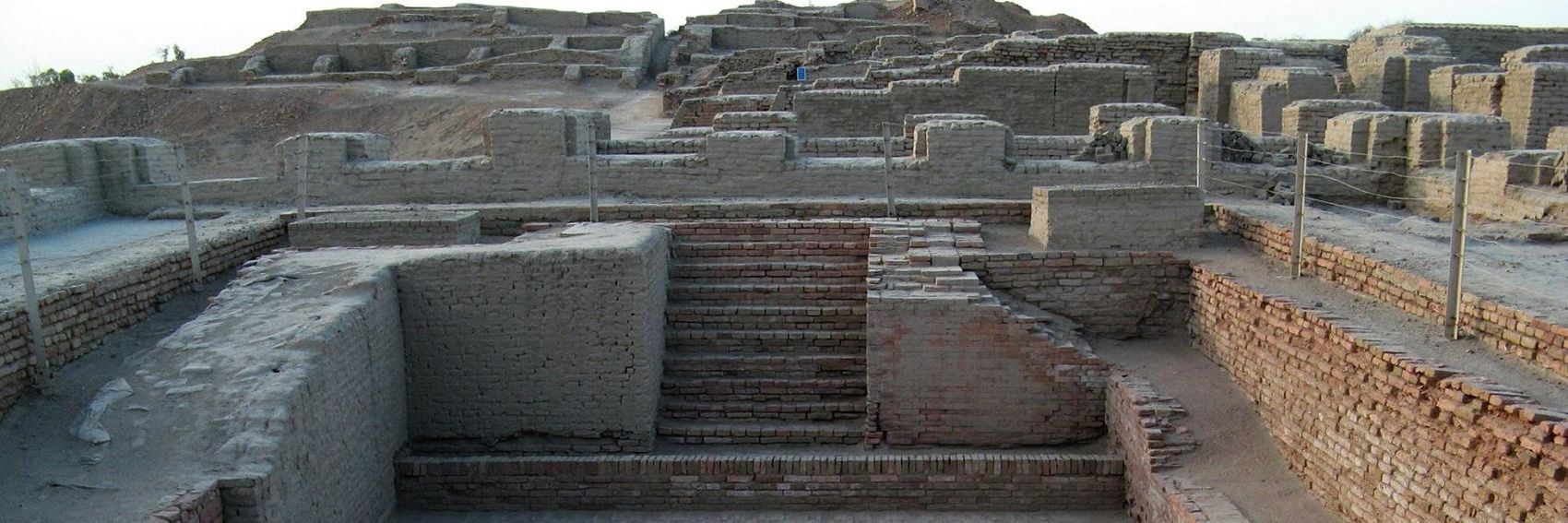
What a dearth of options—these were quite literally the only three four suitable images of Mohenjo-daro on Commons. Flickr was no help either: of the CC-compatible images, the vast majority were uploaded by user "bennylin0724" and their license (CC-BY-NC 2.0) is, as far as I can tell, incompatible with our use. -- AndreCarrotflower (talk) 01:01, 19 December 2013 (UTC)
![]()

![]()
![]()
![]()

- #2, because the text lines up with the image's negative space almost perfectly. Frankly, I'm not dead-set against any of these images, though. -- AndreCarrotflower (talk) 01:01, 19 December 2013 (UTC)
- #4 or #1. --Saqib (talk) 12:49, 19 December 2013 (UTC)
- I'd go for #1, #3, and #2, in that order. Ikan Kekek (talk) 12:51, 19 December 2013 (UTC)
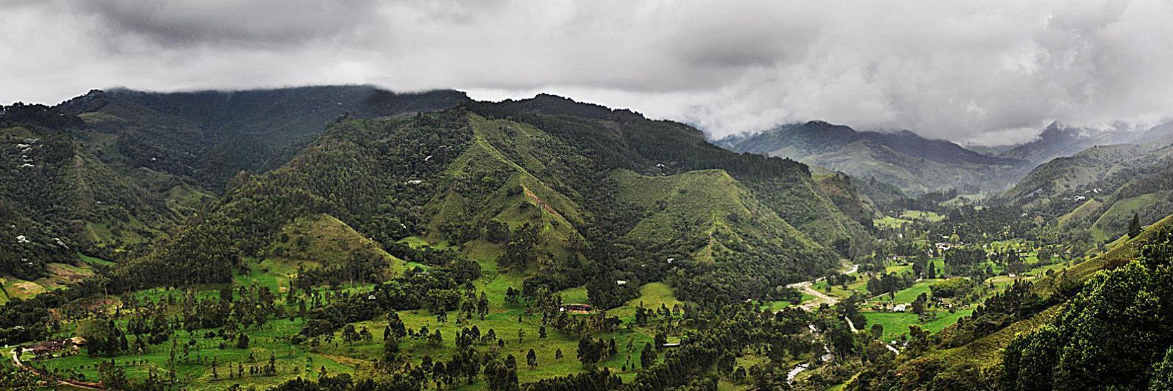
It is my personal goal to have at least three months' worth of featured-destination banners in queue at any given time. -- AndreCarrotflower (talk) 05:59, 4 November 2013 (UTC)
![]()
![]()
![]()
![]()
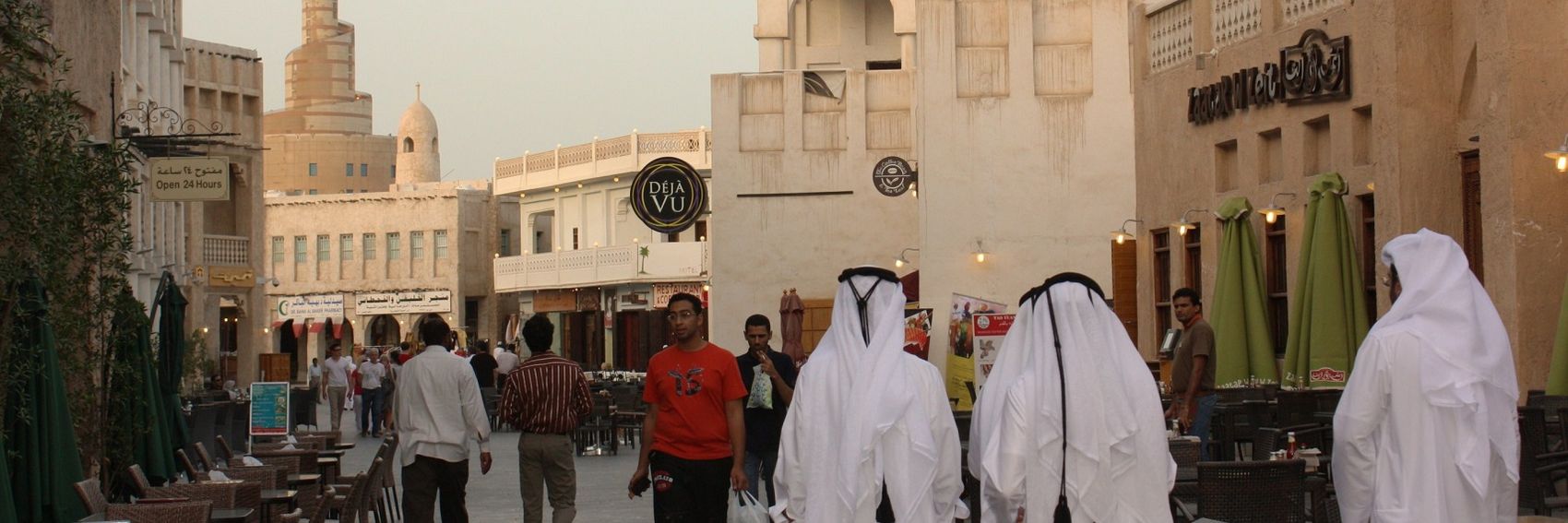
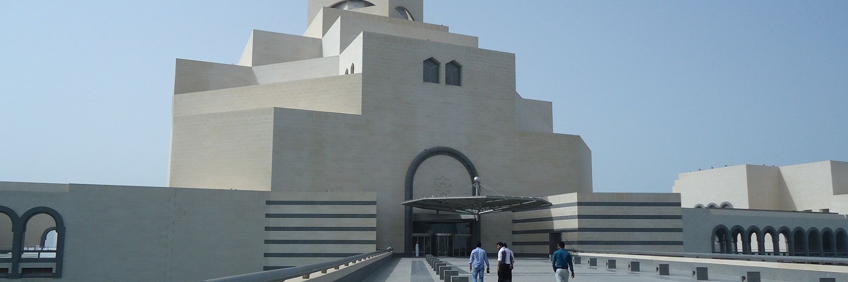
- I'll take any of these except #3—the sculpture at the far left side of the source image was really interesting, but far too much of the top of it was cropped off. Regarding #1, I know we try to shy away from skyline shots as too generic, but the skyline was specifically mentioned in the blurb, and this photo does a great job at showing off the weird and wonderful architectural features of its buildings. Meanwhile, something about the geometric forms on the left side of the building in #2 really do it for me. #4 I enjoy because it's reduced in scale, and the crowd scene really lends it a personal touch—without, IMO, violating the spirit of our guidelines that restrict the inclusion of identifiable people as integral parts of our photos. -- AndreCarrotflower (talk) 05:59, 4 November 2013 (UTC)
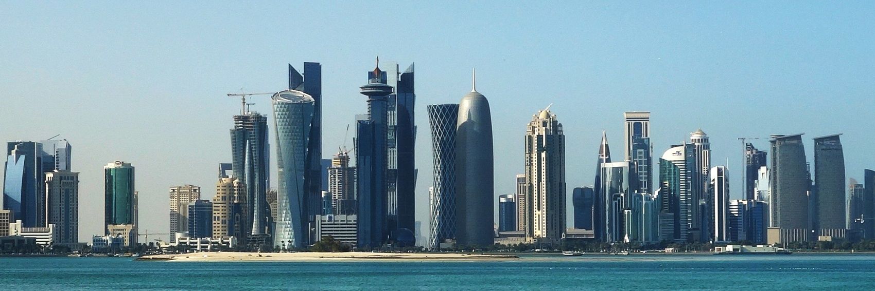
- 1 and 4 are my favourites, although the other two are nice as well. The skyline is not just any skyline, and is interesting in its own right, while 4 presents the city's unique culture and Arabian heritage. Nice work! James A ▪ talk 06:47, 4 November 2013 (UTC)
- Congratulations, these are all great banners, in my opinion, and I'd be happy for any of them to be used! I actually find the 3rd one fine. For whatever it's worth, I'd rank them exactly in order: My preferences are for #1, #2, #3, and then #4. But again, I support them all, so it's just a matter of degree. What a great skyline, though! I seldom see such good modern architecture. Ikan Kekek (talk) 06:50, 4 November 2013 (UTC)
Oof. I was not looking forward to puzzling over what images I might possibly use for these banners.
Here's the best of what I found. As with Valle de Cocora, Banner #1 was sourced from an image that, while smaller than our guidelines say it should be, nonetheless makes for a banner of passable quality.
Vote away!
-- AndreCarrotflower (talk) 08:08, 31 October 2013 (UTC)
![]()
![]()

![]()

![]()
- #4 for me, please. It's perfectly set up so the text is as far as possible out of the way of the salient portion of the image. Meanwhile, #1 is a perfectly good image ruined by the fact that the text blocks out an integral part of the image no matter which side it's placed on; #2 is my second choice, and has an interesting perspective as the would-be "subject" of the image is in the background and out of focus; and #3, while it takes place in a setting where bargaining likely happens with some frequency, looks lifeless and doesn't depict any actual bargaining in progress. -- AndreCarrotflower (talk) 08:08, 31 October 2013 (UTC)
- I agree with you. #4 is the clear winner. The out-of-focus photo strains my eyes, and none of the other photos are nearly as interesting as the fourth. Ikan Kekek (talk) 08:24, 31 October 2013 (UTC)
- Easily 4. Number 1 appears too serious, when haggling is meant to be a sort of fun activity. James A ▪ talk 06:53, 4 November 2013 (UTC)
- We agree on the banners, but bargaining is sometimes pretty serious, often just a mundane part of people's days, and not necessarily fun. Ikan Kekek (talk) 07:08, 4 November 2013 (UTC)
It should be noted that, contrary to the guidelines, the original image that Banner #1 is sourced from is smaller than 1700 x 567 pixels. However, I think it's an excellent image, and after fixing it up in my photo editor to the best of my ability, I feel that it's of sufficient quality to use as a banner. -- AndreCarrotflower (talk) 04:50, 31 October 2013 (UTC)
![]()

![]()

![]()

![]()
- #1 or #2, easily. -- AndreCarrotflower (talk) 04:50, 31 October 2013 (UTC)
- This is some real eye candy! I think #2 is the best, and also that it really should be either #1 or #2, to feature the super-tall palm trees in a highly visible way. Ikan Kekek (talk) 05:58, 31 October 2013 (UTC)
- Thank you Andre, #1 is my clear favorite. The greenness in the background is very pleasant to look at, as opposed to grayish sky in #2, which is my second choice. Danapit (talk) 07:50, 31 October 2013 (UTC)
- It's a cloud forest, so the gray sky, while dreary-looking, is at least truth in advertising. :) -- AndreCarrotflower (talk) 07:55, 31 October 2013 (UTC)
- I prefer #2 precisely because it has a sky, and also because its much deeper background shows a lot of palms in the distance, as well as up front. The whole image is more impressive to me. Ikan Kekek (talk) 07:59, 31 October 2013 (UTC)
- Looking at this again, in light of my original comment I'm leaning toward #2 rather than #1. The vertical orientation—upward thrust, even—of the trees is really visually appealing to me against the backdrop of the sky. -- AndreCarrotflower (talk) 00:44, 5 November 2013 (UTC)
![]()
![]()

![]()

![]()
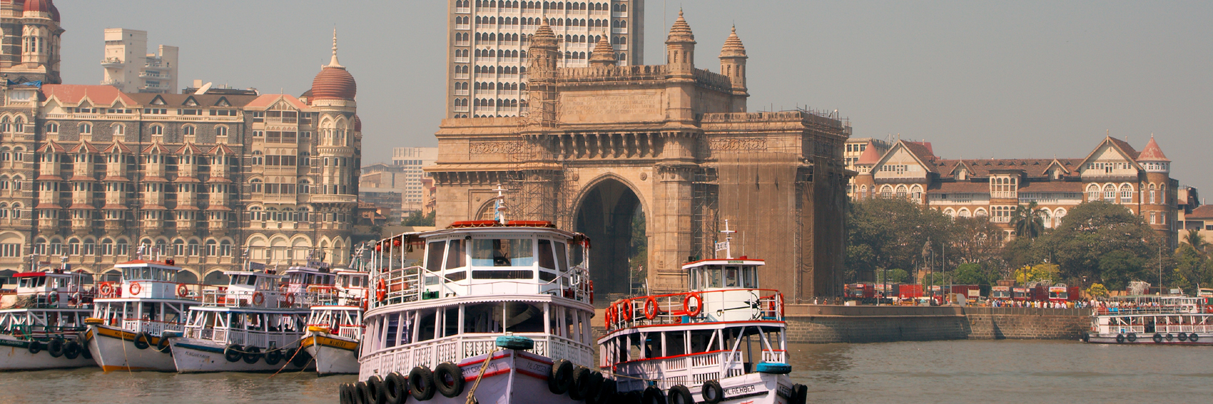
- I'm trying to get myself involved with banners selection procedure here. --Saqib (talk) 23:19, 27 October 2013 (UTC)
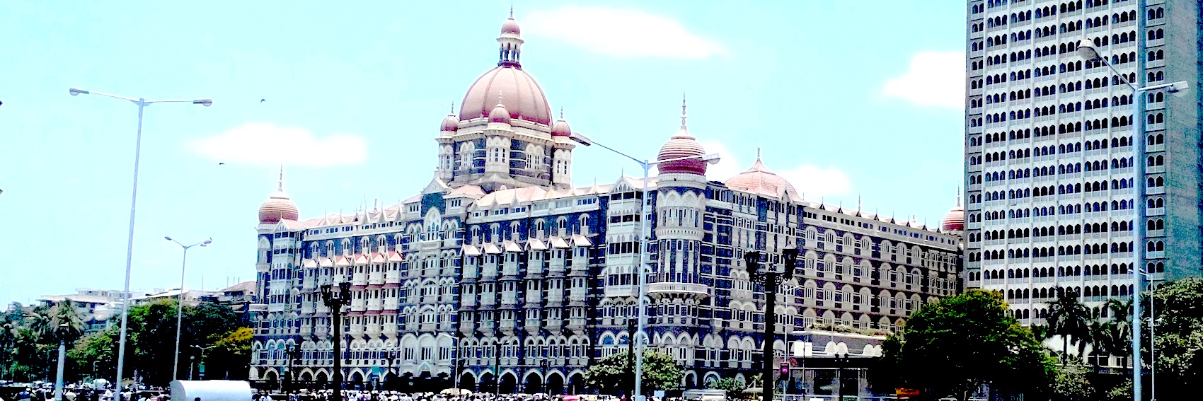
- This is a nice enough image, but before forming an opinion more detailed than that, I'd need to see some other options. We try to select and create banner images that best capture the identity of the destination, but this image frankly doesn't say "Mumbai" (or even "India") to me at all. This looks like it could be in any city. -- AndreCarrotflower (talk) 04:30, 28 October 2013 (UTC)
- Also, for future reference, for the "quote=" section of the banner template, we copy-and-paste the blurb pre-written on the aricle's nomination template. -- AndreCarrotflower (talk) 04:33, 28 October 2013 (UTC)
- The blurb can be changed, though. I agree: Let's see some other possible pagebanners and compare. Thanks for making a nice one, though, Saqib. Ikan Kekek (talk) 07:30, 28 October 2013 (UTC)
- The blurb can indeed be changed, but the change should probably be made on the nomination before doing so on the banner, and stating the rationale for the change on the nomination discussion would be useful as well.
- The blurb can be changed, though. I agree: Let's see some other possible pagebanners and compare. Thanks for making a nice one, though, Saqib. Ikan Kekek (talk) 07:30, 28 October 2013 (UTC)
- Also, for future reference, for the "quote=" section of the banner template, we copy-and-paste the blurb pre-written on the aricle's nomination template. -- AndreCarrotflower (talk) 04:33, 28 October 2013 (UTC)
- (I realize Saqib is new to the banner selection process, so I want to make it clear that I'm not accusing him of acting in bad faith in this instance - just informing him what is the usual and IMO the best procedure.)
- -- AndreCarrotflower (talk) 02:26, 29 October 2013 (UTC)
- Andre, I added the blurb temporarily and Ikan Kekek was saying to change my temporary blurb not the one on nomination page. --Saqib (talk) 09:08, 29 October 2013 (UTC)
- Actually, I was saying that it's fine to change the blurb that's in the nomination. I think that's certainly precedented. Ikan Kekek (talk) 09:11, 29 October 2013 (UTC)
- Andre, I added the blurb temporarily and Ikan Kekek was saying to change my temporary blurb not the one on nomination page. --Saqib (talk) 09:08, 29 October 2013 (UTC)
- Nice banner, Saqib. If selected, the picture would need some editing though, to make the the vertical elements (walls, lamp posts) vertical. I'll see to that later. Danapit (talk) 10:12, 28 October 2013 (UTC)
- I added another two banners for consideration. I tried to straighten up #1, but I didn't succeed. Instead, #2 shows the same sight in perhaps a slightly better weather. #3 is really strange, but I couldn't help myself ;) Halloween is coming! --Danapit (talk) 21:49, 29 October 2013 (UTC)
- Between the three banners so far, I prefer #2. The third one is a bit too strange to me. :-) Ikan Kekek (talk) 22:13, 29 October 2013 (UTC)
- I uploaded one more banner, #4, which I prefer right now. I like the tourist boats in the foreground being sharp and the attractions in the background somewhat hazy. I quite like #2, but the blurb collides badly with the theme I don't see a way to fix it. --Danapit (talk) 22:35, 29 October 2013 (UTC)
- Number 4 is the best so far, I agree. —The preceding comment was added by Ikan Kekek (talk • contribs) .
- The simplicity of #2 appeals to me in a certain way, but I choose #4. Whatever building is in #s 1 and 2, I don't think it makes particularly good subject matter for a banner image of an Indian destination. As I said above, it looks like it could be in any city—specifically a Western city. -- AndreCarrotflower (talk) 08:40, 31 October 2013 (UTC)