Wikivoyage:Destination of the month candidates/Banners/Archive/2017
| DotM banner archives: 2013 • 2014 • 2015 • 2016 • 2017 • 2018 • 2019 • 2020 • 2021 • 2022 • 2023 • 2024 |
Archived banners for destinations featured on the Main Page in 2017.
More banners. Vote! -- AndreCarrotflower (talk) 23:17, 4 November 2017 (UTC)
![]()

![]()
![]()

![]()

- #s 1 and 4, my favorites of the bunch, depict basically the same thing (a manifestation of my lack of ideas of exactly how to depict a concept like the EU in banner form), namely the exteriors of European Parliament buildings (in Brussels and Strasbourg, respectively) with flags in front. Of the two, I like #1 slightly better because it's not sourced from the same image as the pagebanner, and the design of the flags is more easily visible. Third-place #3 is probably the most accurate depiction of the concept of the EU from a traveller's perspective, but I'm not sure whether a person viewing this banner casually would understand the point I was trying to get at with it: this is an international border within the Schengen area, and crossing it is as simple as passing by road signs like those at left and center. Same story with last-place #2: the subject of the image is a big part of what the EU means for travellers, but it doesn't really get at the totality of the subject (though if the article were about the Eurozone in particular, it would be an ideal banner). -- AndreCarrotflower (talk) 23:17, 4 November 2017 (UTC)
- My favorite is number #1 too—I guess some might find the flags a little trite, but it's a great image aesthetically and it basically screams EU. #4 also definitely says EU, and the image isn't half bad. With #2, I get the point and it's a great image, but it feels like a banner for Money. With #3, I think you're right that the point doesn't come across. After all, you might pass by signs like this when crossing between countries that have border controls too—you would just see the signs a little before or a little after the border controls. It would be better if the signs said "Belgique" and "France" instead of "Belgique" and "Wallonie", because then it would be clearer that it's an international border with no border controls. So: 1, 4, 2, 3. —Granger (talk · contribs) 23:54, 4 November 2017 (UTC)
- I also like #1 most, the open border at #3 comes second, then #4 because I prefer the Main Page banner to be different from the one in the article, and on the last place #2. ϒpsilon (talk) 09:13, 5 November 2017 (UTC)
- #1, #4, #3 then #2 Andrewssi2 (talk) 21:03, 5 November 2017 (UTC)
- #1 then #4. AlasdairW (talk) 22:18, 5 November 2017 (UTC)
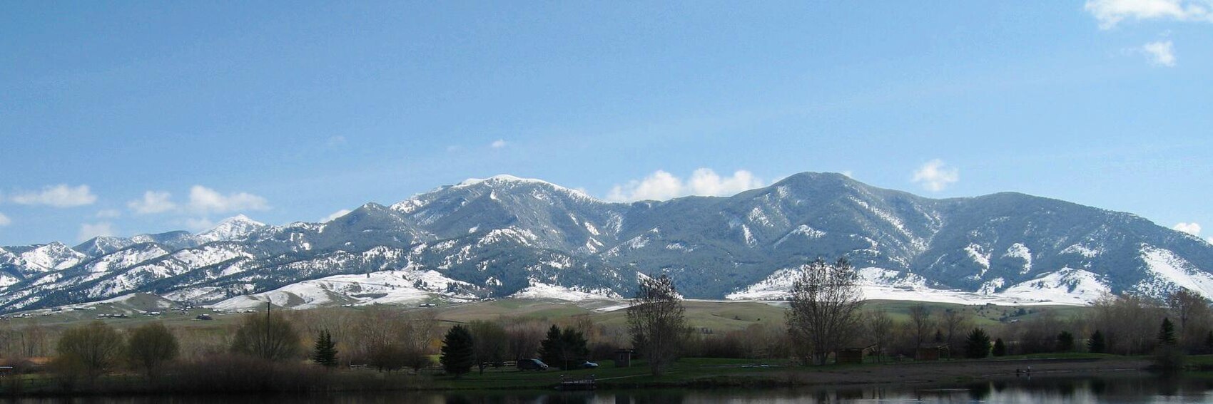
All in all - given the paucity of material to choose from on Commons, the lack of any honkingly obvious marquee tourist attraction in the town, and the fact that a good 95% of the copyleft-compatible photos that a Flickr search of "Bozeman" turns up are the work of one botanist posting photo after photo after photo of what seems like every plant species native to the area - I think I came up with a good selection of banners to choose from. Not perfect by any means (see my remarks below), but good. Let's see if you agree. Vote! -- AndreCarrotflower (talk) 06:37, 3 November 2017 (UTC)
![]()

![]()
![]()

![]()
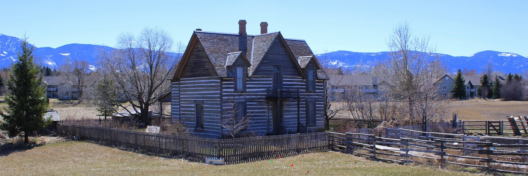
- There's some good and some bad in all these banners. #3 is my favorite by a nose because it shows two elements discussed in the blurb: the mountains (where the winter sports take place) and the university campus. However, this clearly isn't a wintertime view, which may be a problem if we're running the article in December. #2 is a close second, with snow on the mountains, but anything resembling a town is absent. The others trail much further behind: #1 certainly looks like a cute college town, even if the college itself isn't shown, but again, this photo was taken in the summer. #4, the image of the recreated homestead at the Museum of the Rockies, brings up the rear: it depicts an attraction listed in the "See" section but doesn't have anything to do with the text in the blurb. -- AndreCarrotflower (talk) 06:37, 3 November 2017 (UTC)
- 2, 3, 4, 1 for me, and I like them all. Ikan Kekek (talk) 06:48, 3 November 2017 (UTC)
- I like them all too. My order is the same as AndreCarrotflower's: 3, 2, 1, 4. —Granger (talk · contribs) 09:31, 3 November 2017 (UTC)
- 2,3,1,4 ϒpsilon (talk) 18:57, 4 November 2017 (UTC)
- #4, #1, #2, #3 - I really wanted to like #3 more because of the backdrop, but the buildings in the foreground are somewhat of a turn off Andrewssi2 (talk) 21:06, 5 November 2017 (UTC)
What a stunning destination. I've never been to Iguaçu Falls before, yet I'm awestruck just from looking at the photos. It was a true pleasure to make these banners - frankly, it was difficult narrowing the possibilities down to just four. Here they are for your consideration. -- AndreCarrotflower (talk) 18:11, 29 October 2017 (UTC)
![]()

![]()

![]()

![]()

- The aerial view, #1, is the clear favorite for me, being the best expression of the astounding size of this waterfall chain. The others vie pretty closely for second place, but I'm going to say #2 for second (the rainbow was the deciding factor), #3 for third (a really impressive view of the falls marred by there being nowhere to really fit the textbox), and #4 (a nice view of one of the activities listed in the "Do" section, but at the expense of relegating the falls themselves to a supporting player in the image) in last. -- AndreCarrotflower (talk) 18:11, 29 October 2017 (UTC)
- Amazing! I agree with you, 1 is the best banner followed by 2, 3 and 4. ϒpsilon (talk) 19:04, 29 October 2017 (UTC)
- I just love that rainbow! For me, it's 2, 3, 1, 4. Ikan Kekek (talk) 06:50, 3 November 2017 (UTC)
- 1, 2, 3, 4. All are beautiful, of course. —Granger (talk · contribs) 09:27, 3 November 2017 (UTC)
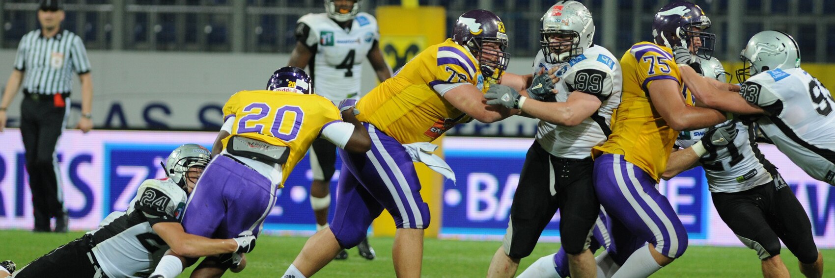
Banner #3 here is recycled from one Powers made a few years back for Pittsburgh's stint as DotM. Let's hear your votes! -- AndreCarrotflower (talk) 03:42, 5 October 2017 (UTC)
![]()
![]()
![]()

![]()
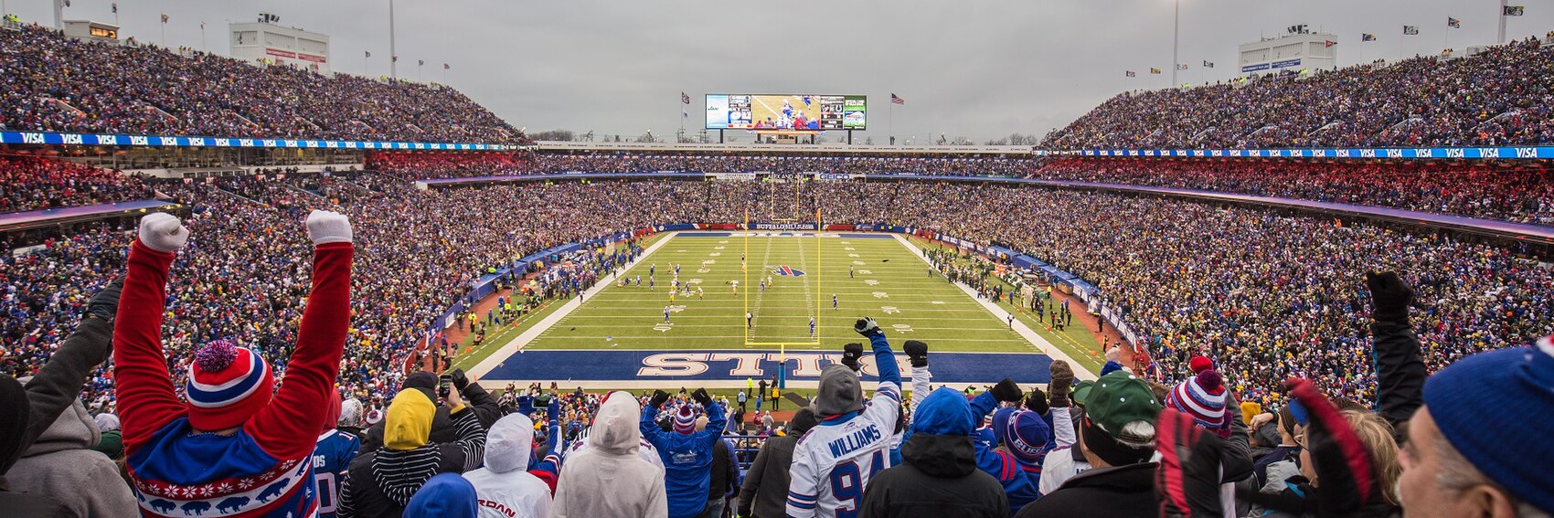
- I may be biased (the view is of a Buffalo Bills game), but I think #2 is clearly the best of the bunch, easily the most accurate representation of the general fan experience as well as just a plain spectacular image. #1 is in second. #3, the view of Steelers fans with their "terrible towels", is an interesting image from an aesthetic viewpoint (and works better in this context than for a Pittsburgh DotM) and would likely score higher on my ranking if it was clear to the uninitiated that this is a crowd at a football game rather than some other event. #4, plagued as it is by low image quality, places last. -- AndreCarrotflower (talk) 03:42, 5 October 2017 (UTC)
- #1, #2, #4, #3. ϒpsilon (talk) 04:34, 5 October 2017 (UTC)
- #1 is the one most clearly showing gameplay, but I am not sure whether it showing a game in Europe is a bug or a feature. #4 does suffer from its smushyness and I personally thing the person with their hands up in #2 is a bit distracting. #3 is recognizable as Football only to the already initiated (who aren't necessarily the target audience) and to almost all who recognize it as "Football" it is recognizable as "Steelers". #2 has a similar problem, but at least it is clear that it's a grass-based-sports event. Overall, I think #1 is best ahead of #2 with #3 and #4 rounding out the rest. Hobbitschuster (talk) 09:38, 5 October 2017 (UTC)
- I like #2 the best. #1 and #3 next and #4 is too low-quality. ChubbyWimbus (talk) 14:24, 5 October 2017 (UTC)
- #2, #1, #4, #3. I think #2 seems pretty much ideal, as it is a beautiful image that illustrates both the game itself and the fan experience. #1 is great too, giving a vivid image of the game. #3 looks like a crowd watching a sports game, but it's a little blurry, not particularly appealing, and doesn't make me think "football". —Granger (talk · contribs) 14:57, 5 October 2017 (UTC)
- #2, #4, #1, #3. A good selection, #3 could be another game. AlasdairW (talk) 22:30, 5 October 2017 (UTC)
- I still think that Terrible Towel pic is perfectly emblematic of Pittsburgh, but that's neither here nor there. I agree #2 is the best of the bunch, though I may also be biased. Our article is about the fan experience; #1 shows what you might see on TV but in no way represents what the typical traveler will see. Powers (talk) 23:10, 5 October 2017 (UTC)
- Powers' point on the fan experience is well taken. I think #2 is optimal, then #4. The point that it's not clear to those who don't already know that #3 is a football game is well taken, too, so I'd counsel against using it. Nix on #1 for the reason Powers states. Ikan Kekek (talk) 02:24, 6 October 2017 (UTC)
Banner time again. let's hear your votes! -- AndreCarrotflower (talk) 01:01, 5 October 2017 (UTC)
![]()

![]()

![]()

![]()
- Judging by the photos I filed through at Commons and Flickr, the big tourist draw in Sde Boker seems to be David Ben Gurion's home and gravesite. It's perhaps unfortunate, then, that my two favorite photos happen to be the ones unrelated to him. The majestic desert scenery in #4 takes first place for me despite it not being apropos of anything in the blurb, but #1 (the Nabataean ruins) is a close second. #3, the goofy statue of Ben Gurion (?) standing on his head next to the walkway in front of his old house, is in third place. -- AndreCarrotflower (talk) 01:01, 5 October 2017 (UTC)
- My favorite is actually the statue #3, then the amazing landscape #4, on the third place home which is the main man-made attraction #2, and lastly #1. ϒpsilon (talk) 04:32, 5 October 2017 (UTC)
- My favourite is #3, which could be "take a headstand off the beaten path", followed by #4 then #1. AlasdairW (talk) 22:43, 5 October 2017 (UTC)
- #1 is my favorite and is mentioned in the blurb. After that, the others drop in intrigue to me considerably, but I guess #3 is next, followed by #4. #2 is last. ChubbyWimbus (talk) 11:10, 6 October 2017 (UTC)
- For me, 1, 4, 3. 2 with the overexposed sky is weak by comparison with all the others, so let's use one of those. Ikan Kekek (talk) 06:54, 3 November 2017 (UTC)
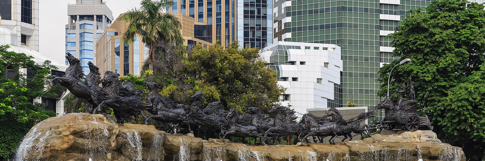
As you can plainly see from what's written in the blurb, Jakarta has been described as a huge, jumbled, sprawling metropolis that, proportionally speaking, has a relative dearth of points of interest for the traveller. Rather, it's said that the allure comes from the chaos and clatter itself, which serve as a kind of soundtrack or rhythm of the city. An overall gritty ambience, constant construction, traffic and noise, the weird juxtaposition of gleaming new high-rise buildings next to slums - that sort of thing. A lot of people don't grok the appeal of that sort of place. I do, but it certainly presents a challenge when trying to come up with a DotM banner that's appealing in a more or less universal way. With these four banners, I think I walked that line about as well as it possibly could be walked. Let's see what you all think. -- AndreCarrotflower (talk) 00:49, 28 September 2017 (UTC)
![]()

![]()

![]()

![]()
![]()

![]()
![]()

- As I had expected going in, the two skyline banners are my favorites. #3 probably comes closest to portraying the true face of Jakarta, but I'm going to put it in second place behind #1 for two different reasons: one, because of the placement of the textbox; and two, because besides the concrete-jungle aspect, #1 also depicts a couple of the "worthwhile cultural attractions" described in the blurb (namely the Monumen Nasional at center and the equestrian statue of Prince Diponegoro at right, both on Merdeka Square). In third place is the image of Istiqlal Mosque in #2, which is very appealing to me as an aficionado of architecture and design but is decidedly at odds with the description of the city in the textbox, and in last place (though still a pretty good banner IMO) is the view of Fatahillah Square with the Jakarta History Museum, in the colonial-era Old Town. -- AndreCarrotflower (talk) 00:49, 28 September 2017 (UTC)
- Visually, I like #2 the most followed by #4. But as stated, they may not capture the essence of the city. Gizza (roam) 03:34, 28 September 2017 (UTC)
- I think #2 is the best hands-down in terms of aesthetics and making the destination look like a nice place to visit, but #3 matches the description of the city the best. I don't like #1 that much, because it seems generic to me – it looks like it could be almost any sizeable city with the right climate. I'd vote #3, #2, #4, #1, with the caveat that I don't know anything about Jakarta beyond what I learned when copyediting the article. —Granger (talk · contribs) 11:11, 28 September 2017 (UTC)
- The more I think this over, the more what Granger says above makes sense. I'm changing my vote: #3 first, the #1, #2, and finally #4. -- AndreCarrotflower (talk) 14:16, 28 September 2017 (UTC)
- I like #1 most, with skyscrapers and monuments and the palms giving it a tropical touch. #4 with the Dutch building comes next, it's an interesting contrast, it also is more livelier than #2 which is close behind. #3 sort of could be anywhere in the world and it's last on my list. ϒpsilon (talk) 17:55, 28 September 2017 (UTC)
- @AndreCarrotflower, DaGizza, Ypsilon: Given the differences of opinion and problems weighing the aesthetic qualities against the description of the city, I went ahead and uploaded three more banners. I'm not sure any of them match the description all that well either, but at least they give more options. What do you think? —Granger (talk · contribs) 21:44, 30 September 2017 (UTC)
- I have a lot of trouble picking between these banners, partly because I haven't been to Jakarta since 1976 and found it chaotic then. We stayed there only as long as necessary and hot-footed it to Yogyakarta. That said, I'm liking banner #6. What is shown in it? Ikan Kekek (talk) 21:53, 30 September 2017 (UTC)
- Arjuna Wijaya, mentioned in Jakarta#See and Jakarta/Central#See. —Granger (talk · contribs) 22:02, 30 September 2017 (UTC)
- Granger - #s 5 and 6 don't do much for me, but #7 (the best of the new lot) I'd put in third place: same basic subject matter as #1, plus better photo quality but minus the Diponegoro statue. -- AndreCarrotflower (talk) 22:05, 30 September 2017 (UTC)
- Thanks for creating additional banners. Now my ranking goes like this: #1, #7, #4, #6, #2, #3, #5. ϒpsilon (talk) 17:22, 3 October 2017 (UTC)
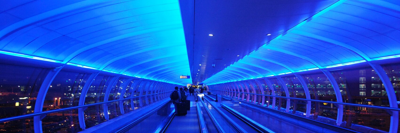
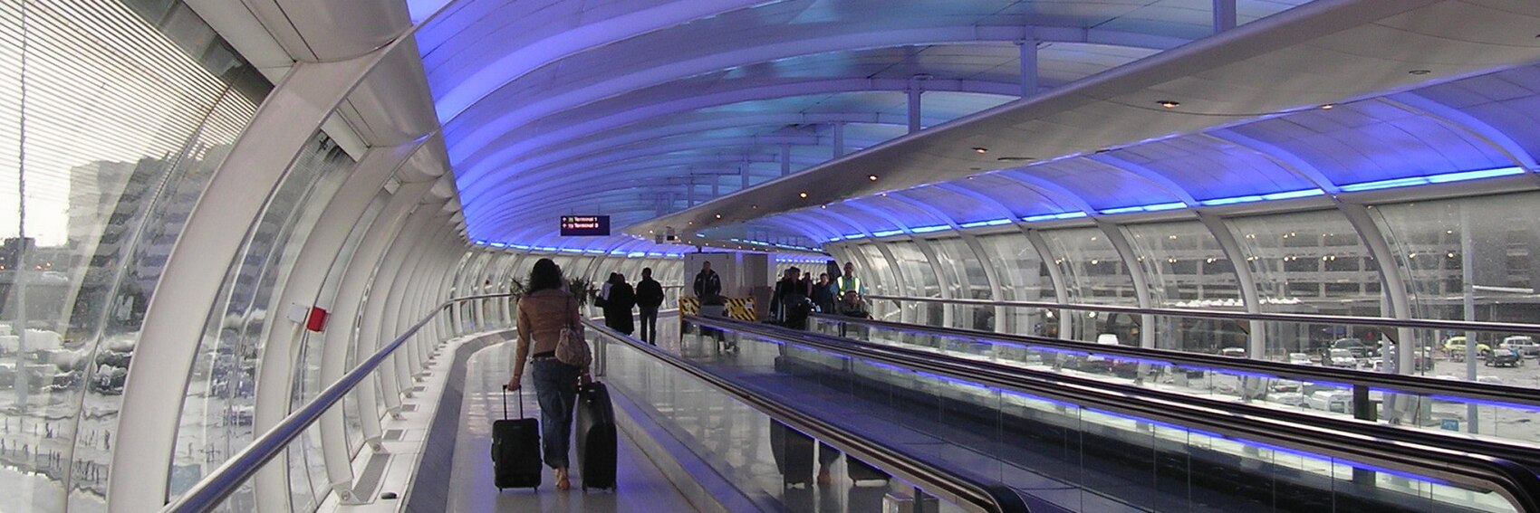
What can I say, sometimes I get on a roll. Four to vote on for October's FTT. -- AndreCarrotflower (talk) 06:04, 18 August 2017 (UTC)
![]()
![]()
![]()
![]()
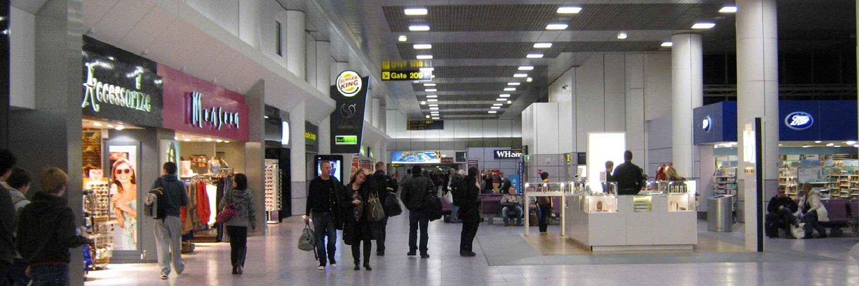
- The blue-lit walkway between the airport railway station and Terminal 1 seems to be the principal "point of interest" within MAN, so it is the subject of two of these banners and also makes an incidental cameo appearance in a third. Despite the poorer image quality, the vibrant color in #1 earns it first place in my book. #3 places second, #2 third, and #4, with its less interesting subject matter and poorer image quality, is in last. -- AndreCarrotflower (talk) 06:04, 18 August 2017 (UTC)
- Thanks for the banners! My votes are exactly the same as yours. #1 by far, then #3 with the gray background, then a dropoff to #2 with #4 a distant last but of course still à propos. Ikan Kekek (talk) 06:13, 18 August 2017 (UTC)
- Nice selection. In this case my preference is exactly in the order that they are given: #1, #2, #3, #4. AlasdairW (talk) 13:58, 18 August 2017 (UTC)
- I prefer #2, then comes #1, #4 and #3. ϒpsilon (talk) 16:51, 18 August 2017 (UTC)
- Number 1 surely has a "space-age" feel to it, but I don't know how representative it is. Hobbitschuster (talk) 19:39, 18 August 2017 (UTC)
- When you run a search for Copyleft-compatible photos of "Manchester Airport" on Flickr, almost all the pictures that come up (leaving aside the usual profusion of airplanes on the tarmac, taxiing, taking off, landing, etc.) are of the blue walkway. -- AndreCarrotflower (talk) 21:04, 18 August 2017 (UTC)
- #1 again because of that awesome, bright blue colour. Gizza (roam) 03:31, 28 September 2017 (UTC)
There are a total of three images of Filadelfia at Commons, and zero on Flickr, that are more than 1700 pixels across and are thus eligible for use as a DotM banner. One is of an electrical substation, one is of a Jeep parked next to a sign that reads "Bienvenido a Fildelfia"; neither of those two are anything remotely close to a good image to use as a banner. That leaves the following banner to run unopposed in this "election". Share your thoughts, along with any other images you might chance to come across. -- AndreCarrotflower (talk) 04:12, 18 August 2017 (UTC)
![]()

![]()

- It's OK. If someone finds something else, great. Otherwise, I don't see any problem at all in using this. Ikan Kekek (talk) 04:48, 18 August 2017 (UTC)
- Thanks for the effort. It is a reasonable choice given what is available, and it is not ideal that it is also the article banner. File:Filadelfia - Chaco paraguayo - panoramio.jpg
 is also available, but I don't think that a picture of a non-descript shopping centre is an improvement. AlasdairW (talk) 14:04, 18 August 2017 (UTC)
- I vote for #1 :D . User:Cmasi took some photos recently (and added them to the article), but they aren't apparently large enough. ϒpsilon (talk) 16:49, 18 August 2017 (UTC)
- I have uploaded four large images of Filadelfia. File:Ferrnheim_Cooperative.jpg
 File:Jakob_Unger_Museum.jpg
  File:Parque_de_las_Memorias_2.jpg
  File:Parque_de_las_Memorias_3.jpg
  Please check them if they are nice enough to be banner, and please create the banner proposal (I don't know how to do it). Cmasi (talk) 00:35, 19 August 2017 (UTC)
- I have created a second banner using Parque_de_las_Memorias_2.jpg. I did this using the crop tool, so a local copy will have to be made if the banner is used. I slightly prefer this to the first one, so my order of preference is now #2, #1. AlasdairW (talk) 22:23, 31 August 2017 (UTC)
- #1 is far from perfect, but what with the Spanish- and German-language street signs and the monument in the center of the roundabout, I think it still has more local flavor than the new one. -- AndreCarrotflower (talk) 14:52, 7 September 2017 (UTC)
- I have created a second banner using Parque_de_las_Memorias_2.jpg. I did this using the crop tool, so a local copy will have to be made if the banner is used. I slightly prefer this to the first one, so my order of preference is now #2, #1. AlasdairW (talk) 22:23, 31 August 2017 (UTC)
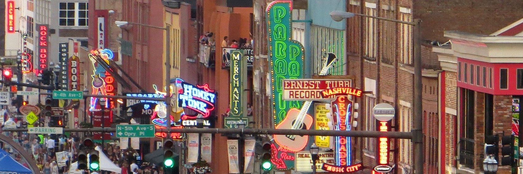
My memories of my 2008 visit to Nashville made it relatively easy to brainstorm subject matter that might make for good banner images. I'm really pleased with the results. Those are my thoughts, now let's hear yours! -- AndreCarrotflower (talk) 03:21, 18 August 2017 (UTC)
![]()
![]()

![]()

![]()
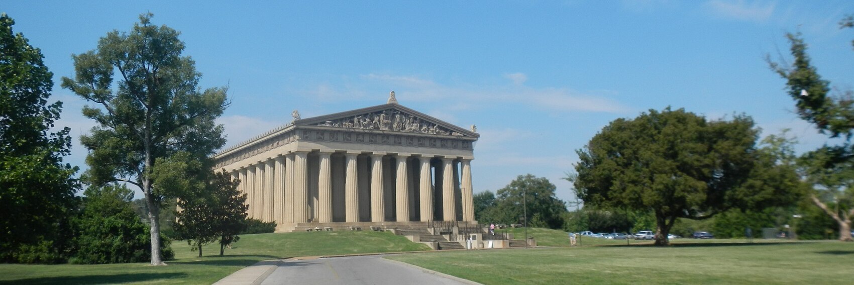
- I really want to pick #4. It's my favorite of all the images aesthetically, plus it jibes well with the blurb and defies the stereotyped conventions of what is in reality a multifaceted city. But - naturally enough - a full-scale replica of the Parthenon like the one plunked into the middle of Centennial Park makes for an image that looks more like Greece than Tennessee. So for first place, just by a hair, I'm going to go with the stereotype-conforming but also very attractive and lively view down Broad Street near the Ryman Auditorium in #1. It's a very close race for third, as well, but I'm going with #3 (the downtown skyline with the iconic "Batman Building" at right) over #2 (the Country Music Hall of Fame and Museum; the subtle "piano keys" motif on the facade only partially makes up for what is a fairly boring image). -- AndreCarrotflower (talk) 03:21, 18 August 2017 (UTC)
- Banner #1 may be stereotypic, but it's exciting! I agree: #4 is my 2nd choice. However, I'd make #2 my 3rd choice and #3 my 4th choice; I don't like Nashville's modern skyline, at least from this angle, as much as you do. I might have a different opinion if I were looking at a view from a bridge, showing some of the bridge and river (when I was in Nashville in 1998 or so, I stayed across the river from Downtown and walked across the bridge repeatedly and with pleasure). Ikan Kekek (talk) 03:32, 18 August 2017 (UTC)
- I agree with Ikan's ranking here; the lively #1 for me, please! Then #4, #2 and #3. ϒpsilon (talk) 16:45, 18 August 2017 (UTC)
- #1 is the winner for sure—it captures the feel of Nashville for a traveller. Then #3, #4, #2. —Granger (talk · contribs) 01:39, 21 August 2017 (UTC)
- Out of all these images, #1 is the photo that makes me want to visit Nashville. Gizza (roam) 03:30, 28 September 2017 (UTC)
Time to make the doughnuts banners. -- AndreCarrotflower (talk) 04:52, 14 August 2017 (UTC)
![]()

![]()

![]()
![]()

- There's no overwhelming winner here, but I think #2 gets the point across just a bit better than the others. I want to put #1 in second place, but the poor image quality prevents me from doing that; #4 takes the silver instead. #3 takes last place, but again, there's not much distance between these candidates and I'd be okay with any one of them on the Main Page. -- AndreCarrotflower (talk) 04:52, 14 August 2017 (UTC)
- It feels like advertising, but you gotta go with #2, the Big Mac, fries and a soda or whatever the drink is. If we decide not to so prominently feature a highly recognizable product, we could go with my 2nd choice, #3, or the more out-of-focus #1. I'd avoid #4 because it's not in good focus and also slanted down to the left. Ikan Kekek (talk) 06:21, 14 August 2017 (UTC)
- #2 is a good fit, except that McDonalds is the one fast food restaurant that is not really covered by the article - if this is used then maybe there should to be a paragraph describing their offering. My preference is #1 then #4. I have never used a drive through, so #3 looks more like a row of parked cars. AlasdairW (talk) 21:06, 14 August 2017 (UTC)
- My weak preference is for #1, then #2, then #3. I like how #1 and #3 look pretty generic at first glance, unlike #2 and #4 which single out one particular chain in an immediately obvious way. I agree with AlasdairW that #3 doesn't scream "fast food", though, especially since the window is covered up by the text. If the image quality of #1 were just a little better, I think it would be perfect. —Granger (talk · contribs) 21:24, 14 August 2017 (UTC)
- Nice to see that you've found time to create so many banners (both for this article and the others below)! I prefer #2 too, even if McDonald's is prevalent pretty much all over the world. #4 comes second, then #1 and lastly #3. ϒpsilon (talk) 16:39, 18 August 2017 (UTC)
- Ypsilon - with eight days left until the wedding, most of the major work is already done, so I've had a bit more time to attend to other things. Also, my foot is about 90% back to normal (i.e. it feels fine to go about my normal routine, if not yet quite good enough to do strenuous exercise). -- AndreCarrotflower (talk) 21:07, 18 August 2017 (UTC)
- That's great to hear! ϒpsilon (talk) 21:21, 18 August 2017 (UTC)
- Ypsilon - with eight days left until the wedding, most of the major work is already done, so I've had a bit more time to attend to other things. Also, my foot is about 90% back to normal (i.e. it feels fine to go about my normal routine, if not yet quite good enough to do strenuous exercise). -- AndreCarrotflower (talk) 21:07, 18 August 2017 (UTC)
Okay, so I've got a lot going on in my life at the moment. I'm getting married in less than three weeks, and I'm up to my eyeballs in the final stages of planning for that as well as lots of other unrelated offwiki tasks, all while simultaneously spending the previous two weeks slowly nursing myself back to health after a particularly nasty flareup of achilles tendonitis and gout that's left me in more or less constant pain.
So as you can imagine, when it comes to making banners for Kurashiki, I'm not in a frame of mind that's conducive to patience with the lack of suitable copyleft-compatible photos. So, you know what? I'm going to make it easy on myself. I managed to find one image that's just about perfect, and I'm going to post it here for your consideration and then not worry about making alternative banners that I already know won't hold a candle to this one. Our policy doesn't specifically stipulate that there need to be four different options to choose from - that's an arbitrary standard that I hold myself to, not anything inviolable or set in stone. And there's certainly nothing stopping any other editor from submitting a banner candidate of their own, should this one not be satisfactory to them.
Hopefully, when the time comes to make banners for Fast food in the United States and Canada, I'll be in an improved headspace (and footspace!) and have less on my to-do list. Be that as it may, though, I think this image is about as emblematic of the Kurashiki tourist experience (and the blurb in the textbox) as possible.
-- AndreCarrotflower (talk) 23:38, 8 August 2017 (UTC)
![]()

- I'm perfectly happy with this. Mazel Tov on the marriage and a speedy recovery to you! Ikan Kekek (talk) 00:37, 9 August 2017 (UTC)
- Thank you, Ikan! -- AndreCarrotflower (talk) 04:05, 9 August 2017 (UTC)
- That's a great banner, so yes just go with that. And all the best for your wedding! --Andrewssi2 (talk) 04:15, 9 August 2017 (UTC)
- Congratulations to your wedding and hope you get well as soon as possible. And thanks for making the banner, it's really nice. --ϒpsilon (talk) 10:01, 9 August 2017 (UTC)
- Let me join the choir of well-wishers and furthermore thank you for your tireless work nominating banners. They are usually always so good that I refrain from voting because I don't know the places well enough to know which one best encapsulates them - aesthetically they're usually all up there. And of course, off-wiki is sometimes (often) more important than what we do here... Hobbitschuster (talk) 14:55, 9 August 2017 (UTC)
What a ridiculously photogenic city Milan is. And the guy from Right Said Fred said he was "too sexy" for it? Not on your life.
If only all DotMs could have this caliber of material to choose from when banner-making time rolls around.
-- AndreCarrotflower (talk) 01:35, 26 July 2017 (UTC)
![]()

![]()
![]()
![]()

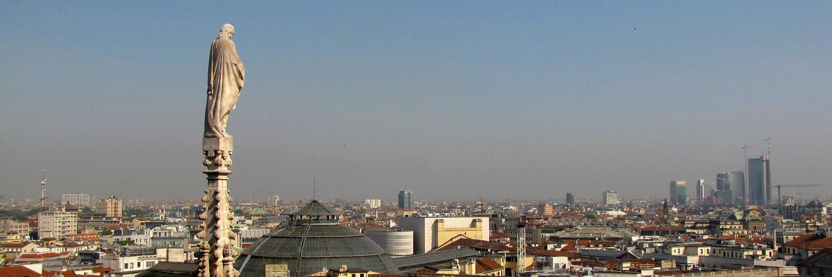
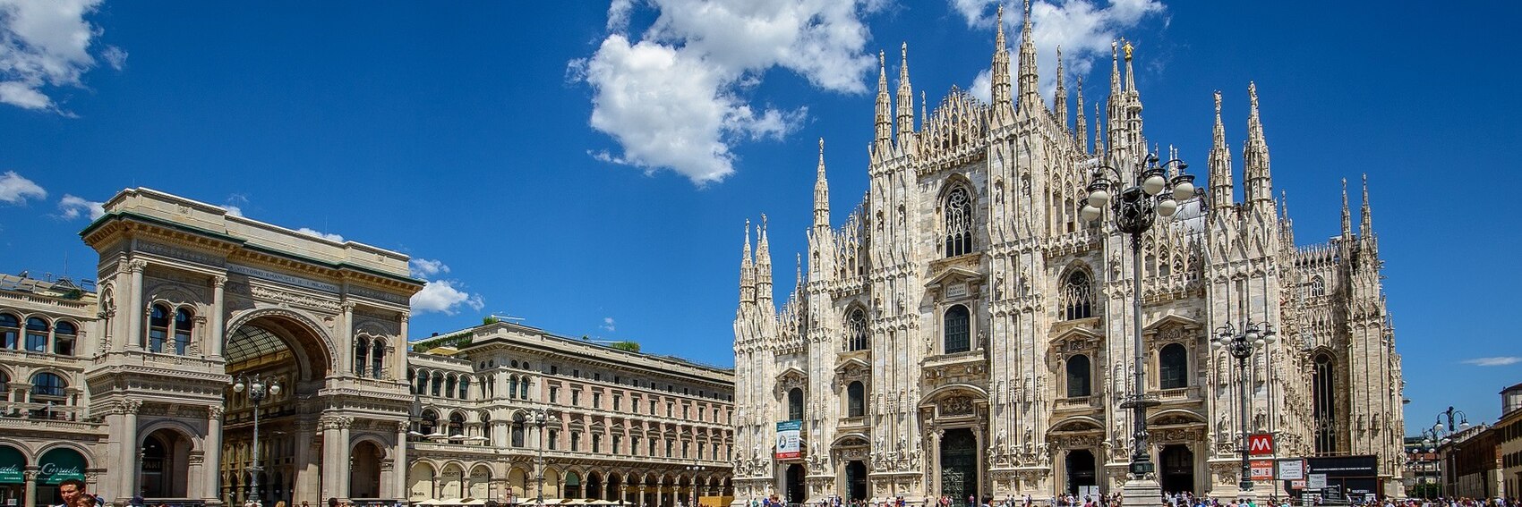
- Iconic images all, so for me it's down to aesthetic presentation to differentiate the great from the merely good. #3 (the Piazza del Duomo, with the namesake cathedral at right and the Galleria Vittorio Emanuele II at left) is the runaway winner for me. Placing a distant second is the handsome #1 (Teatro alla Scala), followed by #2 (one of the pinnacle statues on the roof of the Duomo looking toward the modern skyline; probably the best reflection of the text in the blurb, but a lackluster image compared to the others) and finally #4 (Da Vinci's The Last Supper - kind of a cheat, but hey, it's a symbol of Milan as much as any of these other things, located as it is in the Convent of Santa Maria delle Grazie) which might have placed higher if there had been a better place to put the textbox. -- AndreCarrotflower (talk) 01:35, 26 July 2017 (UTC)
- I agree that #3 is the winner by far. I'd say 3, 2, 4, 1. —Granger (talk · contribs) 01:42, 26 July 2017 (UTC)
- From someone familiar with Milan: 3, 4, 1, 2. Duomo and the Galleria are definitely the symbols of Milan so I like that banner most, the Last Supper banner is a close second. La Scala is OK; the building is in reality less spectacular than one might expect, the panorama is nice too, yup the banner a bit hazy but you shouldn't be surprised to encounter smog in Milan, nevertheless it's sort of similar to the banner that Aarhus most likely will get therefore I've ranked it last. ϒpsilon (talk) 09:00, 26 July 2017 (UTC)
- With the caveat that I haven't been to Milan yet, my order is exactly the same as Andre's: 3, 1, 2, 4. Ikan Kekek (talk) 21:43, 26 July 2017 (UTC)
I'm really happy with this banner selection, and I hope you feel the same way. Please vote (both on these banners and the article itself, which needs your feedback)! -- AndreCarrotflower (talk) 16:01, 11 July 2017 (UTC)
![]()

![]()

![]()

![]()

- Ideally, I would have been able to find a picture with both an old-fashioned covered wagon as well as some really spectacular scenery as backdrop. Unfortunately, it was one or the other (or neither, in the case of #3). Given the fact that very few of our readers will be covering this itinerary by wagon, my first choice is #4, the spectacular sunset at Scotts Bluff. It's a close race for second, but I'm awarding the silver medal to #1 over #2 for the simple reason that wagons usually were grouped into caravans rather than travelling solo. #3, Fort Laramie, is not only an important landmark in the Oregon Trail computer game but also a real-life restored historic site, and it's a fine image as well; the problem with it is that the Trail itself is nowhere to be seen. So it's in last place, but I still won't shed too many tears if you all decide you like it best. -- AndreCarrotflower (talk) 16:10, 11 July 2017 (UTC)
- I like #2 most, it looks like out of a movie. Then #1, #3 and #4. ϒpsilon (talk) 17:11, 11 July 2017 (UTC)
- 4, 1, 2, 3. —Granger (talk · contribs) 00:45, 12 July 2017 (UTC)
- My order is exactly the same as Mx. Granger. Ikan Kekek (talk) 09:41, 12 July 2017 (UTC)
- 1, 4, 2, 3. K7L (talk) 20:50, 20 July 2017 (UTC)
- I like number 2 best, then number 4 number 1 and number 3. Hobbitschuster (talk) 22:16, 20 July 2017 (UTC)
- Amazing offer :) Any of these will make a fine banner. 2, 4 (both have a pleasant composition and colours than the latter two, but I slightly prefer the one with "action" in it), 1, 3 for me. Danapit (talk) 11:37, 21 July 2017 (UTC)
Back in the banner-making game. My next dotm-related task is going to be adding some additional options for Aarhus, as I think the current ones rely too heavily on one aspect of the city's identity, that being as a center of modern architecture. Be on the lookout for those over the next few days. For now, let's hear your votes on these ones for next month's OtBP! -- AndreCarrotflower (talk) 03:46, 7 July 2017 (UTC)
![]()

![]()

![]()

![]()
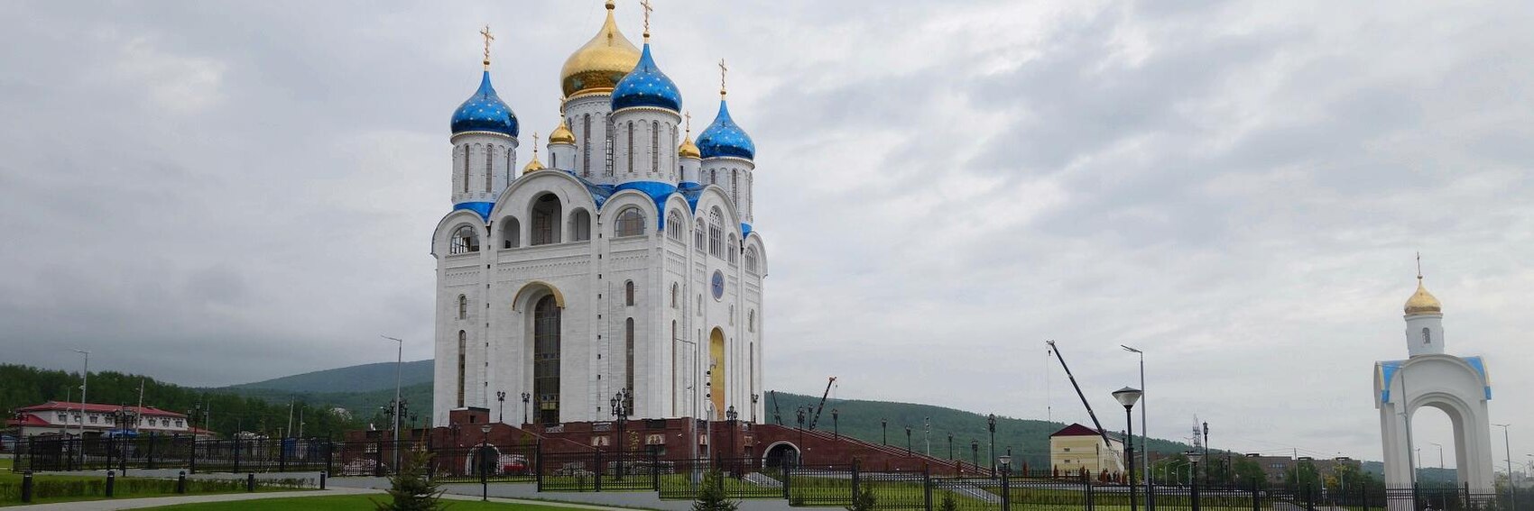
- It's between the last two for me, and it's a photo finish. If pressed, I'd choose #3 as first place (the architecture of the Sakhalin Regional Museum is a perfect depiction of the mix of Russian and Japanese cultures described in the blurb) and #4 as an extremely close second (the Orthodox Cathedral is a handsome building indeed, and it stands on a nice Siberian-looking landscape; however the cloudy sky puts a damper on things, though as I understand it, that's fairly typical for late summer in Sakhalin). #1, what I call the "truth in advertising" banner, comes in third, while #2 (the interior of the Komsomolets movie theater) seems too much like a Disneyfied dreamworld version of Russia to be truly believable. (Cute, though.) -- AndreCarrotflower (talk) 03:46, 7 July 2017 (UTC)
- The last two are my favorites too. I would say 4, 3, 1, 2. —Granger (talk · contribs) 13:33, 7 July 2017 (UTC)
- #3 then #4 for the same reason Andre gives (the "Japanese influence" blurb). The other two are far behind for me. ChubbyWimbus (talk) 14:01, 7 July 2017 (UTC)
- #4, #1, #3, #2. Number 4 is the most striking. Number 2 is my least favorite, because I guess it is inside a shopping mall? Andrewssi2 (talk) 05:21, 9 July 2017 (UTC)
- #2 is from the colorful lobby of the Komsomolets movie theater. ϒpsilon (talk) 16:56, 11 July 2017 (UTC)
- I like the banner with the Japanese element - #3. #1 is my second choice. #4 comes as third. Danapit (talk) 20:56, 10 July 2017 (UTC)
- Tough choice, but I'd say 4, 1, 3, 2. The movie theater lobby is by no means a bad banner. ϒpsilon (talk) 16:56, 11 July 2017 (UTC)
Hope it's not too early for Aarhus, but here are my suggestions. #1 is a rather abstract photo showing the foundation stones of Aarhus City Hall. #2 shows some interesting modern architecture, Isbjerget residential building, a prominent feature when you arrive with a ferry to the Aarhus harbour. #3 is the Moesgaar archaeological museum. Ideas? Danapit (talk) 13:37, 13 June 2017 (UTC)
![]()

![]()

![]()

![]()

![]()
![]()

- I'll go for 1, 3, 2. Danapit (talk) 13:39, 13 June 2017 (UTC)
- Never too early, I think. I like #1 and #2, with maybe just a slight edge to #1 because of a relative lack of contrast in #2. As a matter of personal taste, I don't like #3 too much, as it seems rather brutalist, so it isn't really a choice for me. Ikan Kekek (talk) 21:11, 13 June 2017 (UTC)
- I think number 3 is the best. Dowling002 (talk) 07:49, 18 June 2017 (UTC)
- I think they're all stunning. I would say #2, #1, #3. —Granger (talk · contribs) 11:27, 18 June 2017 (UTC)
- I like #2, #1, #3. ChubbyWimbus (talk) 13:59, 7 July 2017 (UTC)
- I added three new banners above, as promised in my comments below. As you can plainly see, I didn't hold myself to my stated intention of offering a diversity of depictions beyond modern architecture: judging by a quick perusal of the available material on Commons, modernism characterizes Aarhus' architectural landscape to such a pervasive degree that it would almost be ipso facto a poor representation of the city to depict it otherwise. Nonetheless - and here again I don't want it to seem as if I don't appreciate others lending a hand in the banner-making process; I really do, I'm not trying to be a jerk about this - but for various reasons, the preexisting three banners all rubbed me the wrong way (which is why I didn't vote until now). #3 is nice enough, but fairly anonymous (I can name quite a few buildings I've seen in my lifetime that I might mistake the Moesgaar Museum for - off the top of my head, the Johnson Geo Centre in St. John's, Newfoundland comes to mind); #1 is actually a pretty intriguing image, but too abstract IMO to be used as a banner; #2 I just plain don't like for whatever reason.
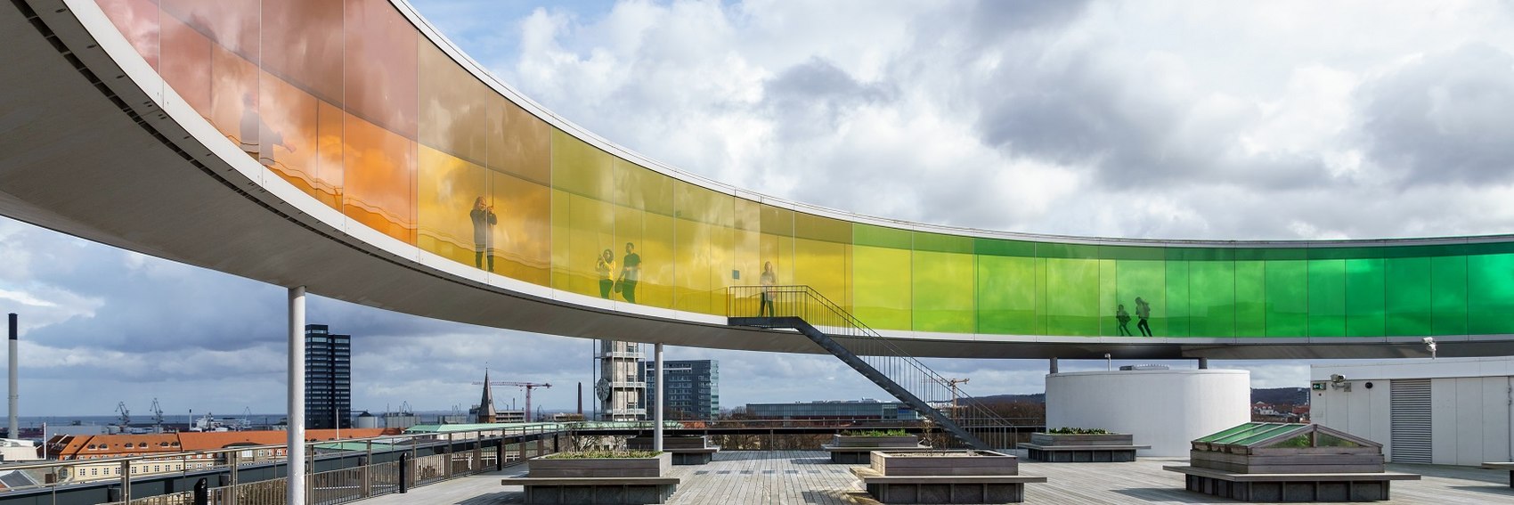
- Without further ado, then, here are my votes. #5 is first place for me - the Your Rainbow Panorama on the roof of the ARoS Aarhus Kunstmuseum seems to be about as iconic an image of Aarhus as you can get - while #6, taken at the opening ceremony of the European Capital of Culture celebration, is an aesthetically interesting image that's apropos of the blurb, yet suffers from slightly poorer photo quality and is also not seasonally appropriate for an August feature (the photo was taken in January and shows people bundled up in winter coats, hats and scarves). A distant third is #4, which depicts the same staircase as #1 but makes it more clear what's being looked at. The back three for me are #1, #2, and in last place #3.
- Those who've already voted: Danapit, Ikan, Dowling002, Granger, ChubbyWimbus - where do the new three fit in your rankings?
- #5, #2, #6, #3, #1 and #4 for me. I think #5 is an obvious choice... Andrewssi2 (talk) 05:24, 9 July 2017 (UTC)
- 5, 1, 2, 4, 6 for me. Ikan Kekek (talk) 08:11, 9 July 2017 (UTC)
- Impressive how one city can produce so many different beautiful banners. 5 is my new favorite, but I still think 2 is attractive and distinctive. 6 has good composition but looks a little blurry. So: 5, 2, 1, 4, 3, 6. —Granger (talk · contribs) 12:59, 9 July 2017 (UTC)
- Andre, these are all fine banners :) I jumped in because during one of my (nowadays sadly rather rare) visits to WV I noticed you asked for support with the banner business. I was considering making a banner similar to #5, but decided against, because picture like that is already in the guide pagebanner and the city has so many interesting buildings I didn't want to repeat the same theme. Therefore: #1, #6, #5, #3, #2 and #4. Danapit (talk) 20:51, 10 July 2017 (UTC)
- Again, Danapit, I really do appreciate the assistance. Sometimes it's hard for me to remember that it's not enough just to have the banner ready in time for the article to go on the Main Page - it actually needs to be done a month ahead of time, so dotm#Next change can be fully populated - and I often find myself scrambling to come up with four choices, after having completely forgotten. I should say as well that I'm coming around on your Banner #2, especially after having seen its prominent setting in the harbour. -- AndreCarrotflower (talk) 14:52, 11 July 2017 (UTC)
- 5, 2, 3, 6, 1, 4. ϒpsilon (talk) 16:52, 11 July 2017 (UTC)
- I like 5 the most. I don't ever recall seeing a rainbow theme inspired banner on the main page. It will be a refreshing change. Gizza (roam) 12:54, 12 July 2017 (UTC)
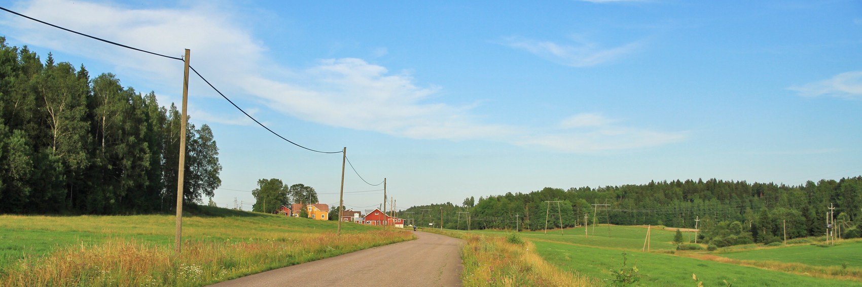
A naïve crop of the image that accompanied the nomination, to get a starting point. I think it nicely shows the landscape awaiting at this itinerary. --LPfi (talk) 18:04, 12 June 2017 (UTC)
- I couldn't resist relenting a little bit off of what I said originally, and coming up with a few banners of my own. (What can I say, when you get set in your ways and routines, it's hard to avoid falling back into them.) Anyway, I usually like to have four banners for folks to choose from, and by happenstance I had found three contenders when I saw LPfi had posted this one, for a total of four. I'm going to upload them now and post them on this page, so stay tuned for just a few minutes. -- AndreCarrotflower (talk) 18:09, 12 June 2017 (UTC)
 Done -- AndreCarrotflower (talk) 18:36, 12 June 2017 (UTC)
![]()
![]()

![]()

![]()
- The major problem I had with making banners for this article was that it is a road itinerary, but there are scant few pictures available of the road itself, as opposed to merely the points of interest along the way. LPfi's banner is obviously an exception, but by the same token it's quite an anonymous image: this could be pretty much any stretch of rural road anywhere in the world. As much as I hate to be the guy who asks for help and then criticizes the help he gets (I really do appreciate it, LPfi!), I don't like this banner as much as I like the ones I chose. #2, the historic ironworks at Fagervik, is my first choice not only because of the prominence of the road on the left side of the image but also because it simply looks more historic and old than my second-place choice, #3, the view over old Porvoo where the road (and I'm not even sure this is the actual King's Road route) is depicted as little more than a small bridge peeking up over the bottom margin. #4, Svartå manor, is a close third: a handsome image indeed, but nothing about it screams "historic Finland" in particular. -- AndreCarrotflower (talk) 18:36, 12 June 2017 (UTC)
- Also, I am quite sure Ypsi will have a thing or two to say about the selection. -- AndreCarrotflower (talk) 18:37, 12 June 2017 (UTC)
- No problem. I also think #2 and #3 are better than mine (that I even did not do anything to find). I think both give nice glimpses of what you seen en route. I however prefer #1 to #4, which I find associating just to that single sight. --LPfi (talk) 19:02, 12 June 2017 (UTC)
- All nice and appropriate banners. I would say #3, #2, #1, #4. ϒpsilon (talk) 04:14, 13 June 2017 (UTC)
- #3, #1, #2, #4 - nothing wrong with 4, just doesn't feel like an itinerary... —The preceding comment was added by Andrewssi2 (talk • contribs)
- #3 and #1 are very good to illustrate this itinerary. I've traveled some parts of the King's road, and #1 in fact feels very authentic, although I agree it is rather a generic photo. #4, nice banner, but I agree that road should be part of it. #2 seems a bit out of focus to me, sadly. Danapit (talk) 12:32, 13 June 2017 (UTC)
I've never been there and thus can't attest to this hypothesis firsthand, but judging simply by the images I perused while looking for sources for these banners, Groningen seems to be a place where the modern stands side by side with the historic. I'm glad that these banners seem to reflect that mix. Let's hear your votes! -- AndreCarrotflower (talk) 14:40, 27 May 2017 (UTC)
![]()

![]()

![]()

![]()

- For first place, I have to go with the historic over the modern. #4, the view down the Aa River, is just undeniable. #s 1 and 2 (the main building of the University of Groningen and the Kempkensberg or so-called "Cruise Ship" building, respectively) are in a tight race for second place, but I'm giving the edge to the latter because of the placement of the textbox, and because it's just so much more interesting-looking. I feel really bad relegating #3 to last place, and I think maybe a different view of the Groninger Museum would have made for a better banner, but the available images were what they were. It's a nice image, just not quite as nice as the others IMO. -- AndreCarrotflower (talk) 14:40, 27 May 2017 (UTC)
- I would go for #3, #4, #1. I think that there is something distinctive about the view of the museum. AlasdairW (talk) 18:01, 27 May 2017 (UTC)
- Quite an interesting set of banners! Thank you! I would go for #4, #3, #1 and #2, in that order, and any one of them would be good. Ikan Kekek (talk) 20:51, 27 May 2017 (UTC)
- I like #3 and #2. #1 and #4 could be many towns in the world. Gizza (roam) 01:23, 28 May 2017 (UTC)
- I think they're all great. If I have to choose, #3, #2, #4, #1. I agree with DaGizza about #1 and #4 (especially #1). —Granger (talk · contribs) 23:17, 31 May 2017 (UTC)
- I would go for #4, I like the historical perspective of Groningen as Hanseatic city. #3 is my second choice. #1 and #2 are too 'ordinary'. Thanks for the banners Andre. Iceandsnow (talk) 20:23, 6 June 2017 (UTC)
- #4, #3, #1, #2 - Really like 4. After reviewing other feedback it is great to see my choices largely aligning :) --Andrewssi2 (talk) 05:03, 13 June 2017 (UTC)
It was way easier than I expected to find good source images! Since there's only four days to go until Riga's term as DotM begins - and, therefore, until one of these banners needs to be put in place at dotm#Next change - that certainly makes things easier and less frustrating for me. Please vote! -- AndreCarrotflower (talk) 18:43, 26 May 2017 (UTC)
![]()

![]()

![]()
![]()

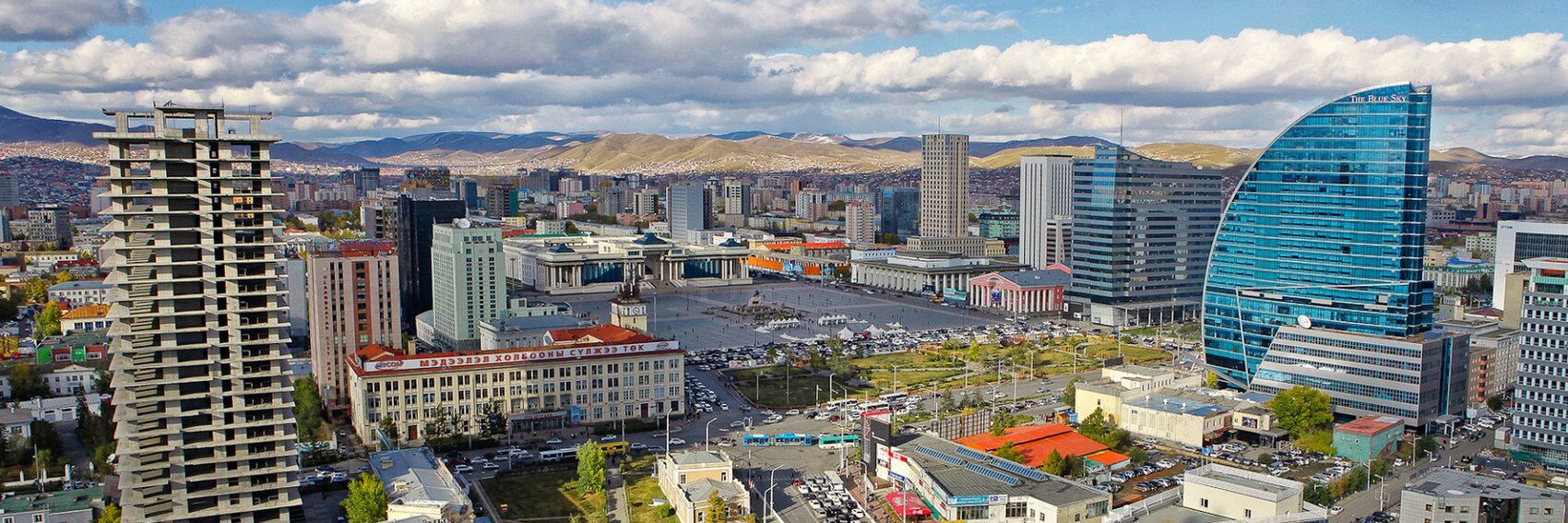
- Tough choice here. I want badly to pick #1 (the Naadam festival in the National Sports Stadium), but the text is hard to read under the light-colored, busy background. Meanwhile, #2 (the Monument to Genghis Khan in Sukhbaatar Square) is a nice representation of undoubtedly Mongolia's most famous native son, but its colors are quite drab. #3, the panoramic view over downtown, is great, but nothing about the scene screams "Mongolia" to me (though the sail-shaped Blue Sky Tower is fairly iconic in its own right). Similarly #4 (the Winter Palace of Bogd Khan) certainly says "Asia", but not "Mongolia" specifically.
- If pressed, I'd say #2 is in first place, #3 in second, and #1 in third - with an exceedingly short spread between those three - with #4 trailing behind. I'm definitely looking forward to hearing some other perspectives, though.
- #2, #1, #3, #4. #2 is the most striking as a picture, (although Genghis Khan is possibly more representative of Mongolia as a whole than just Ulaanbaatar). #1 comes next for me as a display of local life, although it doesn't work so well as a banner. #3 is an interesting shot of the city, but not too inspiring. #4 is a good shot, but hard to see something distinct than a similar photo from China or Korea. Andrewssi2 (talk) 21:35, 26 May 2017 (UTC)
- I like 'em all. For me, #3 is quite interesting with that building with the blue semicircle and so forth. It's my first choice, followed by #4, #2 and #1. Ikan Kekek (talk) 22:39, 26 May 2017 (UTC)
- #4, #3, #1, #2. #2 is so drab, surprised to see it so popular! 4 & 3 are roughly the same (and preferable) for me, there's just no "action" in the first two. --ButteBag (talk) 23:34, 26 May 2017 (UTC)
- #4 or #1. The colour speaks out. Aerial views of the city are generally boring but Ulaanbaatar has some bright buildings so #3 is not bad. Gizza (roam) 14:28, 27 May 2017 (UTC)
- #3, #2, #4, #1, with #1 a distant fourth. #1 just doesn't speak to me, but the other three are great. #2 seems like the most distinctively Mongolian, whereas #3 and #4 make the destination look the most appealing. The hills, the buildings, and the plaza in #3 feel like they give me a distinct impression of what Ulaanbataar is like. —Granger (talk · contribs) 15:56, 27 May 2017 (UTC)
When I first nominated this article for FTT last October, I remember searching and searching through Commons for an image to use for the "DotMImage=" argument in the FeatureNom template, and coming up completely emptyhanded. It was the same story at Flickr, with the following exception. I think that's why when I uploaded it to Commons, I had already cropped it to the 3:1 aspect ratio - because I had foreseen doing precisely what I'm doing now, that is, re-uploading the same image locally as the sole candidate for this article's banner, and encouraging others to come up with some additional alternatives. -- AndreCarrotflower (talk) 00:17, 5 May 2017 (UTC)
![]()

- I'm fine with this as the banner. It's right to the point. -- Ikan Kekek (talk) 00:20, 5 May 2017 (UTC)
- I am OK with this banner. I had a quick unsuccessful look for alternatives based on flags of the countries that speak English - Commons:Category:English language flags sounded promising, but most were just US/UK flag merges, but the gif animation is fun. AlasdairW (talk) 22:09, 26 May 2017 (UTC)
Predictably, searching for "Labrador" on Flickr resulted in far more dog photos than anything else. :)
Nonetheless, I'm satisfied with the pertinent source images I was able to dig up. Diverse enough in terms of subject matter given the fact that the place is a huge wilderness, and they all seem to cut to the heart of what the place means.
Let's hear your votes.
-- AndreCarrotflower (talk) 23:42, 4 May 2017 (UTC)
![]()

![]()

![]()
![]()
- #1 is the winner for me, narrowly over #4, despite the fact that the same source image was already adapted for Labrador's pagebanner. I like the content of the two images equally, but the pagebanner fits just perfectly over the patch of sky in the Battle Harbor skyline view. Third place is the Torngat Mountains scene in #3. I like #2 as a concept - the image of the man gazing out at the landscape in front of him really gets the whole "Big Land" idea across well - but the shoddy image quality is the deal-killer there. -- AndreCarrotflower (talk) 23:42, 4 May 2017 (UTC)
- Thanks a lot for making the banners! For me, #3, #4, #1, #2. Ikan Kekek (talk) 23:56, 4 May 2017 (UTC)
- My order is the same as Ikan Kekek's. #4 and especially #3 make me think, "Wow, I want to go there!" #1 is very nice too. As for #2, I agree that it's a good concept but didn't turn out that well. —Granger (talk · contribs) 00:05, 5 May 2017 (UTC)
- #1, #4, #3, #2 - The first one is great. The others are nice but rather generic.. I could imagine many other places in the world looking like those... Andrewssi2 (talk) 01:14, 5 May 2017 (UTC)
- #1 is the best, but I guess I'd like to see different images between this and the page banner. IQ on #2 is poor, which ruins it as you say. So I guess my preference is #3, or maybe #4 if it can be lightened up without blowing out all the highlights. --ButteBag (talk) 14:12, 7 May 2017 (UTC)
- #3, #1, #4, #2. Number 2 in particular is bland and uninspiring. The rest are ok though. Gizza (roam) 14:22, 27 May 2017 (UTC)
Right alongside Buffalo and London/Hampstead, Riga's voyage from nomination to the Main Page is among the longest and most convoluted in DotM history: first nominated way back in October 2015, the community eventually got bogged down in a contentious discussion about whether the article should be districtified, causing us to scuttle our plans for featuring it last summer, and on several occasions almost leading us to throw the article on the Slush Pile. Given the fact that Riga was, in the end, districtified (thank you, Ypsilon, wherever you are), a few months ago the decision was made to invalidate all the previous Support and Oppose votes (being that they applied to what was, in effect, a completely different article) and begin again with a clean slate. We've only accrued two new Support votes thus far, and it's my hope that putting these banners up for consideration might inspire some of our other editors to revisit Riga and either express their support for the nominee or else share their feelings about what else the article needs before being featured. Please, if you have time, weigh in at dotm#Riga and let's get the "pending stronger consensus" disclaimer removed from the schedule grid.
That all having been said - let's hear your thoughts on these banners!
-- AndreCarrotflower (talk) 22:59, 10 April 2017 (UTC)
![]()

![]()

![]()

![]()

- All of these images are nice, but you do DotM banners long enough and sooner or later it seems like an endless loop of the same old clichés. That's why I like #1 (a close-up view of the base of the Freedom Monument) the best of all of these: because it's the one that's most outside the box. Second-place finisher #4 (bird's eye view of the Old Town) shows an image of Riga that, presumably, hews closes to the tourist experience - but come on, this is basically the same thing as the Tallinn banner from 2014, the rejected Trondheim banner #2 from the next year, and a host of others. Last-place #3 (the town hall and surrounding buildings) is Stockholm #4 all over again. As for #2 (the Art Nouveau buildings along Alberta iela), my personal affinity for 19th- and early 20th-century architecture (natural enough for someone born and raised in Buffalo) can't completely win out over my distaste for the poor image quality that comes from having stretched the width of the original source image from 1,365 pixels to 1,701, hence its third-place ranking.
- To recap: #1, #4, #2 and finally #3.
- -- AndreCarrotflower (talk) 22:59, 10 April 2017 (UTC)
- No one else is going to vote? -- AndreCarrotflower (talk) 19:16, 15 April 2017 (UTC)
- My choice is #1 then #4. AlasdairW (talk) 21:20, 15 April 2017 (UTC)
- Andrew, it looks like I sharply disagree with you. Outside the box isn't necessarily better. My order of preference is #4, #3, #2, #1. If I were in Riga, I'd surely want to see the Freedom Monument up close and personal, but it wouldn't be my reason for visiting, whereas what's in #4 and #3 could be. Ikan Kekek (talk) 02:33, 16 April 2017 (UTC)
- Agree with Ikan, for me it's: #3, #4, #2, #1. --ButteBag (talk) 14:06, 7 May 2017 (UTC)
- My preferences are #1, #4, #3, then #2. The first one with its close-up perspective of the Freedom Monument has a unique look. Gizza (roam) 14:17, 27 May 2017 (UTC)
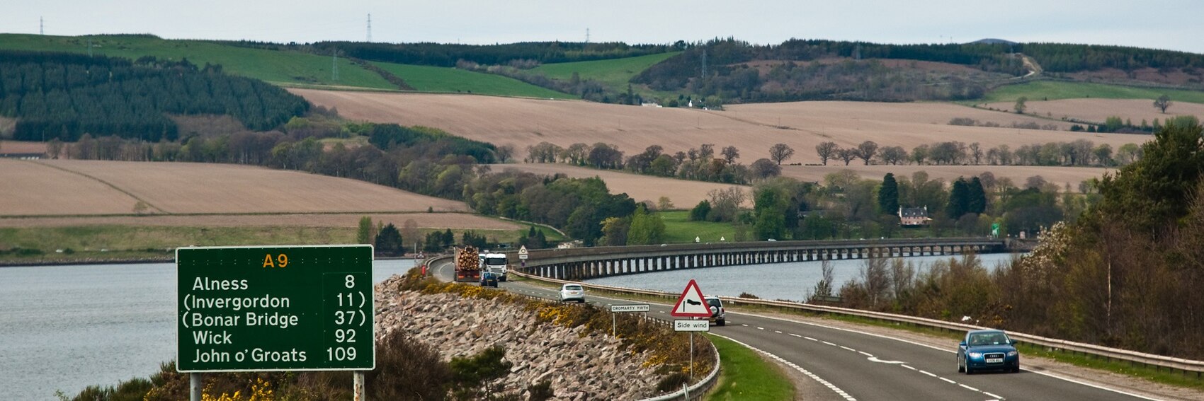
When searching for source images for DotM banners for UK-related articles, geograph.org.uk is the bane of one's existence - Commons images sourced from that site are so numerous as to overwhelm the selection in any given category, and while they're usually lovely pictures, their 640x480 resolution makes them useless for banner-making. Accordingly, I had to slog through the copyleft-compatible corners of Flickr to find three of the four source images for the following banner selection, which nonetheless I'm quite happy with. Let's please hear your votes! -- AndreCarrotflower (talk) 19:29, 9 April 2017 (UTC)
![]()

![]()
![]()

![]()

- Tough choice here. About the only thing that's clear to be is that #4 belongs in last place - a relatively anonymous and humdrum motorway scene on the M6, with the only thing marking it as identifiably British is the telltale left-hand driving orientation. Of the other three, #3 is the most interesting image - the blurred images of the red double-decker buses in motion on Regent Street in London's West End provide a dynamic quality that's a nice contrast to the relative stasis of the other three - and I feel very tempted to name it my top choice, but there's something about the placid image of A9 on the Scottish shore in #2 that really speaks to me. #1 I feel bad relegating to third - it's a close third, no doubt - but it's just missing a certain je ne sais quoi.
- To recap: #2 in first, #3 second, #1 third and finally #4.
- AndreCarrotflower, my order is exactly the same as yours: 2, 3, 1, 4. My only slight disagreement with you is that I find #2 the most appealing, even striking image and didn't consider the idea of #3 as my first choice. -- Ikan Kekek (talk) 19:45, 9 April 2017 (UTC)
- My preference is #1, then #2. These are the only images that would make me want to drive in the UK. 3 and 4 look like good reasons to get a train or bus. I like the colours of the trees and the roundabout in #1. (I agree with you about geograph images - when looking on commons for UK article banners I usually search the results for mb to just look at the larger file sizes. But it is great to have the smaller images for other purposes.) AlasdairW (talk) 23:00, 9 April 2017 (UTC)
- #3, #1, #2, #4 - I like the London scene (Bond street?) even if it isn't going to be a realistic representation of most car driving in the UK. The motorway is really depressing, even if it is actually pretty representative of the subject :) Andrewssi2 (talk) 01:12, 5 May 2017 (UTC)
- For me: 2, 3, 1, 4. ChubbyWimbus (talk) 13:23, 7 May 2017 (UTC)
- #2, #1, #3, #4. I agree with AlasdairW that 1 and 2 are the only ones that make driving in the UK look appealing. —Granger (talk · contribs) 23:57, 9 May 2017 (UTC)
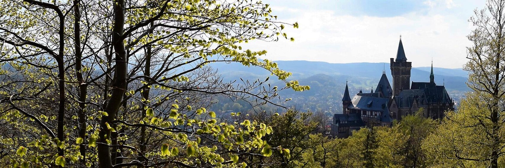
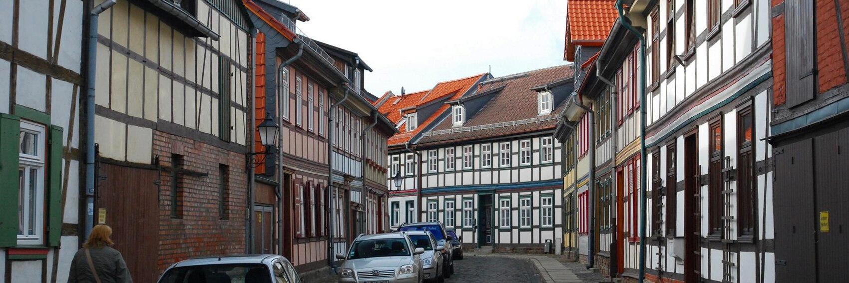
Though I'm really happy with the way these turned out, I'm aware that this may seem a rather one-note selection of banners at first blush. But as the text in the article presents it, the picture-perfect, preserved Old Town of half-timbered buildings etc. is pretty much the long and short of what Wernigerode has to offer the visitor. And it is indeed mighty picturesque. Let's hear your votes! -- AndreCarrotflower (talk) 02:41, 6 April 2017 (UTC)
![]()
![]()

![]()
![]()

- When I first saw the source image, I was fully expecting #1 to be a runaway winner. It definitely wins the prize for best composition, and Wernigerode Castle is indeed the star attraction of the city, but it just doesn't speak to the place's character the way first-place finisher #2 and very close second-place #3 do. Meanwhile, it's hard for me to think of #4 as deserving of last place - it reminds me of the "glass elevator" scene at the end of the original Willy Wonka and the Chocolate Factory, and for that alone it would normally gain an advantage - but I can't deny that the view could be of any old town in Germany. -- AndreCarrotflower (talk) 02:41, 6 April 2017 (UTC)
- That town is really magnificent! I don't know the place, but for me, my preferences are 1, 2, 4, 3. 3 is by no means a bad photo! But compared to the others, the cars somewhat break the spell. Ikan Kekek (talk) 04:20, 6 April 2017 (UTC)
- #4, #2, #1, #3. #4 is the most visually interesting. It uses up the whole frame and has great color, which is why I prefer it even with the image quality issues. #2 is also great, but the shadows (dramatic!) make it a little dark and I guess I just found the sky a little boring? #1 is good, but the focus is more the trees than the castle. #3 is pretty meh (must be the cars as Ikan suggested). Thank you for making these! --ButteBag (talk) 13:59, 6 April 2017 (UTC)
- All good images, but for me #2, #3, #4, #1 Andrewssi2 (talk) 00:23, 5 May 2017 (UTC)
More banners. Vote! -- AndreCarrotflower (talk) 01:04, 24 March 2017 (UTC)
![]()

![]()

![]()

![]()
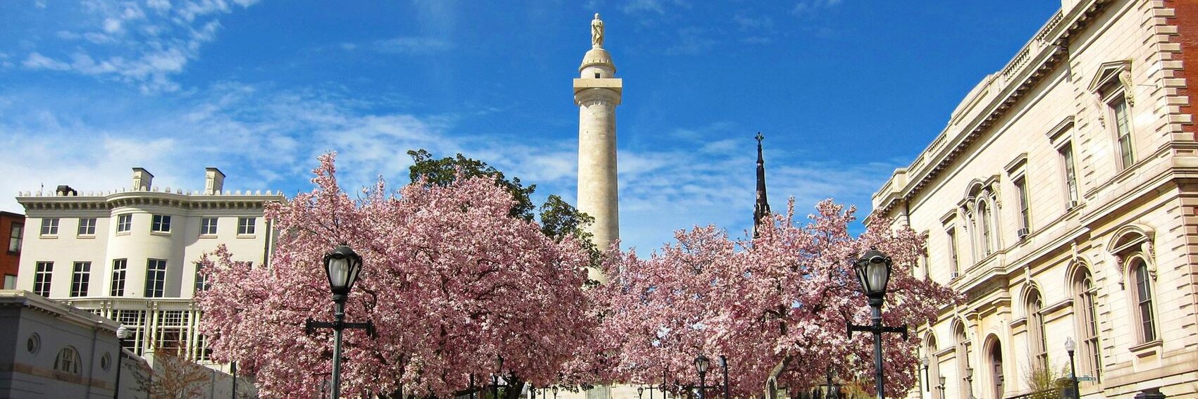
- #1 depicts the quintessential Baltimore tourist experience and is one of the elements mentioned in the blurb (the "redeveloped Inner Harbor"); the problem is that there's no place in which to shoehorn the textbox. #3, Fort McHenry, is also mentioned in the blurb, and has a much better place to fit the textbox, but it looks oddly anonymous, as if it could be any fort. #4, the Washington Monument and Mount Vernon Place, is a beautiful image of a site that's a bit further off the tourist path. That leaves #2 as the Goldilocks option - Fell's Point is certainly no stranger to the tourist scene, the sturdy brick buildings of this 19th-century commercial row are as handsome as can be, and the textbox fits perfectly into the upper left corner of the banner.
- My breakdown: #2 first, then #4 a close second, then #1 in a disappointing third.
- I don't care quite as much as you do about where the text box is, apparently. My votes are 1, 4, 2, 3. #2 is indeed attractive, but the image seems less sharp or at least less bright than my two favorites. Ikan Kekek (talk) 01:31, 24 March 2017 (UTC)
- My favorite is #4. It's nice and bright and it does have a distinct Baltimore landmark that's lesser-known, which in this case I think is a positive since one of the strengths of our Baltimore guides is showing off things slightly off the beaten tourist path. #1 definitely pops out and it's recognizably Baltimore, but it's also a very busy image, almost cluttered even. #2 and #3 don't really do anything for me; both strike me as rather nondescript. PerryPlanet (talk) 01:55, 24 March 2017 (UTC)
- #4, #1, #2, #3 These look great, thank you for making them Andre! Agree with you about #3. #1 is pretty good actually, it's just too bad they went and slapped logos up on everything after they redeveloped it. Really liking the symmetry, textures, and image quality of #4 the best. #2 is pretty good, but the light pole wrecks it for me, and the sky is a little bland. Thanks again for the work! --ButteBag (talk) 01:58, 24 March 2017 (UTC)
- Also, the line breaks in the #3 caption are the best. I'd use them in the #4 box as well. --ButteBag (talk) 02:05, 24 March 2017 (UTC)
- #4, #1, #2, #3 These look great, thank you for making them Andre! Agree with you about #3. #1 is pretty good actually, it's just too bad they went and slapped logos up on everything after they redeveloped it. Really liking the symmetry, textures, and image quality of #4 the best. #2 is pretty good, but the light pole wrecks it for me, and the sky is a little bland. Thanks again for the work! --ButteBag (talk) 01:58, 24 March 2017 (UTC)
- I like the first one, though I'd expand the text box width to make it one line shorter. Powers (talk) 00:24, 28 March 2017 (UTC)
I'm on a roll, somewhat unexpectedly, with creating new banners. Let's hear your opinion on these. -- AndreCarrotflower (talk) 11:40, 28 February 2017 (UTC)
![]()

![]()

![]()
![]()

- #s 3 and 4 provide some diversity in terms of subject matter, but for these banners I'd prefer to play it a bit more conservative and opt for one of the photos that depict an actual passport. I'm torn on which of the two that do, but I think I prefer #1 just a bit more than #2. Third place goes to #3, a better quality and IMO a somewhat more on-topic image than the final one. -- AndreCarrotflower (talk) 11:40, 28 February 2017 (UTC)
- I'm wavering a little between the two, but for now at least, prefer #2, which doesn't identify the passport's issuing country. After that, I'd support #1, #3, and finally the depressing #4. Ikan Kekek (talk) 11:45, 28 February 2017 (UTC)
- Although it'd be nice to see a few different ones stacked, I prefer #1 by a large margin. I guess #2 would be second, but it's far behind. The idea is nice, but aside from Fukuoka, the stamps aren't that interesting. The other two fall off the ranking for me. ChubbyWimbus (talk) 14:00, 28 February 2017 (UTC)
- #2. This one most clearly illustrates the idea of "passport". It could definitely stand to have its levels adjusted in your favorite photo-editing-software. (dull and grey at the moment). #1 is very good, I like the playing with DoF, but it feels very USA centric and looks like there is a car ad back there? --ButteBag (talk) 15:03, 28 February 2017 (UTC)
- #3 or maybe #2. I'd prefer not to tie the "passport/passeport/pasaporte" concept to just one specific issuing country. K7L (talk) 00:38, 11 March 2017 (UTC)
Per ChubbyWimbus' comments on its OtBP nomination, there are a few stubborn but ultimately easily addressed issues to be ironed out before Nauru is truly ready for prime time. I've carved out a space of time over the next few weeks to attend to it, Kabak, and several of the other nominees that need minor fixes, so we can safely put those concerns out of our minds (at least for the time being) and vote on these four banners.
Special thanks go out to Flickr user Sean Kelleher, whose CC-BY-SA 2.0-licensed Nauru photo album was the source of three of these four images.
-- AndreCarrotflower (talk) 02:18, 28 February 2017 (UTC)
![]()

![]()
![]()

![]()
- In my examination of the available photos of Nauru on Commons and Flickr, one thing that made itself immediately clear is that Anibare Bay is by far the most photogenic spot on the island. Therefore, the two banners that depict it, #s 2 and 4, are by far my favorites of this bunch, with #2 easily my favorite between the two of those. The other photos, aside from being less interesting in terms of content, also sport decidedly lower image quality. #3 is an interesting and beautiful-in-spite-of-itself depiction of the "inland... desolate moonscape dotted with abandoned mining equipment" described in the blurb, and it narrowly edges into third place ahead of #1, a pleasant and clearly tropical but ultimately anonymous scene of a nice country house. -- AndreCarrotflower (talk) 02:18, 28 February 2017 (UTC)
- Well, here's the thing: If going along with the blurb and unusualness is the most important thing, we have to go with #3. However, disregarding the blurb, I'd support the banners in this order: #2, #3, #4, #1. Ikan Kekek (talk) 02:43, 28 February 2017 (UTC)
- I'd go with #1, #2, #4, #3. The colonial tropical buildings look compelling to me. Andrewssi2 (talk) 02:57, 28 February 2017 (UTC)
- I prefer #2. That was what stood out to me the most when reviewing the article. To me the others all look slightly fuzzy. ChubbyWimbus (talk) 13:54, 28 February 2017 (UTC)
- #2. #4 looks slightly more "quirky" to me (in a good way), but the colors and quality of the light on #2 is just so much better. #1 is pretty good too, I actually like the anonymous buildings, feels like I'm being invited to ride that bike someplace interesting! --ButteBag (talk) 14:55, 28 February 2017 (UTC)
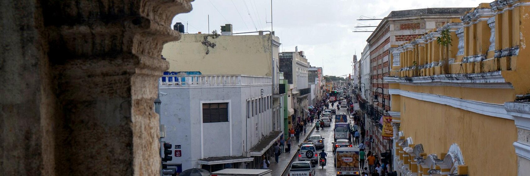
The eternal struggle: keeping up with DotM banners. Here we go again with a quartet for our April 2017 DotM, Mérida. Vote! -- AndreCarrotflower (talk) 19:16, 26 February 2017 (UTC)
![]()

![]()

![]()
![]()

- #4, with the clock tower of the Palacio Municipal and the Mexican flag at right, would be an easy first choice for me if not for the fact that there's no good place to put the textbox. Instead, it falls to second place below the Ermita de Santa Isabel in #2. Third place is #1, the Arco de San Juan, with its pleasant pastel colors; fourth place is the downtown street scene with colonial architecture, which - while it boasts a perfect swath of negative space for the textbox - is a fairly ugly and gritty scene (though perhaps sporting a dose of warts-and-all vérité that the other banners lack?) -- AndreCarrotflower (talk) 19:16, 26 February 2017 (UTC)
- #4 is the most striking banner. #1 #2 #3 are all OK banners (in that order) I guess the street scenes could be pretty much any old town in Mexico? Andrewssi2 (talk) 21:16, 26 February 2017 (UTC)
- My order is precisely the same as Andrewssi2's: #4 (as he says, most striking), #1 (welcoming the reader into the gate), #2 (nice combination of a historic building and a palm tree), #3 (very nice photo, but made more nearly pedestrian by the vehicles). I'd be perfectly happy with any one of those banners being used, and perhaps there might be a way to repurpose some of the ones that end up not being used for the DotM? Congratulations, AndreCarrotflower! Ikan Kekek (talk) 07:11, 27 February 2017 (UTC)
- #4, best light and composition by far. --ButteBag (talk) 14:48, 28 February 2017 (UTC)
Yes, these are several months early, and I probably should be getting to work on the North Central New Mexico banners instead (coming within a week or so, I promise!). But this article is due to go on the Main Page in March - unusually early in the year for a destination of this latitude - so we face the same situation as when Buffalo was DotM a while back. Namely: if I had waited much longer to go out and take these pictures, winter would have already begun and our choices would have been limited to four uninviting-looking images taken at precisely the time of year tourists don't want to visit Buffalo. And, as long as I have the photos taken, cropped and ready to go, why not throw them on this page and commence the voting process? -- AndreCarrotflower (talk) 00:46, 29 October 2016 (UTC)
![]()

![]()

![]()

![]()

- #1 (the twin towers and dome of St. Adalbert's Basilica looming over the little worker's cottages of Rother Avenue) is the clear winner for me, as it gives a sense of the majesty of these buildings both in and of themselves as well as by comparison with the surrounding areas - the article mentions that, much as in the old countries, by far the largest and tallest building in the typical East Side immigrant neighborhood was and is the parish church. Somewhat surprisingly to me, I think #3 (the close-up shot of the façade of St. Luke's) takes second place by a narrow margin as the best illustration of the really ornate architectural detail that the article talks up. #2 (St. Ann's) is in third place and, under other circumstances, might have placed higher - if I could do it over again, I'd have taken the picture from an angle where you could get a better look at the façade, rather than a sidelong view like this one. Last-place #4 (the twin towers of St. Stanislaus in old Polonia) depicts invariably the most famous church on the itinerary and is a great example of a defining feature of the Polish Cathedral style talked about in the article, but overall I feel like I went way too minimalist with it. -- AndreCarrotflower (talk) 00:46, 29 October 2016 (UTC)
- For me, #3 is my first choice, followed by #1, #2 and #4. Yes, #1 is a good picture and provides a nice context, but #3 is simply the best picture in the bunch, in my opinion, and really focuses on a unique and very attractive church. Ikan Kekek (talk) 00:53, 29 October 2016 (UTC)
- It looks like we're deadlocked here. Ypsi or Andrewssi2, would either of you care to add your thoughts? -- AndreCarrotflower (talk) 01:46, 1 November 2016 (UTC)
- Oh, I apparently haven't voted on these. I also prefer #3, then #1, #4, and #2. ϒpsilon (talk) 05:09, 1 November 2016 (UTC)
- As usual I looked at the candidates and then read the comments afterwards. I really like #1 the best with the contrast between the church and its surrounding neighborhood. Then it is followed by #3, #2 and then #4. Andrewssi2 (talk) 09:41, 1 November 2016 (UTC)
- Now we're deadlocked 2-2 instead of 1-1! :) Umm... Powers? -- AndreCarrotflower (talk) 14:49, 1 November 2016 (UTC)
- I'm not the best person to ask about churches. I hate that they're the most enduring examples of historic architecture. From a purely aesthetic point of view I really want to like #4 but I agree it's a bit too stark and minimalist. With that in mind, #2 is probably my favorite. Of course you're trying to decide between #3 and #1 but both have their merits. I guess I'd go #1; it's not my favorite aesthetically but it certainly does drive home the point. Powers (talk) 15:10, 1 November 2016 (UTC)
- Now we're deadlocked 2-2 instead of 1-1! :) Umm... Powers? -- AndreCarrotflower (talk) 14:49, 1 November 2016 (UTC)
- They are all good pictures, and I think that they have been presented in my order of preference - #1, #2, #3, #4. #1 provides a good context, especially if the street shown is on the route. #2 and #4 are clearly churches, but I would prefer that #4 was only used if the other banners at the same time were not also showing a lot of sky. AlasdairW (talk) 22:15, 1 November 2016 (UTC)
With that, ladies and gentlemen, for the first time since way back in November 2015, we have three months' worth of banners ready to go on this page.
And what a nice selection to reach that benchmark with! Now these are what you call DotM banners.
Let's hear your votes!
-- AndreCarrotflower (talk) 01:20, 20 December 2016 (UTC)
![]()
![]()

![]()
![]()
- The magnificent and aptly-numbered #1 is my first choice, followed by the peaceful and inviting thatched beach huts of #3. Third place is #2 by a hair, but even last-place #4 would be a fine image to put on our Main Page. -- AndreCarrotflower (talk) 01:20, 20 December 2016 (UTC)
- 1, 3, 4, 2 for me, and thank you. Ikan Kekek (talk) 08:57, 20 December 2016 (UTC)
- 3, 4, 2, 1 for me. Number one just appears bland to my eyes, although perhaps I'm missing something. --Andrewssi2 (talk) 11:12, 20 December 2016 (UTC)
- 2, 3, 1, 4 --ϒpsilon (talk) 11:25, 20 December 2016 (UTC)
- 2, 3, 4, 1 ChubbyWimbus (talk) 13:56, 28 February 2017 (UTC)
More banners. Vote! -- AndreCarrotflower (talk) 23:25, 19 December 2016 (UTC)
![]()

![]()

![]()

![]()

- #4, the bird's eye view of the Marble Mountains, would be the unquestionable easy winner for me if not for the fact that it bears more than a passing resemblance to the current favorite banner for Ipoh's stint as DotM only two months previous to Da Nang. Hmm. I guess it's still in first place for me, but it's a conundrum. Following somewhat further behind in close succession are #s 1, 2, and 3, in that order. -- AndreCarrotflower (talk) 23:25, 19 December 2016 (UTC)
- #4,#2, #1, #3 for me. I'd definitely want to visit #4. --Andrewssi2 (talk) 00:13, 20 December 2016 (UTC)
- 4, 3, 2, 1 for me. Ikan Kekek (talk) 08:58, 20 December 2016 (UTC)
- 2, 1, 4, 3--ϒpsilon (talk) 11:25, 20 December 2016 (UTC)
I don't think I've ever been as frustrated in the course of producing DotM banners as I have been for this feature. Neither Commons nor Flickr had any suitable photos of Igbo-language advertisements, signs, literature, etc. - I don't mean the pickings were slim, I don't mean the photos wouldn't look good cropped to the 3:1 aspect ratio, I mean literally nothing. The best I could do were these two (yes, only two! Urgh!) images that depict other aspects of Igbo culture: traditional dress and art. One of the two source images was also used to create the article's pagebanner, so I suppose the following is probably the best any of us could conceivably do, though if anyone wants to go on the hunt for better options, be my guest. As for me, I'd just as soon wash my hands of the whole thing.
Vote away, I guess.
-- AndreCarrotflower (talk) 02:21, 18 December 2016 (UTC)
![]()

![]()

- I like the first one better. -- AndreCarrotflower (talk) 02:21, 18 December 2016 (UTC)
- 1, 2 --ϒpsilon (talk) 11:25, 20 December 2016 (UTC)
- There is no indication on c:File:Igbo Roman Catholics.jpg or the Flickr page it was taken from that the subjects in photo #1 gave their consent for their likenesses to be used in a public photo, and in the past Wikivoyage has tried to avoid that legal gray area (see c:Commons:Photographs of identifiable people). As a result, unless someone can provide a reason why it is OK to use this image, my opinion would be that #1 should definitely not be used. -- Ryan • (talk) • 16:45, 22 January 2017 (UTC)
- If anyone wants to comb through Commons and Flickr looking for another suitable image to use for the banner, I'd welcome that. And good luck, because you're going to need it. Failing that, I've always thought Wikivoyage's stance on this is needlessly restrictive. I honestly don't see what the difference is between this banner and the "Kimono buying guide" banner from June 2014, which passed muster uncontroversially. -- AndreCarrotflower (talk) 17:03, 22 January 2017 (UTC)
Only three banner options to choose from this time around, reflective of how little coverage Entebbe gets on Commons and Flickr. Have at 'em! -- AndreCarrotflower (talk) 01:16, 14 December 2016 (UTC)
![]()
![]()

![]()

- #2 is the winner for me, and the race isn't close. Second place #1 may have been a contender despite the fact that the modern architecture of the Imperial Beach Hotel doesn't exactly scream "Africa" - like it or not, it's an Entebbe landmark - but the poor lighting conditions of the photo kept it off the top spot. #3 is easily the best-quality image, and if "cute" were what we were aiming for, it would be my pick. (Believe me, there's a part of me that wants to.) Unfortunately, that's not the objective of a DotM banner. -- AndreCarrotflower (talk) 01:16, 14 December 2016 (UTC)
- 2, 3, 1, and thank you for the banners! Ikan Kekek (talk) 01:21, 14 December 2016 (UTC)
- 2, 3, 1 as well (#1 just looks like a hospital) . Thanks! Andrewssi2 (talk) 02:56, 14 December 2016 (UTC)
- 3, 2, 1 --ϒpsilon (talk) 11:25, 20 December 2016 (UTC)
Remember that personal goal I had once a long time ago about having 3 months' worth of DotM banners on deck at all times? I haven't forgotten about it. And, with the Hobart banners, I'm now two-thirds of the way there.
That said: given that Hobart is a state capital located in a prosperous First World nation, one would have thought there'd be more photos on Commons and Flickr that would be suitable for use as banners. Same story as always: a pretty good if frustratingly imperfect selection.
Let's hear your votes.
-- AndreCarrotflower (talk) 02:23, 7 December 2016 (UTC)
![]()

![]()

![]()

![]()

- I'm torn here between #1 and #4 - aesthetically #1 is clearly the better of the two, with a nice simple composition and perfectly placed textbox, but in terms of relevance to visitors #4 is superior: Salamanca Market is one of Hobart's main visitor attractions. If pressed, I would choose #4 for first place and #1 for second. Close behind in third place is #3, a contrast of old and new architecture (the Parliament House of Tasmania and 10 Murray Street, respectively) that typifies Hobart's CBD, with a nice statue at left as a bonus. #2 is a fine view of the city and Mount Wellington in the distance that suffers from the "skyline cliché" that we tend to shy away from in banners, as well as visually with a harsh contrast that I couldn't PhotoShop away. -- AndreCarrotflower (talk) 02:23, 7 December 2016 (UTC)
- 1, 4, 2, 3 for me. Ikan Kekek (talk) 07:01, 7 December 2016 (UTC)
- #2, #4, #1, #3 . Hobart is a state capital, but a very backwater one at that (and no offence intended to residents, whom I'm sure would agree). #2 is my image of Hobart if I think of it. #4 is not a great shot, but gives some atmosphere. #1 & #3 don't do too much for me. Andrewssi2 (talk) 09:44, 7 December 2016 (UTC)
- #2, #1, #4, #3 I spent a night in Hobart about 15 years ago, and one of my memories is of the harbour area (I also remember drinking Cascade beer). AlasdairW (talk) 09:53, 20 December 2016 (UTC)
- 3, 2, 1, 4 --ϒpsilon (talk) 11:25, 20 December 2016 (UTC)
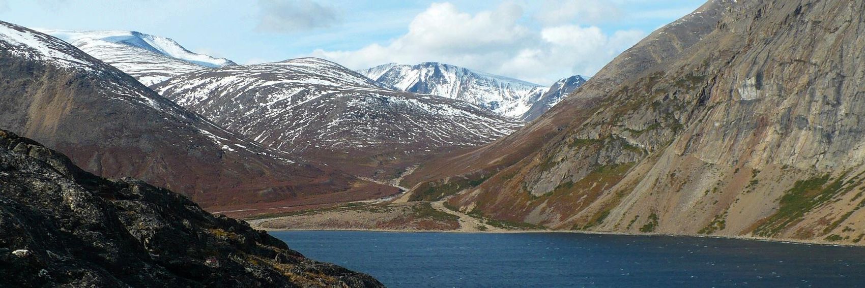
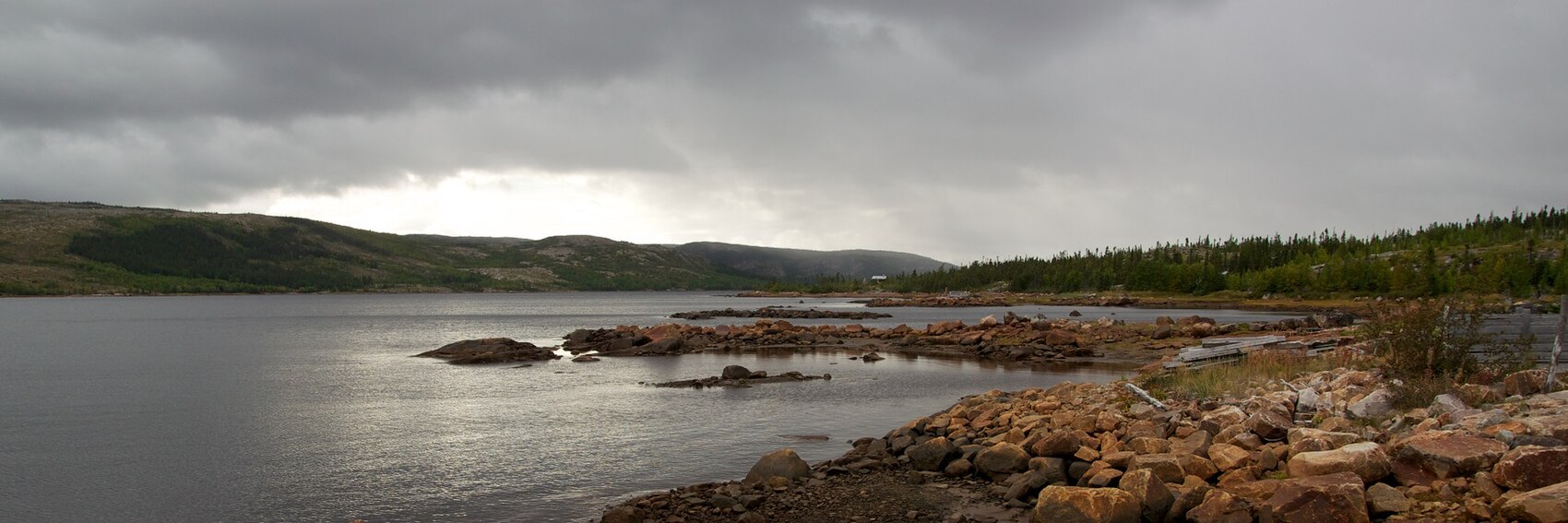
As searches for DotM banners go, this was an easy one: choose four archetypal next-to-impossible destinations, ones that embody the topic of inaccessibility the best - in order: the Sahara, the Amazon rainforest, interior Antarctica, and the closest suitable image I could find to a desert island - and then search for the best image possible of each.
I'm sure that the act of presenting these four banners for your consideration is very likely to reignite the debate over whether it's a worthy FTT candidate. Preemptively: while the nominee has earned only one Support vote out of three total votes cast, I think we have a broad consensus (including many editors who commented but did not formally cast votes) that the work required to get NTID up to featureable status is no more overwhelming than your typical close-but-no-cigar nominee. That's a discussion we can pick up at dotm, if you like, and if necessary, I'll see if I can't attend to some of the deficiencies in the article myself sometime between now and January 21st.
Cast your votes!
-- AndreCarrotflower (talk) 02:33, 3 December 2016 (UTC)
![]()

![]()

![]()

![]()

- #3 over #1 by a hair for me, with #4 a bit (but not too much) further behind. All three of these are exemplary images from an aesthetic standpoint, so the ranking is of how well they get across the concept of inaccessibility. As for #2, what can I say, I tried. It's an image of dense thicket and greenery that's true to what the Amazon is like in real life, but the same could be said of any thick forest, including ones within easy reach of civilization. Oh well, they can't all be winners. -- AndreCarrotflower (talk) 02:33, 3 December 2016 (UTC)
- That jungle looks pretty inaccessible without a machete to my eyes. 4, 2, 1, 3 for me, and every one would be great! Ikan Kekek (talk) 03:58, 3 December 2016 (UTC)
- I've rethought this. 1, 3, 4, 2. Ikan Kekek (talk) 09:19, 3 December 2016 (UTC)
- I'm going to change my mind and place #1 ahead of #3 because of the placement of the textbox. #1, 3, 4, 2 for me. -- AndreCarrotflower (talk) 00:32, 20 December 2016 (UTC)
- 1, 4, 2, 3 --ϒpsilon (talk) 11:25, 20 December 2016 (UTC)
Another selection of banners that are passably good on the whole, yet troublingly deficient in certain specific areas. The problem with the images in the pool of what's available on Commons and Flickr is that so many of them feature depressing, gray, overcast skies. I'm given to understand that's rather the rule than the exception when it comes to the Falklands, though, so I won't be too upset about it. -- AndreCarrotflower (talk) 17:37, 1 December 2016 (UTC)
![]()

![]()

![]()

![]()

- #3 is my choice, despite the fact that there's no good place for the textbox. After that, #1 and #2 are in a tight race for second place but I'm going to give the edge to #1, a pastoral view of Government House that's pleasant despite the gloomy sky. #4 suffers from the same gloominess, and carries the tinge of taking sides in a political dispute (the image is of the monument commemorating the liberation of the islands in 1982, while Argentina still hasn't formally given up the ghost vis-à-vis its territorial claim.) -- AndreCarrotflower (talk) 17:37, 1 December 2016 (UTC)
- I think either #2 or #3 would be best, with a slight preference for #3 since the whalebone arch at the church is so iconic. The thing to highlight about Stanley is that it's a tiny, colorful place located far away from anything else and clinging to the edge of a rough sea, with a history that goes back to whaling days, and #1 and #4 don't convey that message to me. -- Ryan • (talk) • 17:45, 1 December 2016 (UTC)
- I too prefer #3, and the textbox could be placed left so it doesn't obscure the church tower. Then #1, #2 and lastly #4. ϒpsilon (talk) 19:21, 1 December 2016 (UTC)
- Ideally, the textbox would be placed to the right but compressed to something like 30% width, but that results in the words "Stanley" and "Falkland Islands" in the title not fitting on the same line. If the textbox is left-justified, it obscures the colorful houses in the background, which is undesirable. Again, the ultimate answer is there's no ideal placement for it; what the least bad placement would be is certainly up for debate. -- AndreCarrotflower (talk) 22:54, 1 December 2016 (UTC)
- For me, #3 is first, #2 is second because it shows a wind-swept sea suggestive of super-Antarctic regions, and then #1, which I might rank above #2 as a picture. #4 is unacceptable to me in this condition because there are three obvious, large dust spots in a horizontal line with the monument. I should add that if we included the word "British" in the blurb, everything except my first choice would change, and then if #4 were cleaned, I'd rank the banners 3, 4, 1, 2. Ikan Kekek (talk) 22:23, 1 December 2016 (UTC)
- I like #3, #2, #1 and finally #4. #2 and #3 have the colourful roofs of Stanley, and #3 has the cathedral and whale bone which I think are significant. If the photo
 in #4 is to be used, then I would rather it was cropped to have the lower half of the memorial with "In memory of those who liberated us 14 June 1982" visible. AlasdairW (talk) 23:12, 1 December 2016 (UTC)
- There's no way to do that without cropping off the top of the monument. I tried it and it was pretty ugly. -- AndreCarrotflower (talk) 23:46, 1 December 2016 (UTC)
- I see 4 dust spots in that photo at thumbnail size. Someone should really clean up that photo. Ikan Kekek (talk) 23:51, 1 December 2016 (UTC)
- Thanks for trying. To me the significant part of the memorial is "1982" and the top is unimportant, otherwise it could be a memorial from another naval conflict in another town. AlasdairW (talk) 23:55, 1 December 2016 (UTC)
- Ikan - I had assumed the dust sports were on the surface of my desktop monitor, which was crying out for a cleaning! I see now that they're part of the image itself, and I agree with you. I can clean the image up without too much of a problem. I'll get on it ASAP. -- AndreCarrotflower (talk) 23:58, 1 December 2016 (UTC)
- Terrific. Thank you. Ikan Kekek (talk) 00:04, 2 December 2016 (UTC)
- Ikan - I had assumed the dust sports were on the surface of my desktop monitor, which was crying out for a cleaning! I see now that they're part of the image itself, and I agree with you. I can clean the image up without too much of a problem. I'll get on it ASAP. -- AndreCarrotflower (talk) 23:58, 1 December 2016 (UTC)
- Thanks for trying. To me the significant part of the memorial is "1982" and the top is unimportant, otherwise it could be a memorial from another naval conflict in another town. AlasdairW (talk) 23:55, 1 December 2016 (UTC)
- I see 4 dust spots in that photo at thumbnail size. Someone should really clean up that photo. Ikan Kekek (talk) 23:51, 1 December 2016 (UTC)
- There's no way to do that without cropping off the top of the monument. I tried it and it was pretty ugly. -- AndreCarrotflower (talk) 23:46, 1 December 2016 (UTC)
Sticking another quartet of DotM banners up here really quickly before I head to Pennsylvania for the holiday. Let's hear your votes, and happy Thanksgiving to those of us in the U.S.! -- AndreCarrotflower (talk) 20:49, 23 November 2016 (UTC)
![]()

![]()

![]()

![]()

- Since cuisine is Ipoh's main draw, it was practically a given that I'd make food an integral part of as many of these banners as possible. However, the challenge was to give a sense of the place as well - Ipoh is a destination article, not a travel topic about cuisine. I think #4 strikes the best balance between the two of those, while the other food banner - the plate of ayam tauge; a banner inspired by Powers' long-ago suggestion of a plate of chicken wings for Buffalo's DotM image - falls to third place because of its anonymity; this is Ipoh cuisine, but the picture could be taken anywhere. #1 is in second place for me as an attractive bird's-eye view of the skyline and over the impressive landscape around town, while #3 takes last: a pleasant enough scene, but one that has little to do with the blurb.
- To recap: #4 in first, then #1, #2 and finally #3.
- Please clarify: Isn't #3 outside of Ipoh? I ask, because if it were within Ipoh city limits, it would be my favorite, but I believe it's somewhere in the region, not in the city. I don't recall any of the karst hills being within the city. Even Sam Poh Tong is a bit outside the city. I think it took me 30 minutes to get there (maybe it was 20) in a regional - not a local - bus. Ikan Kekek (talk) 22:24, 23 November 2016 (UTC)
- Given that Gunung Lang is listed in "Do" rather than "Go next", it should probably be considered for Wikivoyage purposes to be within the city of Ipoh. I also notice that on the dynamic map it appears to be fairly close in to the city center. -- AndreCarrotflower (talk) 00:11, 24 November 2016 (UTC)
- With urban sprawl of the Asian variety, Sam Poh Tong and Gunung Rapat / Gunung Lang are firmly in Ipoh now. And since they doubled the city limits in the 2000s, even Kleblang is considered part of Ipoh and also managed by the city council. I'm pretty sure I can take a two-hour bus ride and still be in Sydney, so why not :)
- I would pick #1 for sure, the rest aren't close contenders. There's a lack of current photos in the article and Commons anyway, the pickup in tourist traffic has led to way nicer pictures and portrayals of Ipoh, but doesn't seem to have translated to CC-compliant photos. As it happens, I'll be visiting Ipoh again soon, though I can't promise any new or better photographs. Even the scene in #4 could be improved, maybe as a wider shot of charming shophouses. -- torty3 (talk) 04:17, 24 November 2016 (UTC)
- Given that Gunung Lang is listed in "Do" rather than "Go next", it should probably be considered for Wikivoyage purposes to be within the city of Ipoh. I also notice that on the dynamic map it appears to be fairly close in to the city center. -- AndreCarrotflower (talk) 00:11, 24 November 2016 (UTC)
- Please clarify: Isn't #3 outside of Ipoh? I ask, because if it were within Ipoh city limits, it would be my favorite, but I believe it's somewhere in the region, not in the city. I don't recall any of the karst hills being within the city. Even Sam Poh Tong is a bit outside the city. I think it took me 30 minutes to get there (maybe it was 20) in a regional - not a local - bus. Ikan Kekek (talk) 22:24, 23 November 2016 (UTC)
- Definitely #1, followed closely by #3. A long way behind would be #4 and #2, both of which don't give me much feeling for the destination. Andrewssi2 (talk) 00:32, 24 November 2016 (UTC)
- I didn't realize Ipoh had expanded its borders so much since I was there in 2003. #3 is my favorite banner, followed very closely by #1, and then I have a dilemma. To me, #2 is more interesting, but to people who haven't been to Malaysia, I think #4 is more interesting. So ultimately, my 3rd choice is #4 and my 4th choice is #2. I think any of the banners would be fine, though I'd be eager to see any photos torty3 is able to take, and Torty3, it's good to see you here. Selamat jalan ke Ipoh! Ikan Kekek (talk) 06:20, 24 November 2016 (UTC)
- Oh, I seem to have completely overlooked this set of banners :P . Anyways, it's a bit hard to rank four beautiful and very different banners, but I'll go for the signs (#4) too. Then the stunning landscape #3, #1 and finally #2. ϒpsilon (talk) 19:28, 1 December 2016 (UTC)